文章目录
- CSS的介绍
- 引入方式
- 代码风格
- 选择器
- 复合选择器 (选学)
- 常用元素属性
- 背景属性
- 圆角矩形
- Chrome 调试工具 -- 查看 CSS 属性
- 元素的显示模式
- 盒模型
- 弹性布局
一、CSS的介绍
层叠样式表 (Cascading Style Sheets).
CSS 能够对网页中元素位置的排版进行像素级精确控制, 实现美化页面的效果. 能够做到页面的样式和结构分离.
基础语法规范
- 选择器 + {一条/N条声明}
- 选择器决定针对谁修改 (找谁)
- 声明决定修改啥. (干啥)
- 声明的属性是键值对. 使用 ; 区分键值对, 使用 : 区分键和值.
<style>p {/* 设置字体颜色 */color: red;/* 设置字体大小 */font-size: 30px;}
</style>
<p>hello</p>
注意:
- CSS 要写到 style 标签中(还有其他写法) .
- style 标签可以放到页面任意位置. 一般放到 head 标签内.
- CSS 使用 /* */ 作为注释. (使用 ctrl + / 快速切换) .
二、引入方式
1.内部样式表
写在 style 标签中. 嵌入到 html 内部. 理论上来说 style 放到 html 的哪里都行. 但是一般都是放到 head 标签中.
优点: 这样做能够让样式和页面结构分离.
缺点: 分离的还不够彻底. 尤其是 css 内容多的时候.
2.行内样式表
通过 style 属性, 来指定某个标签的样式. 只适合于写简单样式. 只针对某个标签生效.
缺点: 不能写太复杂的样式. 这种写法优先级较高, 会覆盖其他的样式.
<!DOCTYPE html>
<html lang="en">
<head><meta charset="UTF-8"><meta name="viewport" content="width=device-width, initial-scale=1.0"><title>Document</title><style>div {color: red;}</style>
</head>
<body><div style="color:green">想要生活过的去, 头上总得带点绿</div>
</body>
</html>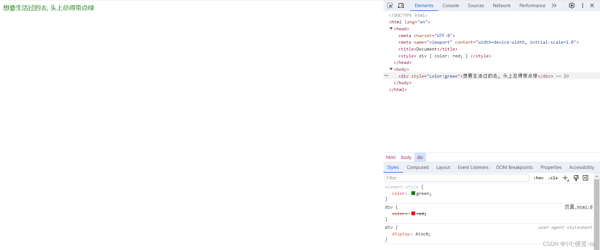
此时我们可以发现此时的红色被覆盖了。
3.外部样式
实际开发中最常用的方式.
1. 创建一个 css 文件.
2. 使用 link 标签引入 css
<link rel="stylesheet" href="[CSS文件路径]">
创建 demo.html
<head><meta charset="UTF-8"><meta name="viewport" content="width=device-width, initial-scale=1.0"><title>外部样式</title><link rel="stylesheet" href="style.css">
</head>
<body><div>上帝为你关上一扇门, 然后就去睡觉了</div>
</body>
创建 style.css
div {color: red;
}
注意: 不要忘记 link 标签调用 CSS, 否则不生效.
优点: 样式和结构彻底分离了.
缺点: 受到浏览器缓存影响, 修改之后 不一定 立刻生效.
- 关于缓存:
- 这是计算机中一种常见的提升性能的技术手段.
- 网页依赖的资源(图片/CSS/JS等)通常是从服务器上获取的. 如果频繁访问该网站, 那么这些外部资源就没必要反复从服务器获取. 就可以使用缓存先存起来(就是存在本地磁盘上了). 从而提高访问效率.
- 可以通过 ctrl + F5 强制刷新页面, 强制浏览器重新获取 css 文件.
三、代码风格
1.样式格式
1.紧凑风格
p { color : red ; font-size : 30px ;}
2.展开风格(推荐)
p {color : red ;font-size : 30px ;}
注意:虽然 CSS 不区分大小写, 我们开发时统一使用小写字母 。
空格规范
- 冒号后面带空格
- 选择器和 { 之间也有一个空格.
四、选择器
1.选择器的功能
选中页面中指定的标签元素. 要先选中元素, 才能设置元素的属性.
1.选择器的种类
以下内容只是 CSS2 标准中支持的选择器, 在 CSS3 中还做出了一些补充.
参考文档
1. 基础选择器: 单个选择器构成的
- 标签选择器
- 类选择器
- id 选择器
- 通配符选择器
2. 复合选择器: 把多种基础选择器综合运用起来.
- 后代选择器
- 子选择器
- 并集选择器
- 伪类选择器
2.基础选择器
特点: 能快速为同一类型的标签都选择出来. 但是不能差异化选择 。
测试代码:
<!DOCTYPE html>
<html lang="en">
<head><meta charset="UTF-8"><meta name="viewport" content="width=device-width, initial-scale=1.0"><title>Document</title><style>p {color: red;}div {color: green;}</style>
</head>
<body><p>咬人猫</p><p>咬人猫</p><p>咬人猫</p><div>阿叶君</div><div>阿叶君</div><div>阿叶君</div>
</body>
</html>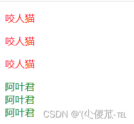
3.类选择器
特点:
- 差异化表示不同的标签
- 可以让多个标签的都使用同一个标签.
<!DOCTYPE html><html lang="en"><head><meta charset="UTF-8"><meta name="viewport" content="width=device-width, initial-scale=1.0"><title>Document</title><style>.blue {color: blue;}</style></head><body><div class="blue">咬人猫</div><div>咬人猫</div></body></html>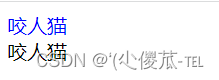
语法细节:
- 类名用 . 开头的
- 下方的标签使用 class 属性来调用.
- 一个类可以被多个标签使用, 一个标签也能使用多个类(多个类名要使用空格分割, 这种做法可以让代码更好复用)
- 如果是长的类名, 可以使用 - 分割.
- 不要使用纯数字, 或者中文, 以及标签名来命名类名.
代码示例: 使用多个类名
注意: 一个标签可以同时使用多个类名
这样做可以把相同的属性提取出来, 达到简化代码的效果.
<!DOCTYPE html><html lang="en"><head><meta charset="UTF-8"><meta name="viewport" content="width=device-width, initial-scale=1.0"><title>Document</title><style>.box {width: 200px;height: 150px;}.red {background-color: red;}.green {background-color: green;}</style></head><body><div class="box red"></div><div class="box green"></div><div class="box red"></div></body></html>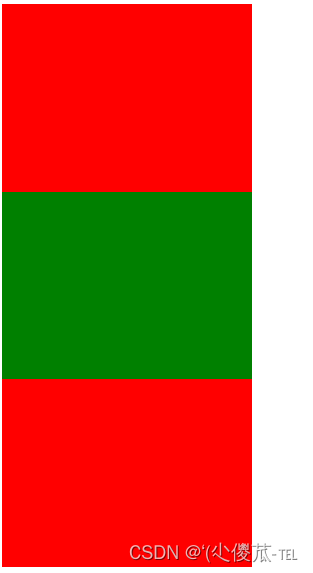
4.id 选择器
和类选择器类似.
- CSS 中使用 # 开头表示 id 选择器
- id 选择器的值和 html 中某个元素的 id 值相同
- html 的元素 id 不必带 #
- id 是唯一的, 不能被多个标签使用 (是和 类选择器 最大的区别)
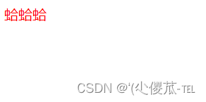
<!DOCTYPE html><html lang="en"><head><meta charset="UTF-8"><meta name="viewport" content="width=device-width, initial-scale=1.0"><title>Document</title><style>#ha {color: red;}</style></head><body><div id="ha">蛤蛤蛤</div></body></html>
5.通配符选择器
使用 * 的定义, 选取所有的标签.
* {color: red;
}
页面的所有内容都会被改成 红色 .
不需要被页面结构调用.
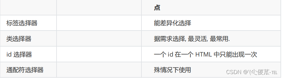
6.基础选择器小结
五、复合选择器 (选学)
后代选择器
又叫包含选择器. 选择某个父元素中的某个子元素.
元素1 元素2 {样式声明}
- 元素 1 和 元素 2 要使用空格分割
- 元素 1 是父级, 元素 2 是子级, 只选元素 2 , 不影响元素 1
代码示例: 把 ol 中的 li 修改颜色, 不影响 ul
<!DOCTYPE html><html lang="en"><head><meta charset="UTF-8"><meta name="viewport" content="width=device-width, initial-scale=1.0"><title>Document</title><style>ol li {color: red;}</style></head><body><ul><li>aaa</li><li>bbb</li><li>ccc</li></ul><ol><li>ddd</li><li>eee</li><li>fff</li></ol></body></html>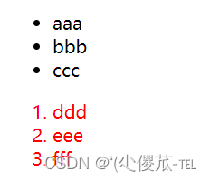
代码示例: 元素 2 不一定非是 儿子, 也可以是孙子.
<!DOCTYPE html><html lang="en"><head><meta charset="UTF-8"><meta name="viewport" content="width=device-width, initial-scale=1.0"><title>Document</title><style>/* ul li a {color: yellow;} */ul a {color: yellow;}</style></head><body><ul><li>aaa</li><li>bbb</li><li><a href="#">ccc</a></li></ul></body></html>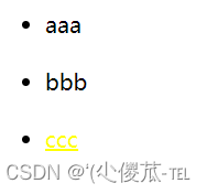
代码示例: 可以是任意基础选择器的组合. (包括类选择器, id 选择器)
<!DOCTYPE html><html lang="en"><head><meta charset="UTF-8"><meta name="viewport" content="width=device-width, initial-scale=1.0"><title>Document</title><style>.one li a {color: green;}</style></head><body><ol class="one"><li>ddd</li><li>eee</li><li><a href="#">fff</a></li><li><a href="#">fff</a></li><li><a href="#">fff</a></li></ol></body></html>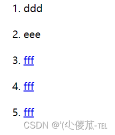
1.子选择器
和后代选择器类似, 但是只能选择子标签.
元素1>元素2 { 样式声明 }
- 使用大于号分割
- 只选亲儿子, 不选孙子元素
后代选择器的写法, 会把链接1 和 2 都选中.
<!DOCTYPE html><html lang="en"><head><meta charset="UTF-8"><meta name="viewport" content="width=device-width, initial-scale=1.0"><title>Document</title><style>.two a {color: red;}</style></head><body><div class="two"><a href="#">链接1</a><p><a href="#">链接2</a></p></div></body></html>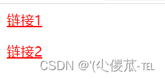
子选择器的写法, 只选链接 1
<!DOCTYPE html><html lang="en"><head><meta charset="UTF-8"><meta name="viewport" content="width=device-width, initial-scale=1.0"><title>Document</title><style>.two>a {color: red;}</style></head><body><div class="two"><a href="#">链接1</a><p><a href="#">链接2</a></p></div></body></html>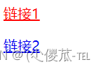
2.并集选择器
用于选择多组标签. (集体声明)
元素1, 元素2 { 样式声明 }
- 通过 逗号 分割等多个元素.
- 表示同时选中元素 1 和 元素 2
- 任何基础选择器都可以使用并集选择器.
- 并集选择器建议竖着写. 每个选择器占一行. (最后一个选择器不能加逗号)
代码示例 :
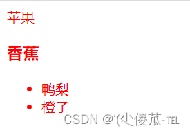
1. 把苹果和香蕉颜色改成红色
<!DOCTYPE html><html lang="en"><head><meta charset="UTF-8"><meta name="viewport" content="width=device-width, initial-scale=1.0"><title>Document</title><style>div, h3 {color: red;}</style></head><body><div>苹果</div><h3>香蕉</h3><ul><li>鸭梨</li><li>橙子</li></ul></body></html>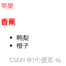
2. 把鸭梨和橙子也都一起改成红色
<!DOCTYPE html><html lang="en"><head><meta charset="UTF-8"><meta name="viewport" content="width=device-width, initial-scale=1.0"><title>Document</title><style>div,h3,ul>li {color: red;}</style></head><body><div>苹果</div><h3>香蕉</h3><ul><li>鸭梨</li><li>橙子</li></ul></body></html>
3.伪类选择器
1) 链接伪类选择器
- a:link 选择未被访问过的链接
- a:visited 选择已经被访问过的链接
- a:hover 选择鼠标指针悬停上的链接
- a:active 选择活动链接(鼠标按下了但是未弹起)
<!DOCTYPE html><html lang="en"><head><meta charset="UTF-8"><meta name="viewport" content="width=device-width, initial-scale=1.0"><title>Document</title><style>a:link {color: black;/* 去掉 a 标签的下划线 */text-decoration: none;}a:visited {color: green;}a:hover {color: red;}a:active {color: blue;}</style></head><body><a href="#">小猫</a></body></html> 示例:
如何让一个已经被访问过的链接恢复成未访问的状态?
清空浏览器历史记录即可. ctrl + shift + delete
注意事项
- 按照 LVHA 的顺序书写, 例如把 active 拿到前面去, 就会导致 active 失效. 记忆规则 "绿化"
- 浏览器的 a 标签都有默认样式, 一般实际开发都需要单独制定样式.
- 实际开发主要给链接做一个样式, 然后给 hover 做一个样式即可. link, visited, active 用的不多.
a {color : black ;}a : hover {color : red ;}
2) :force 伪类选择器
选取获取焦点的 input 表单元素.
<!DOCTYPE html><html lang="en"><head><meta charset="UTF-8"><meta name="viewport" content="width=device-width, initial-scale=1.0"><title>Document</title><style>.three>input:focus {color: red;}</style></head><body><div class="three"><input type="text"><input type="text"><input type="text"><input type="text"></div></body></html>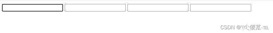
六、常用元素属性
1.字体属性
1.设置字体
body {font-family: '微软雅黑';font-family: 'Microsoft YaHei';
}- 字体名称可以用中文, 但是不建议.
- 多个字体之间使用逗号分隔. (从左到右查找字体, 如果都找不到, 会使用默认字体. )
- 如果字体名有空格, 使用引号包裹.
- 建议使用常见字体, 否则兼容性不好.
<!DOCTYPE html><html lang="en"><head><meta charset="UTF-8"><meta name="viewport" content="width=device-width, initial-scale=1.0"><title>Document</title><style>.font-family .one {font-family: 'Microsoft YaHei';}.font-family .two {font-family: '宋体';}</style></head><body><div class="font-family"><div class="one">这是微软雅黑</div><div class="two">这是宋体</div></div></body></html>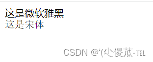
2.大小
p {font-size: 20px;
}- 不同的浏览器默认字号不一样, 最好给一个明确值. (chrome 默认是 16px)
- 可以给 body 标签使用 font-size
- 要注意单位 px 不要忘记.
- 标题标签需要单独指定大小
注意: 实际上它设置的是字体中字符框的高度;实际的字符字形可能比这些框高或矮
<!DOCTYPE html><html lang="en"><head><meta charset="UTF-8"><meta name="viewport" content="width=device-width, initial-scale=1.0"><title>Document</title><style>.font-size .one {font-size: 40px;}.font-size .two {font-size: 20px;}</style></head><body><div class="font-size"><div class="one">大大大</div><div class="two">小小小</div></div></body></html>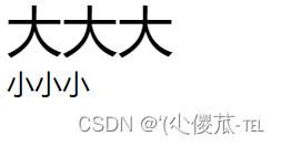
3.粗细
p {font-weight: bold;font-weight: 700;
}- 可以使用数字表示粗细.
- 700 == bold, 400 是不变粗, == normal
- 取值范围是 100 -> 900
4.文字样式
/* 设置倾斜 */
font-style: italic;
/* 取消倾斜 */
font-style: normal;
很少把某个文字变倾斜.
但是经常要把 em / i 改成不倾斜.
<!DOCTYPE html><html lang="en"><head><meta charset="UTF-8"><meta name="viewport" content="width=device-width, initial-scale=1.0"><title>Document</title><style>.font-style em {font-style: normal;}.font-style div {font-style: italic;}</style></head><body><div class="font-style"><em>放假啦</em><div class="one">听说要加班</div></div></body></html>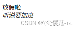
2.文本属性
1.文本颜色
认识 RGB
我们的显示器是由很多很多的 "像素" 构成的. 每个像素视为一个点, 这个点就能反映出一个具体的颜色. 我们使用 R (red), G (green), B (blue) 的方式表示颜色(色光三原色). 三种颜色按照不同的比例搭配, 就能混合出各种五彩斑斓的效果. 计算机中针对 R, G, B 三个分量, 分别使用一个字节表示(8个比特位, 表示的范围是 0-255, 十六进制表示为 00-FF).
数值越大, 表示该分量的颜色就越浓. 255, 255, 255 就表示白色; 0, 0, 0 就表示黑色.
设置文本颜色
color : red ;color : #ff0000 ;color : rgb ( 255 , 0 , 0 );
鼠标悬停在 vscode 的颜色上, 会出现颜色选择器, 可以手动调整颜色.
color 属性值的写法:
- 预定义的颜色值(直接是单词)
- [最常用] 十六进制形式
- RGB 方式
十六进制形式表示颜色, 如果两两相同, 就可以用一个来表示.
#ff00ff => #f0f
<!DOCTYPE html><html lang="en"><head><meta charset="UTF-8"><meta name="viewport" content="width=device-width, initial-scale=1.0"><title>Document</title><style>.color {color: red;/* color: rgb(255, 0, 0); *//* color: #ff0000; */}</style></head><body><div class="color">这是一段话</div></body></html>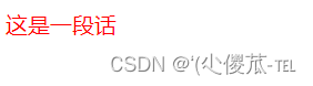
2.文本对齐
控制文字水平方向的对齐.
不光能控制文本对齐, 也能控制图片等元素居中或者靠右
text-align : [ 值 ];
- center: 居中对齐
- left: 左对齐
- right: 右对齐
<!DOCTYPE html>
<html lang="en"><head><meta charset="UTF-8"><meta name="viewport" content="width=device-width, initial-scale=1.0"><title>Document</title><style>.text-align .one {text-align: left;}.text-align .two {text-align: right;}.text-align .three {text-align: center;}</style>
</head><body><div class="text-align"><div class="one">左对齐</div><div class="two">右对齐</div><div class="three">居中对齐</div></div>
</body></html>

3.文本装饰
text-decoration : [ 值 ];
常用取值:
- underline 下划线. [常用]
- none 啥都没有. 可以给 a 标签去掉下划线.
- overline 上划线. [不常用]
- line-through 删除线 [不常用]
<!DOCTYPE html>
<html lang="en"><head><meta charset="UTF-8"><meta name="viewport" content="width=device-width, initial-scale=1.0"><title>Document</title><style>.text-decorate .one {text-decoration: none;}.text-decorate .two {text-decoration: underline;}.text-decorate .three {text-decoration: overline;}.text-decorate .four {text-decoration: line-through;}</style>
</head><body><div class="text-decorate"><div class="one">啥都没有</div><div class="two">下划线</div><div class="three">上划线</div><div class="four">删除线</div></div>
</body></html>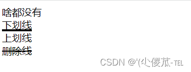
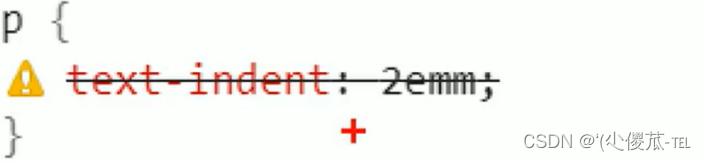
4.文本缩进
控制段落的 首行 缩进 (其他行不影响)
text-indent : [ 值 ];
- 单位可以使用 px 或者 em.
- 使用 em 作为单位更好. 1 个 em 就是当前元素的文字大小.
- 缩进可以是负的, 表示往左缩进. (会导致文字就冒出去了)
<!DOCTYPE html>
<html lang="en"><head><meta charset="UTF-8"><meta name="viewport" content="width=device-width, initial-scale=1.0"><title>Document</title><style>.text-indent .one {text-indent: 2em;}.text-indent .two {text-indent: -2em;}</style>
</head><body><div class="text-indent"><div class="one">正常缩进</div><div class="two">反向缩进</div></div>
</body></html> 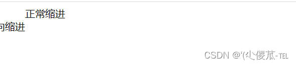
5.行高
行高指的是上下文本行之间的基线距离.
HTML 中展示文字涉及到这几个基准线:
- 顶线
- 中线
- 基线 (相当于英语四线格的倒数第二条线)
- 底线
内容区:底线和顶线包裹的区域,即下图深灰色背景区域
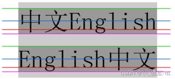
其实基线之间的距离 = 顶线间距离 = 底线间距离 = 中线间距离
text-indent : [ 值 ];
注意 1: 行高 = 上边距 + 下边距 + 字体大小
上下边距是相等的, 此处字体大小是 16px, 行高 40px, 上下边距就分别是 12px
<!DOCTYPE html>
<html lang="en"><head><meta charset="UTF-8"><meta name="viewport" content="width=device-width, initial-scale=1.0"><title>Document</title><style>.line-height .one {line-height: 40px;font-size: 16px;}</style>
</head><body><div class="line-height"><div>上一行</div><div class="one">中间行</div><div>下一行</div></div>
</body></html>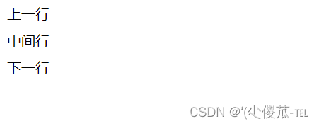
注意 2: 行高也可以取 normal 等值 .
这个取决于浏览器的实现. chrome 上 normal 为 21 px
注意 3: 行高等与元素高度 , 就可以实现文字居中对齐 .
<!DOCTYPE html>
<html lang="en"><head><meta charset="UTF-8"><meta name="viewport" content="width=device-width, initial-scale=1.0"><title>Document</title><style>.line-height .two {height: 100px;line-height: 100px;}</style>
</head><body><div class="line-height"><div class="two">文本垂直居中</div></div>
</body></html>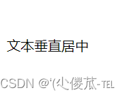
七、背景属性
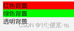
1.背景颜色
默认是 transparent (透明) 的. 可以通过设置颜色的方式修改.
background-color: [ 指定颜色 ]
<!DOCTYPE html>
<html lang="en"><head><meta charset="UTF-8"><meta name="viewport" content="width=device-width, initial-scale=1.0"><title>Document</title><style>body {background-color: #f3f3f3;}.bgc .one {background-color: red;}.bgc .two {background-color: #0f0;}.bgc .three {/* 背景透明 */background-color: transparent;}</style>
</head><body><div class="bgc"><div class="one">红色背景</div><div class="two">绿色背景</div><div class="three">透明背景</div></div>
</body></html>
2.背景图片
background-image: url(...);
比 image 更方便控制位置 ( 图片在盒子中的位置 )
注意:
- 1. url 不要遗漏.
- 2. url 可以是绝对路径, 也可以是相对路径
- 3. url 上可以加引号, 也可以不加.
<!DOCTYPE html>
<html lang="en"><head><meta charset="UTF-8"><meta name="viewport" content="width=device-width, initial-scale=1.0"><title>Document</title><style>.bgi .one {background-image: url(前端.jpg);height: 300px;}</style>
</head><body><div class="bgi"><div class="one">背景图片</div></div>
</body></html>
3.背景平铺
background-repeat: [平铺方式]
重要取值:
- repeat: 平铺
- no-repeat: 不平铺
- repeat-x: 水平平铺
- repeat-y: 垂直平铺
默认是 repeat.
背景颜色和背景图片可以同时存在. 背景图片在背景颜色的上方.
<!DOCTYPE html>
<html lang="en"><head><meta charset="UTF-8"><meta name="viewport" content="width=device-width, initial-scale=1.0"><title>Document</title><style>.bgr .one {background-image: url(前端.jpg);height: 300px;background-repeat: no-repeat;}.bgr .two {background-image: url(前端.jpg);height: 300px;background-repeat: repeat-x;}.bgr .three {background-image: url(前端.jpg);height: 300px;background-repeat: repeat-y;}</style>
</head><body><div class="bgr"><div class="one">不平铺</div><div class="two">水平平铺</div><div class="three">垂直平铺</div></div>
</body></html>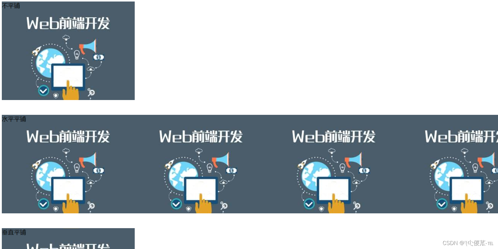
4.背景位置
background-position: x y;
修改图片的位置.
参数有三种风格:
- 1. 方位名词: (top, left, right, bottom)
- 2. 精确单位: 坐标或者百分比(以左上角为原点)
- 3. 混合单位: 同时包含方位名词和精确单位
<!DOCTYPE html>
<html lang="en"><head><meta charset="UTF-8"><meta name="viewport" content="width=device-width, initial-scale=1.0"><title>Document</title><style>.bgp .one {background-image: url(前端.jpg);height: 500px;background-repeat: no-repeat;background-color: purple;background-position: center;}</style>
</head><body><div class="bgp"><div class="one">背景居中</div></div>
</body></html>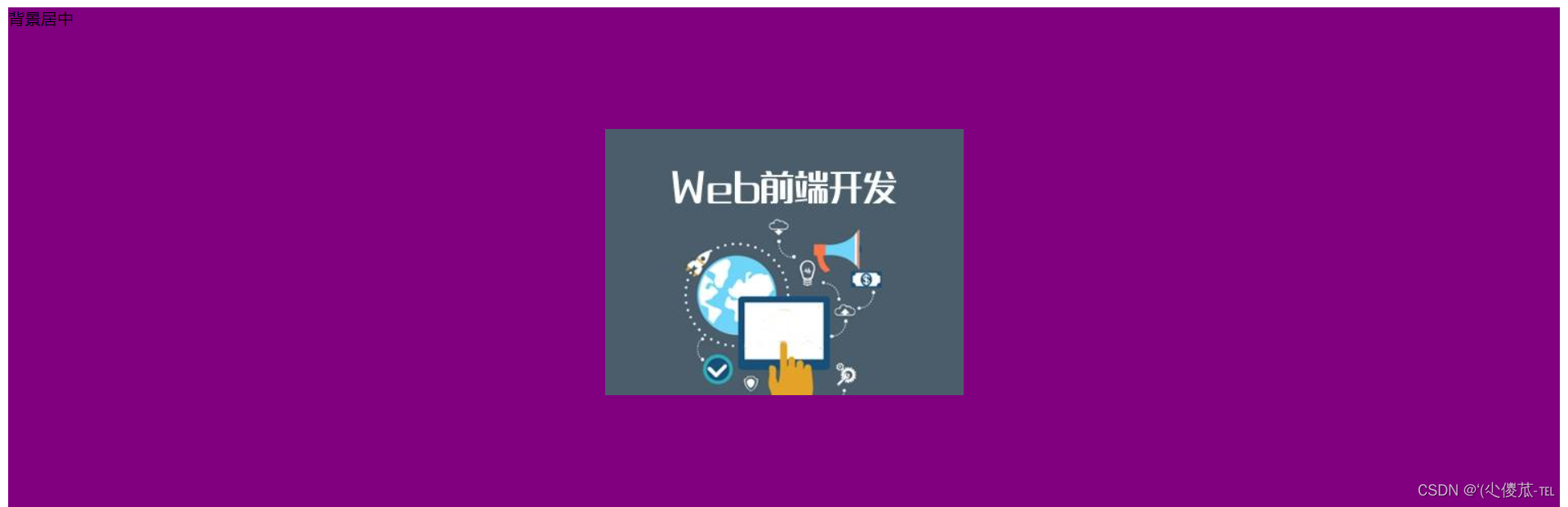
注意
- 如果参数的两个值都是方位名词, 则前后顺序无关. (top left 和 left top 等效)
- 如果只指定了一个方位名词, 则第二个默认居中. (left 则意味着水平居中, top 意味着垂直居中. )
- 如果参数是精确值, 则的的第一个肯定是 x , 第二个肯定是 y. (100 200 意味着 x 为 100, y 为 200)
- 如果参数是精确值, 且只给了一个数值, 则该数值一定是 x 坐标, 另一个默认垂直居中.
- 如果参数是混合单位, 则第一个值一定为 x, 第二个值为 y 坐标. (100 center 表示横坐标为 100, 垂
- 直居中)
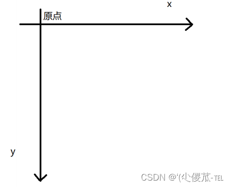
关于坐标系 :
计算机中的平面坐标系 , 一般是左手坐标系 ( 和高中数学上常用的右手系不一样 . y 轴是往下指的 ).
5.背景尺寸
background-size : length | percentage | cover | contain ;
- 可以填具体的数值: 如 40px 60px 表示宽度为 40px, 高度为 60px
- 也可以填百分比: 按照父元素的尺寸设置.
- cover: 把背景图像扩展至足够大,以使背景图像完全覆盖背景区域。背景图像的某些部分也许无
- 法显示在背景定位区域中。
- 把图像图像扩展至最大尺寸,以使其宽度和高度完全适应内容区域.
注意体会 contain 和 cover 的区别 . 当元素为矩形 ( 不是正方形 ) 时 , 区别是很明显的 .
<!DOCTYPE html>
<html lang="en"><head><meta charset="UTF-8"><meta name="viewport" content="width=device-width, initial-scale=1.0"><title>Document</title><style>.bgs .one {width: 500px;height: 300px;background-image: url(前端.jpg);background-repeat: no-repeat;background-position: center;background-size: contain;}</style>
</head><body><div class="bgs"><div class="one">背景尺寸</div></div>
</body></html>
contain:

cover:

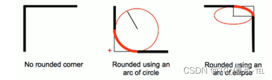
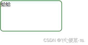
八、圆角矩形
通过 border-radius 使边框带圆角效果.
1.基本用法
border-radius: length;
length 是内切圆的半径. 数值越大, 弧线越强烈
<!DOCTYPE html>
<html lang="en"><head><meta charset="UTF-8"><meta name="viewport" content="width=device-width, initial-scale=1.0"><title>Document</title><style>div {width: 200px;height: 100px;border: 2px solid green;border-radius: 10px;}</style>
</head><body><div>蛤蛤</div>
</body></html>
2.生成圆形
让 border-radius 的值为正方形宽度的一半即可.
<!DOCTYPE html>
<html lang="en"><head><meta charset="UTF-8"><meta name="viewport" content="width=device-width, initial-scale=1.0"><title>Document</title><style>div {width: 200px;height: 200px;border: 2px solid green;border-radius: 100px;/* 或者用 50% 表示宽度的一半 */border-radius: 50%;}</style>
</head><body><div>蛤蛤</div>
</body></html>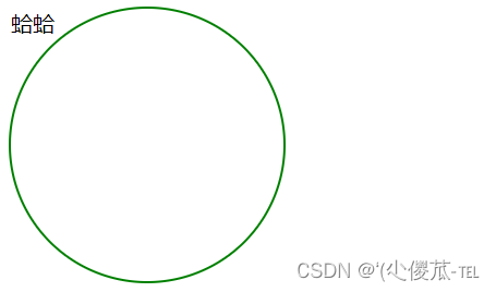
3.生成圆角矩形
让 border-radius 的值为矩形高度的一半即可
<!DOCTYPE html>
<html lang="en"><head><meta charset="UTF-8"><meta name="viewport" content="width=device-width, initial-scale=1.0"><title>Document</title><style>div {width: 200px;height: 100px;border: 2px solid green;border-radius: 50px;}</style>
</head><body><div>蛤蛤</div>
</body></html>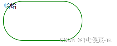
4.展开写法
border-radius 是一个复合写法. 实际上可以针对四个角分别设置.
border-radius : 2em ;
等价于
border-top-left-radius : 2em ;border-top-right-radius : 2em ;border-bottom-right-radius : 2em ;border-bottom-left-radius : 2em ;
border-radius: 10px 20px 30px 40px;
等价于(按照顺时针排列)
border-top-left-radius : 10px ;border-top-right-radius : 20px ;border-bottom-right-radius : 30px ;border-bottom-left-radius : 40px ;
九、Chrome 调试工具 -- 查看 CSS 属性
1.打开浏览器
有两种方式可以打开 Chrome 调试工具
- 直接按 F12 键
- 鼠标右键页面 => 检查元素
2.标签页含义
- elements 查看标签结构
- console 查看控制台
- source 查看源码+断点调试
- network 查看前后端交互过程
- application 查看浏览器提供的一些扩展功能(本地存储等)
- Performance, Memory, Security, Lighthouse
3.elements 标签页使用
- ctrl + 滚轮进行缩放, ctrl + 0 恢复原始大小.
- 使用 左上角 箭头选中元素
- 右侧可以查看当前元素的属性, 包括引入的类.
- 右侧可以修改选中元素的 css 属性. 例如颜色, 可以点击颜色图标, 弹出颜色选择器, 修改颜色. 例如
- 字体大小, 可以使用方向键来微调数值.
- 此处的修改不会影响代码, 刷新就还原了~
- 如果 CSS 样式写错了, 也会在这里有提示. (黄色感叹号)
十、元素的显示模式
在 CSS 中, HTML 的标签的显示模式有很多.此处只重点介绍两个:
- 块级元素
- 行内元素
1.块级元素
常见的元素:
- h1 - h6
- p
- div
- ul
- ol
- li
- ....
特点:
- 独占一行
- 高度, 宽度, 内外边距, 行高都可以控制.
- 宽度默认是父级元素宽度的 100% (和父元素一样宽)
- 是一个容器(盒子), 里面可以放行内和块级元素.
<!DOCTYPE html>
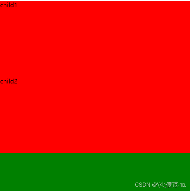
<html lang="en"><head><meta charset="UTF-8"><meta name="viewport" content="width=device-width, initial-scale=1.0"><title>Document</title><style>.demo1 .parent {width: 500px;height: 500px;background-color: green;}.demo1 .child {/* 不写 width, 默认和父元素一样宽 *//* 不写 height, 默认为 0 (看不到了) */height: 200px;background-color: red;}</style>
</head><body><div class="demo1"><div class="parent"><div class="child">child1</div><div class="child">child2</div></div></div>
</body></html>
注意:
- 文字类的元素内不能使用块级元素
- p 标签主要用于存放文字, 内部不能放块级元素, 尤其是 div
<body><p><div> 蛤蛤 </div></p></body>
2.行内元素/内联元素
常见的元素:
- a
- strong
- b
- em
- i
- del
- s
- ins
- u
- span
特点:
- 不独占一行, 一行可以显示多个
- 设置高度, 宽度, 行高无效
- 左右外边距有效(上下无效). 内边距有效.
- 默认宽度就是本身的内容
- 行内元素只能容纳文本和其他行内元素, 不能放块级元素
<!DOCTYPE html>
<html lang="en"><head><meta charset="UTF-8"><meta name="viewport" content="width=device-width, initial-scale=1.0"><title>Document</title><style>.demo2 span {width: 200px;height: 200px;background-color: red;}</style>
</head><body><div class="demo2"><span>child1</span><span>child2</span><span>child3</span></div>
</body></html>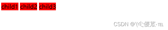
注意:
- a 标签中不能再放 a 标签 (虽然 chrome 不报错, 但是最好不要这么做).
- a 标签里可以放块级元素, 但是更建议先把 a 转换成块级元素.
3.行内元素和块级元素的区别
- 块级元素独占一行, 行内元素不独占一行
- 块级元素可以设置宽高, 行内元素不能设置宽高.
- 块级元素四个方向都能设置内外边距, 行内元素垂直方向不能设置.
4.改变显示模式
使用 display 属性可以修改元素的显示模式.
- 可以把 div 等变成行内元素, 也可以把 a , span 等变成块级元素.
- display: block 改成块级元素 [常用]
- display: inline 改成行内元素 [很少用]
- display: inline-block 改成行内块元素
十一、盒模型
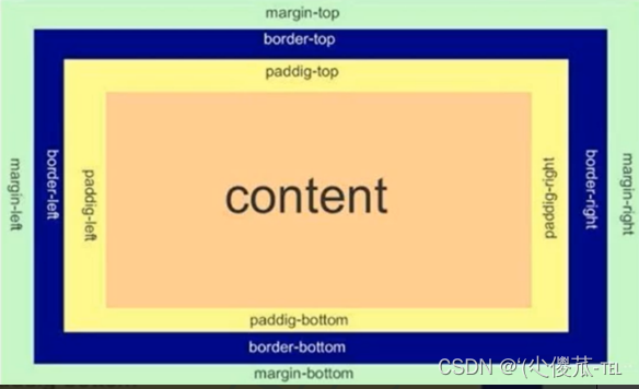
每一个 HTML 元素就相当于是一个矩形的 "盒子"
这个盒子由这几个部分构成
- 边框 border
- 内容 content
- 内边距 padding
- 外边距 margin
 <style>
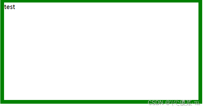
1.边框
基础属性
- 粗细: border-width
- 样式: border-style, 默认没边框. solid 实线边框 dashed 虚线边框 dotted 点线边框
- 颜色: border-color
<!DOCTYPE html>
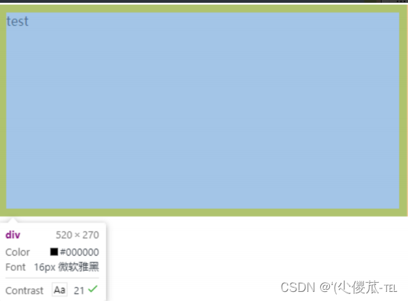
<html lang="en"><head><meta charset="UTF-8"><meta name="viewport" content="width=device-width, initial-scale=1.0"><title>Document</title><style>div {width: 500px;height: 250px;border-width: 10px;border-style: solid;border-color: green;}</style>
</head><body><div>test</div>
</body></html>
支持简写, 没有顺序要求
border: 1px solid red;
可以改四个方向的任意边框.
border-top/bottom/left/right
以下的代码只给上边框设为红色, 其余为蓝色.
利用到的层叠性, 就近原则的生效.
border: 1px solid blue;border-top: red;
2.边框会撑大盒子
可以看到, width, height 是 500*250, 而最终整个盒子大小是 520 * 270. 边框10个像素相当于扩大了大小.
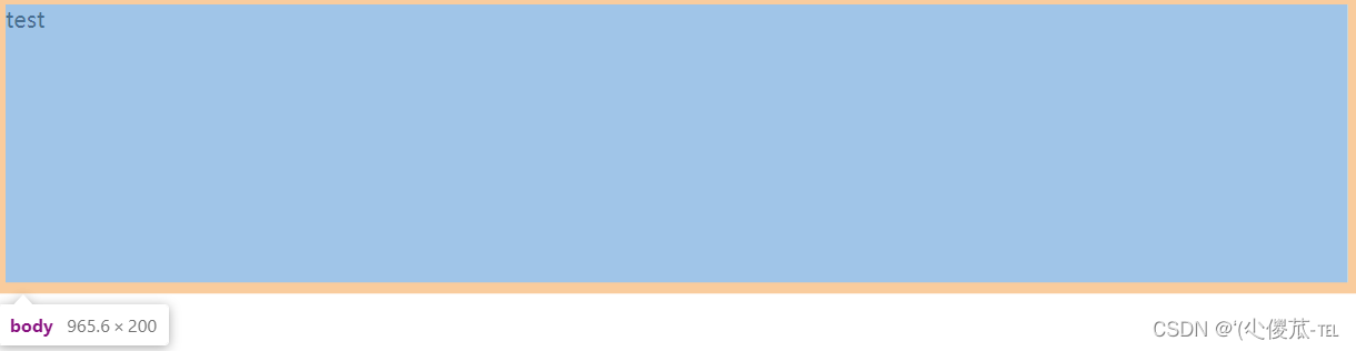
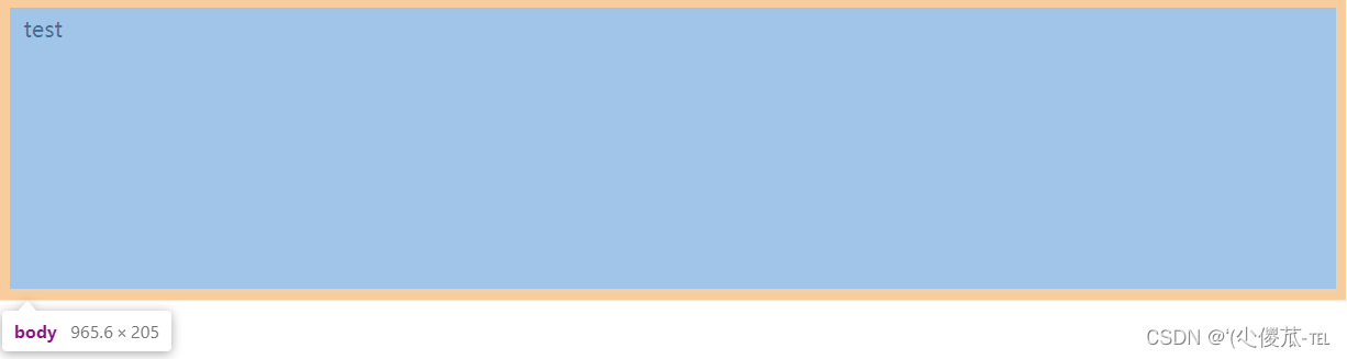
通过 box-sizing 属性可以修改浏览器的行为, 使边框不再撑大盒子.
* 为通配符选择器.
* {box-sizing : border-box ;}
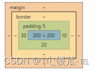
3.内边距
padding 设置内容和边框之间的距离.
基础写法
默认内容是顶着边框来放置的. 用 padding 来控制这个距离
可以给四个方向都加上边距
- padding-top
- padding-bottom
- padding-left
- padding-right
加上 padding 之后
此时可以看到带有了一个绿色的内边距.
注意:
- 整个盒子的大小从原来的 300 * 200 => 310 * 205. 说明内边距也会影响到盒子大小(撑大盒 子).
- 使用 box-sizing: border-box 属性也可以使内边距不再撑大盒子. (和上面 border 类似)
复合写法
可以把多个方向的 padding 合并到一起. [四种情况都要记住, 都很常见]
- padding: 5px; 表示四个方向都是 5px
- padding: 5px 10px; 表示上下内边距 5px, 左右内边距为 10px
- padding: 5px 10px 20px; 表示上边距 5px, 左右内边距为 10px, 下内边距为 20px
- padding: 5px 10px 20px 30px; 表示 上5px, 右10px, 下20px, 左30px (顺时针)
控制台中选中元素, 查看右下角, 是很清楚的
4.外边距
基础写法
控制盒子和盒子之间的距离.
可以给四个方向都加上边距
- margin-top
- margin-bottom
- margin-left
- margin-right
<!DOCTYPE html>
<html lang="en"><head><meta charset="UTF-8"><meta name="viewport" content="width=device-width, initial-scale=1.0"><title>Document</title><style>div {background-color: red;width: 200px;height: 200px;}.first {margin-bottom: 20px;}</style>
</head><body><div class="first">蛤蛤</div><div>呵呵</div>
</body></html>

复合写法
规则同 padding
- margin: 10px; // 四个方向都设置
- margin: 10px 20px; // 上下为 10, 左右 20
- margin: 10px 20px 30px; // 上 10, 左右 20, 下 30
- margin: 10px 20px 30px 40px; // 上 10, 右 20, 下 30, 左 40
块级元素水平居中
- 前提:
- 指定宽度(如果不指定宽度, 默认和父元素一致)
- 把水平 margin 设为 auto
- margin-left: auto; margin-right: auto;
- margin: auto;
- margin: 0 auto;
<!DOCTYPE html>
<html lang="en"><head><meta charset="UTF-8"><meta name="viewport" content="width=device-width, initial-scale=1.0"><title>Document</title><style>div {width: 500px;height: 200px;background-color: red;margin: 0 auto;}</style>
</head><body><div>蛤蛤</div>
</body></html>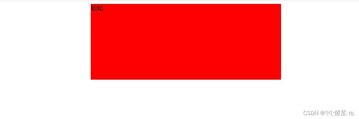
注意:
- 这个水平居中的方式和 text-align 不一样.
- margin: auto 是给块级元素用得到.
- text-align: center 是让行内元素或者行内块元素居中的.
- 另外, 对于垂直居中, 不能使用 "上下 margin 为 auto " 的方式.
去除浏览器默认样式
浏览器会给元素加上一些默认的样式, 尤其是内外边距. 不同浏览器的默认样式存在差别.
为了保证代码在不同的浏览器上都能按照统一的样式显示, 往往我们会去除浏览器默认样式.
使用通配符选择器即可完成这件事情.
* {marign : 0 ;padding : 0 ;}
十一、弹性布局
<!DOCTYPE html>
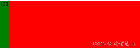
<html lang="en"><head><meta charset="UTF-8"><meta name="viewport" content="width=device-width, initial-scale=1.0"><title>Document</title><style>div {width: 100%;height: 150px;background-color: red;}div>span {background-color: green;idth: 100px;}</style>
</head><body><div><span>1</span><span>2</span><span>3</span></div>
</body></html>
当我们给 div 加上 display:flex 之后, 效果为
此时看到, span 有了高度, 不再是 "行内元素了" 再给 div 加上 justify-content: space-around; 此时效果为
此时可以看到这些 span 已经能够水平隔开了. 把 justify-content: space-around; 改为 justify-content: flex-end; 可以看到此时三个元素在右侧显示了.

1.flex 布局基本概念
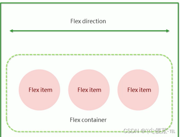
flex 是 flexible box 的缩写. 意思为 "弹性盒子".
任何一个 html 元素, 都可以指定为 display:flex 完成弹性布局.
flex 布局的本质是给父盒子添加 display:flex 属性, 来控制子盒子的位置和排列方式.
基础概念:
- 被设置为 display:flex 属性的元素, 称为 flex container
- 它的所有子元素立刻称为了该容器的成员, 称为 flex item
- flex item 可以纵向排列, 也可以横向排列, 称为 flex direction(主轴)
注意:
当父元素设置为 display: flex 之后, 子元素的 float, clear, vertical-align 都会失效.
常用属性
justify-content
设置主轴上的子元素排列方式.
使用之前一定要确定好主轴是哪个方向
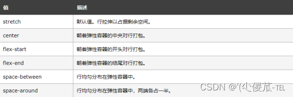
属性取值
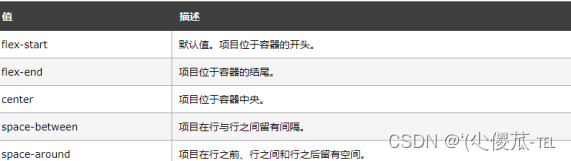
代码示例
<!DOCTYPE html>
<html lang="en"><head><meta charset="UTF-8"><meta name="viewport" content="width=device-width, initial-scale=1.0"><title>Document</title><style>div {width: 100%;height: 150px;background-color: red;display: flex;}div span {width: 100px;height: 100px;background-color: green;}</style>
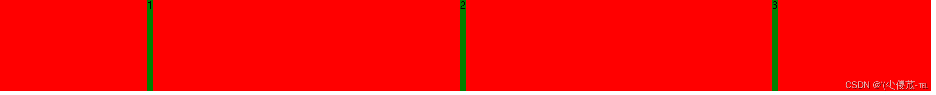
</head><body><div><span>1</span><span>2</span><span>3</span><span>4</span><span>5</span></div>
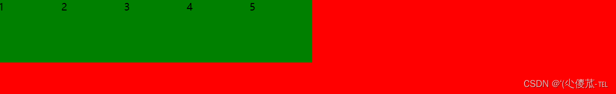
</body></html>未指定 justify-content 时, 默认按照从左到右的方向布局.
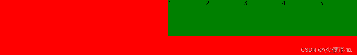
设置 justify-content: flex-end , 此时元素都排列到右侧了.
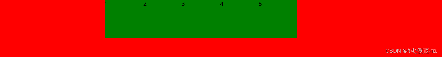
设置 jutify-content: center , 此时元素居中排列
设置 justify-content: space-around;平分了剩余空间.

设置 justify-content: space-between; 先两边元素贴近边缘, 再平分剩余空间.

align-items
设置侧轴上的元素排列方式
在上面的代码中, 我们是让元素按照主轴的方向排列, 同理我们也可以指定元素按照侧轴方向排列.
取值和 justify-content 差不多.
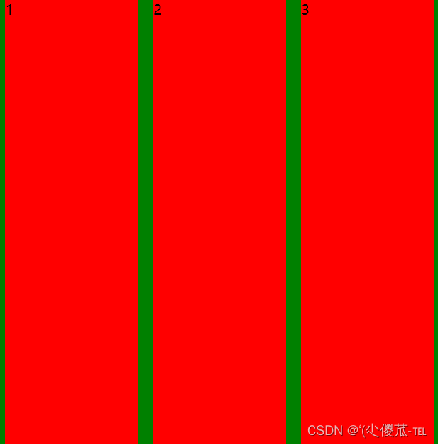
- 理解 stretch(拉伸): 这个是 align-content 的默认值. 意思是如果子元素没有被显式指定高度, 那么就会填充满父元素的高度.
<!DOCTYPE html>
<html lang="en"><head><meta charset="UTF-8"><meta name="viewport" content="width=device-width, initial-scale=1.0"><title>Document</title><style>div {width: 500px;height: 500px;background-color: green;display: flex;justify-content: space-around;}div span {width: 150px;background-color: red;}</style>
</head><body><div><span>1</span><span>2</span><span>3</span></div>
</body></html>
<!DOCTYPE html>
<html lang="en"><head><meta charset="UTF-8"><meta name="viewport" content="width=device-width, initial-scale=1.0"><title>Document</title><style>div {width: 500px;height: 500px;background-color: green;display: flex;justify-content: space-around;align-items: center;}div span {width: 150px;height: 100px;background-color: red;}</style>
</head><body><div><span>1</span><span>2</span><span>3</span></div>
</body></html>
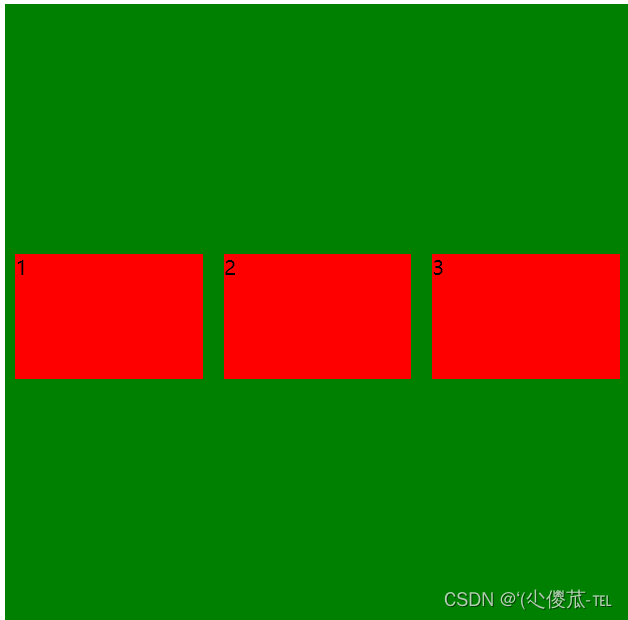
注意:
- align-items 只能针对单行元素来实现. 如果有多行元素, 就需要使用 item-contents