数据集来源:Unsupervised Learning on Country Data (kaggle.com)
代码参考:Clustering: PCA| K-Means - DBSCAN - Hierarchical | | Kaggle
基于特征合成降维和主成分分析法降维的国家数据集聚类效果评价
目录
1.特征合成降维
2.PCA降维
3.K-Means聚类
3.1 对特征合成降维的数据聚类分析
3.2 对PCA降维的数据聚类分析
摘要:本文主要探讨了特征合成降维和主成分分析法(PCA)降维在K-Means聚类中的效果评价。数据来源于HELP国际人道主义组织提供的168个国家的社会经济和健康领域的数据集,通过特征合成和PCA方法进行降维处理,再用K-Means聚类分析进行聚类,并使用轮廓系数对两种降维方法的数据集聚类效果进行评价。结果显示,特征合成降维的数据集的聚类效果优于PCA降维的数据集。尽管PCA降维保留了95.8%的原始信息,但其聚类效果较差,可能是由于数据失去原有结构等原因。
| 变量名 | 描述 |
| country | 国家名称 |
| child_mort | 每1000例活产婴儿中,5岁以下儿童死亡人数 |
| exports | 人均商品和服务出口。以占人均GDP的百分比给出 |
| health | 人均医疗总支出。以占人均GDP的百分比给出 |
| imports | 人均进口商品和服务。以占人均GDP的百分比给出 |
| Income | 人均净收入 |
| Inflation | 通货膨胀:衡量国内生产总值的年增长率 |
| life_expec | 寿命:按照目前的死亡率模式,新生儿的平均寿命 |
| total_fer | 按当前的年龄-生育率,每个妇女将生下的子女数量 |
| gdpp | 人均国内生产总值。以国内生产总值除以总人口计算 |
import pandas as pd
import numpy as np
import matplotlib.pyplot as plt
%matplotlib inline
import seaborn as sns
pd.options.display.float_format = '{:.2f}'.format
import warnings
warnings.filterwarnings('ignore')from sklearn.cluster import KMeans
from sklearn.metrics import silhouette_score
from mpl_toolkits.mplot3d import Axes3Dimport plotly.express as px
import kaleidodata = pd.read_csv(r'F:\Jupyter Files\Practice\kaggle-聚类\Country-data.csv')
plt.rcParams['font.family'] = ['sans-serif']
plt.rcParams['font.sans-serif']=['Microsoft YaHei']
ut = np.triu(data.corr())
lt = np.tril(data.corr())
colors = ['#FF781F','#2D2926']
fig,ax = plt.subplots(nrows = 1, ncols = 2,figsize = (15,5))
plt.subplot(1,2,1)
sns.heatmap(data.corr(),cmap = colors,annot = True,cbar = 'True',mask = ut);
plt.title('相关系数矩阵:上三角格式');plt.subplot(1,2,2)
sns.heatmap(data.corr(),cmap = colors,annot = True,cbar = 'True',mask = lt);
plt.title('相关矩阵:下三角格式');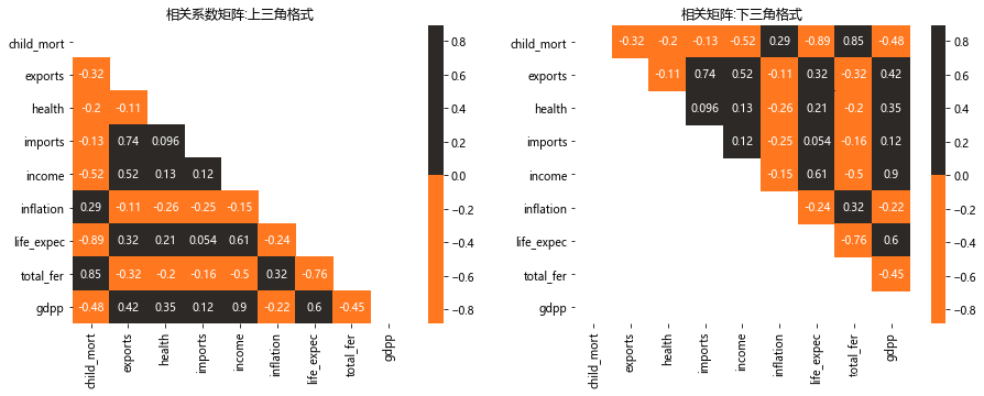
1.特征合成降维
| 类别 | 合并变量 |
| 健康类 | child_mort,Health, life_expecc, total_fer |
| 贸易类 | exports, imports |
| 金融类 | Income, Inflation, gdpp |
df1 = pd.DataFrame()
df1['健康类'] = (data['child_mort'] / data['child_mort'].mean()) + (data['health'] / data['health'].mean()) +(data['life_expec'] / data['life_expec'].mean()) + (data['total_fer'] / data['total_fer'].mean())
df1['贸易类'] = (data['imports'] / data['imports'].mean()) + (data['exports'] / data['exports'].mean())
df1['经济类'] = (data['income'] / data['income'].mean()) + (data['inflation'] / data['inflation'].mean()) + (data['gdpp'] / data['gdpp'].mean())
fig,ax = plt.subplots(nrows = 1,ncols = 1,figsize = (5,5))
plt.subplot(1,1,1)
sns.heatmap(df1.describe().T[['mean']],cmap = 'Oranges',annot = True,fmt = '.2f',linecolor = 'black',linewidths = 0.4,cbar = False);
plt.title('Mean Values');
fig.tight_layout(pad = 4)
col = list(df1.columns)
numerical_features = [*col]
fig, ax = plt.subplots(nrows = 1,ncols = 3,figsize = (12,4))
for i in range(len(numerical_features)):plt.subplot(1,3,i+1)sns.distplot(df1[numerical_features[i]],color = colors[0])title = '变量 : ' + numerical_features[i]plt.title(title)
plt.show()
#归一化处理
from sklearn.preprocessing import MinMaxScaler,StandardScaler
mms = MinMaxScaler() # Normalization
ss = StandardScaler() # Standardization
df1['健康类'] = mms.fit_transform(df1[['健康类']])
df1['贸易类'] = mms.fit_transform(df1[['贸易类']])
df1['经济类'] = mms.fit_transform(df1[['经济类']])
df1.insert(loc = 0, value = list(data['country']), column = 'Country')
df1.head()| Country | 健康类 | 贸易类 | 经济类 | |
|---|---|---|---|---|
| 0 | Afghanistan | 0.63 | 0.14 | 0.08 |
| 1 | Albania | 0.13 | 0.20 | 0.09 |
| 2 | Algeria | 0.18 | 0.19 | 0.21 |
| 3 | Angola | 0.66 | 0.28 | 0.24 |
| 4 | Antigua and Barbuda | 0.12 | 0.28 | 0.15 |
2.PCA降维
col = list(data.columns)
col.remove('country')
categorical_features = ['country']
numerical_features = [*col]
print('Categorical Features :',*categorical_features)#分类型变量
print('Numerical Features :',*numerical_features)#数据型变量
Categorical Features : country Numerical Features : child_mort exports health imports income inflation life_expec total_fer gdpp
fig, ax = plt.subplots(nrows = 3,ncols = 3,figsize = (15,15))
for i in range(len(numerical_features)):plt.subplot(3,3,i+1)sns.distplot(data[numerical_features[i]],color = colors[0])title =  numerical_features[i]
plt.show()
#对health变量做标准化处理,对其余变量进行归一化处理
df2 = data.copy(deep = True)
col = list(data.columns)
col.remove('health'); col.remove('country')
df2['health'] = ss.fit_transform(df2[['health']]) # Standardization
for i in col:df2[i] = mms.fit_transform(df2[[i]]) # Normalization
df2.drop(columns = 'country',inplace = True) 
利用 SPSS 软件对处理后的数据进行检验,由表3得,KMO值为 0.678(>0.5),达到主成分分析的标准,且 Bartlett检验显著性水平值为 0.000 小于 0.05,说明样本数据适宜做主成分分析。
from sklearn.decomposition import PCA
pca = PCA()
pca_df2 = pd.DataFrame(pca.fit_transform(df2))
pca.explained_variance_
array([1.01740511, 0.13090418, 0.03450018, 0.02679822, 0.00979752,0.00803398, 0.00307055, 0.00239976, 0.00179388])
fig,ax = plt.subplots(nrows = 1,ncols = 1,figsize = (10,5),dpi=80)
plt.step(list(range(1,10)), np.cumsum(pca.explained_variance_ratio_))
# plt.plot(np.cumsum(pca.explained_variance_ratio_))
plt.xlabel('主成分个数')
plt.ylabel('主成分累计贡献率')
plt.show()
3.K-Means聚类
m1 = df1.drop(columns = ['Country']).values # Feature Combination : Health - Trade - Finance
m2 = pca_df2.values # PCA Data
3.1 对特征合成降维的数据聚类分析
sse = {};sil = [];kmax = 10
fig = plt.subplots(nrows = 1, ncols = 2, figsize = (20,5))# Elbow Method 肘部法则:
plt.subplot(1,2,1)
for k in range(1, 10):kmeans = KMeans(n_clusters=k, max_iter=1000).fit(m1)sse[k] = kmeans.inertia_ # Inertia: Sum of distances of samples to their closest cluster center
sns.lineplot(x = list(sse.keys()), y = list(sse.values()));
plt.title('Elbow Method')
plt.xlabel("k : Number of cluster")
plt.ylabel("Sum of Squared Error")
plt.grid()# Silhouette Score Method
plt.subplot(1,2,2)
for k in range(2, kmax + 1):kmeans = KMeans(n_clusters = k).fit(m1)labels = kmeans.labels_sil.append(silhouette_score(m1, labels, metric = 'euclidean'))
sns.lineplot(x = range(2,kmax + 1), y = sil);
plt.title('Silhouette Score Method')
plt.xlabel("k : Number of cluster")
plt.ylabel("Silhouette Score")
plt.grid()plt.show()
model = KMeans(n_clusters = 3,max_iter = 1000,algorithm="elkan")
model.fit(m1)
cluster = model.cluster_centers_
centroids = np.array(cluster)
labels = model.labels_
data['Class'] = labels; df1['Class'] = labelsfig = plt.figure(dpi=100)
ax = Axes3D(fig)
x = np.array(df1['健康类'])
y = np.array(df1['贸易类'])
z = np.array(df1['经济类'])
ax.scatter(centroids[:,0],centroids[:,1],centroids[:,2],marker="X", color = 'b')
ax.scatter(x,y,z,c = y)
plt.title('健康类-贸易类-经济类数据聚类结果可视化')
ax.set_xlabel('健康类')
ax.set_ylabel('贸易类')
ax.set_zlabel('经济类')
plt.show();
fig, ax = plt.subplots(nrows = 1, ncols = 2, figsize = (15,5))
plt.subplot(1,2,1)
sns.boxplot(x = 'Class', y = 'child_mort', data  = data, color = '#FF781F');
plt.title('child_mort vs Class')
plt.subplot(1,2,2)
sns.boxplot(x = 'Class', y = 'income', data  = data, color = '#FF781F');
plt.title('income vs Class')
plt.show()
df1['Class'].loc[df1['Class'] == 0] =  'Might Need Help'
df1['Class'].loc[df1['Class'] == 1] ='No Help Needed'
df1['Class'].loc[df1['Class'] == 2] = 'Help Needed'fig = px.choropleth(df1[['Country','Class']],locationmode = 'country names',locations = 'Country',title = 'Needed Help Per Country (World)',color = df1['Class'],  color_discrete_map = {'Help Needed':'Red','No Help Needed':'Green','Might Need Help':'Yellow'})
fig.update_geos(fitbounds = "locations", visible = True)
fig.update_layout(legend_title_text = 'Labels',legend_title_side = 'top',title_pad_l = 260,title_y = 0.86)
fig.show(engine = 'kaleido')
3.2 对PCA降维的数据聚类分析
sse = {};sil = [];kmax = 10
fig = plt.subplots(nrows = 1, ncols = 2, figsize = (20,5))# Elbow Method 肘部法则 :
plt.subplot(1,2,1)
for k in range(1, 10):kmeans = KMeans(n_clusters=k, max_iter=1000).fit(m2)sse[k] = kmeans.inertia_ # Inertia: Sum of distances of samples to their closest cluster center
sns.lineplot(x = list(sse.keys()), y = list(sse.values()));
plt.title('Elbow Method')
plt.xlabel("k : Number of cluster")
plt.ylabel("Sum of Squared Error")
plt.grid()# Silhouette Score Method
plt.subplot(1,2,2)
for k in range(2, kmax + 1):kmeans = KMeans(n_clusters = k).fit(m2)labels = kmeans.labels_sil.append(silhouette_score(m2, labels, metric = 'euclidean'))
sns.lineplot(x = range(2,kmax + 1), y = sil);
plt.title('Silhouette Score Method')
plt.xlabel("k : Number of cluster")
plt.ylabel("Silhouette Score")
plt.grid()plt.show()

model = KMeans(n_clusters = 3,max_iter = 1000,algorithm="elkan")
model.fit(m2)
cluster = model.cluster_centers_
centroids = np.array(cluster)
labels = model.labels_
data['Class'] = labels; pca_df2['Class'] = labelsfig = plt.figure(dpi=100)
ax = Axes3D(fig)
ax.scatter(centroids[:,0],centroids[:,1],centroids[:,2],marker="X", color = 'b')
plt.title('PCA降维数据聚类结果可视化')
ax.set_xlabel('第一主成分')
ax.set_ylabel('第二主成分')
ax.set_zlabel('第三主成分')
ax.scatter(x,y,z,c = y)
plt.show();
fig, ax = plt.subplots(nrows = 1, ncols = 2, figsize = (15,5))
plt.subplot(1,2,1)
sns.boxplot(x = 'Class', y = 'child_mort', data  = data, color = '#FF781F');
plt.title('child_mort vs Class')
plt.subplot(1,2,2)
sns.boxplot(x = 'Class', y = 'income', data  = data, color = '#FF781F');
plt.title('income vs Class')
plt.show()
pca_df2['Class'].loc[pca_df2['Class'] == 0] = 'Might Need Help'
pca_df2['Class'].loc[pca_df2['Class'] == 1] = 'No Help Needed'
pca_df2['Class'].loc[pca_df2['Class'] == 2] = 'Help Needed' fig = px.choropleth(pca_df2[['Country','Class']],locationmode = 'country names',locations = 'Country',title = 'Needed Help Per Country (World)',color = pca_df2['Class'],  color_discrete_map = {'Help Needed':'Red','Might Need Help':'Yellow','No Help Needed': 'Green'})
fig.update_geos(fitbounds = "locations", visible = True)
fig.update_layout(legend_title_text = 'Labels',legend_title_side = 'top',title_pad_l = 260,title_y = 0.86)
fig.show(engine = 'kaleido')
3.3 轮廓系数效果评价
轮廓系数是一种用于评估聚类效果的指标。它是对每个样本来定义的,它能够同时衡量样本与其自身所在的簇中的其他样本的相似度a和样本与其他簇中的样本的相似度b,其中,a等于样本与同一簇中所有其他点之间的平均距离;b等于样本与下一个最近的簇中得所有点之间的平均距离。单个样本的轮廓系数计算为:

根据聚类的要求“簇内差异小,簇外差异大”,当轮廓系数越接近1表示样本与自己所在的簇中的样本很相似,并且与其他簇中的样本不相似。如果一个簇中的大多数样本具有比较高的轮廓系数,则簇会有较高的总轮廓系数,即整个数据集的平均轮廓系数越高,则聚类效果是合适的。
#特征合成降维的数据集
cluster_1=KMeans(n_clusters=3,random_state=0).fit(m1)
silhouette_score(m1,cluster_1.labels_) #0.452
#PCA降维的数据集
cluster_2=KMeans(n_clusters=3,random_state=0).fit(m2)
silhouette_score(m2,cluster_2.labels_) #0.384| 特征合成降维的数据集 | PCA降维的数据集 | |
| 轮廓系数 | 0.452 | 0.384 |
ps:低价出课程论文-多元统计分析论文、R语言论文、stata计量经济学课程论文(论文+源代码+数据集)