HarmonyOS4.0 系列——08、UI 组件
Blank
Blank 组件在横竖屏占满空余空间效果
// xxx.ets
@Entry
@Component
struct BlankExample {build() {Column() {Row() {Text('Button').fontSize(18)Blank()Toggle({type: ToggleType.Switch}).margin({top: 14,bottom: 14,left: 6,right: 6})}.width('100%').backgroundColor(0xFFFFFF).borderRadius(15).padding({ left: 12 })}.backgroundColor(0xEFEFEF).padding(20)}
}
Blank 的父组件需要设置宽度,否则不生效
Button
ButtonType 枚举说明
名称 | 描述 |
|---|---|
Capsule | 胶囊型按钮(圆角默认为高度的一半)。 |
Circle | 圆形按钮。 |
Normal | 普通按钮(默认不带圆角)。 |
属性
- type: 按钮类型,可选值:Normal/Capsule/Circle 默认值:ButtonType.Capsule
- stateEffect: 按钮状态效果,可选值:true/false,默认 flase
例:
@Entry
@Component
struct Index {build() {Column({ space: 5 }) {Text('按钮类型').margin({top:20})Flex({ direction: FlexDirection.Row, justifyContent: FlexAlign.SpaceAround, alignItems: ItemAlign.Center }) {Button('Button', { type: ButtonType.Normal })Button('Button', { type: ButtonType.Capsule })Button('Button', { type: ButtonType.Circle }).width(80)}.width('100%')Divider().margin(20)Text('按钮自定义样式').margin({bottom:20})Flex({ direction: FlexDirection.Row, justifyContent: FlexAlign.SpaceAround }) {Button({ type: ButtonType.Normal, stateEffect: true }) {Row() {LoadingProgress().width(20).height(20).margin({ left: 12 }).color(0xFFFFFF)Text('loading').fontSize(12).fontColor(0xffffff).margin({ left: 5, right: 12 })}.alignItems(VerticalAlign.Center)}.borderRadius(8).backgroundColor(0x317aff).width(90).height(40)Button('Disable', { type: ButtonType.Normal, stateEffect: false }).opacity(.4).borderRadius(8).backgroundColor(0x317aff).width(90)}.width('100%')}.height('100%')}
}
Checkbox 和 CheckboxGroup
复选框,通常用于某选项的打开或关闭。
Checkbox
Checkbox 接口
Checkbox(options?: {name?: string, group?: string })
属性
- name:多选框名称。
- group:多选框的群组名称。说明:未配合使用 CheckboxGroup 组件时,此值无用。
CheckboxGroup 接口
CheckboxGroup(options?: { group?: string })
属性:
- selectAll:设置是否全选。默认值:false,若同组的 Checkbox 显式设置 select,则 Checkbox 的优先级高。
- selectedColor:设置被选中或部分选中状态的颜色。
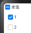
@Entry
@Component
struct Index {build() {Row() {Column({ space: 10 }) {Row() {CheckboxGroup({ group: 'box' })Text('全选')}Row() {Checkbox({ group: 'box' })Text('1')}Row() {Checkbox({ group: 'box' })Text('2')}}}}
}
监听事件:
@Entry
@Component
struct Index {build() {Row() {Column({ space: 10 }) {Row() {CheckboxGroup({ group: 'checkboxGroup' }).selectedColor('#ff8e1e9b').onChange((itemName: CheckboxGroupResult) => {console.info("checkbox group content" + JSON.stringify(itemName))})Text('全选')}Row() {Checkbox({ name: 'checkbox1', group: 'checkboxGroup' }).onChange((value: boolean) => {console.info('Checkbox1' + value)})Text('1')}Row() {Checkbox({ name: 'checkbox2', group: 'checkboxGroup' }).onChange((value: boolean) => {console.info('Checkbox2' + value)})Text('2')}Row() {Checkbox({ name: 'checkbox3', group: 'checkboxGroup' }).onChange((value: boolean) => {console.info('Checkbox3' + value)})Text('2')}}}}
}
效果:
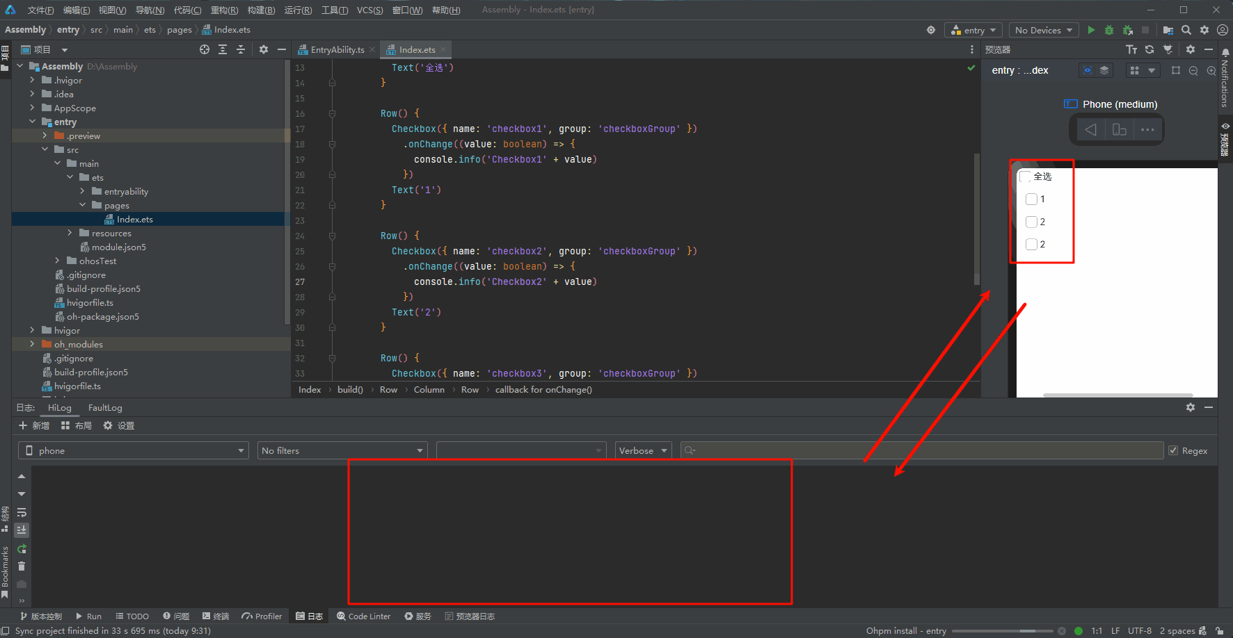
DataPanel
数据面板组件,用于将多个数据占比情况使用占比图进行展示。
接口
DataPanel(options:{values: number[], max?: number, type?: DataPanelType})
参数
参数名 | 参数类型 | 必填 | 参数描述 |
|---|---|---|---|
values | number[] | 是 | 数据值列表,最多包含9个数据,大于9个数据则取前9个数据。若数据值小于0则置为0。 |
max | number | 否 | - max大于0,表示数据的最大值。 - max小于等于0,max等于value数组各项的和,按比例显示。 默认值:100 |
type8+ | DataPanelType | 否 | 数据面板的类型(不支持动态修改)。 默认值:DataPanelType.Circle |
属性
名称 | 类型 | 描述 |
|---|---|---|
closeEffect | boolean | 关闭数据占比图表旋转动效。 默认值:false |
DataPanelType 枚举说明
名称 | 描述 |
|---|---|
Line | 线型数据面板。 |
Circle | 环形数据面板。 |
实例:
@Entry
@Component
struct Index {public valueArr: number[] = [10, 10, 10, 10, 10, 10, 10, 10, 10]build() {Row() {Column({ space: 5 }) {Flex({wrap:FlexWrap.Wrap,justifyContent:FlexAlign.Center}){Row(){Text('环形图')}.width('80%')Stack() {DataPanel({ values: [25], max: 100, type: DataPanelType.Circle }).width(168).height(168)Column() {Text('30').fontSize(35).fontColor('#182431')Text('1.0.0').fontSize(9.33).lineHeight(12.83).fontWeight(500).opacity(0.6)}}.width('100%')Stack(){DataPanel({ values: [50, 12, 8, 5], max: 100, type: DataPanelType.Circle }).width(168).height(168)Column() {Text('75').fontSize(35).fontColor('#182431')Text('98GB/128GB').fontSize(8.17).lineHeight(11.08).fontWeight(500).opacity(0.6)}}Row(){Text('线图')}.width('80%')DataPanel({ values: this.valueArr, max: 100, type: DataPanelType.Line }).width('80%').height(10)}.width('100%')}.height('100%')}.width('100%').margin({ top: 5 })}
}
效果:
注意:在使用 DataPanel 组件在圆环内添加文字需要在外层使用 Stack 容器
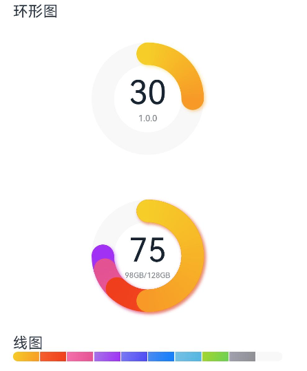
DatePicker
日期选择器组件,用于根据指定日期范围创建日期滑动选择器。
接口
DatePicker(options?: {start?: Date, end?: Date, selected?: Date})
- start:起始日期 默认值:Date(‘1970-1-1’)
- end:结束日期 默认值:Date(‘2100-12-31’)
- selected:当前日期 默认值:当前系统日期
属性
名称 | 参数类型 | 描述 |
|---|---|---|
lunar | boolean | 日期是否显示农历。 - true:展示农历。 - false:不展示农历。 默认值:false |
事件
onChange(callback: (value: DatePickerResult) => void)
DatePickerResult 对象说明
名称 | 参数类型 | 描述 |
|---|---|---|
year | number | 选中日期的年。 |
month | number | 选中日期的月(0~11),0表示1月,11表示12月。 |
day | number | 选中日期的日。 |
示例:
@Entry
@Component
struct Index {@State isLunar: boolean = falseprivate selectedDate: Date = new Date('2024-01-26')build() {Column() {Button('切换公历农历').margin({ top: 30, bottom: 30 }).onClick(() => {this.isLunar = !this.isLunar})DatePicker({start: new Date('1970-1-1'),end: new Date('2100-1-1'),selected: this.selectedDate}).lunar(this.isLunar).onChange((value: DatePickerResult) => {this.selectedDate.setFullYear(value.year, value.month, value.day)console.info('select current date is: ' + JSON.stringify(value))})}.width('100%')}
}
Divider
分割线
Divider();
属性
- vertical:使用水平分割线还是垂直分割线,默认 false。
- color:分割线颜色。默认值:‘#33182431’
- strokeWidth:分割线宽度。默认值:1,单位:vp。
- lineCap:分割线的端点样式。默认值:LineCapStyle.Butt。
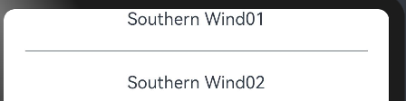
@Entry
@Component
struct Index {build() {Column() {Row() {Column(){Text('Southern Wind01')Divider().vertical(false).color('#182431').opacity(0.6).margin(20)Text('Southern Wind02')}}}.width('100%')}
}
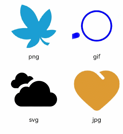
Image
Image 为图片组件,常用于在应用中显示图片。Image 支持加载 string、PixelMap 和 Resource 类型的数据源,支持 png、jpg、bmp、svg 和 gif 类型的图片格式。
参数名 | 参数类型 | 必填 | 参数描述 |
|---|---|---|---|
src | string | PixelMap | Resource | 是 | 图片的数据源,支持本地图片和网络图片,引用方式请参考加载图片资源。
说明:
|
加载基本类型图片
@Entry
@Component
struct ImageExample1 {build() {Column() {Flex({ direction: FlexDirection.Column, alignItems: ItemAlign.Start }) {Row() {// 加载png格式图片Image($r('app.media.ic_camera_master_ai_leaf')).width(110).height(110).margin(15).overlay('png', { align: Alignment.Bottom, offset: { x: 0, y: 20 } })// 加载gif格式图片Image($r('app.media.loading')).width(110).height(110).margin(15).overlay('gif', { align: Alignment.Bottom, offset: { x: 0, y: 20 } })}Row() {// 加载svg格式图片Image($r('app.media.ic_camera_master_ai_clouded')).width(110).height(110).margin(15).overlay('svg', { align: Alignment.Bottom, offset: { x: 0, y: 20 } })// 加载jpg格式图片Image($r('app.media.ic_public_favor_filled')).width(110).height(110).margin(15).overlay('jpg', { align: Alignment.Bottom, offset: { x: 0, y: 20 } })}}}.height(320).width(360).padding({ right: 10, top: 10 })}
}
加载网络图片
@Entry
@Component
struct ImageExample2 {build() {Column({ space: 10 }) {Image("https://nanchen042.gitee.io/docs/ceshi.jpg")// 直接加载网络地址,请填写一个具体的网络图片地址.alt($r('app.media.icon'))// 使用alt,在网络图片加载成功前使用占位图.width(100).height(100)}}
}
LoadingProgress
@Entry
@Component
struct LoadingProgressExample {build() {Column({ space: 5 }) {Text('Orbital LoadingProgress ').fontSize(9).fontColor(0xCCCCCC).width('90%')LoadingProgress().color(Color.Blue)}.width('100%').margin({ top: 5 })}
}

Marquee
跑马灯组件,用于滚动展示一段单行文本,仅当文本内容宽度超过跑马灯组件宽度时滚动。
接口
Marquee(value: { start: boolean, step?: number, loop?: number, fromStart?: boolean, src: string })
参数名 | 参数类型 | 必填 | 参数描述 |
|---|---|---|---|
start | boolean | 是 | 控制跑马灯是否进入播放状态。 说明: 有限的滚动次数播放完毕后,不可以通过改变start重置滚动次数重新开始播放。 |
step | number | 否 | 滚动动画文本滚动步长。 默认值:6,单位vp |
loop | number | 否 | 设置重复滚动的次数,小于等于零时无限循环。 默认值:-1 说明: ArkTS卡片上该参数设置任意值都仅在可见时滚动一次。 |
fromStart | boolean | 否 | 设置文本从头开始滚动或反向滚动。 默认值:true |
src | string | 是 | 需要滚动的文本。 |
核心代码:
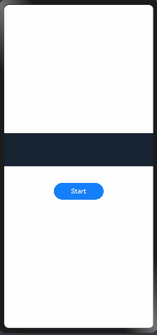
@Entry
@Component
struct Index {@State start: boolean = falseprivate fromStart: boolean = trueprivate step: number = 50private loop: number = Infinityprivate src: string = "Southern Wind01"build() {Flex({ direction: FlexDirection.Column, alignItems: ItemAlign.Center, justifyContent: FlexAlign.Center }) {Marquee({start: this.start,step: this.step,loop: this.loop,fromStart: this.fromStart,src: this.src}).width(360).height(80).fontColor('#FFFFFF').fontSize(48).fontWeight(700).backgroundColor('#182431').margin({ bottom: 40 })Button('Start').onClick(() => {this.start = true}).width(120).height(40).fontSize(16).fontWeight(500).backgroundColor('#007DFF')}.width('100%').height('100%')}
}
效果:
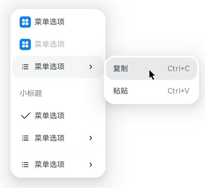
Menu
以垂直列表形式显示的菜单。
子组件
包含 MenuItem、MenuItemGroup 子组件。
接口
Menu();
作为菜单的固定容器,无参数。
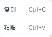
组合用法:
- 首先创建一个@builder 容器
@BuilderSubMenu() {Menu() {MenuItem({ content: "复制", labelInfo: "Ctrl+C" })MenuItem({ content: "粘贴", labelInfo: "Ctrl+V" })}}
-
使用 MenuItem 容器创建二级菜单
private iconStr: iconStr = $r("app.media.view_list_filled") // 创建菜单图标... MenuItem({startIcon: this.iconStr,content: "菜单选项",endIcon: $r("app.media.arrow_right_filled"),builder: this.SubMenu.bind(this), //二级菜单显示 }); -
创建菜单标题 MenuItemGroup
MenuItemGroup({ header: '小标题' }) {MenuItem({ content: "菜单选项" }).selectIcon(true).selected(this.select).onChange((selected) => {console.info("menuItem select" + selected);this.iconStr2 = $r("app.media.icon");})MenuItem({startIcon: $r("app.media.view_list_filled"),content: "菜单选项",endIcon: $r("app.media.arrow_right_filled"),builder: this.SubMenu.bind(this)})}
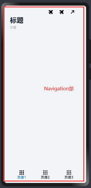
Navigation
接口
Navigation();
属性
名称 | 参数类型 | 描述 |
|---|---|---|
title | string | CustomBuilder8+ | NavigationCommonTitle9+ | NavigationCustomTitle9+ | 页面标题。 |
subTitledeprecated | string | 页面副标题。从API Version 9开始废弃,建议使用title代替。 |
menus | Array<NavigationMenuItem> | CustomBuilder8+ | 页面右上角菜单。使用Array<NavigationMenuItem> 写法时,竖屏最多支持显示3个图标,横屏最多支持显示5个图标,多余的图标会被放入自动生成的更多图标。 |
titleMode | NavigationTitleMode | 页面标题栏显示模式。 默认值:NavigationTitleMode.Free |
toolBar | object | CustomBuilder8+ | 设置工具栏内容。 items: 工具栏所有项。 说明: items均分底部工具栏,在每个均分内容区布局文本和图标,文本超长时,逐级缩小,缩小之后换行,最后...截断。 |
hideToolBar | boolean | 隐藏工具栏。 默认值:false true: 隐藏工具栏。 false: 显示工具栏。 |
hideTitleBar | boolean | 隐藏标题栏。 默认值:false true: 隐藏标题栏。 false: 显示标题栏。 |
hideBackButton | boolean | 隐藏返回键。不支持隐藏NavDestination组件标题栏中的返回图标。 默认值:false true: 隐藏返回键。 false: 显示返回键。 说明: 返回键仅针对titleMode为NavigationTitleMode.Mini时才生效。 |
navBarWidth9+ | Length | 导航栏宽度。 默认值:200vp 单位:vp 说明: 仅在Navigation组件分栏时生效。 |
navBarPosition9+ | NavBarPosition | 导航栏位置。 默认值:NavBarPosition.Start 说明: 仅在Navigation组件分栏时生效。 |
mode9+ | NavigationMode | 导航栏的显示模式。 默认值:NavigationMode.Auto 自适应:基于组件宽度自适应单栏和双栏。 |
backButtonIcon9+ | string | PixelMap | Resource | 设置导航栏返回图标。不支持隐藏NavDestination组件标题栏中的返回图标。 |
hideNavBar9+ | boolean | 是否显示导航栏(仅在mode为NavigationMode.Split时生效)。 |
例:
// xxx.ets
@Entry
@Component
struct NavigationExample {private arr: number[] = [0, 1, 2, 3, 4, 5, 6, 7, 8, 9]@State currentIndex: number = 0@State Build: Array<Object> = [{text: '页面1',num: 0},{text: '页面2',num: 1},{text: '页面3',num: 2}]@Builder NavigationTitle() {Column() {Text('标题').fontColor('#182431').fontSize(30).lineHeight(41).fontWeight(700)Text('介绍').fontColor('#182431').fontSize(14).lineHeight(19).opacity(0.4).margin({ top: 2, bottom: 20 })}.alignItems(HorizontalAlign.Start)}@Builder NavigationMenus() {Row() {Image('https://api.iconify.design/ph:airplane-tilt-fill.svg').width(24).height(24)Image('https://api.iconify.design/ph:airplane-tilt-fill.svg').width(24).height(24).margin({ left: 24 })Image('https://api.iconify.design/mingcute:arrow-right-up-fill.svg').width(24).height(24).margin({ left: 24 })}}@Builder NavigationToolbar() {Row() {ForEach(this.Build, item => {Column() {Image(this.currentIndex == item.num ? 'https://api.iconify.design/ion:apps.svg' : 'https://api.iconify.design/ion:apps-outline.svg').width(24).height(24)Text(item.text).fontColor(this.currentIndex == item.num ? '#007DFF' : '#182431').fontSize(15).lineHeight(14).fontWeight(500).margin({ top: 3 })}.width(104).height(60).onClick(() => {this.currentIndex = item.num})})}.margin({ left: 24 })}build() {Column() {Navigation() {//   中间写入内容}.title(this.NavigationTitle).menus(this.NavigationMenus).titleMode(NavigationTitleMode.Full).toolBar(this.NavigationToolbar).hideTitleBar(false).hideToolBar(false).onTitleModeChange((titleModel: NavigationTitleMode) => {console.info('titleMode' + titleModel)})}.width('100%').height('100%').backgroundColor('#F1F3F5')}
}
NavigationMenuItem 类型说明
名称 | 类型 | 必填 | 描述 |
|---|---|---|---|
value | string | 是 | 菜单栏单个选项的显示文本。 |
icon | string | 否 | 菜单栏单个选项的图标资源路径。 |
action | () => void | 否 | 当前选项被选中的事件回调。 |
object 类型说明
名称 | 类型 | 必填 | 描述 |
|---|---|---|---|
value | string | 是 | 工具栏单个选项的显示文本。 |
icon | string | 否 | 工具栏单个选项的图标资源路径。 |
action | () => void | 否 | 当前选项被选中的事件回调。 |
NavigationTitleMode 枚举说明
名称 | 描述 |
|---|---|
Free | 当内容为可滚动组件时,标题随着内容向上滚动而缩小(子标题的大小不变、淡出)。向下滚动内容到顶时则恢复原样。 |
Mini | 固定为小标题模式。 |
Full | 固定为大标题模式。 |
NavigationCommonTitle 类型说明
名称 | 类型 | 必填 | 描述 |
|---|---|---|---|
main | string | 是 | 设置主标题。 |
sub | string | 是 | 设置副标题。 |
NavigationCustomTitle 类型说明
名称 | 类型 | 必填 | 描述 |
|---|---|---|---|
builder | CustomBuilder | 是 | 设置标题栏内容。 |
height | TitleHeight | Length | 是 | 设置标题栏高度。 |
NavBarPosition 枚举说明
名称 | 描述 |
|---|---|
Start | 双栏显示时,主列在主轴方向首部。 |
End | 双栏显示时,主列在主轴方向尾部。 |
NavigationMode 枚举说明
名称 | 描述 |
|---|---|
Stack | 导航栏与内容区独立显示,相当于两个页面。 |
Split | 导航栏与内容区分两栏显示。 |
Auto | 窗口宽度>=520vp时,采用Split模式显示;窗口宽度<520vp时,采用Stack模式显示。 |
TitleHeight 枚举说明
名称 | 描述 |
|---|---|
MainOnly | 只有主标题时标题栏的推荐高度(56vp)。 |
MainWithSub | 同时有主标题和副标题时标题栏的推荐高度(82vp)。 |
事件
onTitleModeChange(callback: (titleMode: NavigationTitleMode) => void)
当 titleMode 为 NavigationTitleMode.Free 时,随着可滚动组件的滑动标题栏模式发生变化时触发此回调。
onNavBarStateChange(callback: (isVisible: boolean) => void)
导航栏显示状态切换时触发该回调。返回值 isVisible 为 true 时表示显示,为 false 时表示隐藏。
NavRouter 和 NavDestination
NavRouter
导航组件,默认提供点击响应处理,不需要开发者自定义点击事件逻辑。
子组件
必须包含两个子组件,其中第二个子组件必须为NavDestination。
说明
子组件个数异常时:
有且仅有 1 个时,触发路由到 NavDestination 的能力失效。
有且仅有 1 个时,且使用 NavDestination 场景下,不进行路由。
大于 2 个时,后续的子组件不显示。
第二个子组件不为 NavDestination 时,触发路由功能失效。
事件
onStateChange(callback: (isActivated: boolean) => void)
组件激活状态切换时触发该回调。返回值 isActivated 为 true 时表示激活,为 false 时表示未激活。
说明:
开发者点击激活 NavRouter,加载对应的 NavDestination 子组件时,回调 onStateChange(true)。NavRouter 对应的 NavDestination 子组件不再显示时,回调 onStateChange(false)。
NavDestination
作为 NavRouter 组件的子组件,用于显示导航内容区。
PatternLock
图案密码锁组件,以九宫格图案的方式输入密码,用于密码验证场景。手指在 PatternLock 组件区域按下时开始进入输入状态,手指离开屏幕时结束输入状态完成密码输入。
效果:
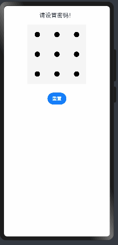
代码示例:
// Index.ets
@Entry
@Component
struct PatternLockExample {@State passwords: Number[] = []@State message: string = '请设置密码!'private patternLockController: PatternLockController = new PatternLockController()build() {Column() {Text(this.message).textAlign(TextAlign.Center).margin(20).fontSize(20)PatternLock(this.patternLockController).sideLength(200).circleRadius(9).pathStrokeWidth(18).activeColor('#B0C4DE').selectedColor('#228B22').pathColor('#90EE90').backgroundColor('#F5F5F5').autoReset(true).onPatternComplete((input: Array<number>) => {// 输入的密码长度小于5时,提示重新输入if (input === null || input === undefined || input.length < 5) {this.message = '密码长度小于5,请重新输入'return}// 判断密码长度是否大于0if (this.passwords.length > 0) {// 判断两次输入的密码是否相同,相同则提示密码设置成功,否则提示重新输入if (this.passwords.toString() === input.toString()) {this.passwords = inputthis.message = '密码设置成功:' + this.passwords.toString()} else {this.message = '两次不一致,请重新输入'}} else {// 提示第二次输入密码this.passwords = inputthis.message = "请在输入一次!"}})Button('重置').margin(30).onClick(() => {// 重置密码锁this.patternLockController.reset()this.passwords = []this.message = '重置成功!'})}.width('100%').height('100%')}
}
Progress
进度条组件,用于显示内容加载或操作处理等进度。
QRCode
显示二维码的组件
效果:

示例:
@Entry
@Component
struct QRCodeExample {private value: string = 'hello world'build() {Column({ space: 5 }) {Text('normal').fontSize(9).width('90%').fontColor(0xCCCCCC).fontSize(30)QRCode(this.value).width(200).height(200)// 设置二维码颜色Text('color').fontSize(9).width('90%').fontColor(0xCCCCCC).fontSize(30)QRCode(this.value).color(0xF7CE00).width(200).height(200)// 设置二维码背景色Text('backgroundColor').fontSize(9).width('90%').fontColor(0xCCCCCC).fontSize(30)QRCode(this.value).width(200).height(200).backgroundColor(Color.Orange)}.width('100%').margin({ top: 5 })}
}
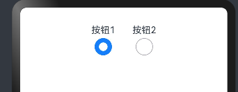
Radio
单选按钮
-
value:当前单选框的值。 -
group:当前单选框的所属群组名称,相同 group 的 Radio 只能有一个被选中。
事件
onChange(callback: (isChecked: boolean) => void)
group属性相同时,可以作为一组
效果:
@Entry
@Component
struct RadioExample {build() {Flex({ direction: FlexDirection.Row, justifyContent: FlexAlign.Center, alignItems: ItemAlign.Center }) {Column() {Text('按钮1')Radio({ value: '按钮1', group: 'radioGroup' }).checked(true).height(30).width(30).onChange((isChecked: boolean) => {console.log('按钮1的状态' + isChecked)})}Column() {Text('按钮2')Radio({ value: '按钮2', group: 'radioGroup' }).checked(false).height(30).width(30).onChange((isChecked: boolean) => {console.log('按钮2的状态 ' + isChecked)})}.margin({left:30})}.padding({ top: 30 })}
}
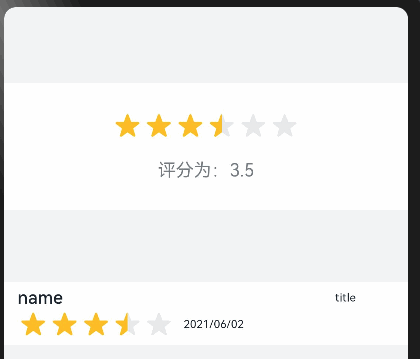
Rating
五角星
案例及效果:
@Entry
@Component
struct RatingExample {@State rating: number = 3.5build() {Column() {Column() {Rating({ rating: this.rating, indicator: false })  // rating:数值,indicator:是否可选.stars(6) // 星星个数.stepSize(0.5) // 步长.margin({ top: 24 }).onChange((value: number) => {this.rating = value})Text('评分为:' + this.rating).fontSize(16).fontColor('rgba(24,36,49,0.60)').margin({ top: 16 })}.width(360).height(113).backgroundColor('#FFFFFF').margin({ top: 68 })Row() {Column() {Text('name').fontSize(16).fontColor('#182431').fontWeight(500)Row() {Rating({ rating: 3.5, indicator: false }).margin({ top: 1, right: 8 })Text('2021/06/02').fontSize(10).fontColor('#182431')}}.margin({ left: 12 }).alignItems(HorizontalAlign.Start)Text('title').fontSize(10).fontColor('#182431').position({ x: 295, y: 8 })}.width(360).height(56).backgroundColor('#FFFFFF').margin({ top: 64 })}.width('100%').height('100%').backgroundColor('#F1F3F5')}
}
RichText
富文本组件,解析 HTML 格式文本
需要真机调试
@Entry
@Component
struct Index{@State data: string = '<h1>Southern Wind</h1>'build(){Flex({direction:FlexDirection.Column,alignItems:ItemAlign.Center}){RichText(this.data).onStart(()=>{console.info('RichText onStart');}).onComplete(()=>{console.log('onComplete')}).width(100).height(200).backgroundColor(0XBDDB69)RichText('layoutWeight(1)').onStart(() => {console.info('RichText onStart');}).onComplete(() => {console.info('RichText onComplete');}).size({ width: '100%', height: 110 }).backgroundColor(0X92D6CC).layoutWeight(1)}}
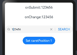
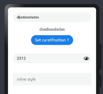
}Search
搜索:
案例:
@Entry
@Component
struct SearchExample {@State changeValue: string = ''@State submitValue: string = ''controller: SearchController = new SearchController()build() {Column() {Text('onSubmit:' + this.submitValue).fontSize(18).margin(15)Text('onChange:' + this.changeValue).fontSize(18).margin(15)Search({ value: this.changeValue, placeholder: 'Type to search...', controller: this.controller }).searchButton('SEARCH').width('100%').height(40).backgroundColor('#F5F5F5').placeholderColor(Color.Grey).placeholderFont({ size: 14, weight: 400 }).textFont({ size: 14, weight: 400 }).onSubmit((value: string) => {this.submitValue = value}).onChange((value: string) => {this.changeValue = value}).margin(20)Button('Set caretPosition 1').onClick(() => {// 设置光标位置到输入的第一个字符后this.controller.caretPosition(1)})}.width('100%')}
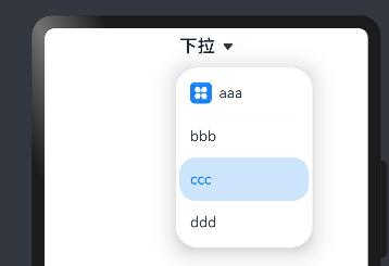
}Select
下拉菜单
接口
Select(options: Array<SelectOption>)
示例:
@Entry
@Component
struct Index{build(){Column(){Select([{ value: 'aaa', icon: $r("app.media.icon") },{ value: 'bbb' },{ value: 'ccc' },{ value: 'ddd' }])// 默认选中.selected(2).value('下拉').font({ size: 20, weight: 500 }).fontColor('#182431')// 设置下拉菜单选中项的文本样式。.selectedOptionFont({ size: 16, weight: 400 })// 设置下拉菜单项的文本样式。.optionFont({ size: 16, weight: 400 }).onSelect((index: number) => {console.info('Select:' + index)})}.width('100%')}
}
效果:
Span
行内标签,写法:
Text(){Span("Span")
}
属性的话可以参考文档
TextInput
文本输入框
案例:
@Entry
@Component
struct Index {@State text: string = ''controller: TextInputController = new TextInputController()build() {Column() {TextInput({ text: this.text, placeholder: 'input your word...', controller: this.controller }).placeholderColor(Color.Grey).placeholderFont({ size: 14, weight: 400 }).caretColor(Color.Blue).width(400).height(40).margin(20).fontSize(14).fontColor(Color.Black).inputFilter('[a-z]', (e) => {console.log(JSON.stringify(e))}).onChange((value: string) => {this.text = value})Text(this.text)Button('Set caretPosition 1').margin(15).onClick(() => {// 将光标移动至第一个字符后this.controller.caretPosition(1)})// 密码输入框TextInput({ placeholder: 'input your password...' }).width(400).height(40).margin(20).type(InputType.Password).maxLength(9).showPasswordIcon(true)// 内联风格输入框TextInput({ placeholder: 'inline style' }).width(400).height(50).margin(20).borderRadius(0).style(TextInputStyle.Inline)}.width('100%')}
}
TextPicker
滑块组件
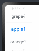
@Entry
@Component
struct TextPickerExample {private select: number = 1private fruits: string[] = ['apple1', 'orange2', 'peach3', 'grape4']build() {Column() {TextPicker({ range: this.fruits, selected: this.select }).onChange((value: string, index: number) => {console.info('Picker item changed, value: ' + value + ', index: ' + index)})}}
}
TimePicker
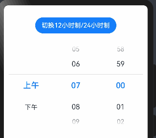
时间选择器组件
@Entry
@Component
struct TimePickerExample {@State isMilitaryTime: boolean = falseprivate selectedTime: Date = new Date('2022-07-22T08:00:00')build() {Column() {Button('切换12小时制/24小时制').margin({ top: 30, bottom: 30 }).onClick(() => {this.isMilitaryTime = !this.isMilitaryTime})TimePicker({selected: this.selectedTime,}).useMilitaryTime(this.isMilitaryTime).onChange((value: TimePickerResult) => {this.selectedTime.setHours(value.hour, value.minute)console.info('select current date is: ' + JSON.stringify(value))})}.width('100%')}
}