前言:Grid 布局是将容器划分成"行"和"列",产生单元格,然后将"项目"分配给划分好的单元格,因为有行和列,可以看作是二维布局。
一 术语
1. 容器
采用网格布局的区域,也就是外层盒子。
2. 项目
容器包裹的一级子元素,不包含二级及其以下的子元素。当容器使用了 grid 布局,项目的 float,display 等设置都将失效。
3. 单元格
通过容器设置行列属性,切割出来的单元格。单元格不等于项目,打个比方,容器相当于一个房子,单元格相当于在房子里划分出的一个个房间,项目相当于房间里的家具等东西。
二 容器属性
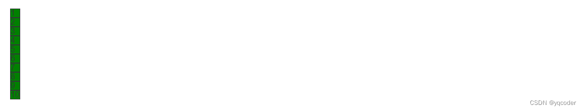
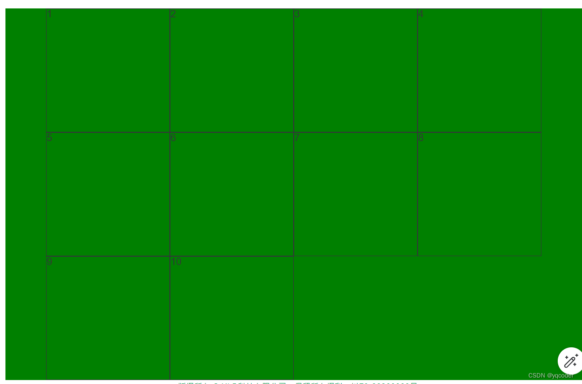
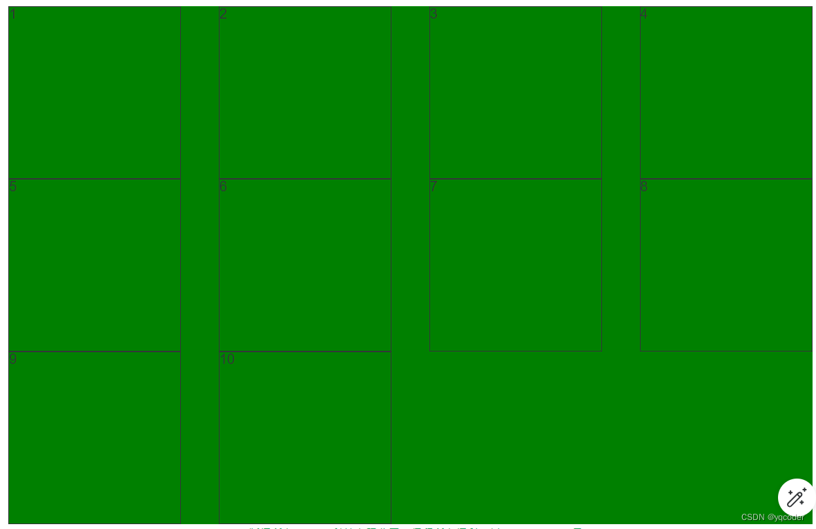
demo 默认样式,未设置 grid 属性。
<template><div class="container"><span v-for="i in 10" :class="`item${i}`">{{ i }}</span></div>
</template><style lang="scss" scoped>.container {background: green;span {border: 1px solid;}}
</style>
1. display
设置网格布局
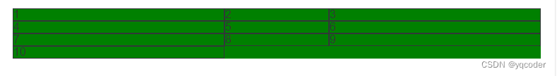
1.1 display: grid
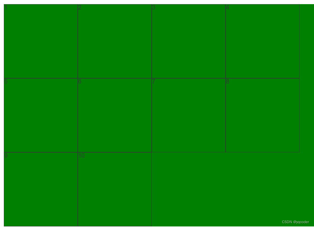
项目宽度填充整行
.container {background: green;display: grid;span {border: 1px solid;}
}
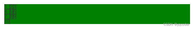
1.2 display: inline-grid
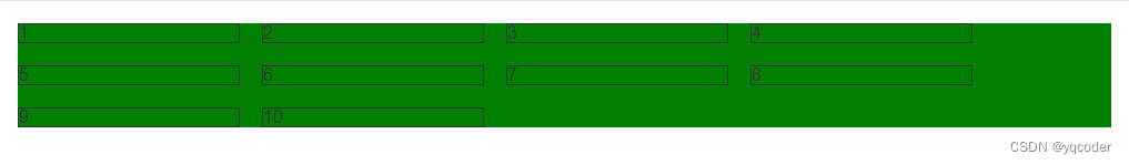
项目宽度根据内容撑宽。
.container {background: green;display: inline-grid;span {border: 1px solid;}
}
2. grid-template-columns
划分容器列和列宽,可以单独或混合使用:绝对值 px,百分比 %,比例 fr,关键字 auto,函数 minmax,函数 repeat,函数 fit-content
2.1 绝对值 px
例:设置 3 列,每列宽 300px
.container {background: green;display: grid;grid-template-columns: 300px 300px 300px;span {border: 1px solid;}
}
2.2 百分比 %
例:设置 3 列,每列宽 33.33 %
.container {background: green;display: grid;grid-template-columns: 33.33% 33.33% 33.33%;span {border: 1px solid;}
}
2.3 比例 fr
总宽度除以总的 fr,得到每份 fr 所占宽度,然后分给设置的列宽,例:设置 3 列,第 2 列是第 1 列的 1 倍,第 3 列是第 1 列的 3 倍
.container {background: green;display: grid;grid-template-columns: 1fr 2fr 3fr;span {border: 1px solid;}
}
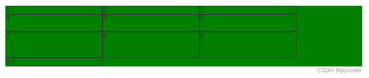
2.4 关键字 auto
宽度自适应,例:设置 3 列,第 1 列 100px,第 3 列 100px,第 2 列宽度自适应
.container {background: green;display: grid;grid-template-columns: 100px auto 100px;span {border: 1px solid;}
}
2.5 函数 minmax
minmax(min, max),用于产生一个长度范围,例:设置 3 列,第 2 列 自适应宽度在 100px 到 300px 之间,第 1 列和第 3 列宽度为 300px。
.container {background: green;display: grid;grid-template-columns: 300px minmax(100px, 300px) 300px;span {border: 1px solid;}
}
2.6 函数 repeat
repeat(n, content),n 代表重复次数,可以是数字代表几次,可以 auto-fill 自动填充满,content 代表重复内容。例:设置 3 列,每列 1fr。
.container {background: green;display: grid;grid-template-columns: repeat(3, 100px);span {border: 1px solid;}
}
例:设置每列 100px,每行自动填充最多的 100px 列
.container {background: green;display: grid;grid-template-columns: repeat(auto-fill, 100px);span {border: 1px solid;}
}
2.7 函数 fit-content
fit-content(length),当内容小于 length,以内容为准,如果大于 length 以 leng 为长度,例:设置 3 列,每列最大宽度 200px,当小于 200px,以内容撑开宽度。
.container {background: green;display: grid;grid-template-columns: repeat(3, fit-content(200px));span {border: 1px solid;}
}
3. grid-template-rows
划分容器行和行高,属性同 grid-template-columns 一致,比例 fr 略有不同。如果不设置项目高度,1fr 代表的高度就是项目高度,如果设置有项目设置了高度,那就以该项目的高度除以该项目所分的 fr 算出 1fr 的大小。例:设置列宽 200px,自动铺满列,不设置项目高度,第 1 行 2fr,第 2 行 2fr,第 3 行 3fr。
.container {background: green;display: grid;grid-template-columns: repeat(auto-fill, 200px);grid-template-rows: 1fr 2fr 3fr;span {border: 1px solid;}
}
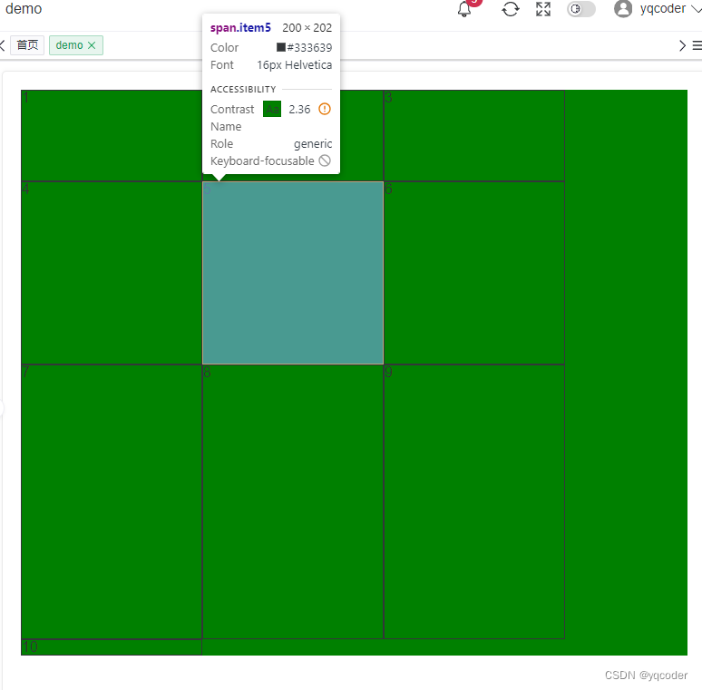
例:设置列宽 200px,自动铺满列,设置项目 item5 高度 200 px,第 1 行 2fr,第 2 行 2fr,第 3 行 3fr。
.container {background: green;display: grid;grid-template-columns: repeat(auto-fill, 200px);grid-template-rows: 1fr 2fr 3fr;span {border: 1px solid;}.item5 {height: 200px;}
}

4. grid-template-areas
区域命名,区域命名形成区域一定要是矩形区域,无论是 L,凹,凸都是无效属性值。可以配合 grid-template-rows、grid-template-columns 使用。例:设置 3 列每列 100px,3 行每行 100px,通过区域命名实现如图布局。
.container {background: green;display: grid;grid-template-columns: repeat(3, 100px);grid-template-rows: repeat(3, 100px);grid-template-areas:"left top top""left middle right""bottom bottom right";span {border: 1px solid;}.item1 {grid-area: left;}.item2 {grid-area: top;}.item3 {grid-area: middle;}.item4 {grid-area: right;}.item5 {grid-area: bottom;}
}
5. grid-template
是 grid-template-columns、grid-template-rows 这 2 个属性的合并简写形式。
grid-template-columns: repeat(3, 100px);
grid-template-rows: repeat(3, 100px);// 简写
grid-template: repeat(3, 100px) / repeat(3, 100px);
6. column-gap
列间距,支持数值和百分比。例:设置列间距为 20px。
.container {background: green;display: grid;grid-template-columns: repeat(auto-fill, 200px);column-gap: 20px;span {border: 1px solid;}
}
7. row-gap
行间距,支持数值和百分比。例:设置行间距 10px。
.container {background: green;display: grid;grid-template-columns: repeat(auto-fill, 200px);row-gap: 10px;span {border: 1px solid;}
}
8. grid-gap
行间距和列间距简写,grid-gap: 行间距,列间距,如果第二个值省略,默认两个值相等。例:设置行间距,列间距都为 20px。
.container {background: green;display: grid;grid-template-columns: repeat(auto-fill, 200px);grid-gap: 20px;span {border: 1px solid;}
}
9. grid-auto-flow
定义栅格元素的排列规则:row、column、row dense、column dense。
9.1 row
默认水平顺序排列
.container {background: green;display: grid;grid-template-columns: repeat(auto-fill, 200px);grid-template-rows: repeat(3, 200px);grid-auto-flow: column;span {border: 1px solid;}
}
9.2 column
垂直顺序排序
.container {background: green;display: grid;grid-template-columns: repeat(auto-fill, 200px);grid-template-rows: repeat(3, 200px);grid-auto-flow: column;span {border: 1px solid;}
}
10. justify-items
单元格内容水平位置设置:stretch、start、end、center
10.1 stretch
默认单元格内容水平填充单元格
.container {background: green;display: grid;grid-template-columns: repeat(auto-fill, 200px);grid-template-rows: repeat(3, 200px);justify-items: stretch;span {border: 1px solid;}
}
10.2 start
单元格内容水平靠右
.container {background: green;display: grid;grid-template-columns: repeat(auto-fill, 200px);grid-template-rows: repeat(3, 200px);justify-items: start;span {border: 1px solid;}
}
10.3 end
单元格内容水平靠左
.container {background: green;display: grid;grid-template-columns: repeat(auto-fill, 200px);grid-template-rows: repeat(3, 200px);justify-items: end;span {border: 1px solid;}
}
10.4 center
单元格内容水平居中
.container {background: green;display: grid;grid-template-columns: repeat(auto-fill, 200px);grid-template-rows: repeat(3, 200px);justify-items: center;span {border: 1px solid;}
}
11. align-items
单元格内容垂直位置:stretch、start、end、center
11.1 stretch
单元格内容垂直填充
.container {background: green;display: grid;grid-template-columns: repeat(auto-fill, 200px);grid-template-rows: repeat(3, 200px);align-items: stretch;span {border: 1px solid;}
}
11.2 start
单元格内容垂直靠上
.container {background: green;display: grid;grid-template-columns: repeat(auto-fill, 200px);grid-template-rows: repeat(3, 200px);align-items: start;span {border: 1px solid;}
}
11.3 end
单元格内容垂直靠下
.container {background: green;display: grid;grid-template-columns: repeat(auto-fill, 200px);grid-template-rows: repeat(3, 200px);align-items: end;span {border: 1px solid;}
}
11.4 center
单元格内容垂直居中
.container {background: green;display: grid;grid-template-columns: repeat(auto-fill, 200px);grid-template-rows: repeat(3, 200px);align-items: center;span {border: 1px solid;}
}
12. place-items
是 align-items 属性和 justify-items 属性的合并简写形式。如果省略第二个值,则浏览器认为与第一个值相等。例:设置单元格内容垂直和水平居中
.container {background: green;display: grid;grid-template-columns: repeat(auto-fill, 200px);grid-template-rows: repeat(3, 200px);place-items: center;span {border: 1px solid;}
}
13. justify-content
容器内容水平位置:start、end、center、stretch、space-around、space-between、space-evenly
13.1 start
默认容器内容水平靠左
.container {background: green;display: grid;grid-template-columns: repeat(auto-fill, 200px);grid-template-rows: repeat(3, 200px);justify-content: start;span {border: 1px solid;}
}
13.2 end
例:设置容器内容水平靠右
.container {background: green;display: grid;grid-template-columns: repeat(auto-fill, 200px);grid-template-rows: repeat(3, 200px);justify-content: end;span {border: 1px solid;}
}
13.3 center
例:设置容器内容水平居中
.container {background: green;display: grid;grid-template-columns: repeat(auto-fill, 200px);grid-template-rows: repeat(3, 200px);justify-content: center;span {border: 1px solid;}
}
13.4 space-around
例:设置容器内容水平平均分布,项目间距是项目距离容器边框的两倍
.container {background: green;display: grid;grid-template-columns: repeat(auto-fill, 200px);grid-template-rows: repeat(3, 200px);justify-content: space-around;span {border: 1px solid;}
}
13.5 space-between
例:设置容器内容水平平均分布,靠近容器边框项目紧贴容器,其余水平项目平均间距
.container {background: green;display: grid;grid-template-columns: repeat(auto-fill, 200px);grid-template-rows: repeat(3, 200px);justify-content: space-between;span {border: 1px solid;}
}
13.6 space-evenly
例:设置容器内容水平平均分布,项目间距和项目距离容器边框间距相等
.container {background: green;display: grid;grid-template-columns: repeat(auto-fill, 200px);grid-template-rows: repeat(3, 200px);justify-content: space-evenly;span {border: 1px solid;}
}
14. align-content
容器内容垂直位置:start、end、center、stretch、space-around、space-between、space-evenly,同 justify-content 属性一致。一般需要给容器设置固定高度。align-content 属性才有效。例:设置容器内容垂直居中
.container {height: 500px;background: green;display: grid;grid-template-columns: repeat(auto-fill, 200px);grid-template-rows: repeat(3, 100px);align-content: center;span {border: 1px solid;}
}
15. place-content
是 align-content 属性和 justify-content 属性的合并简写形式。如果省略第二个值,浏览器就会假定第二个值等于第一个值。例:设置容器内容水平居中,垂直居中。
.container {height: 500px;background: green;display: grid;grid-template-columns: repeat(auto-fill, 200px);grid-template-rows: repeat(3, 100px);place-content: center;span {border: 1px solid;}
}
三 项目属性
1. grid-column-start、grid-column-end、grid-column、grid-row-start、grid-row-end、grid-row、grid-area
grid-column-start: number; 左边框垂直网格线
grid-column-end: number; 右边框垂直网格线
grid-column: grid-column-start / grid-column-end; 左、右边框垂直网格线简写
grid-row-start: number; 上边框垂直网格线
grid-row-end: number; 下边框垂直网格线
grid-row: grid-column-start / grid-column-end; 左、右边框垂直网格线简写
grid-area: grid-row-start / grid-column-start / grid-row-end / grid-column-end; 上、左、下、右边框垂直网格线简写
number 值默认从 1 开始依次递增。
例:设置一个 3 列每列宽 200px,3 行每行高 200px,让内容为 1 的项目居中。
.container {background: green;display: grid;grid-template-columns: repeat(3, 200px);grid-template-rows: repeat(3, 200px);span {border: 1px solid;}.item1 {grid-column-start: 2;grid-column-end: 3;grid-row-start: 2;grid-row-end: 3;background: red;}
}// grid-column、grid-row 简写
.container {background: green;display: grid;grid-template-columns: repeat(3, 200px);grid-template-rows: repeat(3, 200px);span {border: 1px solid;}.item1 {grid-column: 2 / 3;grid-row: 2 / 3;background: red;}
}// grid-area 简写
.container {background: green;display: grid;grid-template-columns: repeat(3, 200px);grid-template-rows: repeat(3, 200px);span {border: 1px solid;}.item1 {grid-area: 2 / 2 / 3 / 3;background: red;}
}
2. justify-self
单元格内容的水平位置,同 justify-items 但只作用于单个项目。赋值:start、end、center、stretch。
3. align-self
单元格内容的垂直位置,同 align-items 但只作用于单个项目。赋值:start、end、center、stretch。
4. place-self
justify-self 和 align-self 简写,同 place-items 但只作用于单个项目。只有一个值时,第二个值默认与第一个值相同。


