数据分析
Jupyter Notebook
- Jupyter Notebook: 一款用于编程、文档、笔记和展示的软件。
启动命令:
jupyter notebook

Matplotlib
设置中文格式:
plt.rcParams['font.sans-serif'] = ['KaiTi']
# 查看本地所有字体
import matplotlib.font_manager
a = sorted([f.name for f in matplotlib.font_manager.fontManager.ttflist])
for i in a:print(i)
常用数据图
折线图
通过折线的上升或下降来表示统计数量的增减变化的统计图。
特点:能够显示数据的变化趋势,反映事物的变化情况。(变化)
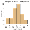
直方图
用一系列高度不等的纵向条纹或线段表示数据分布的情况。一般用横轴表示数据范围,纵轴表示分布情况。
特点:绘制连续性的数据,展示一组或者多组数据的分布状况。(统计)
条形图
排列在工作表的列或行中的数据可以绘制成条形图。
特点:绘制离散的数据,能够一眼看出各个数据的大小,比较数据之间的差别。(统计)

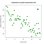
散点图
用两组数据构成多个坐标点,考察坐标点的分布,判断两变量之间是否存在某种关联或总结坐标点的分布模式。
特点:判断变量之间是否存在数量关联趋势,展示离群点。(分布规律)
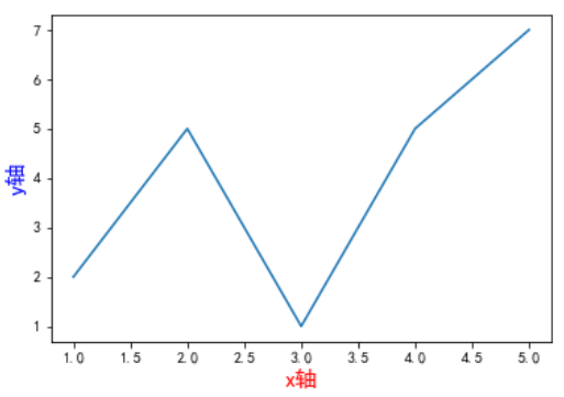
折线图
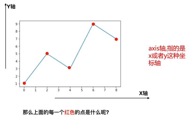
每个红色的点是坐标,把5个点的坐标连接成一条线,组成了一个折线图。
目前存在以下几个问题:
- 设置图片大小(高清大图)
- 保存到本地
- 描述信息,如x轴和y轴表示什么,这个图表示什么
- 调整x或y的刻度间距
- 线条样式(颜色、透明度等)
- 标记特殊点(如最高点和最低点)
- 给图片添加水印(防伪、防盗用)
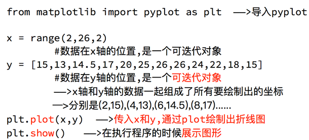
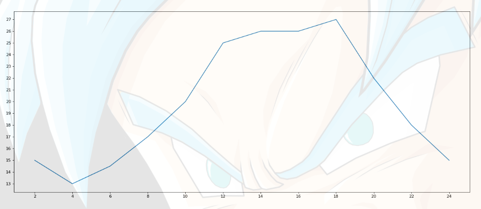
示例1
'''
假设一天中每隔两个小时(range(2, 26, 2))的气温(℃)分别是
'''
# 导包
from matplotlib import pyplot as plt# 设置图片大小
fig = plt.figure(figsize=(20, 8), dpi=80)# 设置x,y轴的值
x = range(2, 26, 2)
y = [15, 13, 14.5, 17, 20, 25, 26, 26, 27, 22, 18, 15]# 绘图
plt.plot(x, y)# 设置x轴刻度
plt.xticks(range(2, 26, 2))
plt.yticks(range(min(y), max(y) + 1))# 保存图片
# plt.savefig("./image.png") # .svg格式,放大无锯齿# 展示图形
plt.show()
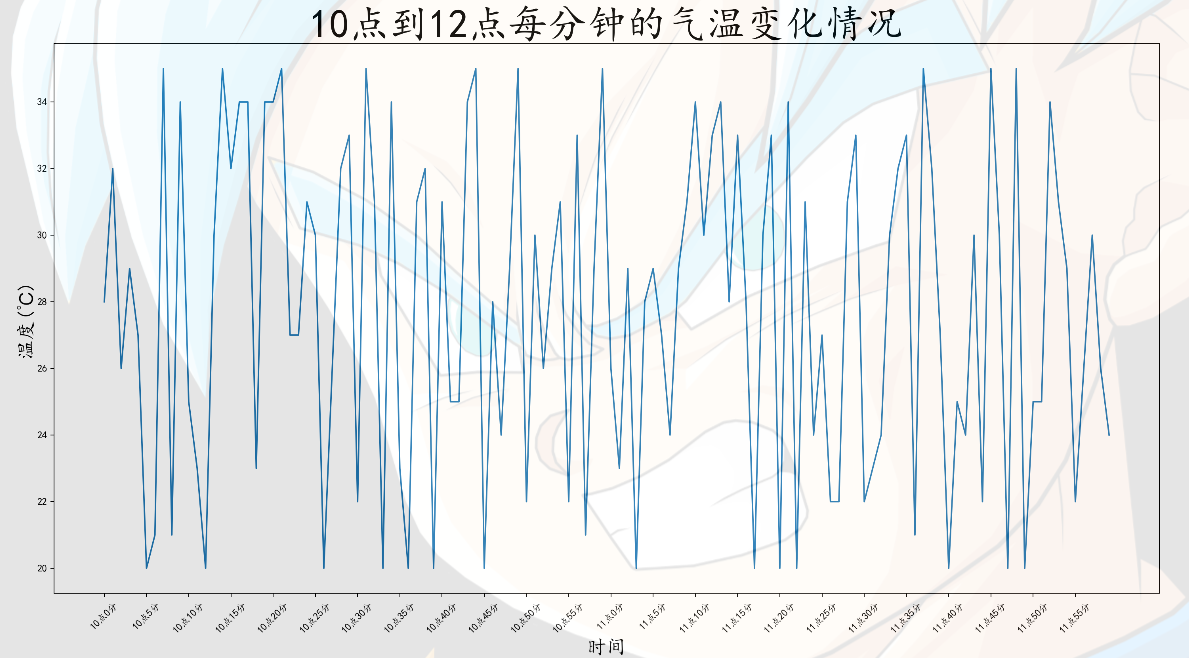
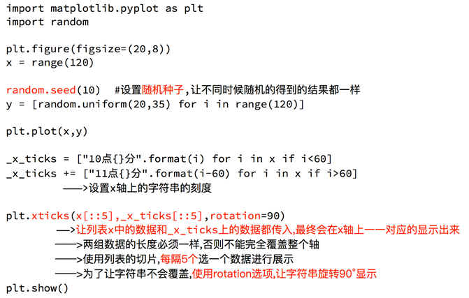
示例2
import random
from matplotlib import pyplot as plt# 设置字体为楷体
plt.rcParams['font.sans-serif'] = ['KaiTi']x = range(0, 120)
y = [random.randint(20, 35) for _ in range(120)]# 设置图片大小
fig = plt.figure(figsize=(20, 10), dpi=180)# 绘图
plt.plot(x, y)# 调整x轴刻度
xl = ["10点{}分".format(i) for i in range(60)]
xl += ["11点{}分".format(i) for i in range(60)]
plt.xticks(list(x)[::5], xl[::5], rotation=45)  # rotation旋转的度数# 添加描述信息
plt.xlabel("时间", size=20)
plt.ylabel("温度(℃)", size=20)
plt.title("10点到12点每分钟的气温变化情况", size=40)# 展示图形
plt.show()
多条折线
多次 plt.plot()
'''
统计出童某从11岁到30岁每年交的女朋友数量列表,将数据绘制成折线图
以及同桌从11岁到30岁交往数量做出数据折线图对比差距
'''from matplotlib import pyplot as pltfig = plt.figure(figsize=(20, 10), dpi=180)
plt.rcParams['font.sans-serif'] = ['SimHei']
plt.title("童某与其同桌从11岁到30岁每年交的女朋友数量图", size=30)x = range(11, 31)
y = [1, 3, 2, 3, 4, 4, 5, 6, 5, 4, 3, 3, 1, 1, 1, 4, 6, 4, 5, 3]
z = [1, 0, 3, 1, 2, 2, 3, 3, 2, 1, 2, 3, 1, 1, 1, 1, 1, 1, 1, 1]# 绘制两条折线图
plt.plot(x, y, label="童某", color='red', linestyle='--', linewidth=2)
plt.plot(x, z, label="同桌", color='blue', linestyle='-.', linewidth=5)plt.ylabel("交往数量(个)", size=20)
plt.xlabel("年龄", size=20)
xl = ["{}岁".format(i) for i in x]
plt.xticks(x, xl)# 添加图例
plt.legend(loc=2)
''''best'            0'upper right'     1'upper left'      2'lower left'      3'lower right'     4'right'           5'center left'     6'center right'    7'lower center'    8'upper center'    9'center'          10
'''# 绘制网格
plt.grid(alpha=0.8, linestyle=':', linewidth=1, color='k')	# alpha设置网格
plt.show()

总结
- 绘制了折线图 (
plt.plot) - 设置了图片的大小和分辨率 (
plt.figure) - 实现了图片的保存 (
plt.savefig) - 设置了xy轴上的刻度和字符串 (
plt.xticks) - 解决了刻度稀疏和密集的问题 (
plt.xticks) - 设置了标题,xy轴的标签 (
plt.title,plt.xlabel,plt.ylabel) - 设置了字体 (
plt.rcParams) - 在一个图上绘制多个图形(多次
plt.plot) - 为不同的图形添加图例 (
plt.legend)
| 颜色字符 | 风格字符 |
|---|---|
| r 红色 | - 实线 |
| g 绿色 | – 虚线, 破折线 |
| b 蓝色 | - . 点划线 |
| w 白色 | : 点虚线, 虚线 |
| c 青色 | ‘’ 留空或空格, 无线条 |
| m 洋红 | |
| y 黄色 | |
| k 黑色 | |
| #00ff00 16进制 | |
| 0.8 灰度值字符串 |
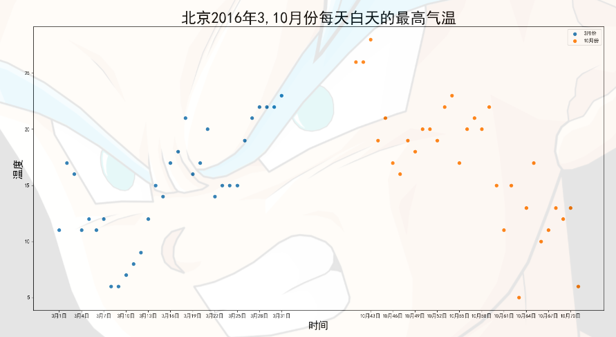
散点图
'''
散点图假设通过爬虫你获取到了北京2016年3,10月份每天白天的最高气温(分别位于列表a,b),
那么此时如何寻找出气温和随时间(天)变化的某种规律?
'''
from matplotlib import pyplot as plty_3 = [11, 17, 16, 11, 12, 11, 12, 6, 6, 7, 8, 9, 12, 15, 14, 17, 18, 21, 16, 17, 20, 14, 15, 15, 15, 19, 21, 22, 22,22, 23]
y_10 = [26, 26, 28, 19, 21, 17, 16, 19, 18, 20, 20, 19, 22, 23, 17, 20, 21, 20, 22, 15, 11, 15, 5, 13, 17, 10, 11, 13,12, 13, 6]
x_3 = range(1, 32)
x_10 = range(41, 72)# 设置中文
plt.rcParams['font.sans-serif'] = ['SimHei']
# 设置图片大小
plt.figure(figsize=(20, 10), dpi=100)# 使用scatter方法绘制散点图
plt.scatter(x_3, y_3, label="3月份")
plt.scatter(x_10, y_10, label="10月份")# 调整x轴的刻度
xl = list(x_3) + list(x_10)  # 总数应当是两个月的天数而不是72
xlabels = ["3月{}日".format(i) for i in x_3]
xlabels += ["10月{}日".format(i) for i in x_10]
plt.xticks(xl[::3], xlabels[::3])# 添加描述信息
plt.xlabel("时间", size=20)
plt.ylabel("温度", size=20)
plt.title("北京2016年3,10月份每天白天的最高气温", size=30)# 添加图例
plt.legend()# 展示
plt.show()
不同条件(维度)之间的内在关联关系
观察数据的离散聚合程度
条形图

'''
柱状图假设你获取到了2017年内地电影票房前20的电影(列表a)和电影票房数据(列表b),那么如何更加直观的展示该数据?
'''
from matplotlib import pyplot as plt# 设置中文
plt.rcParams['font.sans-serif'] = ['SimHei']
plt.figure(figsize=(20,10), dpi=100)a = ["战狼2", "速度与激情8", "功夫瑜伽", "西游伏妖篇", "变形金刚5:最后的骑士", "摔跤吧!爸爸", "加勒比海盗5:死无对证", "金刚:骷髅岛", "极限特工:终极回归", "生化危机6:终章", "乘风破浪", "神偷奶爸3", "智取威虎山", "大闹天竺", "金刚狼3:殊死一战", "蜘蛛侠:英雄归来", "悟空传", "银河护卫队2", "情圣", "新木乃伊", ]
b = [56.01, 26.94, 17.53, 16.49, 15.45, 12.96, 11.8, 11.61, 11.28, 11.12, 10.49, 10.3, 8.75, 7.55, 7.32, 6.99, 6.88,6.86, 6.58, 6.23]# 通过bar方法绘制柱状图
plt.bar(a, b, width=0.5)# 调整x轴刻度
plt.xticks(rotation=35)plt.show()
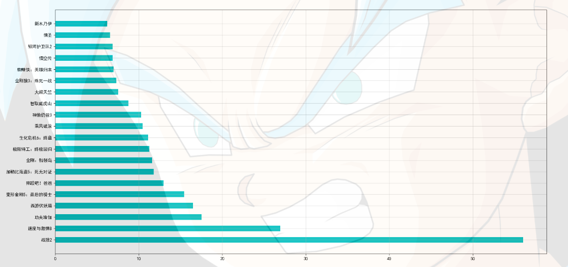
绘制横排条形图
from matplotlib import pyplot as plt# 设置中文
plt.rcParams['font.sans-serif'] = ['SimHei']
plt.figure(figsize=(20,10), dpi=100)a = ["战狼2", "速度与激情8", "功夫瑜伽", "西游伏妖篇", "变形金刚5:最后的骑士", "摔跤吧!爸爸","加勒比海盗5:死无对证", "金刚:骷髅岛", "极限特工:终极回归", "生化危机6:终章", "乘风破浪", "神偷奶爸3", "智取威虎山", "大闹天竺", "金刚狼3:殊死一战", "蜘蛛侠:英雄归来", "悟空传", "银河护卫队2", "情圣", "新木乃伊", ]
b = [56.01, 26.94, 17.53, 16.49, 15.45, 12.96, 11.8, 11.61, 11.28, 11.12, 10.49, 10.3, 8.75, 7.55, 7.32, 6.99, 6.88,6.86, 6.58, 6.23]# 通过barh方法绘制条形图
plt.barh(a, b, height=0.5, color='c') # 粗细的调节和柱状图的不一样
plt.grid(alpha=0.5)plt.show()
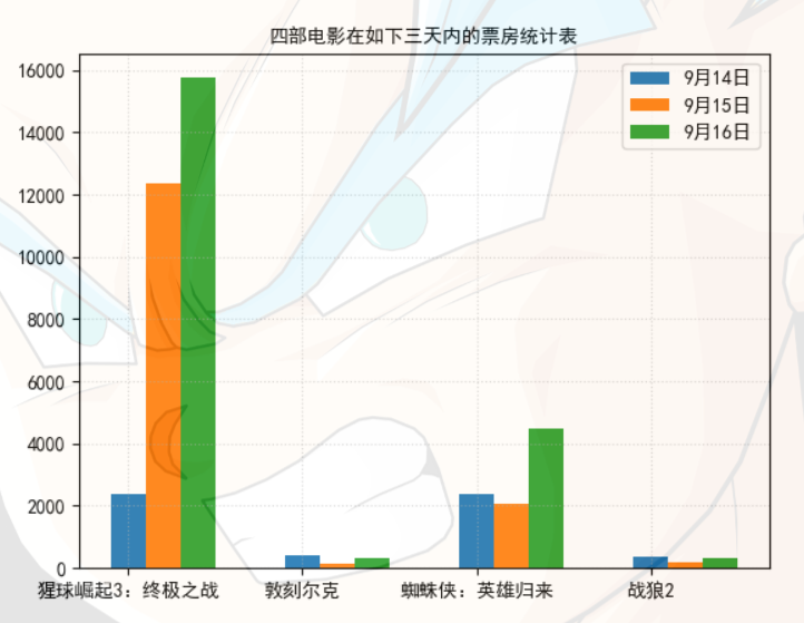
绘制分组条形图
'''
分组条形图假设你知道了列表a中电影分别在2017-09-14(b_14), 2017-09-15(b_15), 2017-09-16(b_16)
三天的票房,为了展示列表中电影本身的票房以及同其他电影的数据对比情况,应该如何更加直观的呈现该数据?
'''
from matplotlib import pyplot as pltplt.rcParams['font.sans-serif'] = ['SimHei']
plt.title("四部电影在如下三天内的票房统计表", size=10)a = ["猩球崛起3:终极之战", "敦刻尔克", "蜘蛛侠:英雄归来", "战狼2"]
b_14 = [2358, 399, 2358, 362]
b_15 = [12357, 156, 2045, 168]
b_16 = [15746, 312, 4497, 319]bar_width = 0.2
x_14 = range(len(a)) #可迭代
x_15 = [i+bar_width for i in x_14] #遍历循环,每次位移bar_width
x_16 = [i+bar_width*2 for i in x_14]plt.bar(a, b_14, width=bar_width, label="9月14日")
plt.bar(x_15, b_15, width=bar_width, label="9月15日")
plt.bar(x_16, b_16, width=bar_width, label="9月16日")
# 设置图例
plt.legend()
# 设置网格线
plt.grid(alpha=0.5, linestyle=":")
plt.show()
数量统计
频率统计(市场饱和度)
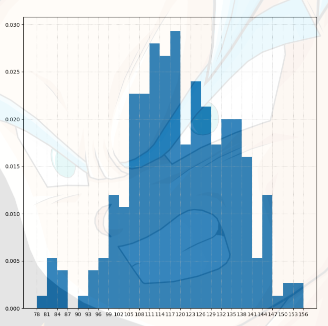
绘制直方图

'''
直方图假设你获取了250部电影的时长(列表a中),希望统计出这些电影时长的分布状态
(比如时长为100分钟到120分钟电影的数量,出现的频率)等信息,你应该如何呈现这些数据?
'''
from matplotlib import pyplot as plta = [131, 98, 125, 131, 124, 139, 131, 117, 128, 108, 135, 138, 131, 102, 107, 114, 119, 128, 121, 142, 127, 130, 124,101, 110, 116, 117, 110, 128, 128, 115, 99, 136, 126, 134, 95, 138, 117, 111, 78, 132, 124, 113, 150, 110, 117, 86,95, 144, 105, 126, 130, 126, 130, 126, 116, 123, 106, 112, 138, 123, 86, 101, 99, 136, 123, 117, 119, 105, 137,123, 128, 125, 104, 109, 134, 125, 127, 105, 120, 107, 129, 116, 108, 132, 103, 136, 118, 102, 120, 114, 105, 115,132, 145, 119, 121, 112, 139, 125, 138, 109, 132, 134, 156, 106, 117, 127, 144, 139, 139, 119, 140, 83, 110, 102,123, 107, 143, 115, 136, 118, 139, 123, 112, 118, 125, 109, 119, 133, 112, 114, 122, 109, 106, 123, 116, 131, 127,115, 118, 112, 135, 115, 146, 137, 116, 103, 144, 83, 123, 111, 110, 111, 100, 154, 136, 100, 118, 119, 133, 134,106, 129, 126, 110, 111, 109, 141, 120, 117, 106, 149, 122, 122, 110, 118, 127, 121, 114, 125, 126, 114, 140, 103,130, 141, 117, 106, 114, 121, 114, 133, 137, 92, 121, 112, 146, 97, 137, 105, 98, 117, 112, 81, 97, 139, 113, 134,106, 144, 110, 137, 137, 111, 104, 117, 100, 111, 101, 110, 105, 129, 137, 112, 120, 113, 133, 112, 83, 94, 146,133, 101, 131, 116, 111, 84, 137, 115, 122, 106, 144, 109, 123, 116, 111, 111, 133, 150]
plt.figure(figsize=(10, 10))# 计算组数
d = 3 #组距
nums_bin = (max(a)-min(a))//d
print(nums_bin)# 通过hist(数据,分成的组数)绘制直方图
plt.hist(a, nums_bin, density=True) # density统计频率分布plt.xticks(range(min(a), max(a)+d,d))
plt.grid(linestyle=":", alpha=0.8)
plt.show()
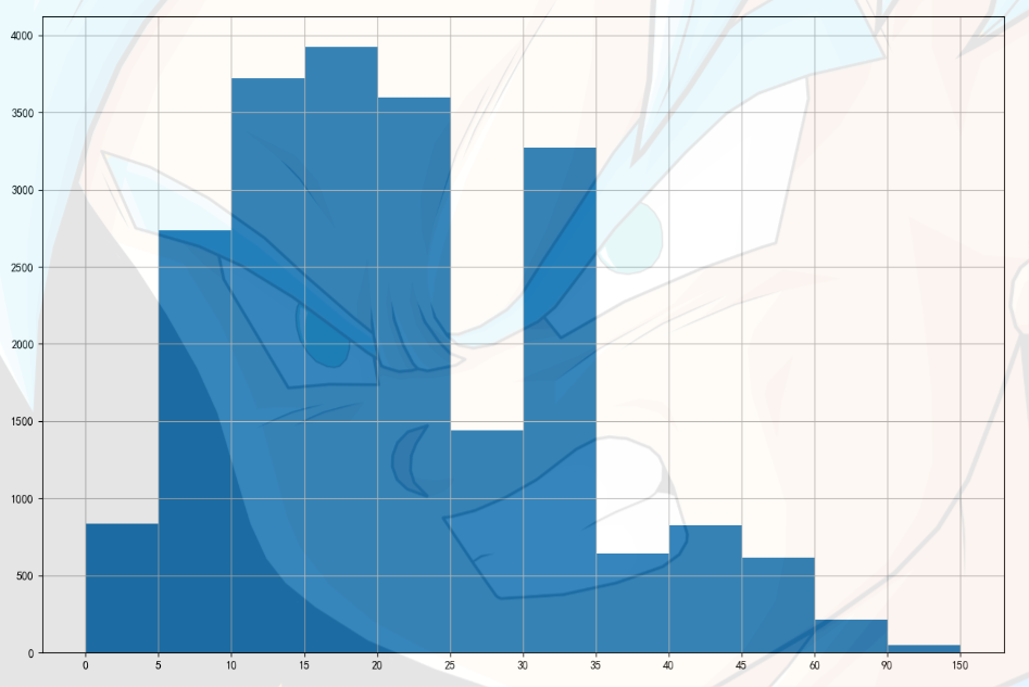
'''
在美国2004年人口普查发现有124 million的人在离家相对较远的地方工作。
根据他们从家到上班地点所需要的时间,通过抽样统计(最后一列)出了下表的数据,这些数据能够绘制成直方图么?
'''
from matplotlib import pyplot as pltplt.rcParams['font.sans-serif'] = ['SimHei']
plt.figure(figsize=(15, 10),dpi=100)
interval = [0,5,10,15,20,25,30,35,40,45,60,90]
width = [5,5,5,5,5,5,5,5,5,15,30,60]
quantity = [836,2737,3723,3926,3596,1438,3273,642,824,613,215,47]plt.bar(range(len(quantity)), quantity, width=1)
# 设置x轴的刻度
_x = [i-0.5 for i in range(13)]
xl = interval+[150]
plt.xticks(_x, xl)plt.grid()
plt.show()
通用配置
基本线条
import numpy as np
import matplotlib.pyplot as plt
%matplotlib inline
最基本的线条
plt.rcParams['font.sans-serif'] = ['SimHei']
plt.plot([1,2,3,4,5],[2,5,1,5,7])
plt.xlabel('x轴',size=15,color='red')
plt.ylabel('y轴',size=15,color='blue')
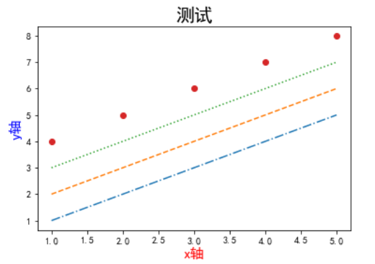
不同的线条样式和颜色
plt.plot([1,2,3,4,5],[1,2,3,4,5],'-.')
plt.plot([1,2,3,4,5],[2,3,4,5,6],'--')
plt.plot([1,2,3,4,5],[3,4,5,6,7],': ')
plt.plot([1,2,3,4,5],[4,5,6,7,8],"o")
plt.title('测试',size=20)
plt.xlabel('x轴',size=15,color='r')
plt.ylabel('y轴',size=15,color='b')
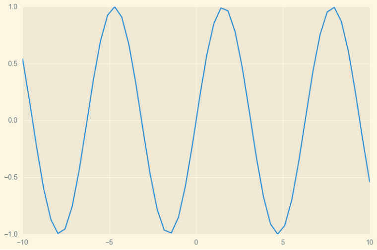
风格设置
import matplotlib.pyplot as plt
import numpy as np
plt.style.available['Solarize_Light2','_classic_test_patch','bmh','classic','dark_background','fast','fivethirtyeight','ggplot','grayscale','seaborn','seaborn-bright','seaborn-colorblind','seaborn-dark','seaborn-dark-palette','seaborn-darkgrid','seaborn-deep','seaborn-muted','seaborn-notebook','seaborn-paper','seaborn-pastel','seaborn-poster','seaborn-talk','seaborn-ticks','seaborn-white','seaborn-whitegrid','tableau-colorblind10']
x = np.linspace(-10,10)
y = np.sin(x)
plt.style.use('Solarize_Light2')
plt.plot(x,y)
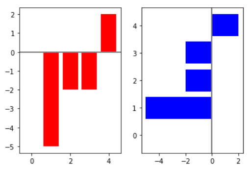
条形图
import numpy as np
import matplotlib
import matplotlib.pyplot as pltnp.random.seed(0) # 设置种子:起始值为0
x = np.arange(5)
y = np.random.randint(-5,5,5)
print(y)
fig,axes = plt.subplots(ncols=2)
v_bars = axes[0].bar(x,y,color='red')
h_bars = axes[1].barh(x,y,color='blue')axes[0].axhline(0,color='grey',linewidth=2)
axes[1].axvline(0,color='grey',linewidth=2)
plt.show()
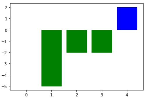
fig,ax = plt.subplots()
v_bars = ax.bar(x,y,color='blue')
for bar,height in zip(v_bars,y):if height < 0:bar.set(color='green')
plt.show()
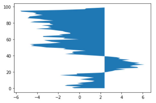
x = np.random.randn(100).cumsum()
y = np.arange(100)fig,ax = plt.subplots()
ax.fill_between(x,y)
plt.show()
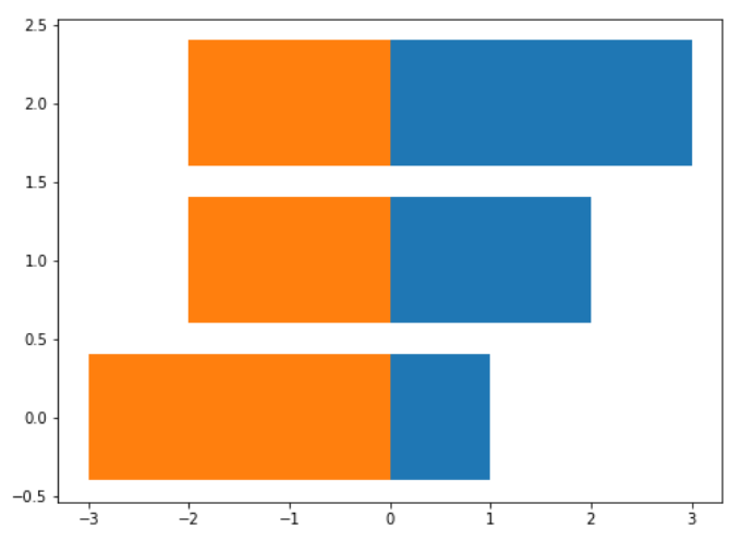
x1 = np.array([1,2,3])
x2 = np.array([3,2,2])bar_labels = ['bar1','bar2','bar3']
plt.figure(figsize=(8,6))
y_pos = [x for x in np.arange(len(x1))]plt.barh(y_pos,x1)
plt.barh(y_pos,-x2)
plt.show()
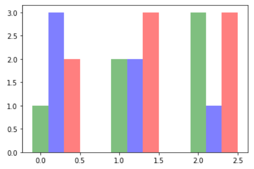
g_data = [1,2,3]
b_data = [3,2,1]
r_data = [2,3,3]
labels = ['group1','group2','group3']pos = list(range(len(g_data)))
width = 0.2
fig,ax = plt.subplots()
plt.bar(pos,g_data,width,alpha=0.5,color='g',label=labels[0])
plt.bar([p+width for p in pos],b_data,width,alpha=0.5,color='b',label=labels[1])
plt.bar([p+width*2 for p in pos],r_data,width,alpha=0.5,color='r',label=labels[2])
plt.show()
绘图细节
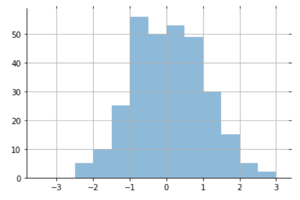
import matplotlib.pyplot as plt
import numpy as np
import mathx = np.random.normal(loc = 0.0, scale=1.0, size=300)
width = 0.5
bins = np.arange(math.floor(x.min())-width,math.ceil(x.max())+width,width)
ax = plt.subplot(111)# 边框不可见
ax.spines['top'].set_visible(False)
ax.spines['right'].set_visible(False)
# 刻度不可见
plt.tick_params(bottom='off',top='off',left='off',right='off')
# 显示网格
plt.grid()
plt.hist(x,alpha = 0.5,bins = bins)
plt.show()
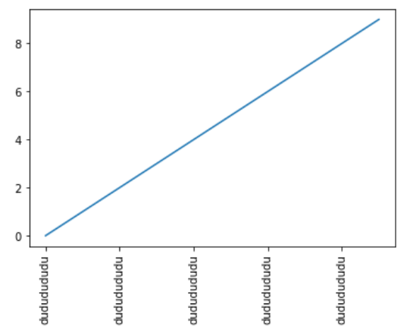
x = range(10)
y = range(10)labels = ['dududududu' for i in range(10)]
fig,ax = plt.subplots()
plt.plot(x,y)
# 标签显示不全; rotation
ax.set_xticklabels(labels,rotation=90)
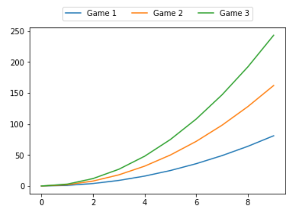
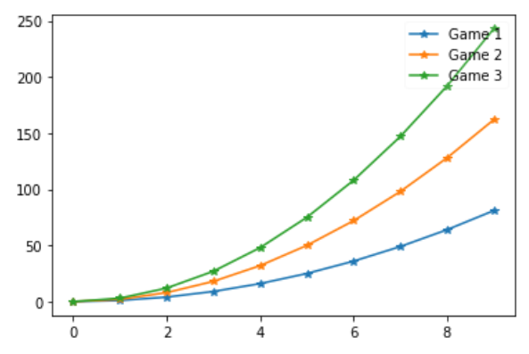
x = np.arange(10)
for i in range(1,4):plt.plot(x,i*x**2,label = "Game %d"%i)
# 设置图例样式
plt.legend(loc='upper center',bbox_to_anchor = (0.5,1.15), ncol=3)
x = np.arange(10)
for i in range(1,4):plt.plot(x,i*x**2,label = "Game %d"%i,marker='*')
# 设置图例透明度
plt.legend(loc='upper right',framealpha=0.1)
直方图&散点图
直方图
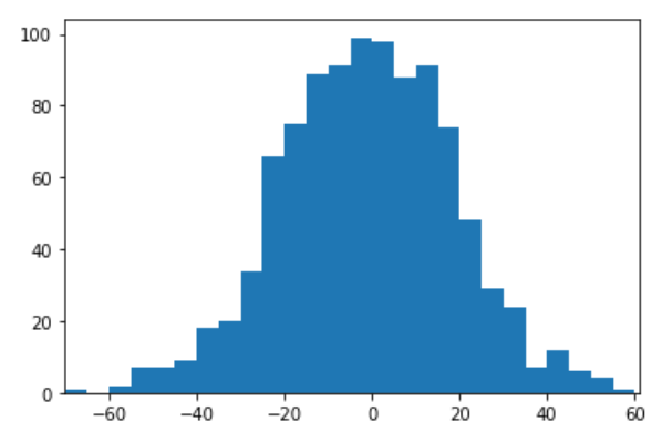
import numpy as np
import matplotlib.pyplot as pltdata = np.random.normal(0,20,1000)
bins = np.arange(-100,100,5)plt.hist(data,bins=bins)
# 设置x轴的边距
plt.xlim([min(data)-5,max(data)+5])
plt.show()
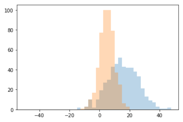
import random
data1 = [random.gauss(15,10) for i in range(500)]
data2 = [random.gauss(5,5) for i in range(500)]
bins = np.arange(-50,50,2.5)plt.hist(data1, bins=bins,label='class 1',alpha=0.3)
plt.hist(data2, bins=bins,label='class 2',alpha=0.3)
plt.show()
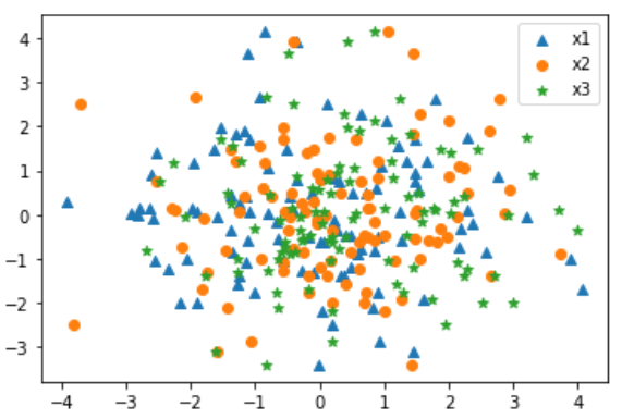
散点图
mu_vecl = np.array([0,0])
cov_matl = np.array([[2,0],[0,2]])x1_samples = np.random.multivariate_normal(mu_vecl,cov_matl,100)
x2_samples = np.random.multivariate_normal(mu_vecl+0.2,cov_matl+0.2,100)
x3_samples = np.random.multivariate_normal(mu_vecl+0.4,cov_matl+0.4,100)plt.scatter(x1_samples[:,0],x1_samples[:,1],marker='^',label='x1')
plt.scatter(x2_samples[:,0],x1_samples[:,1],marker='o',label='x2')
plt.scatter(x3_samples[:,0],x1_samples[:,1],marker='*',label='x3')
plt.legend()
plt.show()
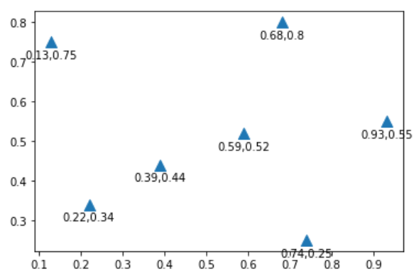
x =[0.13,0.22,0.39,0.59,0.68,0.74,0.93]
y =[0.75,0.34,0.44,0.52,0.80,0.25,0.55]plt.scatter(x,y,marker='^',s=100)
# 添加坐标标注
for x,y in zip(x,y):plt.annotate('%s,%s'%(x,y),xy=(x,y),xytext=(0,-15),textcoords='offset points',ha='center')
plt.show()
pie&子图布局
%matplotlib inline
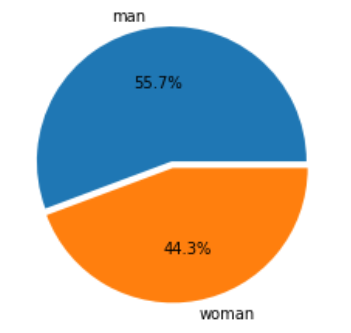
import matplotlib.pyplot as pltm = 51212
f = 40742# 显示详细数据 '%1.1f%%'
plt.pie([m,f],autopct='%1.1f%%',explode=[0,0.05],labels=['man','woman'])
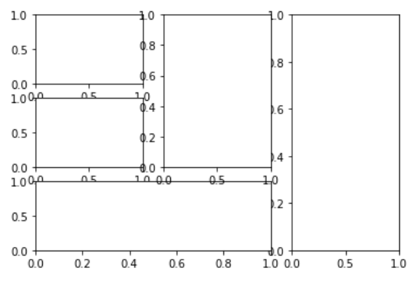
ax1 = plt.subplot2grid((3,3),(0,0))
ax2 = plt.subplot2grid((3,3),(1,0))
ax3 = plt.subplot2grid((3,3),(0,2),rowspan=3)
ax4 = plt.subplot2grid((3,3),(2,0),colspan=2)
ax5 = plt.subplot2grid((3,3),(0,1),rowspan=2)