我们将使用轮廓分数和一些距离指标来执行时间序列聚类实验,并且进行可视化
让我们看看下面的时间序列:

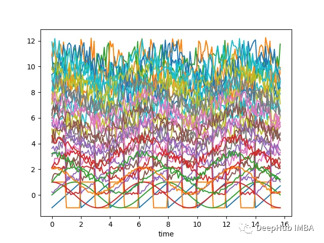
如果沿着y轴移动序列添加随机噪声,并随机化这些序列,那么它们几乎无法分辨,如下图所示-现在很难将时间序列列分组为簇:
上面的图表是使用以下脚本创建的:
# Import necessary librariesimport osimport pandas as pdimport numpy as np# Import random module with an alias 'rand'import random as randfrom scipy import signal# Import the matplotlib library for plottingimport matplotlib.pyplot as plt# Generate an array 'x' ranging from 0 to 5*pi with a step of 0.1x = np.arange(0, 5*np.pi, 0.1)# Generate square, sawtooth, sin, and cos waves based on 'x'y_square = signal.square(np.pi * x)y_sawtooth = signal.sawtooth(np.pi * x)y_sin = np.sin(x)y_cos = np.cos(x)# Create a DataFrame 'df_waves' to store the waveformsdf_waves = pd.DataFrame([x, y_sawtooth, y_square, y_sin, y_cos]).transpose()# Rename the columns of the DataFrame for claritydf_waves = df_waves.rename(columns={0: 'time',1: 'sawtooth',2: 'square',3: 'sin',4: 'cos'})# Plot the original waveforms against timedf_waves.plot(x='time', legend=False)plt.show()# Add noise to the waveforms and plot them againfor col in df_waves.columns:if col != 'time':for i in range(1, 10):# Add noise to each waveform based on 'i' and a random valuedf_waves['{}_{}'.format(col, i)] = df_waves[col].apply(lambda x: x + i + rand.random() * 0.25 * i)# Plot the waveforms with added noise against timedf_waves.plot(x='time', legend=False)plt.show()
现在我们需要确定聚类的基础。这里有两种方法:
把接近于一组的波形分组——较低欧几里得距离的波形将聚在一起。
把看起来相似的波形分组——它们有相似的形状,但欧几里得距离可能不低
距离度量
一般来说,我们希望根据形状对时间序列进行分组,对于这样的聚类-可能希望使用距离度量,如相关性,这些度量或多或少与波形的线性移位无关。
让我们看看上面定义的带有噪声的波形对之间的欧几里得距离和相关性的热图:
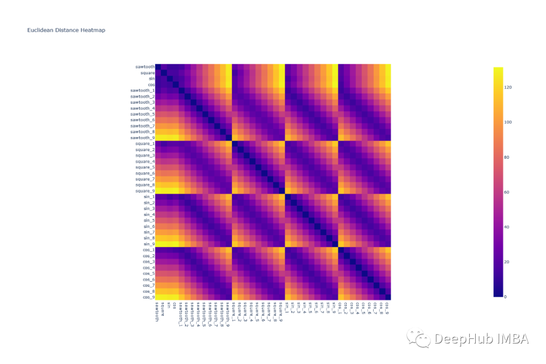
可以看到欧几里得距离对波形进行分组是很困难的,因为任何一组波形对的模式都是相似的。例如,除了对角线元素外,square & cos之间的相关形状与square和square之间的相关形状非常相似

所有的形状都可以很容易地使用相关热图组合在一起——因为类似的波形具有非常高的相关性(sin-sin对),而像sin和cos这样的波形几乎没有相关性。
轮廓分数
通过上面热图和分析,根据高相关性分配组看起来是一个好主意,但是我们如何定义相关阈值呢?看起来像一个迭代过程,容易出现不准确和大量的人工工作。
在这种情况下,我们可以使用轮廓分数(Silhouette score),它为执行的聚类分配一个分数。我们的目标是使轮廓分数最大化。
轮廓分数(Silhouette Score)是一种用于评估聚类质量的指标,它可以帮助你确定数据点是否被正确地分配到它们的簇中。较高的轮廓分数表示簇内数据点相互之间更加相似,而不同簇之间的数据点差异更大,这通常是良好的聚类结果。
轮廓分数的计算方法如下:
- 对于每个数据点 i,计算以下两个值:- a(i):数据点 i 到同一簇中所有其他点的平均距离(簇内平均距离)。- b(i):数据点 i 到与其不同簇中的所有簇的平均距离,取最小值(最近簇的平均距离)。
- 然后,计算每个数据点的轮廓系数 s(i),它定义为:s(i) = \frac{b(i) - a(i)}{\max{a(i), b(i)}}
- 最后,计算整个数据集的轮廓分数,它是所有数据点的轮廓系数的平均值:\text{轮廓分数} = \frac{1}{N} \sum_{i=1}^{N} s(i)
其中,N 是数据点的总数。
轮廓分数的取值范围在 -1 到 1 之间,具体含义如下:
- 轮廓分数接近1:表示簇内数据点相似度高,不同簇之间的差异很大,是一个好的聚类结果。
- 轮廓分数接近0:表示数据点在簇内的相似度与簇间的差异相当,可能是重叠的聚类或者不明显的聚类。
- 轮廓分数接近-1:表示数据点更适合分配到其他簇,不同簇之间的差异相比簇内差异更小,通常是一个糟糕的聚类结果。
一些重要的知识点:
在所有点上的高平均轮廓分数(接近1)表明簇的定义良好且明显。
低或负的平均轮廓分数(接近-1)表明重叠或形成不良的集群。
0左右的分数表示该点位于两个簇的边界上。
聚类
现在让我们尝试对时间序列进行分组。我们已经知道存在四种不同的波形,因此理想情况下应该有四个簇。
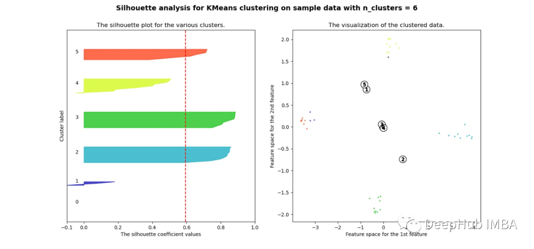
欧氏距离
pca = decomposition.PCA(n_components=2)pca.fit(df_man_dist_euc)df_fc_cleaned_reduced_euc = pd.DataFrame(pca.transform(df_man_dist_euc).transpose(), index = ['PC_1','PC_2'],columns = df_man_dist_euc.transpose().columns)index = 0range_n_clusters = [2, 3, 4, 5, 6, 7, 8]# Iterate over different cluster numbersfor n_clusters in range_n_clusters:# Create a subplot with silhouette plot and cluster visualizationfig, (ax1, ax2) = plt.subplots(1, 2)fig.set_size_inches(15, 7)# Set the x and y axis limits for the silhouette plotax1.set_xlim([-0.1, 1])ax1.set_ylim([0, len(df_man_dist_euc) + (n_clusters + 1) * 10])# Initialize the KMeans clusterer with n_clusters and random seedclusterer = KMeans(n_clusters=n_clusters, n_init="auto", random_state=10)cluster_labels = clusterer.fit_predict(df_man_dist_euc)# Calculate silhouette score for the current cluster configurationsilhouette_avg = silhouette_score(df_man_dist_euc, cluster_labels)print("For n_clusters =", n_clusters, "The average silhouette_score is :", silhouette_avg)sil_score_results.loc[index, ['number_of_clusters', 'Euclidean']] = [n_clusters, silhouette_avg]index += 1# Calculate silhouette values for each samplesample_silhouette_values = silhouette_samples(df_man_dist_euc, cluster_labels)y_lower = 10# Plot the silhouette plotfor i in range(n_clusters):# Aggregate silhouette scores for samples in the cluster and sort themith_cluster_silhouette_values = sample_silhouette_values[cluster_labels == i]ith_cluster_silhouette_values.sort()# Set the y_upper value for the silhouette plotsize_cluster_i = ith_cluster_silhouette_values.shape[0]y_upper = y_lower + size_cluster_icolor = cm.nipy_spectral(float(i) / n_clusters)# Fill silhouette plot for the current clusterax1.fill_betweenx(np.arange(y_lower, y_upper), 0, ith_cluster_silhouette_values, facecolor=color, edgecolor=color, alpha=0.7)# Label the silhouette plot with cluster numbersax1.text(-0.05, y_lower + 0.5 * size_cluster_i, str(i))y_lower = y_upper + 10 # Update y_lower for the next plot# Set labels and title for the silhouette plotax1.set_title("The silhouette plot for the various clusters.")ax1.set_xlabel("The silhouette coefficient values")ax1.set_ylabel("Cluster label")# Add vertical line for the average silhouette scoreax1.axvline(x=silhouette_avg, color="red", linestyle="--")ax1.set_yticks([]) # Clear the yaxis labels / ticksax1.set_xticks([-0.1, 0, 0.2, 0.4, 0.6, 0.8, 1])# Plot the actual clusterscolors = cm.nipy_spectral(cluster_labels.astype(float) / n_clusters)ax2.scatter(df_fc_cleaned_reduced_euc.transpose().iloc[:, 0], df_fc_cleaned_reduced_euc.transpose().iloc[:, 1],marker=".", s=30, lw=0, alpha=0.7, c=colors, edgecolor="k")# Label the clusters and cluster centerscenters = clusterer.cluster_centers_ax2.scatter(centers[:, 0], centers[:, 1], marker="o", c="white", alpha=1, s=200, edgecolor="k")for i, c in enumerate(centers):ax2.scatter(c[0], c[1], marker="$%d$" % i, alpha=1, s=50, edgecolor="k")# Set labels and title for the cluster visualizationax2.set_title("The visualization of the clustered data.")ax2.set_xlabel("Feature space for the 1st feature")ax2.set_ylabel("Feature space for the 2nd feature")# Set the super title for the whole plotplt.suptitle("Silhouette analysis for KMeans clustering on sample data with n_clusters = %d" % n_clusters,fontsize=14, fontweight="bold")plt.savefig('sil_score_eucl.png')plt.show()

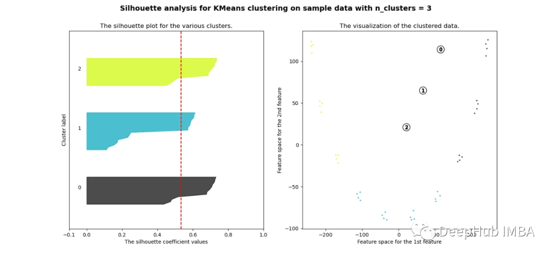

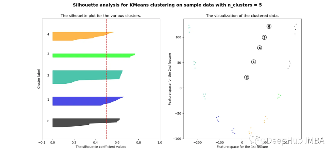
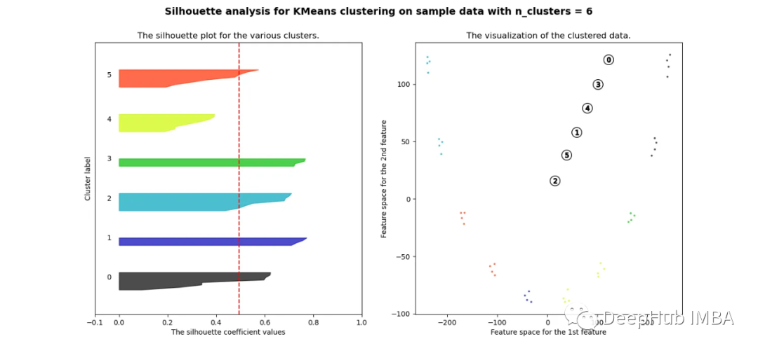
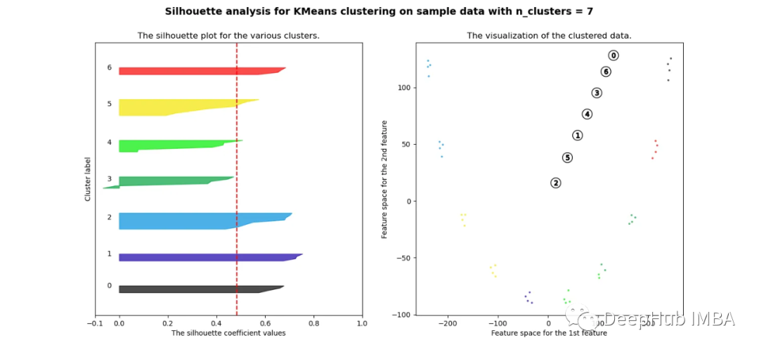

可以看到无论分成多少簇,数据都是混合的,并不能为任何数量的簇提供良好的轮廓分数。这与我们基于欧几里得距离热图的初步评估的预期一致
相关性
pca = decomposition.PCA(n_components=2)pca.fit(df_man_dist_corr)df_fc_cleaned_reduced_corr = pd.DataFrame(pca.transform(df_man_dist_corr).transpose(), index = ['PC_1','PC_2'],columns = df_man_dist_corr.transpose().columns)index=0range_n_clusters = [2,3,4,5,6,7,8]for n_clusters in range_n_clusters:# Create a subplot with 1 row and 2 columnsfig, (ax1, ax2) = plt.subplots(1, 2)fig.set_size_inches(15, 7)# The 1st subplot is the silhouette plot# The silhouette coefficient can range from -1, 1 but in this example all# lie within [-0.1, 1]ax1.set_xlim([-0.1, 1])# The (n_clusters+1)*10 is for inserting blank space between silhouette# plots of individual clusters, to demarcate them clearly.ax1.set_ylim([0, len(df_man_dist_corr) + (n_clusters + 1) * 10])# Initialize the clusterer with n_clusters value and a random generator# seed of 10 for reproducibility.clusterer = KMeans(n_clusters=n_clusters, n_init="auto", random_state=10)cluster_labels = clusterer.fit_predict(df_man_dist_corr)# The silhouette_score gives the average value for all the samples.# This gives a perspective into the density and separation of the formed# clusterssilhouette_avg = silhouette_score(df_man_dist_corr, cluster_labels)print("For n_clusters =",n_clusters,"The average silhouette_score is :",silhouette_avg,)sil_score_results.loc[index,['number_of_clusters','corrlidean']] = [n_clusters,silhouette_avg]index=index+1sample_silhouette_values = silhouette_samples(df_man_dist_corr, cluster_labels)y_lower = 10for i in range(n_clusters):# Aggregate the silhouette scores for samples belonging to# cluster i, and sort themith_cluster_silhouette_values = sample_silhouette_values[cluster_labels == i]ith_cluster_silhouette_values.sort()size_cluster_i = ith_cluster_silhouette_values.shape[0]y_upper = y_lower + size_cluster_icolor = cm.nipy_spectral(float(i) / n_clusters)ax1.fill_betweenx(np.arange(y_lower, y_upper),0,ith_cluster_silhouette_values,facecolor=color,edgecolor=color,alpha=0.7,)# Label the silhouette plots with their cluster numbers at the middleax1.text(-0.05, y_lower + 0.5 * size_cluster_i, str(i))# Compute the new y_lower for next ploty_lower = y_upper + 10 # 10 for the 0 samplesax1.set_title("The silhouette plot for the various clusters.")ax1.set_xlabel("The silhouette coefficient values")ax1.set_ylabel("Cluster label")# The vertical line for average silhouette score of all the valuesax1.axvline(x=silhouette_avg, color="red", linestyle="--")ax1.set_yticks([]) # Clear the yaxis labels / ticksax1.set_xticks([-0.1, 0, 0.2, 0.4, 0.6, 0.8, 1])# 2nd Plot showing the actual clusters formedcolors = cm.nipy_spectral(cluster_labels.astype(float) / n_clusters)ax2.scatter(df_fc_cleaned_reduced_corr.transpose().iloc[:, 0], df_fc_cleaned_reduced_corr.transpose().iloc[:, 1], marker=".", s=30, lw=0, alpha=0.7, c=colors, edgecolor="k")# for i in range(len(df_fc_cleaned_cleaned_reduced.transpose().iloc[:, 0])):# ax2.annotate(list(df_fc_cleaned_cleaned_reduced.transpose().index)[i], # (df_fc_cleaned_cleaned_reduced.transpose().iloc[:, 0][i], # df_fc_cleaned_cleaned_reduced.transpose().iloc[:, 1][i] + 0.2))# Labeling the clusterscenters = clusterer.cluster_centers_# Draw white circles at cluster centersax2.scatter(centers[:, 0],centers[:, 1],marker="o",c="white",alpha=1,s=200,edgecolor="k",)for i, c in enumerate(centers):ax2.scatter(c[0], c[1], marker="$%d$" % i, alpha=1, s=50, edgecolor="k")ax2.set_title("The visualization of the clustered data.")ax2.set_xlabel("Feature space for the 1st feature")ax2.set_ylabel("Feature space for the 2nd feature")plt.suptitle("Silhouette analysis for KMeans clustering on sample data with n_clusters = %d"% n_clusters,fontsize=14,fontweight="bold",)plt.show()
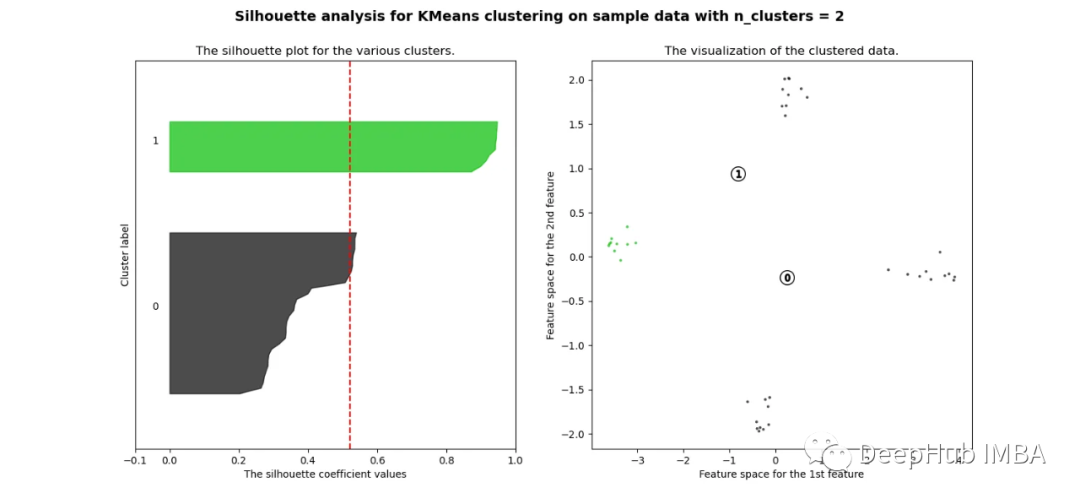


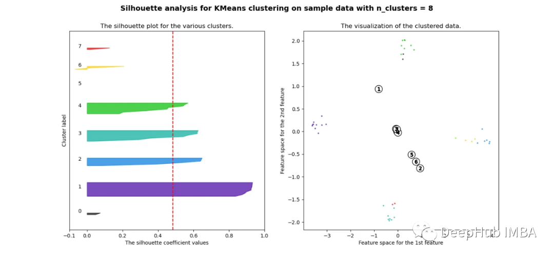
当选择的簇数为4时,我们可以清楚地看到分离的簇,其他结果通常比欧氏距离要好得多。
欧几里得距离与相关廓形评分的比较
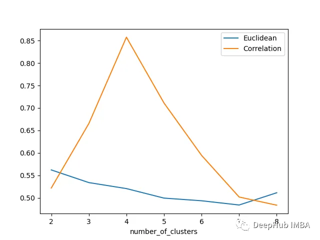
轮廓分数表明基于相关性的距离矩阵在簇数为4时效果最好,而在欧氏距离的情况下效果就不那么明显了结论
总结
在本文中,我们研究了如何使用欧几里得距离和相关度量执行时间序列聚类,并观察了这两种情况下的结果如何变化。如果我们在评估聚类时结合Silhouette,我们可以使聚类步骤更加客观,因为它提供了一种很好的直观方式来查看聚类的分离情况。
https://avoid.overfit.cn/post/939876c1609140ac803b86209d8ee7ab
作者:Girish Dev Kumar Chaurasiya