我想大家在做布局的时候,没接触flex布局之前,大家都是用浮动来布局的,但现在我们接触了flex布局之后,我只能说:“真香”。让我为大家介绍一下弹性盒子模型吧!
Flexible Box 弹性盒子
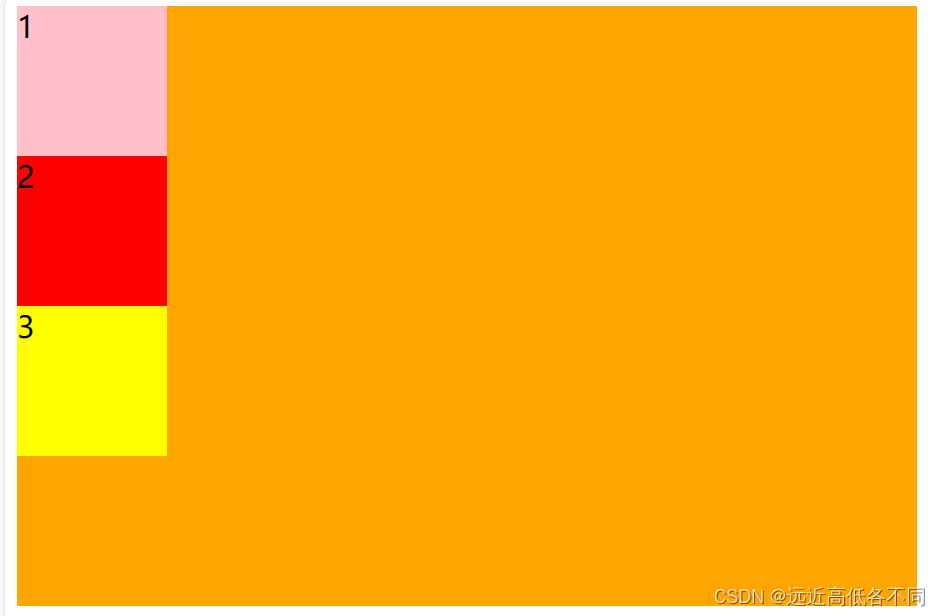
在我们使用弹性盒子时,我们需要给父级添加display:flex;
这是没给父级添加display:flex;时的样子:
这是给父级添加了display:flex;时的样子:

大家看,这是不是浮动该做的事情呀,我们flex也可以做,而且可以更简单更轻松的完成我们的布局,让我为大家介绍一下吧!
写在父级上常用的属性
一.父级添加:
1.display:flex(给父级添加)
不添加这个是开启不了flex布局的,flex的其他方法全部没有效果
.father {/* 给父级宽高,开启弹性盒子布局 */display: flex;width: 600px;height: 400px;background-color: orange;}.father .son {font-size: 20px;width: 100px;height: 100px;}
2.flex-direction(给父级添加)
改变主轴方向
| 属性值 | 描述 |
|---|---|
| row | 默认值,主轴水平,子元素从左到右排列 |
| row-reverse | 主轴水平,子元素从右到左排列 |
| column | 主轴垂直,子元素从上到下排列 |
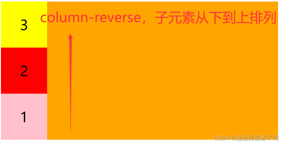
| column-reverse | 主轴垂直,子元素从下到上排列 |
效果图:
row:
row-reverse:
column:
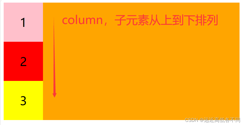
column-reverse:
flex-direction代码总结:
<!DOCTYPE html>
<html lang="en">
<head><meta charset="UTF-8"><title>display</title><style>.father {/* 给父级宽高,开启弹性盒子布局 */display: flex;width: 600px;height: 300px;background-color: orange;flex-direction: row; /* 默认值 *//* flex-direction: row-reverse; *//* flex-direction: column; *//* flex-direction: column-reverse; */}.father .son {text-align: center;line-height: 100px;font-size: 30px;width: 100px;height: 100px;}.father .son:nth-child(1){background-color: pink;}.father .son:nth-child(2){background-color: red;}.father .son:nth-child(3){background-color: yellow;}</style>
</head>
<body><div class="father"><div class="son">1</div><div class="son">2</div><div class="son">3</div></div>
</body>
</html>
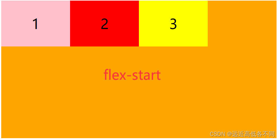
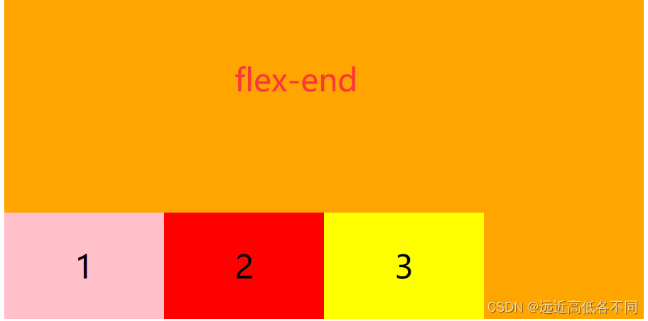
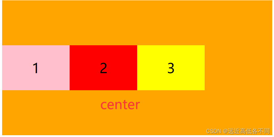
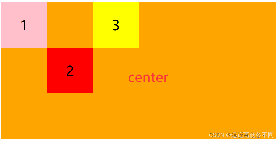
3.justify-content(给父级添加)
设置主轴上子元素的对齐方式
| 属性值 | 描述 |
|---|---|
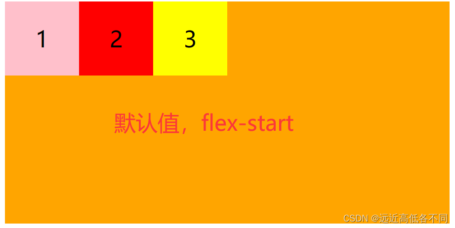
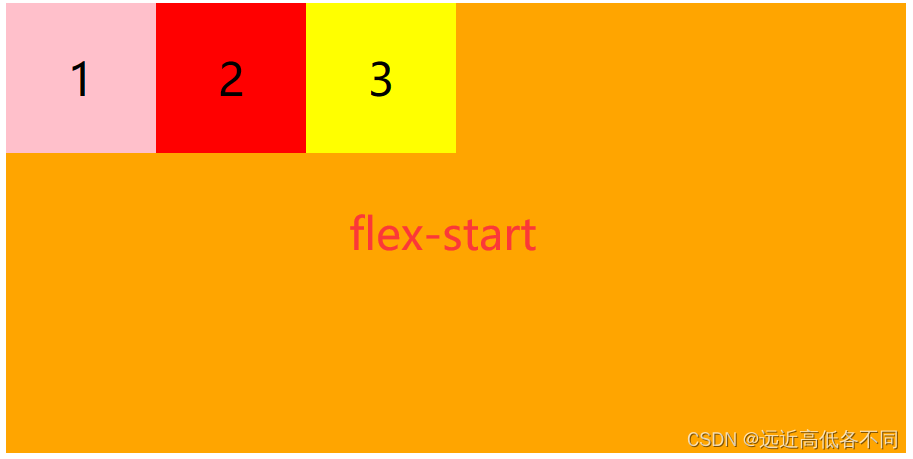
| flex-start | 默认值,所有子元素与主轴起始线对齐 |
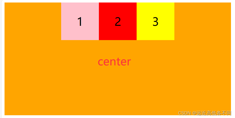
| center | 所有子元素与主轴中心线对齐 |
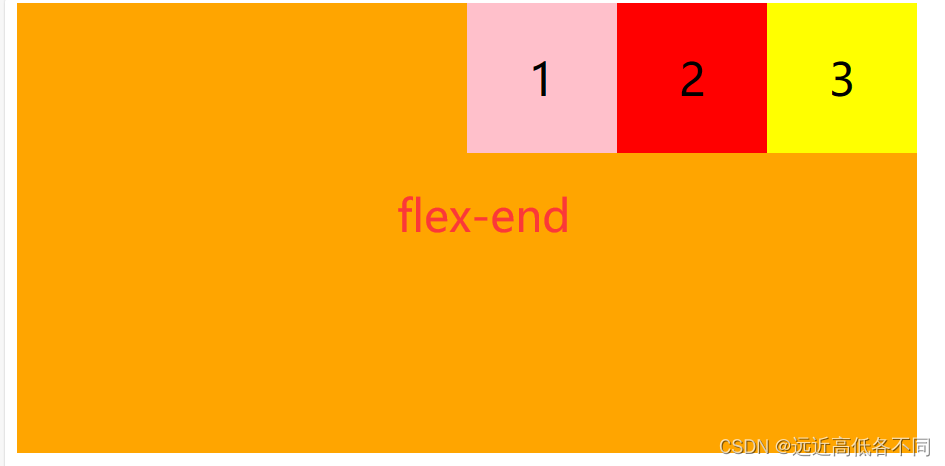
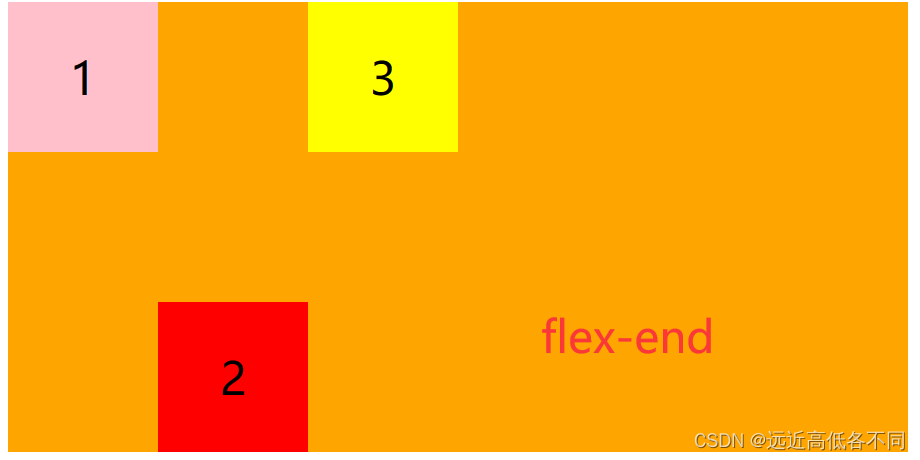
| flex-end | 所有子元素与主轴终止线对齐 |
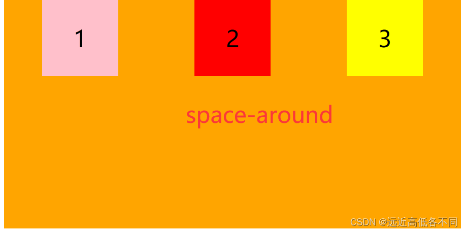
| space-around | 平均分配剩余空间但左右缝隙是中间的一半 |
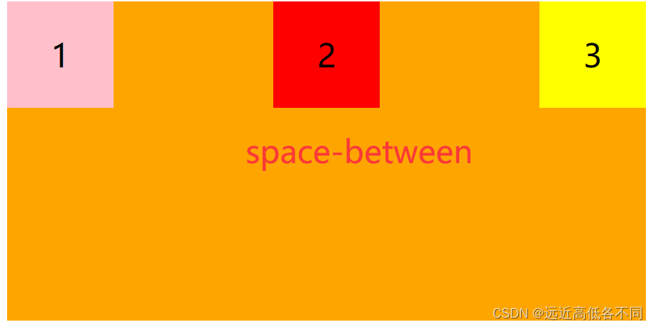
| space-between | 先紧贴两边再平分剩余空间 |
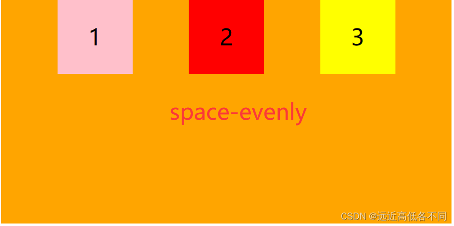
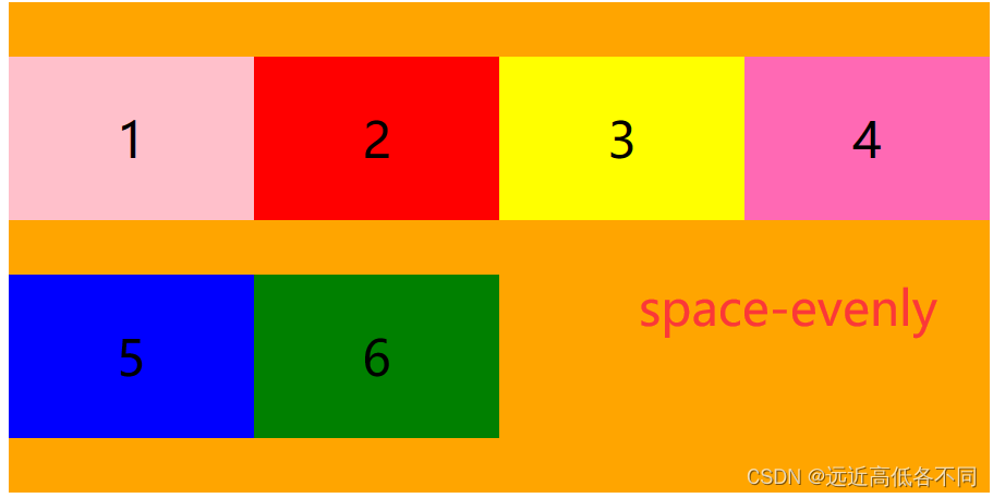
| space-evenly | 平均分配空间 |
效果图:
flex-start:
center:
flex-end:
space-around:
space-between:
space-evenly:
flex-direction代码总结:
<!DOCTYPE html>
<html lang="en">
<head><meta charset="UTF-8"><title>justify-content</title><style>.father {/* 给父级宽高,开启弹性盒子布局 */display: flex;width: 600px;height: 300px;background-color: orange;justify-content: flex-start;/* justify-content: center; *//* justify-content: flex-end; *//* justify-content: space-around; *//* justify-content: space-between; *//* justify-content: space-evenly; */}.father .son {text-align: center;line-height: 100px;font-size: 30px;width: 100px;height: 100px;}.father .son:nth-child(1){background-color: pink;}.father .son:nth-child(2){background-color: red;}.father .son:nth-child(3){background-color: yellow;}</style>
</head>
<body><div class="father"><div class="son">1</div><div class="son">2</div><div class="son">3</div></div>
</body>
</html>
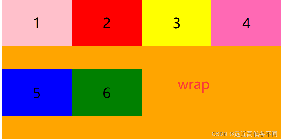
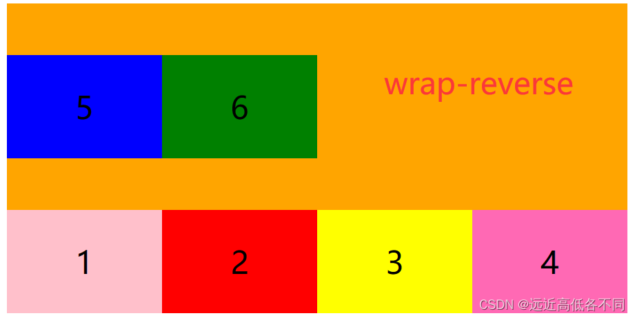
4.flex-wrap(给父级添加)
设置子元素是否换行
| 属性值 | 描述 |
|---|---|
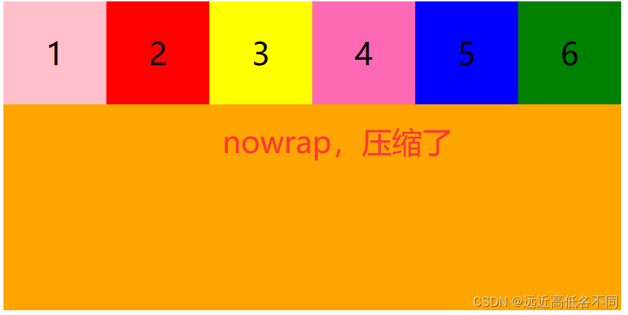
| nowrap | 默认值,默认不换行,在一行显示 |
| wrap | 换行显示,第一行顶在上方 |
| wrap-reverse | 换行显示,第一行顶在下方 |
效果图:
nowrap:
wrap:
wrap-reverse:
flex-wrap代码总结:
<!DOCTYPE html>
<html lang="en">
<head><meta charset="UTF-8"><title>flex-wrap</title><style>.father {/* 给父级宽高,开启弹性盒子布局 */display: flex;width: 600px;height: 300px;background-color: orange;flex-wrap: nowrap;/* flex-wrap: wrap; *//* flex-wrap: wrap-reverse; */}.father .son {text-align: center;line-height: 100px;font-size: 30px;width: 150px;height: 100px;}.father .son:nth-child(1){background-color: pink;}.father .son:nth-child(2){background-color: red;}.father .son:nth-child(3){background-color: yellow;}.father .son:nth-child(4){background-color: hotpink;}.father .son:nth-child(5){background-color: blue;}.father .son:nth-child(6){background-color: green;}</style>
</head>
<body><div class="father"><div class="son">1</div><div class="son">2</div><div class="son">3</div><div class="son">4</div><div class="son">5</div><div class="son">6</div></div>
</body>
</html>
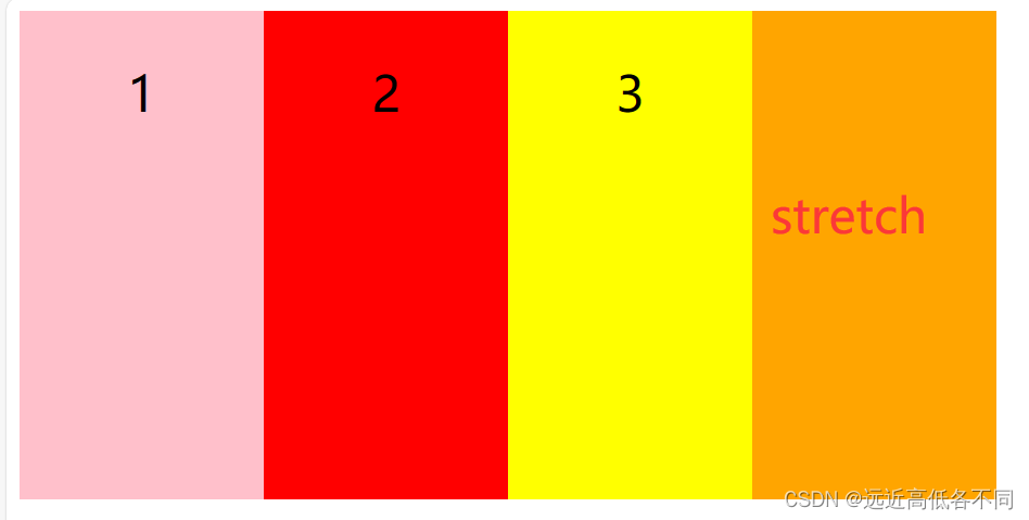
5.align-items(给父级添加)
设置侧轴上的子元素排列方式(单行)
**特别注意:**这是单行的情况下
| 属性值 | 描述 |
|---|---|
| stretch | 默认值,如果子级没高度,各行将会伸展以占用剩余的空间 |
| flex-start | 所有子元素与侧轴起始线对齐 |
| flex-end | 所有子元素与侧轴中终止线对齐 |
| center | 所有子元素与侧轴中心线对齐 |
效果图:
stretch(当没给子级高度时):
flex-start:
flex-end:
center:
align-items:
<!DOCTYPE html>
<html lang="en">
<head><meta charset="UTF-8"><title>align-items</title><style>.father {/* 给父级宽高,开启弹性盒子布局 */display: flex;width: 600px;height: 300px;background-color: orange;/* align-items: stretch; */align-items: flex-start;/* align-items: flex-end; *//* align-items: center; */}.father .son {text-align: center;line-height: 100px;font-size: 30px;width: 150px;height: 100px;}.father .son:nth-child(1){background-color: pink;}.father .son:nth-child(2){background-color: red;}.father .son:nth-child(3){background-color: yellow;}</style>
</head>
<body><div class="father"><div class="son">1</div><div class="son">2</div><div class="son">3</div></div>
</body>
</html>
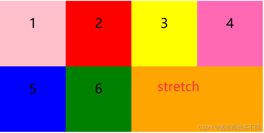
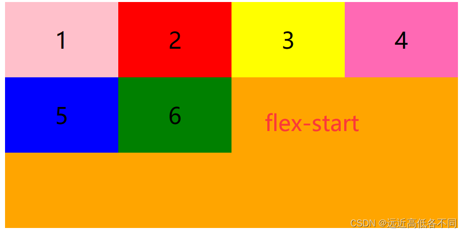
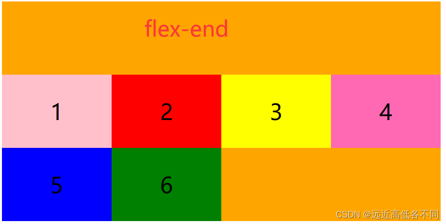
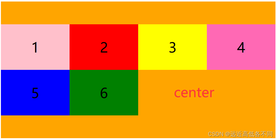
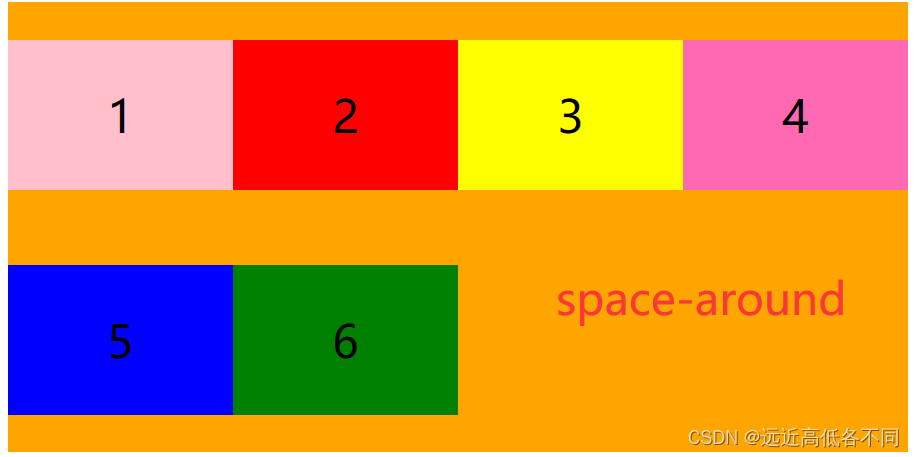
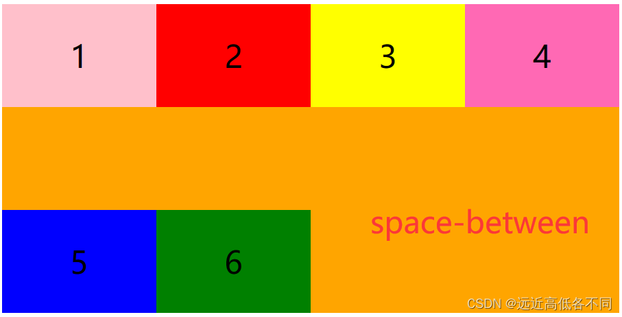
6.align-content(给父级添加)
设置侧轴上子元素的排列方式(多行)
需要与flex-wrap一起使用
注意:多行的情况下,修改 flex-wrap 属性的行为,类似 align-items, 但不是设置子元素对齐,而是设置行对齐
| 属性值 | 描述 |
|---|---|
| stretch | 默认值,如果子级没高度,各行将会伸展以占用剩余的空间 |
| flex-start | 所有子元素与侧轴起始线对齐 |
| flex-end | 所有子元素与侧轴中终止线对齐 |
| center | 所有子元素与侧轴中心线对齐 |
| space-around | 平均分配剩余空间但上下缝隙是中间的一半 |
| space-between | 先紧贴两边再平分剩余空间 |
| space-evenly | 平均分配空间 |
效果图:
stretch:
flex-start:
flex-end:
center:
space-around:
space-between:
space-evenly:
align-content:
<!DOCTYPE html>
<html lang="en">
<head><meta charset="UTF-8"><title>align-content</title><style>.father {/* 给父级宽高,开启弹性盒子布局 */display: flex;width: 600px;height: 300px;background-color: orange;flex-wrap: wrap;/* align-content: stretch; */align-content: flex-start;/* align-content: flex-end; *//* align-content: center; *//* align-content: space-around; *//* align-content: space-between; *//* align-content: space-evenly; */}.father .son {text-align: center;line-height: 100px;font-size: 30px;width: 150px;height: 100px;}.father .son:nth-child(1){background-color: pink;}.father .son:nth-child(2){background-color: red;}.father .son:nth-child(3){background-color: yellow;}.father .son:nth-child(4){background-color: hotpink;}.father .son:nth-child(5){background-color: blue;}.father .son:nth-child(6){background-color: green;}</style>
</head>
<body><div class="father"><div class="son">1</div><div class="son">2</div><div class="son">3</div><div class="son">4</div><div class="son">5</div><div class="son">6</div></div>
</body>
</html>
7.flex-flow(给父级添加)
复合属性,把设置主轴方向和是否换行(换列)简写
语法:flex-flow :主轴方向 是否换行;
主轴方向与是否换行请看2与4的介绍
二.子级添加
1.align-self
用于设置弹性元素自身在侧轴(纵轴)方向上的对齐方式。
注:给子元素设置
| 属性值 | 描述 |
|---|---|
| auto | 默认值,计算值为元素的父元素的’align-items’值,如果其没有父元素,则计算值为’stretch’。 |
| flex-start | 弹性盒子元素的侧轴(纵轴)起始位置的边界紧靠住该行的侧轴起始边界 |
| flex-end | 弹性盒子元素的侧轴(纵轴)起始位置的边界紧靠住该行的侧轴结束边界 |
| center | 弹性盒子元素在该行的侧轴(纵轴)上居中放置。(如果该行的尺寸小于弹性盒子元素的尺寸,则会向两个方向溢出相同的长度) |
| stretch | 在交叉轴方向上拉伸 |
| baseline | 如弹性盒子元素的行内轴与侧轴为同一条,则该值与’flex-start’等效。其它情况下,该值将参与基线对齐 |
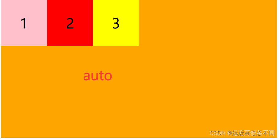
效果图:
auto:
flex-start:
flex-end:
center:
align-self代码:
<!DOCTYPE html>
<html lang="en">
<head><meta charset="UTF-8"><title>flex-self</title><style>.father {/* 给父级宽高,开启弹性盒子布局 */display: flex;width: 600px;height: 300px;background-color: orange;}.father .son {text-align: center;line-height: 100px;font-size: 30px;width: 100px;height: 100px;}.father .son:nth-child(1){background-color: pink;}.father .son:nth-child(2){background-color: red;align-self: auto;/* align-self: flex-start; *//* align-self: flex-end; *//* align-self: center; *//* align-self: stretch; *//* align-self: baseline; */}.father .son:nth-child(3){background-color: yellow;}</style>
</head>
<body><div class="father"><div class="son">1</div><div class="son">2</div><div class="son">3</div></div>
</body>
</html>
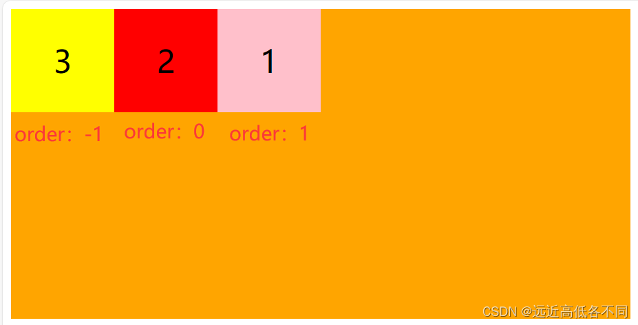
2.order(子级添加)
弹性子元素,排序,用整数值来定义排列顺序,数值小的排在最前面,可以 为负值,属性设置弹性容器内弹性子元素属性
<!DOCTYPE html>
<html lang="en">
<head><meta charset="UTF-8"><title>order</title><style>.father {/* 给父级宽高,开启弹性盒子布局 */display: flex;width: 600px;height: 300px;background-color: orange;}.father .son {text-align: center;line-height: 100px;font-size: 30px;width: 100px;height: 100px;}.father .son:nth-child(1){background-color: pink;order: 1;}.father .son:nth-child(2){background-color: red;order: 0;}.father .son:nth-child(3){background-color: yellow;order: -1;}</style>
</head>
<body><div class="father"><div class="son">1</div><div class="son">2</div><div class="son">3</div></div>
</body>
</html>
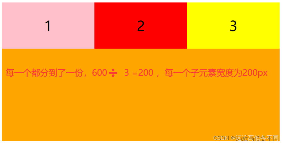
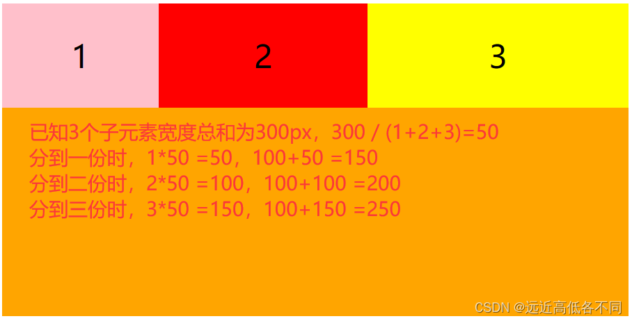
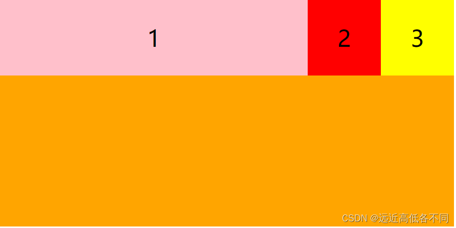
3.flex-grow
用来分配剩余空间,需要主轴上有剩余空间
| 属性值 | 描述 |
|---|---|
| initial | 默认值与0一样 |
| 0 | 不放大也不缩小 |
| number | 正数 |
| flex-grow每一份都为1时: |
但第一个元素为1,第二个为2,第三个为3时:
flex-grow代码:
<!DOCTYPE html>
<html lang="en">
<head><meta charset="UTF-8"><title>flex-grow</title><style>.father {/* 给父级宽高,开启弹性盒子布局 */display: flex;width: 600px;height: 300px;background-color: orange;}.father .son {text-align: center;line-height: 100px;font-size: 30px;width: 100px;height: 100px;}.father .son:nth-child(1){background-color: pink;flex-grow: 1;}.father .son:nth-child(2){background-color: red;flex-grow: 2;}.father .son:nth-child(3){background-color: yellow;flex-grow: 3;}</style>
</head>
<body><div class="father"><div class="son">1</div><div class="son">2</div><div class="son">3</div></div>
</body>
</html>
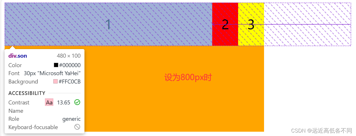
4.flex-base
会覆盖之前的width宽度,但该属性会被项目的min-width/min-height值覆盖
会自动计算主轴是否有多余空间
| 属性值 | 描述 |
|---|---|
| auto | 默认值,不发生改变 |
| % | 百分比 |
| 像素 | px |
我们给son1设置flex-base,如果3个元素的总宽度超出了父级,son1还会继续变宽吗?
会继续变宽,这是伸缩盒模型的缩,当我们宽度超出父级的时候,会缩回,让他们的宽度总和为600px
<!DOCTYPE html>
<html lang="en">
<head><meta charset="UTF-8"><title>flex-base</title><style>.father {/* 给父级宽高,开启弹性盒子布局 */display: flex;width: 600px;height: 300px;background-color: orange;}.father .son {text-align: center;line-height: 100px;font-size: 30px;width: 100px;height: 100px;}.father .son:nth-child(1){background-color: pink;flex-basis: 800px;}.father .son:nth-child(2){background-color: red;}.father .son:nth-child(3){background-color: yellow;}</style>
</head>
<body><div class="father"><div class="son">1</div><div class="son">2</div><div class="son">3</div></div>
</body>
</html>
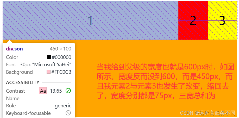
6.flex-shrink
flex-shrink 主要处理当 flex 容器空间不足时候,单个元素的收缩比例,当超出父级宽度时,每个子元素原本宽度减去按比例分配的值,其剩余值为实际宽度
当前子元素宽度超出了主轴空间多少: 子元素的总宽度 - 父级的宽度 = 需要消化的宽度
子元素子元素的收缩因子之和: n
每一份就是: 需要消化的宽度/n = f
每一个项目: 子元素的宽度- shrink的份数 * f = 缩放的宽度
flex-shrink代码:
<!DOCTYPE html>
<html lang="en">
<head><meta charset="UTF-8"><title>flex-base</title><style>.father {/* 给父级宽高,开启弹性盒子布局 */display: flex;width: 600px;height: 300px;background-color: orange;}.father .son {text-align: center;line-height: 100px;font-size: 30px;width: 100px;height: 100px;}.father .son:nth-child(1){background-color: pink;width: 420px;flex-shrink: 1;}.father .son:nth-child(2){background-color: red;flex-shrink: 1;}.father .son:nth-child(3){background-color: yellow;flex-shrink: 1;}</style>
</head>
<body><div class="father"><div class="son">1</div><div class="son">2</div><div class="son">3</div></div>
</body>
</html>
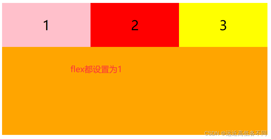
7.flex
项目缩放的简写,可以简写flex-grow flex-base flex-shrink
语法: flex: flex-grow flex-shrink flex-basis
推荐使用flex方法
常用:flex:1;对应flex: 1 1 auto
<!DOCTYPE html>
<html lang="en">
<head><meta charset="UTF-8"><title>flex</title><style>.father {/* 给父级宽高,开启弹性盒子布局 */display: flex;width: 600px;height: 300px;background-color: orange;}.father .son {text-align: center;line-height: 100px;font-size: 30px;width: 100px;height: 100px;}.father .son:nth-child(1){background-color: pink;flex: 1;}.father .son:nth-child(2){background-color: red;flex: 1;}.father .son:nth-child(3){background-color: yellow;flex: 1;}</style>
</head>
<body><div class="father"><div class="son">1</div><div class="son">2</div><div class="son">3</div></div>
</body>
</html>
感谢大家阅读,如有不对的地方,可以向我提出,感谢大家!