一、Badge
描述:给其他组件添加标记
子组件:支持单个子组件
1.创建数字标记
Badge(value: {count: number, position?: BadgePosition, maxCount?: number, style: BadgeStyle})
2.创建字符串标记
Badge(value: {value: string, position?: BadgePosition, style: BadgeStyle})
参数:
- count:数字标记数
- maxCount:最大消息数,默认值:99,超过时显示
- value:文本标记文案
- position:提示点显示位置。默认BadgePosition.RightTop
- RightTop:右上角
- Right:右侧居中
- Left:左侧居中
- style:设置样式,支持设置文本颜色、尺寸、圆点颜色和尺寸
- color:文本颜色,默认值:Color.White
- fontSize:文本大小,默认值:10
- badgeSize:大小
- badgeColor:颜色,默认值:Color.Red
使用案例:
@Entry
@Component
struct BadgePage {@State counts: number = 1@State message: string = 'new'build() {Column() {Row({ space: 20 }) {// 数字上标,maxCount默认99,超过99展示99+Badge({count: this.counts,maxCount: 99,position: BadgePosition.RightTop,style: { color: Color.White, fontSize: 16, badgeSize: 20, badgeColor: Color.Red }}) {Button('数字').onClick(() => {this.counts++}).width(80).height(50).backgroundColor(Color.Green)}.width(80).height(50)// 数字左标Badge({count: this.counts,maxCount: 10,position: BadgePosition.Left,style: { color: 0xFFFFFF, fontSize: 16, badgeSize: 20, badgeColor: Color.Red }}) {Button('数字').onClick(() => {this.counts++}).width(80).height(50).backgroundColor(Color.Green)}.width(80).height(50)// 数字右标Badge({count: this.counts,maxCount: 99,position: BadgePosition.Right,style: { color: Color.White, fontSize: 16, badgeSize: 20, badgeColor: Color.Red }}) {Button('数字').onClick(() => {this.counts++}).width(80).height(50).backgroundColor(Color.Green)}.width(80).height(50)}.margin(10)Row({ space: 30 }) {Badge({value: this.message,style: { color: Color.Yellow, fontSize: 9, badgeSize: 20, badgeColor: Color.Red }}) {Text('文本').width(80).height(50).fontSize(16).lineHeight(37).borderRadius(10).textAlign(TextAlign.Center).backgroundColor(Color.Green).fontColor(Color.White)}.width(80).height(50)// value为空,设置圆点标记Badge({value: '',position: BadgePosition.Left,style: { badgeSize: 6, badgeColor: Color.Red }}) {Text('文本').width(90).height(50).fontSize(16).lineHeight(37).borderRadius(10).textAlign(TextAlign.Center).backgroundColor(Color.Green).fontColor(Color.White)}.width(90).height(50)}.margin(10)}}
}
二、Column
描述:垂直布局容器
子组件:可以包含子组件
Column(value?:{space?: string | number})
参数:
- space:纵向布局元素间距
属性:
- alignItems:设置子组件在水平方向上的对齐格式
- justifyContent:设置子组件在垂直方向上的对齐格式
使用案例:
@Entry
@Component
struct ColumnPage {build() {Column({ space: 10 }) {//space:子组件之间的间距Column({ space: 10 }) {Text().width('100%').height(30).backgroundColor(Color.Green)Text().width('100%').height(30).backgroundColor(Color.Red)}.width('80%').height(100).border({ width: 1 })Column() {Text().width('50%').height(30).backgroundColor(Color.Yellow)Text().width('50%').height(30).backgroundColor(Color.Blue)Text().width('50%').height(30).backgroundColor(Color.Green)}//设置子组件沿水平方向的对齐方式.alignItems(HorizontalAlign.Start).width('80%').border({ width: 1 })Column() {Column().width('30%').height(30).backgroundColor(Color.Red)Column().width('30%').height(30).backgroundColor(Color.Blue)}.height('15%').border({ width: 1 }).width('80%')//设置子组件沿垂直方向的对齐方式.justifyContent(FlexAlign.End)Column() {Column().width('30%').height(30).backgroundColor(Color.Green)Column().width('30%').height(30).backgroundColor(Color.Orange)}.height('15%').border({ width: 1 }).width('80%').alignItems(HorizontalAlign.Center).justifyContent(FlexAlign.Center)}.width('100%').padding({ top: 5 })}
}
三、ColumnSplit
描述:带分割线的垂直布局
子组件:可以包含子组件
ColumnSplit()
属性:
- resizeable:分割线是否可拖拽,默认:false
使用案例:
@Entry
@Component
struct ColumnSplitPage {build() {Column(){ColumnSplit() {Text('1').width('100%').height(50).backgroundColor(Color.Red).textAlign(TextAlign.Center)Text('2').width('100%').height(50).backgroundColor(Color.Orange).textAlign(TextAlign.Center)Text('3').width('100%').height(50).backgroundColor(Color.Yellow).textAlign(TextAlign.Center)Text('4').width('100%').height(50).backgroundColor(Color.Green).textAlign(TextAlign.Center)Text('5').width('100%').height(50).backgroundColor(Color.Brown).textAlign(TextAlign.Center)}.resizeable(true).width('90%').height('60%')}.width('100%')}
}
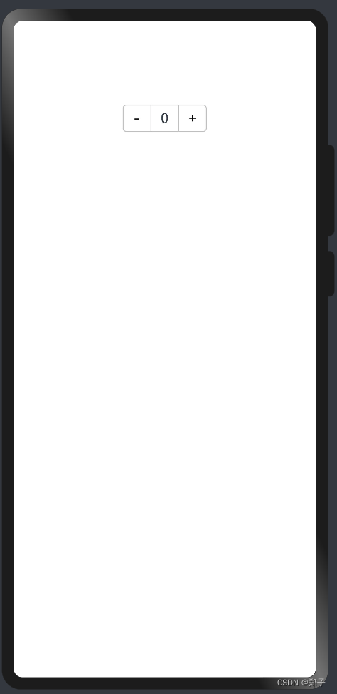
四、Counter
描述:计数器组件
子组件:可以包含子组件
Counter()
事件:
- onInc(event: () => void):监听数值增加事件
- onDec(event: () => void):监听数值减少事件
使用案例:
@Entry
@Component
struct CounterPage {@State value: number = 0build() {Column() {Counter() {Text(this.value.toString())}.margin(100).onInc(() => {this.value++}).onDec(() => {this.value--})}.width("100%")}
}
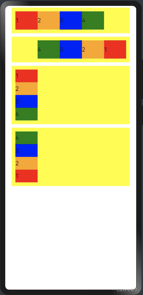
五、Flex
描述:弹性布局组件
子组件:可以包含子组件
Flex(value?: { direction?: FlexDirection, wrap?: FlexWrap, justifyContent?: FlexAlign, alignItems?: ItemAlign, alignContent?: FlexAlign })
参数:
参数名
参数类型
必填
默认值
参数描述
direction
FlexDirection
否
FlexDirection.Row
子组件在Flex容器上排列的方向,即主轴的方向
wrap
FlexWrap
否
FlexWrap.NoWrap
Flex容器是单行/列还是多行/列排列
justifyContent
FlexAlign
否
FlexAlign.Start
子组件在Flex容器主轴上的对齐格式
alignItems
ItemAlign
否
ItemAlign.Stretch
子组件在Flex容器交叉轴上的对齐格式
alignContent
FlexAlign
否
FlexAlign.Start
交叉轴中有额外的空间时,多行内容的对齐方式。仅在wrap为Wrap或WrapReverse下生效
使用案例:
@Entry
@Component
struct FlexPage {build() {Column() {Column({ space: 10 }) {Flex({ direction: FlexDirection.Row }) {Text('1').width('20%').height(50).backgroundColor(Color.Red)Text('2').width('20%').height(50).backgroundColor(Color.Orange)Text('3').width('20%').height(50).backgroundColor(Color.Blue)Text('4').width('20%').height(50).backgroundColor(Color.Green)}.height(70).width('90%').padding(10).backgroundColor(Color.Yellow)Flex({ direction: FlexDirection.RowReverse }) {Text('1').width('20%').height(50).backgroundColor(Color.Red)Text('2').width('20%').height(50).backgroundColor(Color.Orange)Text('3').width('20%').height(50).backgroundColor(Color.Blue)Text('4').width('20%').height(50).backgroundColor(Color.Green)}.height(70).width('90%').padding(10).backgroundColor(Color.Yellow)Flex({ direction: FlexDirection.Column }) {Text('1').width('20%').height(50).backgroundColor(Color.Red)Text('2').width('20%').height(50).backgroundColor(Color.Orange)Text('3').width('20%').height(50).backgroundColor(Color.Blue)Text('4').width('20%').height(50).backgroundColor(Color.Green)}.height(160).width('90%').padding(10).backgroundColor(Color.Yellow)Flex({ direction: FlexDirection.ColumnReverse }) {Text('1').width('20%').height(50).backgroundColor(Color.Red)Text('2').width('20%').height(50).backgroundColor(Color.Orange)Text('3').width('20%').height(50).backgroundColor(Color.Blue)Text('4').width('20%').height(50).backgroundColor(Color.Green)}.height(160).width('90%').padding(10).backgroundColor(Color.Yellow)}.width('100%').margin({ top: 5 })}.width('100%')}
}
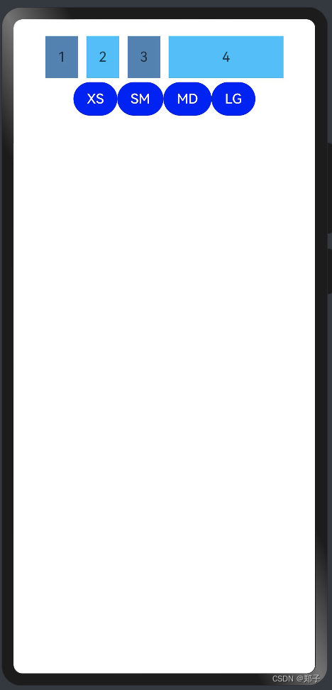
六、GridContainer
描述:纵向排布栅格布局容器,仅在栅格布局场景中使用
子组件:可以包含子组件
使用案例:
@Entry
@Component
struct GridContainerPage {@State sizeType: SizeType = SizeType.XSbuild() {Column({ space: 5 }) {GridContainer({ columns: 12, sizeType: this.sizeType, gutter: 10, margin: 20 }) {Row() {Text('1').useSizeType({xs: { span: 6, offset: 0 },sm: { span: 2, offset: 0 },md: { span: 2, offset: 0 },lg: { span: 2, offset: 0 }}).height(50).backgroundColor(0x4682B4).textAlign(TextAlign.Center)Text('2').useSizeType({xs: { span: 2, offset: 6 },sm: { span: 6, offset: 2 },md: { span: 2, offset: 2 },lg: { span: 2, offset: 2 }}).height(50).backgroundColor(0x00BFFF).textAlign(TextAlign.Center)Text('3').useSizeType({xs: { span: 2, offset: 8 },sm: { span: 2, offset: 8 },md: { span: 6, offset: 4 },lg: { span: 2, offset: 4 }}).height(50).backgroundColor(0x4682B4).textAlign(TextAlign.Center)Text('4').useSizeType({xs: { span: 2, offset: 10 },sm: { span: 2, offset: 10 },md: { span: 2, offset: 10 },lg: { span: 6, offset: 6 }}).height(50).backgroundColor(0x00BFFF).textAlign(TextAlign.Center)}}.width('90%')Row() {Button('XS').onClick(() => {this.sizeType = SizeType.XS}).backgroundColor(Color.Blue)Button('SM').onClick(() => {this.sizeType = SizeType.SM}).backgroundColor(Color.Blue)Button('MD').onClick(() => {this.sizeType = SizeType.MD}).backgroundColor(Color.Blue)Button('LG').onClick(() => {this.sizeType = SizeType.LG}).backgroundColor(Color.Blue)}}.width('100%').margin({ top: 20 })}
}
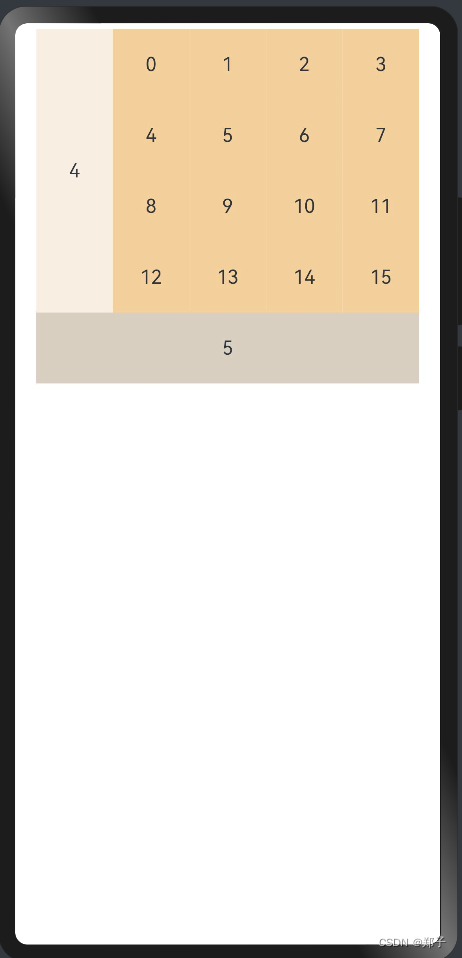
七、Grid
描述:网格容器,由“行”和“列”分割的单元格所组成,通过指定“项目”所在的单元格做出各种各样的布局
子组件:包含GridItem组件
Grid(scroller?: Scroller)
参数:
- scroller:控制器,用于与可滚动组件进行绑定
参数:
- columnsTemplate:设置当前网格布局列的数量,默认:1列
- rowsTemplate:设置当前网格布局行的数量,默认:1行
- columnsGap:设置列与列的间距,默认:0
- rowsGap:设置行与行的间距,默认:0
- scrollBar:设置滚动条状态,默认:BarState.Off
- scrollBarColor:设置滚动条颜色
- scrollBarWidth:设置滚动条宽度
- cachedCount:设置预加载的GridItem的数量,默认:1
- editMode:是否进入编辑模式,编辑模式可以拖拽Grid组件GridItem,默认:false
- layoutDirection:设置布局的主轴方向。默认:GridDirection.Row
- maxCount:最大行数/列数,默认:1
- minCount:最小行数/列数,默认:1
- cellLength:一行的高度/一列宽度,默认:0
- multiSelectable:是否开启鼠标框选,默认值:false
- supportAnimation:是否支持动画。默认值:false
事件:
名称
功能描述
onScrollIndex(event: (first: number) => void)
当前网格显示的起始位置item发生变化时触发
- first: 当前显示的网格起始位置的索引值
onItemDragStart(event: (event: ItemDragInfo, itemIndex: number) => (() => any) | void)
开始拖拽网格元素时触发。
- itemIndex: 被拖拽网格元素索引值
onItemDragEnter(event: (event: ItemDragInfo) => void)
拖拽进入网格元素范围内时触发
onItemDragMove(event: (event: ItemDragInfo, itemIndex: number, insertIndex: number) => void)
拖拽在网格元素范围内移动时触发
- event:
- itemIndex: 拖拽起始位置。
- insertIndex: 拖拽插入位置
onItemDragLeave(event: (event: ItemDragInfo, itemIndex: number) => void)
拖拽离开网格元素时触发
- itemIndex: 拖拽离开的网格元素索引值
onItemDrop(event: (event: ItemDragInfo, itemIndex: number, insertIndex: number, isSuccess: boolean) => void)
绑定该事件的网格元素可作为拖拽释放目标,当在网格元素内停止拖拽时触发
- itemIndex: 拖拽起始位置
- insertIndex: 拖拽插入位置
- isSuccess: 是否成功释放
GridDirection详解:
- Row:主轴布局方向沿水平方向布局,即自左往右先填满一行,再去填下一行
- Column:主轴布局方向沿垂直方向布局,即自上往下先填满一列,再去填下一列
- RowReverse:主轴布局方向沿水平方向反向布局,即自右往左先填满一行,再去填下一行
- ColumnReverse:主轴布局方向沿垂直方向反向布局,即自下往上先填满一列,再去填下一列
GridItem
GridItem()
属性:
事件:
名称
参数类型
描述
rowStart
number
指定当前元素起始行号
rowEnd
number
指定当前元素终点行号
columnStart
number
指定当前元素起始列号
columnEnd
number
指定当前元素终点列号
forceRebuild
boolean
设置在触发组件build时是否重新创建此节点
默认值:false
selectable
boolean
当前GridItem元素是否可以被鼠标框选
默认值:true
说明:
外层Grid容器的鼠标框选开启时,GridItem的框选才生效
名称
功能描述
onSelect(event: (isSelected: boolean) => void)
GridItem元素被鼠标框选的状态改变时触发回调
isSelected:进入鼠标框选范围即被选中,返回true;移出鼠标框选范围即未被选中,返回false
使用案例:
@Entry
@Component
struct GridPage {@State numbers: string[] = Array.apply(null, Array(16)).map(function (item, i) { return i.toString() })build() {Column() {Grid() {GridItem() {Text('4').fontSize(16).backgroundColor(0xFAEEE0).width('100%').height('100%').textAlign(TextAlign.Center)}.rowStart(1).rowEnd(4)ForEach(this.numbers, (item) => {GridItem() {Text(item).fontSize(16).backgroundColor(0xF9CF93).width('100%').height('100%').textAlign(TextAlign.Center)}.forceRebuild(false)}, item => item)GridItem() {Text('5').fontSize(16).backgroundColor(0xDBD0C0).width('100%').height('100%').textAlign(TextAlign.Center)}.columnStart(1).columnEnd(5)}.columnsTemplate('1fr 1fr 1fr 1fr 1fr').rowsTemplate('1fr 1fr 1fr 1fr 1fr').width('90%').height(300)}.width('100%').margin({ top: 5 })}
}
八、List
描述:列表容器,包含一系列相同宽度的列表项。适合连续、多行呈现同类数据,例如图片和文本
子组件:包含ListItem组件
List(value?:{space?: number | string, initialIndex?: number, scroller?: Scroller})
参数:
参数名
参数类型
必填
参数描述
space
number | string
否
列表项间距。默认值:0
initialIndex
number
否
设置当前List初次加载时视口起始位置显示的item的索引值。如果设置的值超过了当前List最后一个item的索引值,则设置不生效。
默认值:0
scroller
Scroller
否
可滚动组件的控制器。用于与可滚动组件进行绑定
属性:
- listDirection:设置List组件排列方向参照Axis枚举说明。默认值:Vertical
- divider:设置分割线,默认:无
strokeWidth: 分割线的线宽
color: 分割线的颜色
startMargin: 分割线与列表侧边起始端的距离
endMargin: 分割线与列表侧边结束端的距离
scrollBar:设置滚动条状态,默认值:BarState.Off
cachedCount:置预加载的ListItem的数量,默认值:1
editMode:是否处于可编辑模式,默认值:false
edgeEffect:滑动效果,EdgeEffect.Spring
chainAnimation:用于设置当前list是否启用链式联动动效,默认值:false
multiSelectable:是否开启鼠标框选,默认值:false
事件:
名称
功能描述
onItemDelete(event: (index: number) => boolean)
列表项删除时触发
onScroll(event: (scrollOffset: number, scrollState: ScrollState) => void)
列表滑动时触发,返回值scrollOffset为滑动偏移量,scrollState为当前滑动状态
onScrollIndex(event: (start: number, end: number) => void)
列表滑动时触发,返回值分别为滑动起始位置索引值与滑动结束位置索引值
onReachStart(event: () => void)
列表到达起始位置时触发
onReachEnd(event: () => void)
列表到底末尾位置时触发
onScrollStop(event: () => void)
列表滑动停止时触发
onItemMove(event: (from: number, to: number) => boolean)
列表元素发生移动时触发,返回值from、to分别为移动前索引值与移动后索引值
onItemDragStart(event: (event: ItemDragInfo, itemIndex: number) => ((() => any) | void))
开始拖拽列表元素时触发,返回值event见ItemDragInfo对象说明,itemIndex为被拖拽列表元素索引值
onItemDragEnter(event: (event: ItemDragInfo) => void)
拖拽进入列表元素范围内时触发,返回值event见ItemDragInfo对象说明
onItemDragMove(event: (event: ItemDragInfo, itemIndex: number, insertIndex: number) => void)
拖拽在列表元素范围内移动时触发,返回值event见ItemDragInfo对象说明,itemIndex为拖拽起始位置,insertIndex为拖拽插入位置
onItemDragLeave(event: (event: ItemDragInfo, itemIndex: number) => void)
拖拽离开列表元素时触发,返回值event见ItemDragInfo对象说明,itemIndex为拖拽离开的列表元素索引值
onItemDrop(event: (event: ItemDragInfo, itemIndex: number, insertIndex: number, isSuccess: boolean) => void)
绑定该事件的列表元素可作为拖拽释放目标,当在列表元素内停止拖拽时触发,返回值event见ItemDragInfo对象说明,itemIndex为拖拽起始位置,insertIndex为拖拽插入位置,isSuccess为是否成功释放
- Idle:未滑动状态
- Scroll:惯性滑动状态
- Fling:手指拖动状态
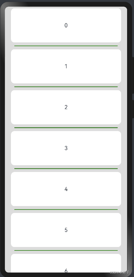
使用案例:
@Entry
@Component
struct ListPage {private arr: number[] = [0, 1, 2, 3, 4, 5, 6, 7, 8, 9]build() {Stack({ alignContent: Alignment.TopStart }) {Column() {List({ space: 20, initialIndex: 0 }) {ForEach(this.arr, (item) => {ListItem() {Text('' + item).width('100%').height(100).fontSize(16).textAlign(TextAlign.Center).borderRadius(10).backgroundColor(0xFFFFFF)}.editable(true)}, item => item)}.listDirection(Axis.Vertical) // 排列方向.divider({ strokeWidth: 2, color: Color.Green, startMargin: 10, endMargin: 10 }) // 分界线.edgeEffect(EdgeEffect.None) // 滑动到边缘 效果.chainAnimation(false) // 联动特效关闭.onScrollIndex((firstIndex: number, lastIndex: number) => {console.info('first' + firstIndex)console.info('last' + lastIndex)}).onItemDelete((index: number) => {console.info(this.arr[index] + 'Delete')this.arr.splice(index, 1)console.info(JSON.stringify(this.arr))return true}).width('90%')}.width('100%')}.width('100%').height('100%').backgroundColor(0xDCDCDC).padding({ top: 5 })}
}
ListItem
ListItem(value?: string)
属性:
- sticky:设置ListItem吸顶效果,默认值:Sticky.None
- None:无效果
- Normal:当前item吸顶
- Opacity:当前item吸顶显示透明度变化效果
- editable:当前ListItem元素是否可编辑,默认值:false
- selectable:当前ListItem元素是否可以被鼠标框选,默认值:true
事件:
- onSelect(event: (isSelected: boolean) => void):ListItem元素被鼠标框选的状态改变时触发回调。isSelected:进入鼠标框选范围即被选中返回true, 移出鼠标框选范围即未被选中返回false
九、Navigator
描述:路由组件
子组件:
Navigator(value?: {target: string, type?: NavigationType})
参数:
- target:指定跳转目标页面的路径
- type:指定路由方式,默认值:NavigationType.Push
- Push:跳转到应用内的指定页面
- Replace:用应用内的某个页面替换当前页面,并销毁被替换的页面
- Back:返回到指定的页面。指定的页面不存在栈中时不响应。未传入指定的页面时返回上一页
属性:
- active:当前路由组件是否处于激活状态,处于激活状态时,会生效相应的路由操作
- params:跳转时要同时传递到目标页面的数据,可在目标页面使用router.getParams()获得
十、Panel
描述:可滑动面板,提供一种轻量的内容展示窗口,方便在不同尺寸中切换
子组件:可包含子组件
Panel(show: boolean)
参数:
- show:控制Panel显示或隐藏
属性:
名称
参数类型
默认值 描述
type
PanelType
PanelType.Foldable 设置可滑动面板的类型
mode
PanelMode
- 设置可滑动面板的初始状态
dragBar
boolean
true 设置是否存在dragbar
fullHeight
number|string
- 指定PanelMode.Full状态下的高度
halfHeight
number|string
- 指定PanelMode.Half状态下的高度,默认为屏幕尺寸的一半
miniHeight
number|string
- 指定PanelMode.Mini状态下的高度
事件:
onChange(event: (width: number, height: number, mode: PanelMode) => void):当可滑动面板发生状态变化时触发, 返回的height值为内容区高度值,当dragbar属性为true时,panel本身的高度值为dragbar高度加上内容区高度
PanelType详解
- Minibar:提供minibar和类全屏展示切换效果
- Foldable:内容永久展示类,提供大(类全屏)、中(类半屏)、小三种尺寸展示切换效果
- Temporary:内容临时展示区,提供大(类全屏)、中(类半屏)两种尺寸展示切换效果
PanelMode详解
- Mini:类型为minibar和foldable时,为最小状态;类型为temporary,则不生效
- Half:类型为foldable和temporary时,为类半屏状态;类型为minibar,则不生效
- Temporary:类全屏状态
使用案例:
@Entry
@Component
struct PanelPage {@State show: boolean = falsebuild() {Column() {Text('可点击文本').width('90%').height(50).borderRadius(10).backgroundColor(0xFFFFFF).padding({ left: 20 }).onClick(() => {this.show = !this.show})Panel(this.show) { // 展示日程Column() {Text('下拉标题')Divider().margin({top:10})Text('内容区内容区').margin({top:20})}}.type(PanelType.Foldable).mode(PanelMode.Half).dragBar(true) // 默认开启.halfHeight(500) // 默认一半.onChange((width: number, height: number, mode: PanelMode) => {console.info(`width:${width},height:${height},mode:${mode}`)})}.width('100%').height('100%').backgroundColor(0xDCDCDC).padding({ top: 5 })}
}
十一、Refresh
描述:可以进行页面下拉操作并显示刷新动效的容器组件
子组件:支持单个子组件
Refresh(value: {refreshing: boolean, offset?: number | string, friction?: number | string})
参数:
参数
参数名
必填
默认值
参数描述
refreshing
boolean
是
-
当前组件是否正在刷新。
offset
Length
否
16
刷新组件静止时距离父组件顶部的距离。
friction
number | string
否
62
下拉摩擦系数,取值范围为0到100。
- 0表示下拉刷新容器不跟随手势下拉而下拉。
- 100表示下拉刷新容器紧紧跟随手势下拉而下拉。
- 数值越大,下拉刷新容器跟随手势下拉的反应越灵敏
事件:
名称
描述
onStateChange(callback: (state: RefreshStatus) => void)
当前刷新状态变更时,触发回调
state:刷新状态
onRefreshing(callback: () => void)
进入刷新状态时触发回调
RefreshStatus详解
名称
描述
Inactive
默认未下拉状态。
Drag
下拉中,下拉距离小于刷新距离
OverDrag
下拉中,下拉距离超过刷新距离
Refresh
下拉结束,回弹至刷新距离,进入刷新状态
Done
刷新结束,返回初始状态(顶部)
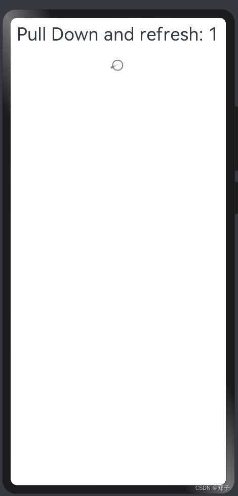
使用案例:
@Entry
@Component
struct RefreshPage {@State isRefreshing: boolean = false@State counter: number = 0build() {Column() {Refresh({refreshing: this.isRefreshing, offset: 120, friction: 100}) {Text('Pull Down and refresh: ' + this.counter).fontSize(30).margin(10)}.onStateChange((refreshStatus: RefreshStatus) => {console.info('Refresh onStatueChange state is ' + refreshStatus)}).onRefreshing(() => {setTimeout(() => {this.counter++this.isRefreshing = false}, 1000)console.log('onRefreshing test')})}}
}
十二、Row
描述:水平布局容器
子组件:可以包含子组件
Row(value?:{space?: string | number})
参数:
- space:横向布局元素间距
属性:
- alignItems:在垂直方向上子组件的对齐格式
- justifyContent:设置子组件在水平方向上的对齐格式
使用案例:
@Entry
@Component
struct RowPage {build() {Column({ space: 10 }) {//space:子组件之间的间距Row({ space: 10 }) {Text().width(100).height('100%').backgroundColor(Color.Green)Text().width(100).height('100%').backgroundColor(Color.Red)}.width('80%').height(100).border({ width: 1 })Row() {Text().width(50).height('100%').backgroundColor(Color.Yellow)Text().width(50).height('100%').backgroundColor(Color.Blue)Text().width(50).height('100%').backgroundColor(Color.Green)}//设置子组件沿水平方向的对齐方式.alignItems(VerticalAlign.Top).width('80%').height(100).border({ width: 1 })Row() {Text().width('30%').height('100%').backgroundColor(Color.Red)Text().width('30%').height('100%').backgroundColor(Color.Blue)}.height('15%').border({ width: 1 }).width('80%')//设置子组件沿垂直方向的对齐方式.justifyContent(FlexAlign.End)Row() {Text().width('30%').height(30).backgroundColor(Color.Green)Text().width('30%').height(30).backgroundColor(Color.Orange)}.height('15%').border({ width: 1 }).width('80%').alignItems(VerticalAlign.Center).justifyContent(FlexAlign.Center)}.width('100%').padding({ top: 5 })}
}
十三、RowSplit
描述:带分割线的水平布局
子组件:可以包含子组件
RowSplit()
属性:
- resizeable:分割线是否可拖拽,默认:false
十四、Scroll
描述:可滑动的容器组件,当子组件的布局尺寸超过父组件的视口时,内容可以滑动
子组件:支持单个子组件
Scroll(scroller?: Scroller)
参数:
- scrollable:设置滑动方法 ScrollDirection
- Horizontal:仅支持水平方向滚动
- Vertical:仅支持垂直方向滚动
- None:不可滚动
- Free:支持竖直或水平方向滚动
- scrollBar:设置滑动条状态,默认值:BarState.Off
- Off:不显示
- On:显示
- Auto:按需显示
scrollBarColor:设置滑动条颜色
scrollBarWidth:设置滑动条宽度
edgeEffect:设置滑动效果,默认值:EdgeEffect.Spring事件
事件:
名称
功能描述
onScroll(event: (xOffset: number, yOffset: number) => void)
滚动事件回调, 返回滚动时水平、竖直方向偏移量
onScrollEdge(event: (side: Edge) => void)
滚动到边缘事件回调
onScrollEnd(event: () => void)
滚动停止事件回调
scroller: Scroller = new Scroller():可滑动容器组件的控制器
关键方法:
-
scrollTo:滑动到指定位置
-
scrollEdge:滑动到容器边缘
-
scrollPage:滑动到下一页或者上一页
-
currentOffset:返回当前的滑动偏移量
-
scrollToIndex:滑动到指定的Index
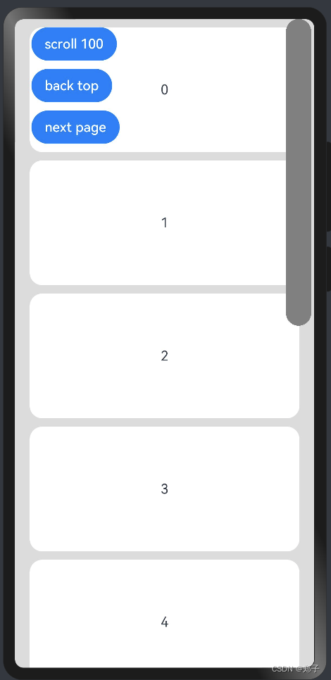
使用案例:
@Entry
@Component
struct ScrollPage {scroller: Scroller = new Scroller()private arr: number[] = [0, 1, 2, 3, 4, 5, 6, 7, 8, 9]build() {Stack({ alignContent: Alignment.TopStart }) {Scroll(this.scroller) {Column() {ForEach(this.arr, (item) => {Text(item.toString()).width('90%').height(150).backgroundColor(0xFFFFFF).borderRadius(15).fontSize(16).textAlign(TextAlign.Center).margin({ top: 10 })}, item => item)}.width('100%')}.scrollable(ScrollDirection.Vertical).scrollBar(BarState.On).scrollBarColor(Color.Gray).scrollBarWidth(30).onScroll((xOffset: number, yOffset: number) => {console.info(xOffset + ' ' + yOffset)}).onScrollEdge((side: Edge) => {console.info('To the edge')}).onScrollEnd(() => {console.info('Scroll Stop')})Button('scroll 100').onClick(() => { // 点击后下滑100.0距离this.scroller.scrollTo({ xOffset: 0, yOffset: this.scroller.currentOffset().yOffset + 100 })}).margin({ top: 10, left: 20 })Button('back top').onClick(() => { // 点击后回到顶部this.scroller.scrollEdge(Edge.Top)}).margin({ top: 60, left: 20 })Button('next page').onClick(() => { // 点击后下滑到底部this.scroller.scrollPage({ next: true })}).margin({ top: 110, left: 20 })}.width('100%').height('100%').backgroundColor(0xDCDCDC)}
}
十五、SideBarContainer
描述:提供侧边栏可以显示和隐藏的侧边栏容器,通过子组件定义侧边栏和内容区,第一个子组件表示侧边栏,第二个子组件表示内容区。
子组件:可以包含子组件
SideBarContainer( type?: SideBarContainerType )
参数:
- type:设置侧边栏的显示类型。默认值:SideBarContainerType.Embed
Embed:侧边栏嵌入到组件内,侧边栏和内容区并列显示
Overlay:侧边栏浮在内容区上面
属性:
事件:
名称
参数类型
描述
showSideBar
boolean
设置是否显示侧边栏
默认值:true
controlButton
ButtonStyle
设置侧边栏控制按钮的属性
showControlButton
boolean
设置是否显示控制按钮
默认值:true
sideBarWidth
number
设置侧边栏的宽度
默认值:200,单位vp
minSideBarWidth
number
设置侧边栏最小宽度
默认值:200,单位vp
maxSideBarWidth
number
设置侧边栏最大宽度
默认值:280,单位vp
- onChange(callback: boolean) => void:当侧边栏的状态在显示和隐藏之间切换时触发回调。true表示显示,false表示隐藏。
| 名称 | 参数类型 | 必填 | 描述 |
|---|---|---|---|
| left | number | 否 | 设置侧边栏控制按钮距离容器左界限的间距 默认值:16,单位vp |
| top | number | 否 | 设置侧边栏控制按钮距离容器上界限的间距 默认值:48,单位vp |
| width | number | 否 | 设置侧边栏控制按钮的宽度 默认值:32,单位vp |
| height | number | 否 | 设置侧边栏控制按钮的高度 默认值:32,单位vp |
| icons | { shown: string | PixelMap | Resource , hidden: string | PixelMap | Resource , switching?: string | PixelMap | Resource } | 否 | 设置侧边栏控制按钮的图标: - shown: 设置侧边栏显示时控制按钮的图标 - hidden: 设置侧边栏隐藏时控制按钮的图标 - switching:设置侧边栏显示和隐藏状态切换时控制按钮的图标 |
使用案例:
@Entry
@Component
struct SideBarContainerPage {normalIcon: Resource = $r("app.media.icon")selectedIcon: Resource = $r("app.media.icon")@State arr: number[] = [1, 2, 3, 4]@State current: number = 1build() {SideBarContainer(SideBarContainerType.Embed) {//侧边栏布局Column() {ForEach(this.arr, (item, index) => {Column({ space: 5 }) {Image(this.current === item ? this.selectedIcon : this.normalIcon).width(64).height(64)Text("菜单" + item).fontSize(25).fontColor(this.current === item ? '#0A59F7' : '#999').fontFamily('source-sans-pro,cursive,sans-serif')}.onClick(() => {this.current = item})}, item => item)}.width('100%').justifyContent(FlexAlign.SpaceEvenly).backgroundColor(Color.Red)//内容区布局Column() {Text().width('100%').height('100%').backgroundColor(Color.Green)}.margin({ top: 50, left: 20, right: 30 })}.sideBarWidth(150).minSideBarWidth(50).maxSideBarWidth(300).onChange((value: boolean) => {console.info('status:' + value)})}
}
十六、Stack
描述:层叠布局
子组件:可以包含子组件
Stack(value?: {alignContent?: Alignment})
参数:
- alignContent:设置子组件在容器内的对齐方式。默认值:Alignment.Center
使用案例:
@Entry
@Component
struct StackPage {build() {Column({ space: 20 }) {Stack({ alignContent: Alignment.BottomEnd }) {Text().width('90%').height('100%').backgroundColor(Color.Red).align(Alignment.Top)Text().width('70%').height('60%').backgroundColor(Color.Green).align(Alignment.Top)}.width('100%').height(150).margin({ top: 5 })Stack({ alignContent: Alignment.TopStart }) {Text().width('90%').height('100%').backgroundColor(Color.Red).align(Alignment.Top)Text().width('70%').height('60%').backgroundColor(Color.Green).align(Alignment.Top)Text().width('50%').height('40%').backgroundColor(Color.Blue).align(Alignment.Top)}.width('100%').height(150).margin({ top: 5 })}}
}
十七、Swiper
描述:banner,滑块视图容器,提供子组件滑动轮播显示的能力
子组件:可以包含子组件
Swiper(controller?: SwiperController)
参数:
- controller:给组件绑定一个控制器,用来控制组件翻页
属性:
名称
参数类型
默认值 描述
index
number
0 设置当前在容器中显示的子组件的索引值。
autoPlay
boolean
false 子组件是否自动播放,自动播放状态下,导航点不可操作
interval
number
3000 使用自动播放时播放的时间间隔,单位为毫秒
indicator
boolean
true 是否启用导航点指示器
loop
boolean
true 是否开启循环
设置为true时表示开启循环,在LazyForEach懒循环加载模式下,加载的组件数量建议大于5个
duration
number
400 子组件切换的动画时长,单位为毫秒
vertical
boolean
false 是否为纵向滑动
itemSpace
number | string
0 设置子组件与子组件之间间隙
displayMode
SwiperDisplayMode
SwiperDisplayMode.Stretch 设置子组件显示模式
cachedCount8+
number
1 设置预加载子组件个数
disableSwipe8+
boolean
false 禁用组件滑动切换功能
displayCount8+
number | string
1 设置一页中显示子组件的个数,设置为“auto”时等同于SwiperDisplayMode.AutoLinear的显示效果
effectMode
EdgeEffect
EdgeEffect.Spring 设置滑动到边缘时的显示效果
curve
Curve | string
Curve.Ease 设置Swiper的动画曲线,默认为淡入淡出曲线
indicatorStyle8+
{left?: Length,
top?: Length,
right?: Length,
bottom?: Length,
size?: Length,
mask?: boolean,
color?: ResourceColor,
selectedColor?: ResourceColor
}
设置导航点样式:
- left: 设置导航点距离Swiper组件左边的距离。
- top: 设置导航点距离Swiper组件顶部的距离。
- right: 设置导航点距离Swiper组件右边的距离。
- bottom: 设置导航点距离Swiper组件底部的距离。
- size: 设置导航点的直径。
- mask: 设置是否显示导航点蒙层样式。
- color: 设置导航点的颜色。
- selectedColor: 设置选中的导航点的颜色。
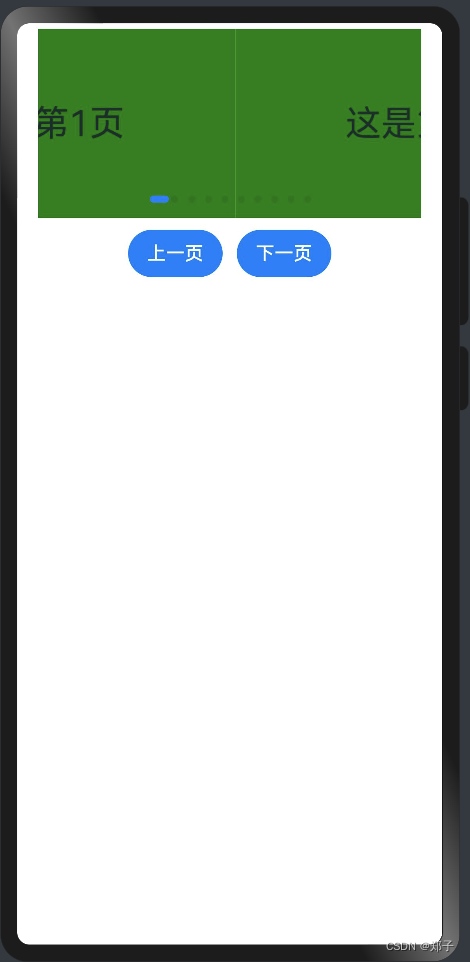
使用案例:
数据源:
export class MyDataSource implements IDataSource {private list: number[] = []private listener: DataChangeListenerconstructor(list: number[]) {this.list = list}unregisterDataChangeListener(listener: DataChangeListener): void {}registerDataChangeListener(listener: DataChangeListener): void {this.listener = listener}getData(index: number) {return this.list[index]}totalCount(): number {return this.list.length}
}
import { MyDataSource } from '../MyDataSource';@Entry
@Component
struct SwiperPage {private swiperController: SwiperController = new SwiperController()private data: MyDataSource = new MyDataSource([])aboutToAppear(): void {let list = []for (var i = 1; i <= 10; i++) {list.push('这是第' + i + '页');}this.data = new MyDataSource(list)}build() {Column({ space: 5 }) {Swiper(this.swiperController) {LazyForEach(this.data, (item: string) => {Text(item).width('90%').height(160).backgroundColor(Color.Green).textAlign(TextAlign.Center).fontSize(30)}, item => item)}.cachedCount(2).index(1).autoPlay(true).interval(4000).indicator(true).loop(true).duration(1000).itemSpace(0).curve(Curve.Linear).onChange((index: number) => {console.info(index.toString())})Row({ space: 12 }) {Button('上一页').onClick(() => {this.swiperController.showNext()})Button('下一页').onClick(() => {this.swiperController.showPrevious()})}.margin(5)}.width('100%').margin({ top: 5 })}
}
十八、Tabs
描述:通过页签进行内容视图切换的容器组件,每个页签对应一个内容视图
子组件:可以包含子组件TabContent
Tabs(value?: {barPosition?: BarPosition, index?: number, controller?:
TabsController})参数:
参数名
参数类型
必填
默认值
参数描述
barPosition
BarPosition
否
BarPosition.Start
指定页签位置来创建Tabs容器组件。
index
number
否
0
指定初次初始页签索引。
controller
TabsController
否
-
设置Tabs控制器。
属性:
名称
参数类型
默认值
描述
vertical
boolean
false
设置为false是为横向Tabs,设置为true时为纵向Tabs。
scrollable
boolean
true
设置为true时可以通过滑动页面进行页面切换,为false时不可滑动切换页面。
barMode
BarMode
BarMode.Fixed
TabBar布局模式,具体描述见BarMode枚举说明。
barWidth
Length
-
TabBar的宽度值。
barHeight
Length
-
TabBar的高度值。
animationDuration
number
200
TabContent滑动动画时长
事件:
名称
功能描述
onChange(event: (index: number) => void)
Tab页签切换后触发的事件。
- index: tab标签的索引值。
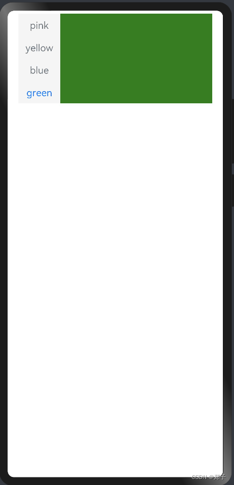
使用案例:
@Entry
@Component
struct TabsPage {private controller: TabsController = new TabsController()build() {Column() {Tabs({ barPosition: BarPosition.Start, controller: this.controller }) {TabContent() {Column().width('100%').height('100%').backgroundColor(Color.Pink)}.tabBar('pink')TabContent() {Column().width('100%').height('100%').backgroundColor(Color.Yellow)}.tabBar('yellow')TabContent() {Column().width('100%').height('100%').backgroundColor(Color.Blue)}.tabBar('blue')TabContent() {Column().width('100%').height('100%').backgroundColor(Color.Green)}.tabBar('green')}.vertical(true).scrollable(true).barMode(BarMode.Fixed).barWidth(70).barHeight(150).animationDuration(400).onChange((index: number) => {console.info(index.toString())}).width('90%').backgroundColor(0xF5F5F5)}.width('100%').height(150).margin({ top: 5 })}
}