目录:
- 定位
- 相对定位:
- 绝对定位
- 定位居中
- 固定定位
- 堆叠层级z-index
- 高级技巧
- CSS精灵
- 案例-写出自己的名字
- 字体图标
- 下载字体
- 使用字体
- CSS修饰属性
- 垂直对齐方式
- 过渡
- 表单获得焦点选择器focus
- 透明度opacity
- 光标类型cursor
- 禁用鼠标样式
- 表格样式-合并相邻两个边框
- 综合案例-轮播图
- 图片效果
- 箭头
- 圆点
1.定位
相对定位:
position: relative
特点:
-
不脱标,占用自己原来位置
-
显示模式特点保持不变
-
设置边偏移则相对自己原来位置移动
div {position: relative;top: 100px;left: 200px;
}
绝对定位
position: absolute
使用场景:子级绝对定位,父级相对定位(子绝父相)
特点:
-
脱标,不占位
-
显示模式具备行内块特点
-
设置边偏移则相对最近的已经定位的祖先元素改变位置
-
如果祖先元素都未定位,则相对浏览器可视区改变位置
.father {position: relative;
}.father span {position: absolute;top: 0;right: 0;
}
定位居中
实现步骤:
-
绝对定位
-
水平、垂直边偏移为 50%
-
子级向左、上移动自身尺寸的一半
-
左、上的外边距为 –尺寸的一半
-
transform: translate(-50%, -50%)
<!DOCTYPE html>
<html lang="en"><head><meta charset="UTF-8"><meta http-equiv="X-UA-Compatible" content="IE=edge"><meta name="viewport" content="width=device-width, initial-scale=1.0"><title>Document</title><style>/* 让绝对定位的盒子水平和垂直居中 */.box {position: absolute;/* 移动父亲的50% */left: 50%;/* 往左走自己宽度的一半 *//* margin-left: -100px; */top: 50%;/* margin-top: -100px; *//* 让子盒子走自己宽度和高度的一半 */transform: translate(-50%, -50%);width: 200px;height: 200px;background-color: pink;/* 绝对定位让margin 0 auto 失效 *//* margin: 0 auto; */}img {position: absolute;top: 50%;left: 50%;/* 让子盒子走自己宽度和高度的一半 */transform: translate(-50%, -50%);/* 注意,translate 百分比相对于盒子自身的宽度和高度来说 */}</style>
</head><body><!-- <div class="box"></div> --><img src="./images/down-open.png" alt="">
</body></html>
固定定位
position: fixed
场景:元素的位置在网页滚动时不会改变
特点:
-
脱标,不占位
-
显示模式具备行内块特点
-
设置边偏移相对浏览器窗口改变位置
<!DOCTYPE html>
<html lang="en"><head><meta charset="UTF-8"><meta http-equiv="X-UA-Compatible" content="IE=edge"><meta name="viewport" content="width=device-width, initial-scale=1.0"><title>Document</title><style>.header {position: fixed;left: 0;top: 0;/* width: 200px; */width: 100%;height: 80px;background-color: pink;}</style>
</head><body><div class="header">123</div><p> 里面有很多的文字</p><p> 里面有很多的文字</p><p> 里面有很多的文字</p><p> 里面有很多的文字</p><p> 里面有很多的文字</p><p> 里面有很多的文字</p><p> 里面有很多的文字</p><p> 里面有很多的文字</p><p> 里面有很多的文字</p><p> 里面有很多的文字</p><p> 里面有很多的文字</p><p> 里面有很多的文字</p><p> 里面有很多的文字</p><p> 里面有很多的文字</p><p> 里面有很多的文字</p><p> 里面有很多的文字</p><p> 里面有很多的文字</p><p> 里面有很多的文字</p><p> 里面有很多的文字</p><p> 里面有很多的文字</p><p> 里面有很多的文字</p><p> 里面有很多的文字</p><p> 里面有很多的文字</p><p> 里面有很多的文字</p><p> 里面有很多的文字</p><p> 里面有很多的文字</p><p> 里面有很多的文字</p><p> 里面有很多的文字</p><p> 里面有很多的文字</p><p> 里面有很多的文字</p><p> 里面有很多的文字</p><p> 里面有很多的文字</p><p> 里面有很多的文字</p><p> 里面有很多的文字</p><p> 里面有很多的文字</p><p> 里面有很多的文字</p>
</body></html>
堆叠层级z-index

默认效果:按照标签书写顺序,后来者居上
作用:设置定位元素的层级顺序,改变定位元素的显示顺序
属性名:z-index
属性值:整数数字(默认值为auto,取值越大,层级越高)
<!DOCTYPE html>
<html lang="en"><head><meta charset="UTF-8"><meta http-equiv="X-UA-Compatible" content="IE=edge"><meta name="viewport" content="width=device-width, initial-scale=1.0"><title>Document</title><style>div {position: absolute;top: 0;left: 0;/* 默认的层级 z-index: auto; *//* 根据标签的书写顺序排列 *//* 越往后,层级越高 */width: 200px;height: 200px;}.box1 {background-color: red;/* 层级属性  整数 不要跟单位*//* 数字越大,层级越高 */z-index: 1;}.box2 {background-color: green;left: 20px;top: 20px;z-index: 2;}.box3 {background-color: blue;left: 40px;top: 40px;}</style>
</head><body><div class="box1"></div><div class="box2"></div><div class="box3"></div>
</body></html>
2.高级技巧
CSS精灵
- CSS 精灵,也叫 CSS Sprites,是一种网页图片应用处理方式。把网页中一些背景图片整合到一张图片文件中,再background-position 精确的定位出背景图片的位置。
优点:减少服务器被请求次数,减轻服务器的压力,提高页面加载速度
实现步骤:
-
创建盒子,盒子尺寸与小图尺寸相同
-
设置盒子背景图为精灵图
-
添加 background-position 属性,改变背景图位置
3.1 使用 PxCook 测量小图片左上角坐标
3.2 取负数坐标为 background-position 属性值(向左上移动图片位置)
案例-写出自己的名字
HTML结构
<!DOCTYPE html>
<html lang="en"><head><meta charset="UTF-8"><meta http-equiv="X-UA-Compatible" content="IE=edge"><meta name="viewport" content="width=device-width, initial-scale=1.0"><title>Document</title><style>div {display: inline-block;margin: 0 15px;background: url(./images/abcd.jpg) no-repeat;}.l {width: 96px;height: 112px;background-color: pink;background-position: -5px -275px;}.i {width: 62px;height: 107px;background-position: -324px -141px;}.u {width: 112px;height: 112px;background-position: -476px -421px;}span {display: block;width: 106px;height: 118px;background: url(./images/abcd.jpg) no-repeat;/* 过渡 */transition: .2s;}span:hover {/* background-position: -118px -12px; */background-position: -484px -10px;/* width: 95px; *//* background-position: -3px -137px; */}</style>
</head><body><div class="l"></div><div class="i"></div><div class="u"></div><span></span>
</body></html>
字体图标
字体图标:展示的是图标,本质是字体
作用:在网页中添加简单的、颜色单一的小图标
优点
-
灵活性:灵活地修改样式,例如:尺寸、颜色等
-
轻量级:体积小、渲染快、降低服务器请求次数
-
兼容性:几乎兼容所有主流浏览器
-
使用方便:先下载再使用
下载字体
iconfont 图标库:iconfont-阿里巴巴矢量图标库
登录 → 素材库 → 官方图标库 → 进入图标库 → 选图标,加入购物车 → 购物车,添加至项目,确定 → 下载至本地
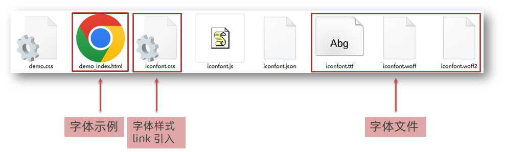
使用字体
-
引入字体样式表(iconfont.css)
-
标签使用字体图标类名
-
iconfont:字体图标基本样式(字体名,字体大小等等)
-
icon-xxx:图标对应的类名
-
<!DOCTYPE html>
<html lang="en"><head><meta charset="UTF-8"><meta http-equiv="X-UA-Compatible" content="IE=edge"><meta name="viewport" content="width=device-width, initial-scale=1.0"><title>Document</title><link rel="stylesheet" href="./fonts/iconfont.css"><style>.iconfont {font-size: 300px;color: pink;}</style>
</head><body><!-- 必须2个类名,第一个类名iconfont --><i class="iconfont icon-shouji"></i><span class="iconfont  icon-zhaoxiangji"></span>
</body></html>
3.CSS修饰属性
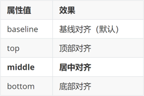
垂直对齐方式
属性名:vertical-align
<!DOCTYPE html>
<html lang="en"><head><meta charset="UTF-8"><meta http-equiv="X-UA-Compatible" content="IE=edge"><meta name="viewport" content="width=device-width, initial-scale=1.0"><title>Document</title><style>img {/* 行内块元素 默认和文字的基线对齐*/vertical-align: middle;}span {display: inline-block;vertical-align: middle;width: 50px;height: 50px;background-color: pink;}div {/* width: 300px;height: 300px; */border: 2px solid red;}</style>
</head><body><img src="./images/computer.png" alt=""> my name is 刘德华<span></span> my name is 刘德华<hr><div><img src="./images/1.webp" alt=""></div>
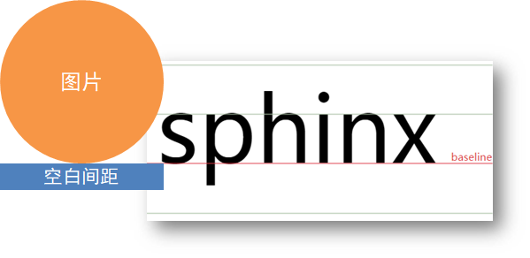
</body></html>去除图片底部缝隙的两种方法:
-
给图片添加 display: block;
-
给图片添加 vertical-align: middle; 等,只要不是 baseline就行
过渡
作用:可以为一个元素在不同状态之间切换的时候添加过渡效果
属性名:transition(复合属性)
属性值:过渡的属性 花费时间 (s)
提示:
-
过渡的属性可以是具体的 CSS 属性
-
也可以为 all(两个状态属性值不同的所有属性,都产生过渡效果)
-
transition 设置给元素本身
<!DOCTYPE html>
<html lang="en"><head><meta charset="UTF-8"><meta http-equiv="X-UA-Compatible" content="IE=edge"><meta name="viewport" content="width=device-width, initial-scale=1.0"><title>Document</title><style>.box {width: 200px;height: 200px;background-color: pink;/* 谁做过渡给谁加 */transition: all .3s;}.box:hover {height: 300px;width: 300px;background-color: green;}input {width: 200px;height: 30px;transition: all .3s;}/* 当表单得到光标的时候 */input:focus {width: 300px;background-color: pink;}</style>
</head><body><div class="box"></div><input type="text">
</body></html>
表单获得焦点选择器 focus
/* 当表单得到光标的时候 */
input:focus {width: 300px;background-color: pink;
}
透明度opacity
作用:设置整个元素的透明度(包含背景和内容)
属性名:opacity
属性值:0 – 1
-
0:完全透明(元素不可见)
-
1:不透明
-
0-1之间小数:半透明
<!DOCTYPE html>
<html lang="en"><head><meta charset="UTF-8"><meta http-equiv="X-UA-Compatible" content="IE=edge"><meta name="viewport" content="width=device-width, initial-scale=1.0"><title>Document</title><style>body {background: url(./images/huawei.jpg);}.box1 {width: 200px;height: 200px;background-color: pink;/*1. 盒子包括内容都是半透明 *//* 0 是完全透明 *//* 1 是完全不透明 */opacity: 0.2;}.box2 {width: 200px;height: 200px;/*2. 背景半透明只是盒子背景透明,而里面的内容不透明 */background-color: rgba(0, 0, 0, 0.3);color: #fff;}</style>
</head><body><div class="box1">里面的文字也会半透明</div><div class="box2">里面的文字不半透明</div>
</body></html>
光标类型cursor
作用:鼠标悬停在元素上时指针显示样式
属性名:cursor
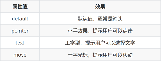
<!DOCTYPE html>
<html lang="en"><head><meta charset="UTF-8"><meta http-equiv="X-UA-Compatible" content="IE=edge"><meta name="viewport" content="width=device-width, initial-scale=1.0"><title>Document</title><style>div:nth-child(1) {cursor: default;}div:nth-child(2) {/* 小手 */cursor: pointer;}div:nth-child(3) {/* 文本 */cursor: text;}div:nth-child(4) {/* 移动 */cursor: move;}div:nth-child(5) {/* 禁止 */cursor: not-allowed;}button {cursor: pointer;}</style>
</head><body><div>鼠标默认</div><div>鼠标小手</div><div>鼠标选择文本</div><div>鼠标移动</div><div>鼠标禁止</div><button>注册</button>
</body></html>
禁用鼠标样式
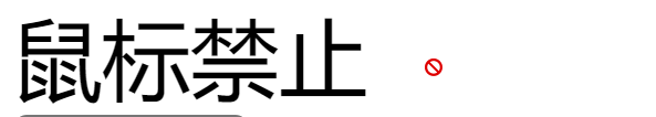
div:nth-child(5) {/* 禁止 */cursor: not-allowed;
}
表格样式-合并相邻两个边框
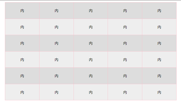
<!DOCTYPE html>
<html lang="en"><head><meta charset="UTF-8"><meta http-equiv="X-UA-Compatible" content="IE=edge"><meta name="viewport" content="width=device-width, initial-scale=1.0"><title>Document</title><style>table {width: 700px;height: 400px;margin: 0 auto;text-align: center;}table,tr,td {border: 1px solid pink;/* 合并相邻的两个边框 */border-collapse: collapse;}/* 2n 偶数 / even   *//* tr:nth-child(2n) {background-color: #eee;} */tr:nth-child(even) {background-color: #eee;}/* 2n+1 奇数   odd */tr:nth-child(odd) {background-color: #ddd;}</style>
</head><body><table><tr><td>内</td><td>内</td><td>内</td><td>内</td><td>内</td></tr><tr><td>内</td><td>内</td><td>内</td><td>内</td><td>内</td></tr><tr><td>内</td><td>内</td><td>内</td><td>内</td><td>内</td></tr><tr><td>内</td><td>内</td><td>内</td><td>内</td><td>内</td></tr><tr><td>内</td><td>内</td><td>内</td><td>内</td><td>内</td></tr><tr><td>内</td><td>内</td><td>内</td><td>内</td><td>内</td></tr></table>
</body></html>
4.综合案例-轮播图
图片效果
HTML结构
<div class="banner"><!-- 图: ul > li --><ul><li><a href="#"><img src="./images/banner1.jpg" alt=""></a></li><li><a href="#"><img src="./images/banner2.jpg" alt=""></a></li><li><a href="#"><img src="./images/banner3.jpg" alt=""></a></li></ul>
</div>
CSS样式
* {margin: 0;padding: 0;box-sizing: border-box;
}li {list-style: none;
}.banner {position: relative;margin: 100px auto;width: 564px;height: 315px;/* background-color: pink; */overflow: hidden;
}/* 图片 */
.banner img {width: 564px;border-radius: 12px;vertical-align: middle;
}.banner ul {display: flex;
}
箭头
HTML结构
<!-- 箭头 -->
<!-- 上一张 prev -->
<a href="#" class="prev"><i class="iconfont icon-zuoce"></i>
</a>
<!-- 下一张 next -->
<a href="#" class="next"><i class="iconfont icon-youce"></i>
</a>
CSS样式
/* 箭头 */
.banner .prev,
.banner .next {/* 隐藏 */display: none;position: absolute;top: 50%;transform: translateY(-50%);width: 20px;height: 30px;background-color: rgba(0,0,0, 0.3);text-decoration: none;color: #fff;line-height: 30px;
}/* 鼠标滑到banner区域,箭头要显示 display:block */
.banner:hover .prev,
.banner:hover .next {display: block;
}.banner .prev {left: 0;border-radius: 0 15px 15px 0;
}.banner .next {right: 0;border-radius: 15px 0 0 15px;text-align: center;
}
圆点
HTML结构
<!-- 圆点 -->
<ol><li></li><li class="active"></li><li></li>
</ol>
CSS样式
/* 圆点 */
.banner ol {position: absolute;bottom: 20px;left: 50%;transform: translateX(-50%);height: 13px;background-color: rgba(255,255,255,0.3);display: flex;border-radius: 10px;
}.banner ol li {margin: 3px;width: 8px;height: 8px;background-color: #fff;border-radius: 50%;cursor: pointer;
}/* 橙色的li */
.banner ol .active {background-color: #ff5000;
}


![[大厂实践] Netflix容器平台内核panic可观察性实践](https://img-blog.csdnimg.cn/img_convert/2a4b58f5c32cbc76b3acfb94b975b9a1.png)