实验6:初级绘图
一:实验目的与要求
1:了解R语言中各种图形元素的添加方法,并能够灵活应用这些元素。
2:了解R语言中的各种图形函数,掌握常见图形的绘制方法。
二:实验内容
【直方图】
Eg.1:画出cars数据集中speed的直方图
| hist(cars$speed) |

【条形图】
Eg.1:VADeaths数据集的条形图——beside=T,horiz=F
| barplot(VADeaths, beside = T) |
Eg.2:VADeaths数据集的条形图——beside=F,horiz=T
| barplot(VADeaths, beside = T) |

Eg.3:VADeaths数据集的条形图——beside=T,horiz=T
| barplot(VADeaths, beside = T, horiz = T) |

【饼图】
Eg.1:数据集VADeaths展示不同人群死亡率的占比情况
| percent <- colSums(VADeaths)*100/sum(VADeaths) pie(percent, labels = paste0(colnames(VADeaths),'\n',round(percent,2),'%')) |

【散点图】
Eg.1:cars数据集的速度与刹车距离的散点图,绘制方法1
| plot(cars[, 1], cars[,2]) |
Eg.2:cars数据集的速度与刹车距离的散点图,绘制方法2
| plot(cars) |

【散点矩阵图】
Eg.1:iris数据集为例,用pairs函数绘制散点矩阵图
| # 方法1 pairs(iris[,1:4]) # 方法2 pairs(~Sepal.Length + Sepal.Width + Petal.Length + Petal.Width, data=iris) |

【多变量相关矩阵图】
Eg.1:mtcars数据集绘图
| install.packages("corrgram") library(corrgram) corrgram(mtcars, order=TRUE, upper.panel=panel.ellipse, main="Correlogram of mtcars intercorrelations") corrgram(mtcars, order=TRUE, upper.panel=panel.pts, lower.panel=panel.pie,main="Correlogram of mtcars intercorrelations") corrgram(mtcars, order=TRUE, upper.panel=panel.conf, lower.panel=panel.cor,main="Correlogram of mtcars intercorrelations") |
[1] 相关图,主对角线上方绘制置信椭圆和平滑拟合曲线,主对角线下方绘制阴影
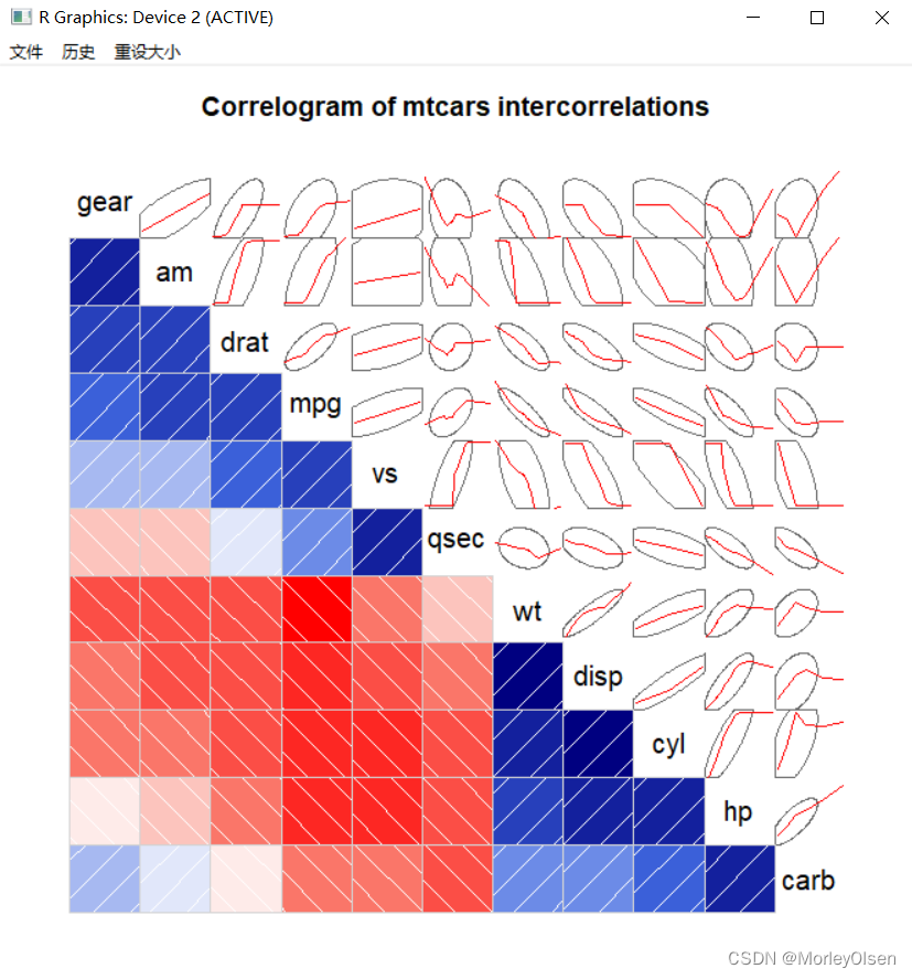
[2] 相关图,主对角线上方绘制散点图,主对角线下方绘制饼图

[3] 相关图,主对角线上方绘制置信区间,主对角线下方绘制相关系数

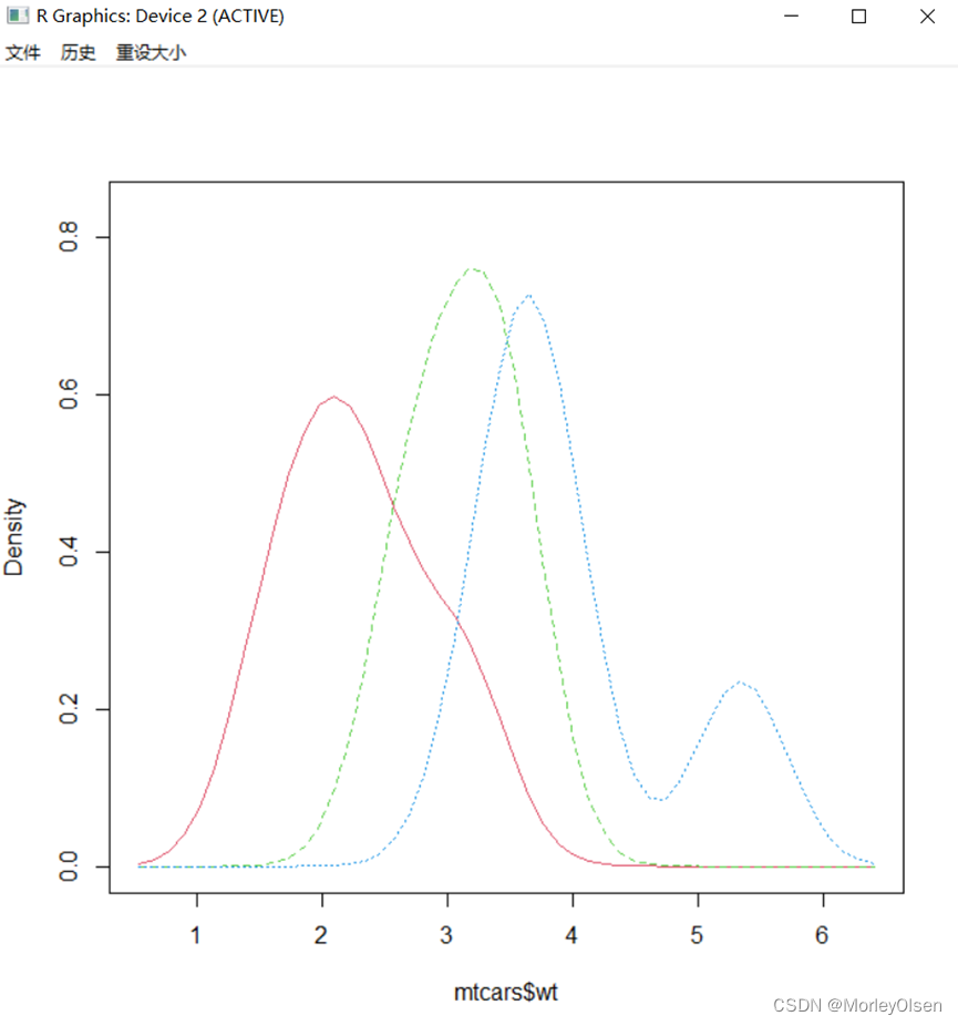
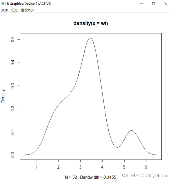
【核密度图】
Eg.1:
| install.packages("sm") library(sm) sm.density.compare(mtcars$wt, factor(mtcars$cyl)) |
【小提琴图】
Eg.1:mtcars数据集wt的小提琴图
| install.packages("vioplot") library(vioplot) attach(mtcars) par(mfrow=c(1,2)) vioplot(wt[cyl == 4], wt[cyl == 6], wt[cyl == 8], border = "black", col = "lightgreen", rectCol = "blue", horizontal = TRUE) title(main = '小提琴图') boxplot(wt~cyl, main = '箱线图', horizontal=TRUE, pars=list(boxwex=0.1),border="blue") par(mfrow = c(1, 1)) |

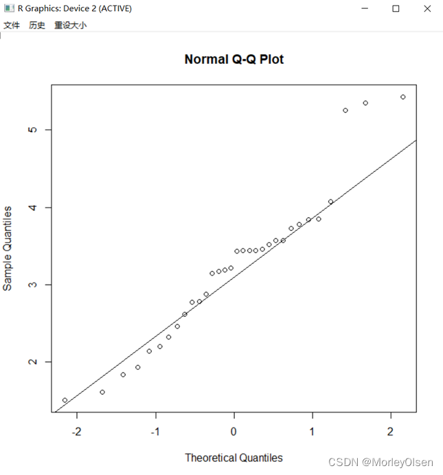
【QQ图】
Eg.1:mtcars数据集wt的QQ图
| qqnorm(wt) qqline(wt) qqplot(qt(ppoints(length(wt)), df = 5), wt,xlab = "Theoretical Quantiles", ylab = "Sample Quantiles", main = "Q-Q plot for t dsn") qqline(wt) |

【星状图】
Eg.1:
| stars(mtcars,draw.segments = T) |

【等高图】
Eg.1:
| library(KernSmooth) mtcars1 = data.frame(wt, mpg) est = bkde2D(mtcars1, apply(mtcars1, 2, dpik)) contour(est$x1, est$x2, est$fhat, nlevels = 15, col = "darkgreen", xlab = "wt",ylab = "mpg") points(mtcars1) |


【固定颜色选择函数】
Eg.1:查看前20种颜色
| colors()[1:20] |

Eg.2:打印657种颜色
| par(mfrow = c(length(colors())%/%60 + 1, 1)) par(mar=c(0.1,0.1,0.1,0.1), xaxs = "i", yaxs = "i") for(i in 1:(length(colors())%/%60 + 1)){ barplot(rep(1,60),col=colors()[((i-1)*60+1):(i*60)],border=colors()[((i-1)*60+1):(i*60)],axes=F) box() } |

Eg.3:固定调色板
| palette() palette(colors()[1:10]) palette() palette('default') |

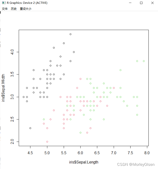
Eg.4:在不同Species使用不同的颜色绘制散点,以便区分种类
| # 方法1 plot(iris$Sepal.Length, iris$Sepal.Width, col = iris$Species) # 方法2 plot(iris$Sepal.Length, iris$Sepal.Width, col = rep(palette()[1:3], each = 50)) |
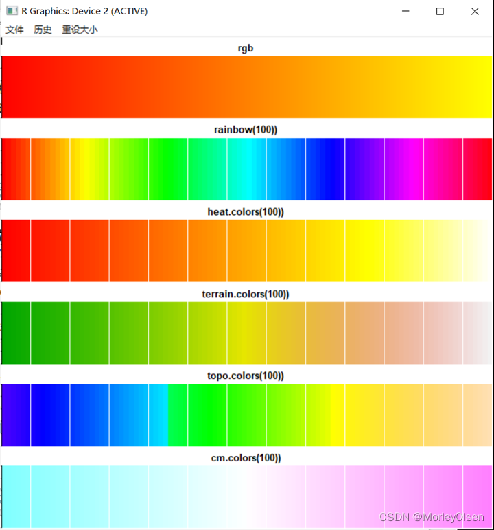
Eg.5:渐变色生成函数调色板的颜色样式
| rgb<-rgb(red=255,green=1:255,blue=0,max=255) par(mfrow=c(6,1)) par(mar=c(0.1,0.1,2,0.1), xaxs="i", yaxs="i") barplot(rep(1,255),col= rgb,border=rgb,main="rgb") barplot(rep(1,100),col=rainbow(100),border=rainbow(100),main="rainbow(100))") barplot(rep(1,100),col=heat.colors(100),border=heat.colors(100),main="heat.colors(100))") barplot(rep(1,100),col=terrain.colors(100),border=terrain.colors(100),main="terrain.colors(100))") barplot(rep(1,100),col=topo.colors(100),border=topo.colors(100),main="topo.colors(100))") barplot(rep(1,100),col=cm.colors(100),border=cm.colors(100),main="cm.colors(100))") |
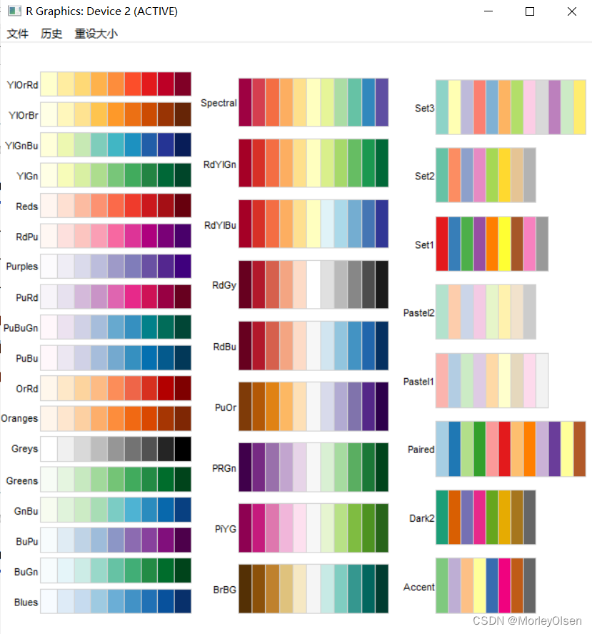
【RColorBrewer依赖包】
Eg.1:颜色展示
| par(mfrow = c(1,3)) library(RColorBrewer) par(mar=c(0.1,3,0.1,0.1)) display.brewer.all(type="seq") display.brewer.all(type="div") display.brewer.all(type="qual") |
Eg.2:绘制颜色散点图
| library(RColorBrewer) par(mfrow = c(1,2)) my_col <- brewer.pal(3,'RdYlGn') plot(iris$Sepal.Length, iris$Sepal.Width, col = rep(my_col, each =50)) plot(iris$Sepal.Length, iris$Sepal.Width, col = rep(rainbow(3), each = 50)) |

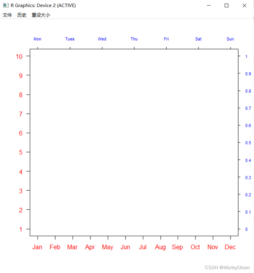
【axis函数绘图】
Eg.1:
| plot(c(1:12), col="white", xaxt="n", yaxt="n", ann = FALSE) axis(1, at=1:12, col.axis="red", labels=month.abb) axis(2, at=seq(1,12,length=10), col.axis="red", labels=1:10, las=2) axis(3, at=seq(1,12,length=7), col.axis="blue", cex.axis=0.7, tck=-0.01, labels = c("Mon", "Tues", "Wed", "Thu", "Fri", "Sat", "Sun")) axis(4, at=seq(1,12,length=11), col.axis="blue", cex.axis=0.7, tck=-0.01, labels=seq(0, 1, 0.1),las=2) |
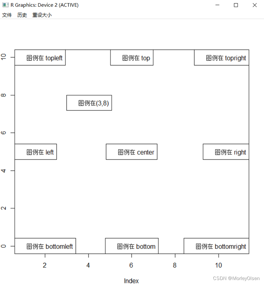
【legend函数绘制图例】
Eg.1:
| local=c("bottomright", "bottom", "bottomleft", "left", "topleft", "top", "topright", "right", "center") par(mar = c(4,2,4,2), pty='m') plot(c(0:10), col = "white") legend(3, 8, "图例在(3,8)") legend(1, 13, "图例在(11,11)", xpd=T) for(i in 1:9){ legend(local[i],paste("图例在",local[i])) } |
【par函数】
Eg.1:
| mfrow1=par(mfrow=c(2,3)) for(i in 1:6){ plot(c(1:i),main=paste("I'm image:",i)) } |

【layout函数】
Eg.1:
| mat<-matrix(c(1,1,2,3,3,4,4,5,5,6), nrow = 2, byrow = TRUE) layout(mat) for(i in 1:6){ plot(c(1:i),main=paste("I'm image:",i)) } |

【保存图形】
Eg.1:
| jpeg(filename = "C:/Users/86158/Desktop/iris.jpg") plot(iris[,1:4]) dev.off() |


Eg.2:657种颜色的打印并保存为PDF文件格式
| pdf("colors-bar.pdf", height=120) par(mar = c(0,10,3,0)+0.1,yaxs="i") barplot(rep(1, length(colors())), col = rev(colors()), names.arg=rev(colors()),horiz = T, las = 1, xaxt="n", main = expression("Bars of colors in"~ italic(colors()))) dev.off() |


三:课堂练习
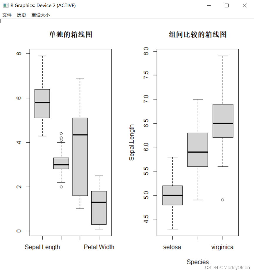
【练习1】PPT-08,第18页,iris箱线图
Eg.1:合并显示
| par(mfrow = c(1,2)) boxplot(iris[1:4], main = '单独的箱线图') boxplot(Sepal.Length ~ Species, data = iris, main = '组间比较的箱线图') |
Eg.2:单独显示
| par(mfrow = c(1,1)) boxplot(iris[1:4], main = '单独的箱线图') boxplot(Sepal.Length ~ Species, data = iris, main = '组间比较的箱线图') |


【练习2】绘图散点图
Eg.1:
| attach(mtcars) # 绑定数据框mtcars plot(wt, mpg) # 打开图形窗口,绘制散点图 detach(mtcars) # 解除绑定数据框mtcars |

【练习3】palette函数的应用
Eg.1:
| data(mtcars) par(mfrow = c(1, 1)) plot(mtcars$wt, mtcars$mpg, col = "blue") plot(mtcars$wt, mtcars$mpg, col = 4) attach(mtcars) str(mtcars) plot(wt, mpg, col = "red", xlim = c(1.3, 5.6), ylim = c(8, 35)) points(wt[cyl == 6], mpg[cyl == 6], col = "green") points(wt[cyl == 8], mpg[cyl == 8], col = "blue") legend(5, 35, c(4, 6, 8), pch = 1, col = c("red", "green", "blue"), bty = "n") |

【练习4】渐变色生成函数
Eg.1:
| library(RColorBrewer) attach(mtcars) cl <- brewer.pal(3, "Dark2") # 左图代码,RColorBrewer包配色方案的使用 par(mfrow = c(1, 1)) plot(wt, mpg, col = cl[1]) points(wt[cyl == 6], mpg[cyl == 6], col = cl[2]) points(wt[cyl == 8], mpg[cyl == 8], col = cl[3]) legend(5, 35, c(4, 6, 8), pch = 1, col = cl, bty = "n") |

Eg.2:
| cl <- rainbow(3) # 右图代码,rainbow函数的使用 plot(wt, mpg, col = cl[1]) points(wt[cyl == 6], mpg[cyl == 6], col = cl[2]) points(wt[cyl == 8], mpg[cyl == 8], col = cl[3]) legend(5, 35, c(4, 6, 8), pch = 1, col = cl, bty = "n") |

【练习5】点的样式
Eg.1:
| plot(1, col = "white", xlim = c(1, 8), ylim = c(1, 7)) symbol <- c("*", "、", ".", "o", "O", "0", " + ", " - ", "|") # 创建循环添加点 for (i in c(0:34)) { x <- (i %/% 5) * 1 + 1 y <- 6 - (i %% 5) if (i > 25) { points(x, y, pch = symbol[i - 25], cex = 1.3) text(x + 0.5, y + 0.1, labels = paste("pch = ", symbol[i - 25]), cex = 0.8) } else { if (sum(c(21:25) == i) > 0) { points(x, y, pch = i, bg = "red", cex = 1.3) } else { points(x, y, pch = i, cex = 1.3) } text(x + 0.5, y + 0.1, labels = paste("pch = ", i), cex = 0.8) } } |

【练习6】改变点的样式
Eg.1:
| attach(mtcars) # 绑定数据框mtcars cyl <- as.factor(cyl) plot(wt, mpg, col = "white") points(wt, mpg, pch = as.integer(cyl) + 1, col = as.integer(cyl) + 1) legend(5, 35, c(4, 6, 8), pch = 2:4, col = 2:4, bty = "n") |
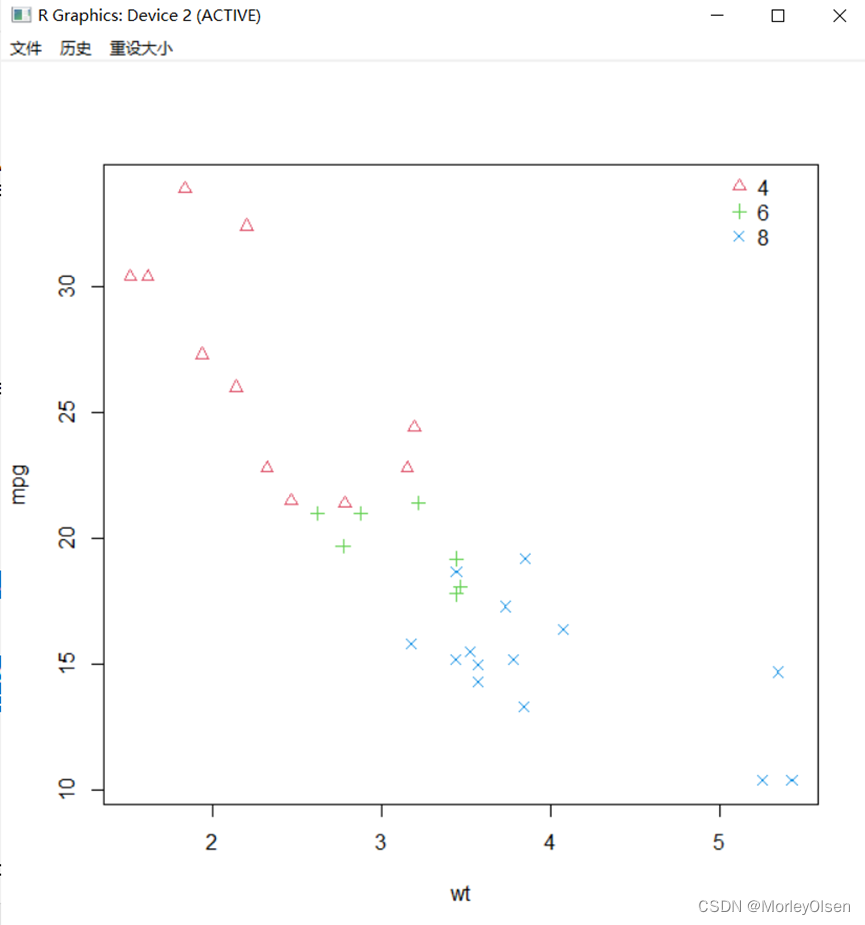
Eg.2:
| plot(wt, mpg, pch = as.integer(cyl) + 1, col = as.integer(cyl) + 1) legend(5, 35, c(4, 6, 8), pch = 2:4, col = 2:4, bty = "n") detach(mtcars) # 解除绑定数据框mtcars |
运行结果:同上图。
【练习7】使用title()展示标题位置
Eg.1:
| plot(c(0:5), col = "white", xlab = "", ylab = "") title(main = list("主标题", cex = 1.5), sub = list("副标题", cex = 1.2), xlab = "x轴标题", ylab = "y轴标题") |

【练习8】使用text()展示字体样式、字体大小
Eg.1:
| plot(c(0:5), col = "white") text(2, 4, labels = "font = 1:正常字体(默认)", font = 1) text(3, 3, labels = "font = 2:粗体字体", font = 2) text(4, 2, labels = "font = 3:斜体字体", font = 3) text(5, 1, labels = "font = 4:粗斜体字体", font = 4) # 大小 plot(c(0:6), col = "white", xlim = c(1, 8)) text(2, 5, labels = "cex = 0.5:放大0.5倍", cex = 0.5) text(3, 4, labels = "cex = 0.8:放大0.8倍", cex = 0.8) text(4, 3, labels = "cex = 1(默认):正常大小", cex = 1) text(5, 2, labels = "cex = 1.2:放大1.2倍", cex = 1.2) text(6, 1, labels = "cex = 1.5:放大1.5倍", cex = 1.5) |

【练习9】mtext()展示文本位置
Eg.1:
| plot(c(0:5), col = "white") mtext("side = 1:下边", side = 1, line = 2); mtext("side = 2:左边" , side = 2, line = 2) mtext("side = 3:上边", side = 3); mtext("side = 4:右边" , side = 4) |

【练习10】以mtcars数据集为例,将散点图变为文本字符
Eg.1:
| cyl <- as.factor(cyl) plot(wt, mpg, col = "white", xlab = "", ylab = "") text(wt, mpg, cyl, col = as.integer(cyl) + 1) title(main = list("Miles per Gallon vs. Weight by Cylinder", cex = 1.5), xlab = "Weight", ylab = "Miles per Gallon") |

Eg.2:
| plot(wt, mpg, pch = as.character(cyl), col = as.integer(cyl) + 1, xlab = "Weight", ylab = "Miles per Gallon ", main = "Miles per Gallon vs. Weight by Cylinder", cex.main = 1.5) |
运行结果:同上图。
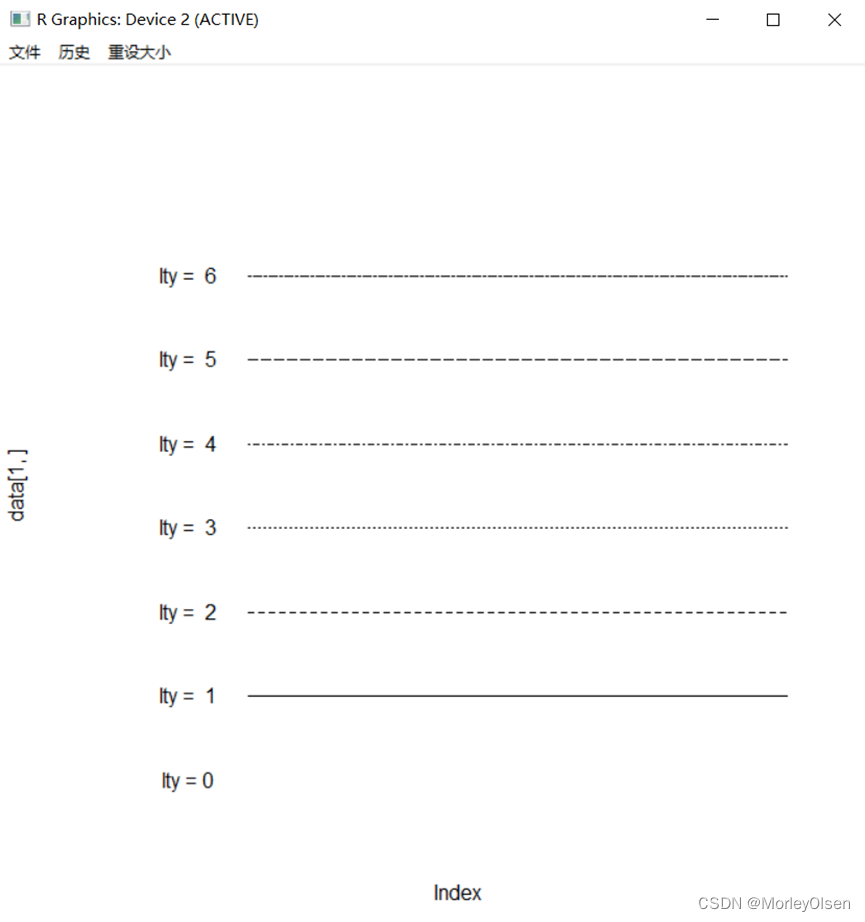
【练习11】线的样式和线的宽度
Eg.1:线的样式
| data <- matrix(rep(rep(1:7), 10), ncol = 10, nrow = 7) plot(data[1, ], type = "l", lty = 0, ylim = c(1, 8), xlim = c(-1, 10), axes = F) text(0, 1, labels = "lty = 0") for (i in c(2:7)) { lines(data[i, ], lty = i - 1) text(0, i, labels = paste("lty = ", i - 1)) } |
Eg.2:线的宽度
| data <- matrix(rep(rep(1:6), 10), ncol = 10, nrow = 6) plot(data[1, ], type = "l", lwd = 0.5, ylim = c(1, 8), xlim = c(-1, 10), axes = F); text(0, 1, labels = "lwd = 0.5") lines(data[2, ], type = "l", lwd = 0.8);text(0, 2, labels = "lwd = 0.8") lines(data[3, ], type = "l", lwd = 1);text(0, 3, labels = "lwd = 1") lines(data[4, ], type = "l", lwd = 1.5);text(0, 4, labels = "lwd = 1.5") lines(data[5, ], type = "l", lwd = 2);text(0, 5, labels = "lwd = 2") lines(data[6, ], type = "l", lwd = 4);text(0, 6, labels = "lwd = 4") |

【练习12】添加参考线
Eg.1:
| # 绘制空白画布 plot(c(0:10), col = "white") # 添加水平线 abline(h = c(2, 6, 8)) # 添加垂直线 abline(v = seq(2, 10, 2), lty = 2, col = "blue") # 添加直线y = 2+x abline(a = 2, b = 1) |

【练习13】添加线段和箭头
Eg.1:
| plot(c(0:10), col = "white") segments(2, 1, 4, 8) arrows(4, 0, 7, 3, angle = 30) arrows(4, 2, 7, 5, angle = 60) |

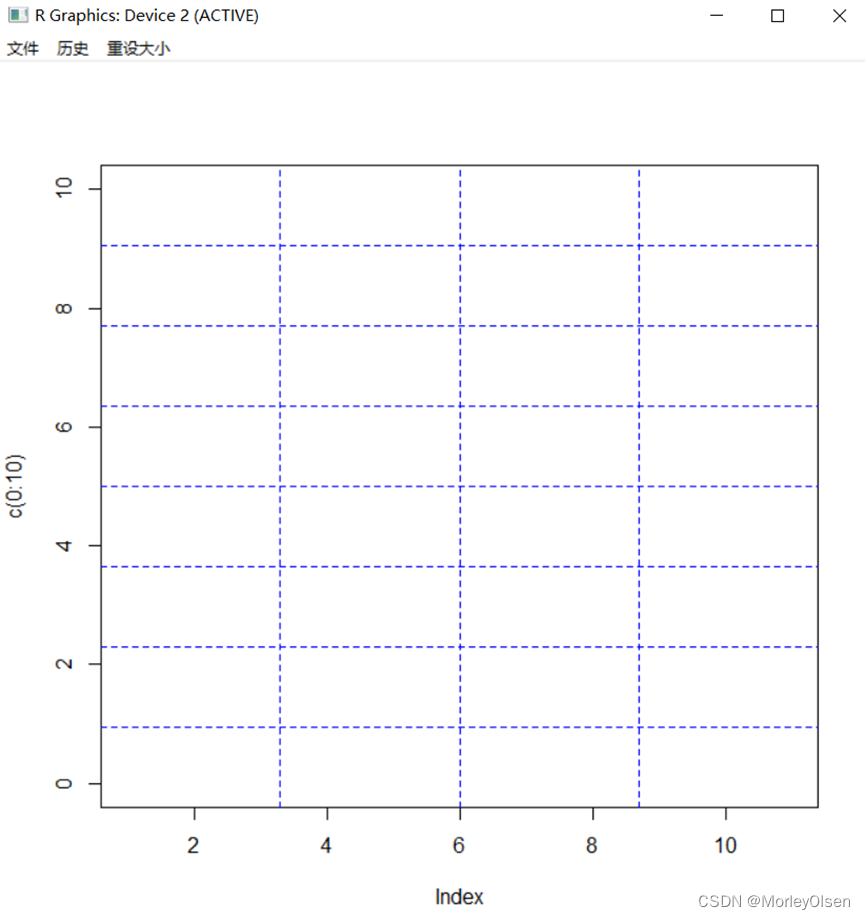
【练习14】添加网格线
Eg.1:
| plot(c(0:10), col = "white") # 空白画布 grid(nx = 4, ny = 8, lwd = 1, lty = 2, col = "blue") # 添加网格线 |
【练习15】添加坐标轴须
Eg.1:
| set.seed(123) # 种子 x <- rnorm(500) # 生成500个标准正态分布的数据 plot(density(x)) # 绘制核密度曲线 rug(x , col = "blue") # 添加坐标轴须 |

【练习16】以mtcars数据集为例查看不同的线元素函数的用法
Eg.1:
| smpg <- (mpg - min(mpg)) / (max(mpg) - min(mpg)) plot(wt, smpg, ylab = "standardized mpg") # 添加核密度曲线图 lines(density(wt), col = "red") # 指向密度曲线的箭头 arrows(1.8, 0.05, 1.5, 0.1, angle = 10, cex = 0.5) text(2, 0.05, "核密度曲线", cex = 0.6) # 添加回归线 abline(lm(smpg ~ wt), lty = 2, col = "green") # 指向回归直线的箭头 arrows(2, 0.5, 2, 0.7, angle = 10, cex = 0.5) text(2, 0.45, "回归线", cex = 0.6) # wt与mpg反向线性相关,添加最大最小值线段表现这种关系 segments(min(wt), max(smpg), max(wt), min(smpg), lty = 3, col = "blue") # 指向最大最小值线段的箭头 arrows(3, 0.8, 2.5, 0.76, angle = 10, cex = 0.5) text(3.3, 0.8, "最大最小值线段", cex = 0.6) # 添加网格线作为背景 grid(nx = 4, ny = 5, lty = 2, col = "grey") |

Eg.2:
| par(mfrow = c(1, 3)) plot(density(wt), col = "red") # 绘制核密度曲线 plot(wt, fitted(lm(mpg ~ wt)), type = "l", lty = 2, col = "green") # 绘制回归线 plot(seq(min(wt), max(wt), length = 100), seq(max(mpg), min(mpg), length = 100), type = "l", lty = 3, col = "blue") # 绘制最大、最小值线 |

【练习17】输出到屏幕
Eg.1:
| windows() # 打开图形设备界面 attach(mtcars) plot(wt, mpg) X11() # 打开图形设备界面 plot(wt, mpg) |

【练习18】以mtcars为例,生成的直方图
Eg.1:
| op <- par(mfrow = c(2, 3), mar = c(4, 4, 2, 0.5), mgp = c(2, 0.5, 0)) hist(wt, main = "freq = TRUE") # 默认的频数直方图,左下,中上,中下,右上,右下 hist(wt, breaks = 5, main = "breaks = 5") # 减小区间段数的直方图 hist(wt, col = "light blue", main = "colored") # 给直方图的柱形添加颜色 hist(wt, freq = FALSE, main = "freq = FALSE") # 概率密度直方图 hist(wt, breaks = 40, main = "breaks = 40") # 增大区间段数的直方图 # 在直方图上添加密度曲线和正态分布概率密度曲线 hist(wt, freq = FALSE, main = "with density curve and normal curve") lines(density(wt), col = "blue") lines(density(rnorm(1e+6, mean(wt), sd(wt))), lty = 2, col = "red") par(op) |

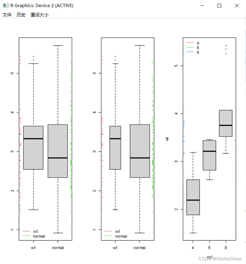
【练习19】绘图箱线图
Eg.1:
| set.seed(1234) normal <- rnorm(100, mean(wt), sd(wt)) # 生成100个正态分布数据 op <- par(mfrow = c(1, 3)) boxplot(list(wt, normal), xaxt = "n") # 绘制箱线图 axis(1, at = 1:2, labels = c("wt", "normal")) # 添加坐标轴 rug(wt, side = 2, col = 2); rug(normal, side = 4, col = 3) # 添加坐标轴须 legend("bottomleft", c("wt", "normal"), lty = 1, col = 2:3, bty = "n") # 添加图例 boxplot(list(wt, normal), xaxt = "n", varwidth = TRUE) rug(wt, side = 2, col = 2); rug(normal, side = 4, col = 3) axis(1, at = 1:2, labels = c("wt", "normal")) legend("bottomleft", c("wt", "normal"), lty = 1, col = 2:3, bty = "n") boxplot(wt ~ cyl) rug(wt[cyl == 4], side = 2, col = 2); rug(wt[cyl == 6], side = 4, col = 3) rug(wt[cyl == 8], side = 2, col = 4) legend("topleft", c("4", "6", "8"), lty = 1, col = 2:4, bty = "n") par(op) |
【练习20】绘图小提琴图
Eg.1:
| # 页面分割掉1/2,为与箱线图和核密度图对比而作,小提琴图只需要第二个语句即可 par(fig = c(0, 1, 0.5, 1), mfrow = c(2, 1)) # 绘制小提琴图 library(vioplot) vioplot(wt[cyl == 4], wt[cyl == 6], wt[cyl == 8], border = "black", col = "light green", rectCol = "blue", horizontal = TRUE) # 分割另外1/2页面 par(fig = c(0, 1, 0, .5), mar = c(0, 2, 0, 0.5) , new = TRUE) # 绘制箱线图 boxplot(wt ~ cyl, horizontal = TRUE, pars = list(boxwex = 0.1), border = "blue") # 在箱线图上叠加核密度图 par(fig = c(0, 0.53, 0.1, 0.2), new = TRUE) plot(density(wt[cyl == 4], bw = 0.3), xaxt = "n", yaxt = "n", ann = FALSE, bty = "n") par(fig = c(0.26, 0.56, 0.25, 0.35), new = TRUE) plot(density(wt[cyl == 6], bw = 0.3), xaxt = "n", yaxt = "n", ann = FALSE, bty = "n") par(fig = c(0.33, 1, 0.4, 0.5), new = TRUE) plot(density(wt[cyl == 8], bw = 0.5), xaxt = "n", yaxt = "n", ann = FALSE, bty = "n") |

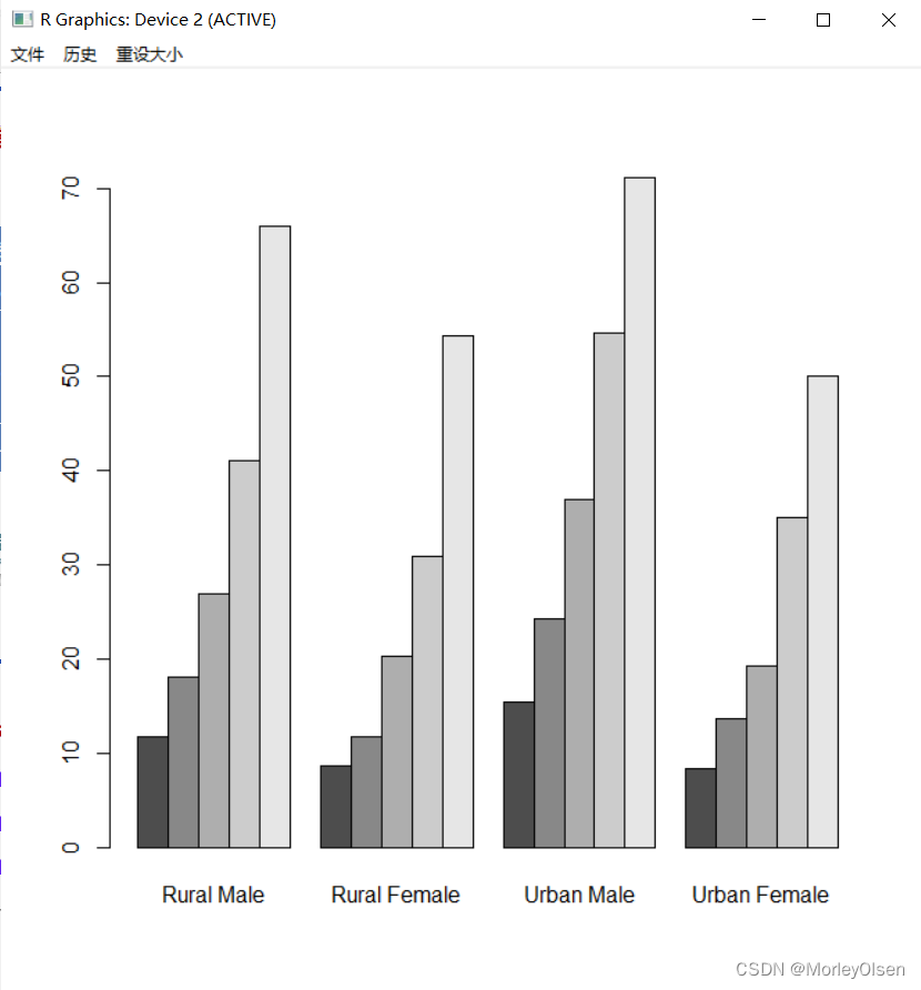
【练习21】绘图条形图
Eg.1:
| bardata <- table(cyl, carb) # 得到表格数据 pal <- RColorBrewer::brewer.pal(3, "Set1") # 颜色调配 op <- par(mfrow = c(2, 2), mar = c(3, 3, 3, 2), mgp = c(1.5, 0.5, 0)) barplot(bardata, col = pal, beside = TRUE, xlab = "carb") # 分组条形图 legend("topright", c("4", "6", "8"), pch = 15, col = pal, bty = "n") barplot(bardata, col = pal, xlab = "carb") # 默认堆砌条形图 legend("topright", c("4", "6", "8"), pch = 15, col = pal, bty = "n") barplot(bardata, col = pal, beside = TRUE, horiz = TRUE, ylab = "carb") # 水平放置的条形图 legend(5.3, 26, c("4", "6", "8"), pch = 15, col = pal, bty = "n", cex = 0.6) barplot(bardata, col = pal, beside = TRUE, ylim = c(0, 7), xlab = "carb") legend("topright", c("4", "6", "8"), pch = 15, col = pal, bty = "n") # 显示数值 text(labels = as.vector(bardata), cex = 0.7, x = c(1.5:23.5)[1:23 %% 4 > 0], y = as.vector(bardata) + 0.5) par(op) |

【练习22】绘图点图
Eg.1:
| dotchart(bardata, bg = pal) |

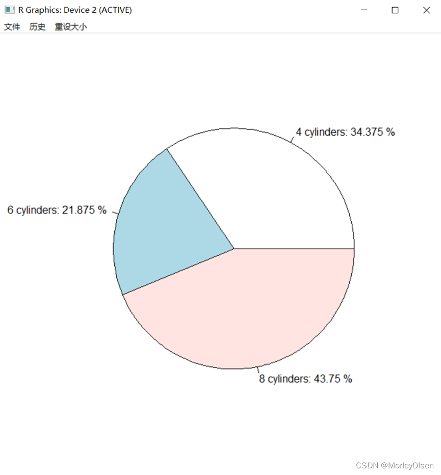
【练习23】绘图饼图
Eg.1:
| percent <- as.vector(table(cyl)) / sum(as.vector(table(cyl))) * 100 # 计算百分比 pie(table(cyl), labels = paste(c("4", "6", "8"), "cylinders:", percent, "%")) # 画饼图 |
【练习24】用methods()查plot()的作图方法
Eg.1:
| methods("plot") |

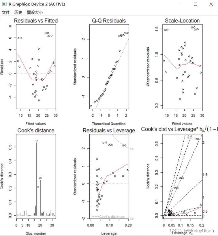
【练习25】plot()函数的应用
Eg.1:
| plot(density(wt), type = "l") class(density(wt)) # 第一个参数density类,画核密度曲线 plot(table(cyl, vs)); class(table(cyl, vs)) # 第一个参数table类,画马赛克图 opr <- par(mfrow = c(2, 3), mar = c(4, 4, 2, 4)) for (i in 1:6) { plot(lm(mpg ~ wt), i) # 第一个参数lm类,画回归诊断图 } par(opr); class(lm(mpg ~ wt)) plot(mtcars[, c(1, 3:7)]) class(mtcars[, c(1, 3:7)]) # 第一个参数data.frame类,画散点图矩阵 |


Eg.2:
| x <- seq(from = 0, to = 2*pi, length = 10) # 取10个x值 y <- sin(x) # 计算相对应的y值 type <- c("p", "l", "b", "o", "c", "h", "s", "S", "n" ) # 图形类型向量 op <- par(mfrow = c(3, 3), mar = c(4, 4, 1, 1)) for (i in 1:9) { plot(x, y, type = type[i] , main = paste("type:", type[i])) } par(op) |

【练习26】绘图散点图矩阵
Eg.1:绘图对象为公式
| pairs( ~ mpg + disp + drat + wt, data = mtcars, col = as.integer(factor(cyl)) + 1, main = "Scatter Plot Matrix") |

Eg.2:绘图对象为数据框
| pairs(mtcars[, c(1, 3, 5, 6)], col = as.integer(factor(cyl)) + 1, main = "Scatter Plot Matrix") |
运行结果:同上图。
Eg.1:
| mosaicdata <- ftable(cyl, vs) # 二维列联表 par(mfrow = c(1, 1)) mosaicplot(mosaicdata, shade = TRUE, main = "") # 绘制马赛克图 |

【练习28】绘图向日葵散点图
Eg.1:
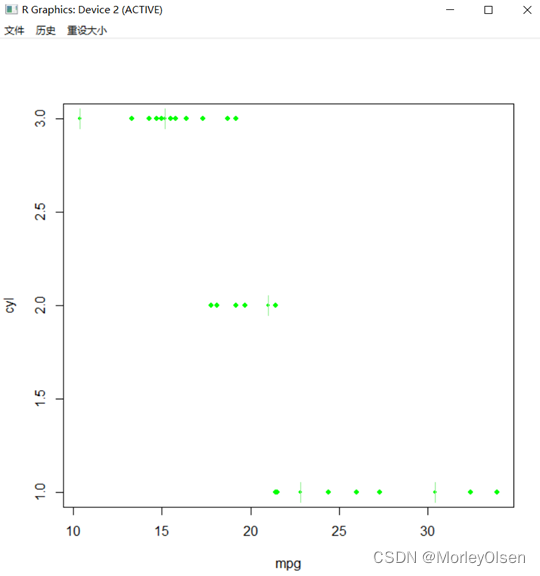
| sunflowerplot(mpg, cyl, col = "green", seg.col = "light green") |
【练习29】绘图热图
Eg.1:
| heatmap(as.matrix(mtcars), col = pal, scale = "column") |

四:实验知识点总结
1:初级绘图主要包括以下四个部分——绘制基础图形、修改图形参数、绘制组合图形、保存图形。
2:分析数据分布情况时,可以使用直方图、条形图、饼图、箱线图、散点图等图形。相关图形的使用函数和功能如下图所示。
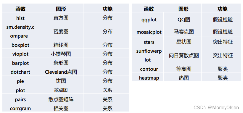
3:R语言绘图函数分类,如下图所示。

五:遇到的问题和解决方法
问题1:在PPT08,第84页中,jpeg设置保存的路径和文件名称、类型处运行会出错。具体的报错如下图所示。

解决1:经过查询后,发现jpeg函数中参数应该是【filename】而不是【filenames】,修改之后即可通过。
问题2:安装包可能因为镜像源的问题而无法下载。
解决2:换源,可使用【chooseCRANmirror()】代码。