目录
- 简介
- 安装
- 实用代码示例
- 带有填充的简单衰减正弦函数及其红色的指数包络线
- 具有数据点的 sinc 函数、相应的误差条和 2--sigma 置信带
- 几种散点样式的演示
- 展示 QCustomPlot 在设计绘图方面的多功能性
- 结语
所有文章除特别声明外,均采用 CC BY-NC-SA 4.0 许可协议。转载请注明来自 nixgnauhcuy’s blog!
如需转载,请标明出处!
完整代码我已经上传到 Github 上了,可前往 https://github.com/nixgnauhcuy/QCustomPlot_Pyqt_Study 获取。
完整文章路径:
- Pyqt QCustomPlot 简介、安装与实用代码示例(一) | nixgnauhcuy
- Pyqt QCustomPlot 简介、安装与实用代码示例(二) | nixgnauhcuy
- Pyqt QCustomPlot 简介、安装与实用代码示例(三) | nixgnauhcuy
- Pyqt QCustomPlot 简介、安装与实用代码示例(四) | nixgnauhcuy
简介
QCustomPlot 是一个用于绘图和数据可视化的 Qt C++ 小部件。它没有其他依赖项,并且有详细的文档说明。这个绘图库专注于制作高质量的、适合发表的二维图表和图形,同时在实时可视化应用中提供高性能。
QCustomPlot 可以导出为多种格式,例如矢量化的 PDF 文件和光栅化图像(如 PNG、JPG 和 BMP)。QCustomPlot 是在应用程序内部显示实时数据以及为其他媒体制作高质量图表的解决方案。
QCustomPlot is a Qt C++ widget for plotting and data visualization. It has no further dependencies and is well documented. This plotting library focuses on making good looking, publication quality 2D plots, graphs and charts, as well as offering high performance for realtime visualization applications. Have a look at the Setting Up and the Basic Plotting tutorials to get started.
QCustomPlot can export to various formats such as vectorized PDF files and rasterized images like PNG, JPG and BMP. QCustomPlot is the solution for displaying of realtime data inside the application as well as producing high quality plots for other media.
安装
推荐安装 QCustomPlot_PyQt5,QCustomPlot2 目前许多源都无法下载,目前只有豆瓣源和腾讯源有(豆瓣源已失效)。
pip install QCustomPlot_PyQt5orpip install -i https://mirrors.cloud.tencent.com/pypi/simple/ QCustomPlot2
实用代码示例
官方提供了多个 demo,不过都是使用 qtC++实现的,由于我们使用的 pyqt,故使用 pyqt 实现。
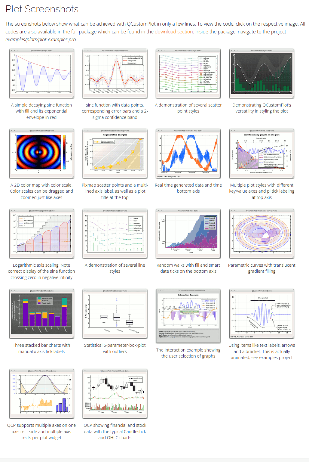
带有填充的简单衰减正弦函数及其红色的指数包络线
A simple decaying sine function with fill and its exponential envelope in red
import sys, mathfrom PyQt5.QtWidgets import QApplication, QGridLayout, QWidget
from PyQt5.QtGui import QPen, QBrush, QColor
from PyQt5.QtCore import Qt
from QCustomPlot_PyQt5 import QCustomPlot, QCP, QCPAxisTickerTime, QCPRangeclass MainForm(QWidget):def __init__(self) -> None:super().__init__()self.setWindowTitle("带有填充的简单衰减正弦函数及其红色的指数包络线")self.resize(400,400)self.customPlot = QCustomPlot(self)self.gridLayout = QGridLayout(self).addWidget(self.customPlot)# add two new graphs and set their look:self.customPlot.addGraph()self.customPlot.graph(0).setPen(QPen(Qt.blue)) # line color blue for first graphself.customPlot.graph(0).setBrush(QBrush(QColor(0, 0, 255, 20))) # first graph will be filled with translucent blueself.customPlot.addGraph()self.customPlot.graph(1).setPen(QPen(Qt.red)) # line color red for second graph# generate some points of data (y0 for first, y1 for second graph):x = []y0 = []y1 = []for i in range(251):x.append(i)y0.append(math.exp(-i/150.0)*math.cos(i/10.0)) # exponentially decaying cosiney1.append(math.exp(-i/150.0)) # exponential envelopeself.customPlot.xAxis.setTicker(QCPAxisTickerTime())self.customPlot.xAxis.setRange(0, 250)self.customPlot.yAxis.setRange(-1.1, 1.1)# configure right and top axis to show ticks but no labels:# (see QCPAxisRect::setupFullAxesBox for a quicker method to do this)self.customPlot.xAxis2.setVisible(True)self.customPlot.xAxis2.setTickLabels(False)self.customPlot.yAxis2.setVisible(True)self.customPlot.yAxis2.setTickLabels(False)# pass data points to graphs:self.customPlot.graph(0).setData(x, y0)self.customPlot.graph(1).setData(x, y1)# let the ranges scale themselves so graph 0 fits perfectly in the visible area:self.customPlot.graph(0).rescaleAxes()# same thing for graph 1, but only enlarge ranges (in case graph 1 is smaller than graph 0):self.customPlot.graph(1).rescaleAxes(True)# Note: we could have also just called customPlot->rescaleAxes(); instead# Allow user to drag axis ranges with mouse, zoom with mouse wheel and select graphs by clicking:self.customPlot.setInteractions(QCP.iRangeDrag | QCP.iRangeZoom | QCP.iSelectPlottables)# make left and bottom axes always transfer their ranges to right and top axes:self.customPlot.xAxis.rangeChanged[QCPRange].connect(self.customPlot.xAxis2.setRange)self.customPlot.yAxis.rangeChanged[QCPRange].connect(self.customPlot.yAxis2.setRange)if __name__ == '__main__':app = QApplication(sys.argv)mainForm = MainForm()mainForm.show()sys.exit(app.exec())
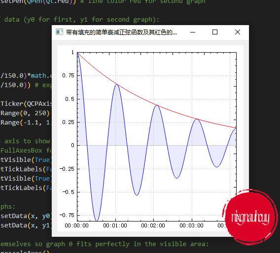
具有数据点的 sinc 函数、相应的误差条和 2–sigma 置信带
sinc function with data points, corresponding error bars and a 2-sigma confidence band
import sys, math, randomfrom PyQt5.QtWidgets import QApplication, QGridLayout, QWidget
from PyQt5.QtGui import QPen, QBrush, QColor, QFont
from PyQt5.QtCore import Qt, QLocale
from QCustomPlot_PyQt5 import QCustomPlot, QCPGraph, QCPScatterStyle, QCPErrorBarsclass MainForm(QWidget):def __init__(self) -> None:super().__init__()self.setWindowTitle("具有数据点的 sinc 函数、相应的误差条和 2--sigma 置信带")self.resize(400,400)self.customPlot = QCustomPlot(self)self.gridLayout = QGridLayout(self).addWidget(self.customPlot)self.customPlot.legend.setVisible(True)self.customPlot.legend.setFont(QFont("Helvetica",9))# set locale to english, so we get english decimal separator:self.customPlot.setLocale(QLocale(QLocale.English, QLocale.UnitedKingdom))# add confidence band graphs:self.customPlot.addGraph()self.pen = QPen(Qt.PenStyle.DotLine)self.pen.setWidth(1)self.pen.setColor(QColor(180,180,180))self.customPlot.graph(0).setName("Confidence Band 68%")self.customPlot.graph(0).setPen(self.pen)self.customPlot.graph(0).setBrush(QBrush(QColor(255,50,30,20)))self.customPlot.addGraph()self.customPlot.legend.removeItem(self.customPlot.legend.itemCount()-1) # don't show two confidence band graphs in legendself.customPlot.graph(1).setPen(self.pen)self.customPlot.graph(0).setChannelFillGraph(self.customPlot.graph(1))# add theory curve graph:self.customPlot.addGraph()self.pen.setStyle(Qt.PenStyle.DashLine)self.pen.setWidth(2)self.pen.setColor(Qt.GlobalColor.red)self.customPlot.graph(2).setPen(self.pen)self.customPlot.graph(2).setName("Theory Curve")# add data point graph:self.customPlot.addGraph()self.customPlot.graph(3).setPen(QPen(Qt.GlobalColor.blue))self.customPlot.graph(3).setLineStyle(QCPGraph.lsNone)self.customPlot.graph(3).setScatterStyle(QCPScatterStyle(QCPScatterStyle.ssCross, 4))# add error bars:self.errorBars = QCPErrorBars(self.customPlot.xAxis, self.customPlot.yAxis)self.errorBars.removeFromLegend()self.errorBars.setAntialiased(False)self.errorBars.setDataPlottable(self.customPlot.graph(3))self.errorBars.setPen(QPen(QColor(180,180,180)))self.customPlot.graph(3).setName("Measurement")# generate ideal sinc curve data and some randomly perturbed data for scatter plot:x0 = []y0 = []yConfUpper = []yConfLower = []for i in range(250):x0.append((i/249.0-0.5)*30+0.01) # by adding a small offset we make sure not do divide by zero in next code liney0.append(math.sin(x0[i])/x0[i]) # sinc functionyConfUpper.append(y0[i]+0.15)yConfLower.append(y0[i]-0.15)x0[i] *= 1000x1 = []y1 = []y1err = []for i in range(50):# generate a gaussian distributed random number:tmp1 = random.random()tmp2 = random.random()r = math.sqrt(-2*math.log(tmp1))*math.cos(2*math.pi*tmp2) # box-muller transform for gaussian distribution# set y1 to value of y0 plus a random gaussian pertubation:x1.append((i/50.0-0.5)*30+0.25)y1.append(math.sin(x1[i])/x1[i]+r*0.15)x1[i] *= 1000y1err.append(0.15)# pass data to graphs and let QCustomPlot determine the axes ranges so the whole thing is visible:self.customPlot.graph(0).setData(x0, yConfUpper)self.customPlot.graph(1).setData(x0, yConfLower)self.customPlot.graph(2).setData(x0, y0)self.customPlot.graph(3).setData(x1, y1)self.errorBars.setData(y1err, y1err)self.customPlot.graph(2).rescaleAxes()self.customPlot.graph(3).rescaleAxes(True)# setup look of bottom tick labels:self.customPlot.xAxis.setTickLabelRotation(30)self.customPlot.xAxis.ticker().setTickCount(9)self.customPlot.xAxis.setNumberFormat("ebc")self.customPlot.xAxis.setNumberPrecision(1)self.customPlot.xAxis.moveRange(-10)# make top right axes clones of bottom left axes. Looks prettier:self.customPlot.axisRect().setupFullAxesBox()if __name__ == '__main__':app = QApplication(sys.argv)mainForm = MainForm()mainForm.show()sys.exit(app.exec())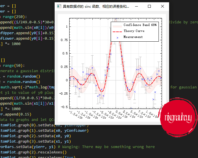
几种散点样式的演示
A demonstration of several scatter point styles
import sys, mathfrom PyQt5.QtWidgets import QApplication, QGridLayout, QWidget
from PyQt5.QtGui import QPen, QColor, QFont, QPainterPath
from PyQt5.QtCore import Qt
from QCustomPlot_PyQt5 import QCustomPlot, QCPGraph, QCPScatterStyleclass MainForm(QWidget):def __init__(self) -> None:super().__init__()self.setWindowTitle("几种散点样式的演示")self.resize(400,400)self.customPlot = QCustomPlot(self)self.gridLayout = QGridLayout(self).addWidget(self.customPlot)self.customPlot.legend.setVisible(True)self.customPlot.legend.setFont(QFont("Helvetica", 9))self.customPlot.legend.setRowSpacing(-3)shapes = [QCPScatterStyle.ssCross, QCPScatterStyle.ssPlus, QCPScatterStyle.ssCircle, QCPScatterStyle.ssDisc, QCPScatterStyle.ssSquare, QCPScatterStyle.ssDiamond, QCPScatterStyle.ssStar, QCPScatterStyle.ssTriangle, QCPScatterStyle.ssTriangleInverted, QCPScatterStyle.ssCrossSquare, QCPScatterStyle.ssPlusSquare, QCPScatterStyle.ssCrossCircle, QCPScatterStyle.ssPlusCircle, QCPScatterStyle.ssPeace, QCPScatterStyle.ssCustom]shapes_names = ["ssCross","ssPlus","ssCircle","ssDisc","ssSquare","ssDiamond","ssStar","ssTriangle","ssTriangleInverted","ssCrossSquare","ssPlusSquare","ssCrossCircle","ssPlusCircle","ssPeace","ssCustom"]self.pen = QPen()# add graphs with different scatter styles:for i in range(len(shapes)):self.customPlot.addGraph()self.pen.setColor(QColor(int(math.sin(i*0.3)*100+100), int(math.sin(i*0.6+0.7)*100+100), int(math.sin(i*0.4+0.6)*100+100)))# generate data:x = [k/10.0 * 4*3.14 + 0.01 for k in range(10)]y = [7*math.sin(x[k])/x[k] + (len(shapes)-i)*5 for k in range(10)]self.customPlot.graph(i).setData(x, y)self.customPlot.graph(i).rescaleAxes(True)self.customPlot.graph(i).setPen(self.pen)self.customPlot.graph(i).setName(shapes_names[i])self.customPlot.graph(i).setLineStyle(QCPGraph.lsLine)# set scatter style:if shapes[i] != QCPScatterStyle.ssCustom:self.customPlot.graph(i).setScatterStyle(QCPScatterStyle(shapes[i], 10))else:customScatterPath = QPainterPath()for j in range(3):customScatterPath.cubicTo(math.cos(2*math.pi*j/3.0)*9, math.sin(2*math.pi*j/3.0)*9, math.cos(2*math.pi*(j+0.9)/3.0)*9, math.sin(2*math.pi*(j+0.9)/3.0)*9, 0, 0)self.customPlot.graph(i).setScatterStyle(QCPScatterStyle(customScatterPath, QPen(Qt.black, 0), QColor(40, 70, 255, 50), 10))# set blank axis lines:self.customPlot.rescaleAxes()self.customPlot.xAxis.setTicks(False)self.customPlot.yAxis.setTicks(False)self.customPlot.xAxis.setTickLabels(False)self.customPlot.yAxis.setTickLabels(False)# make top right axes clones of bottom left axes:self.customPlot.axisRect().setupFullAxesBox()if __name__ == '__main__':app = QApplication(sys.argv)mainForm = MainForm()mainForm.show()sys.exit(app.exec())
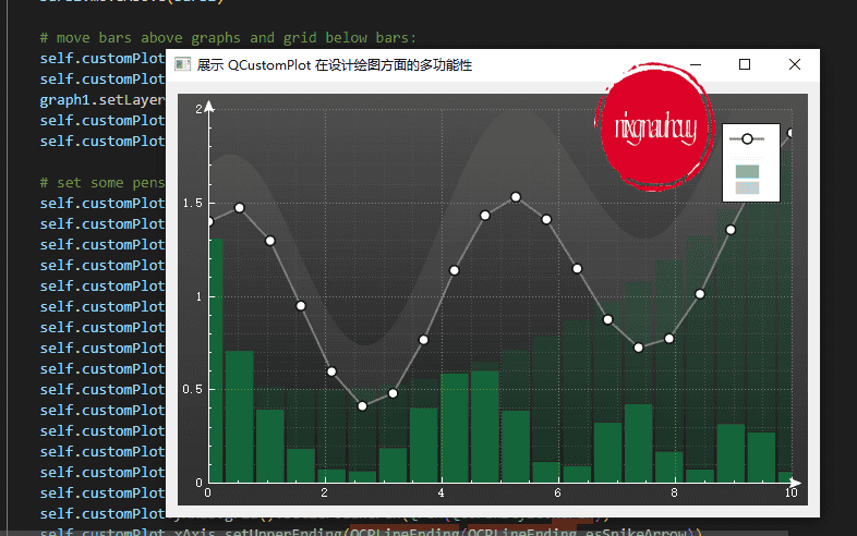
展示 QCustomPlot 在设计绘图方面的多功能性
Demonstrating QCustomPlot’s versatility in styling the plot
import sys, math, randomfrom PyQt5.QtWidgets import QApplication, QGridLayout, QWidget
from PyQt5.QtGui import QPen, QColor, QFont, QBrush, QLinearGradient
from PyQt5.QtCore import Qt
from QCustomPlot_PyQt5 import QCustomPlot, QCPGraph, QCPScatterStyle, QCPBars, QCPLineEndingclass MainForm(QWidget):def __init__(self) -> None:super().__init__()self.setWindowTitle("展示 QCustomPlot 在设计绘图方面的多功能性")self.resize(600,400)self.customPlot = QCustomPlot(self)self.gridLayout = QGridLayout(self).addWidget(self.customPlot)# prepare data:x1 = [i/(20-1)*10 for i in range(20)]y1 = [math.cos(x*0.8+math.sin(x*0.16+1.0))*math.sin(x*0.54)+1.4 for x in x1]x2 = [i/(100-1)*10 for i in range(100)]y2 = [math.cos(x*0.85+math.sin(x*0.165+1.1))*math.sin(x*0.50)+1.7 for x in x2]x3 = [i/(20-1)*10 for i in range(20)]y3 = [0.05+3*(0.5+math.cos(x*x*0.2+2)*0.5)/(x+0.7)+random.random()/100 for x in x3]x4 = x3y4 = [(0.5-y)+((x-2)*(x-2)*0.02) for x,y in zip(x4,y3)]# create and configure plottables:graph1 = QCPGraph(self.customPlot.xAxis, self.customPlot.yAxis)graph1.setData(x1, y1)graph1.setScatterStyle(QCPScatterStyle(QCPScatterStyle.ssCircle, QPen(Qt.black, 1.5), QBrush(Qt.white), 9))graph1.setPen(QPen(QColor(120, 120, 120), 2))graph2 = QCPGraph(self.customPlot.xAxis, self.customPlot.yAxis)graph2.setData(x2, y2)graph2.setPen(QPen(Qt.PenStyle.NoPen))graph2.setBrush(QColor(200, 200, 200, 20))graph2.setChannelFillGraph(graph1)bars1 = QCPBars(self.customPlot.xAxis, self.customPlot.yAxis)bars1.setWidth(9/(20-1))bars1.setData(x3, y3)bars1.setPen(QPen(Qt.PenStyle.NoPen))bars1.setBrush(QColor(10, 140, 70, 160))bars2 = QCPBars(self.customPlot.xAxis, self.customPlot.yAxis)bars2.setWidth(9/(20-1))bars2.setData(x4, y4)bars2.setPen(QPen(Qt.PenStyle.NoPen))bars2.setBrush(QColor(10, 100, 50, 70))bars2.moveAbove(bars1)# move bars above graphs and grid below bars:self.customPlot.addLayer("abovemain", self.customPlot.layer("main"), QCustomPlot.limAbove)self.customPlot.addLayer("belowmain", self.customPlot.layer("main"), QCustomPlot.limBelow)graph1.setLayer("abovemain")self.customPlot.xAxis.grid().setLayer("belowmain")self.customPlot.yAxis.grid().setLayer("belowmain")# set some pens, brushes and backgrounds:self.customPlot.xAxis.setBasePen(QPen(Qt.white, 1))self.customPlot.yAxis.setBasePen(QPen(Qt.white, 1))self.customPlot.xAxis.setTickPen(QPen(Qt.white, 1))self.customPlot.yAxis.setTickPen(QPen(Qt.white, 1))self.customPlot.xAxis.setSubTickPen(QPen(Qt.white, 1))self.customPlot.yAxis.setSubTickPen(QPen(Qt.white, 1))self.customPlot.xAxis.setTickLabelColor(Qt.white)self.customPlot.yAxis.setTickLabelColor(Qt.white)self.customPlot.xAxis.grid().setPen(QPen(QColor(140, 140, 140), 1, Qt.DotLine))self.customPlot.yAxis.grid().setPen(QPen(QColor(140, 140, 140), 1, Qt.DotLine))self.customPlot.xAxis.grid().setSubGridPen(QPen(QColor(80, 80, 80), 1, Qt.DotLine))self.customPlot.yAxis.grid().setSubGridPen(QPen(QColor(80, 80, 80), 1, Qt.DotLine))self.customPlot.xAxis.grid().setSubGridVisible(True)self.customPlot.yAxis.grid().setSubGridVisible(True)self.customPlot.xAxis.grid().setZeroLinePen(QPen(Qt.PenStyle.NoPen))self.customPlot.yAxis.grid().setZeroLinePen(QPen(Qt.PenStyle.NoPen))self.customPlot.xAxis.setUpperEnding(QCPLineEnding(QCPLineEnding.esSpikeArrow))self.customPlot.yAxis.setUpperEnding(QCPLineEnding(QCPLineEnding.esSpikeArrow))plotGradient = QLinearGradient()plotGradient.setStart(0, 0)plotGradient.setFinalStop(0, 350)plotGradient.setColorAt(0, QColor(80, 80, 80))plotGradient.setColorAt(1, QColor(50, 50, 50))self.customPlot.setBackground(plotGradient)axisRectGradient = QLinearGradient()axisRectGradient.setStart(0, 0)axisRectGradient.setFinalStop(0, 350)axisRectGradient.setColorAt(0, QColor(80, 80, 80))axisRectGradient.setColorAt(1, QColor(30, 30, 30))self.customPlot.axisRect().setBackground(axisRectGradient)self.customPlot.rescaleAxes()self.customPlot.yAxis.setRange(0, 2)self.customPlot.legend.setVisible(True)self.customPlot.legend.setFont(QFont("Helvetica", 9))self.customPlot.legend.setRowSpacing(-3)if __name__ == '__main__':app = QApplication(sys.argv)mainForm = MainForm()mainForm.show()sys.exit(app.exec())
结语
官网给的示例太多了,一篇塞进太多内容也不好,所以其他的示例放在后面吧,后续有空再更新出来~