这里写目录标题
- 1.loding加载动画
- 2.全屏加载动画效果
- 3.吃豆豆
- 4.鼠标悬停3D翻转效果
- 5.3D旋转木马效果
- 6.flex弹性布局-酷狗音乐播放列表
- flex弹性布局-今日头条首页热门视频栏
- grid网格布局-360图片展示
- 小米商城左侧二级菜单
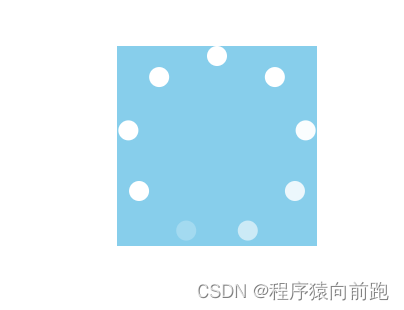
1.loding加载动画
代码如下:
<!DOCTYPE html>
<html><head><meta charset="utf-8"><title>loding加载动画</title><style type="text/css">body {margin: 0;padding: 0;}.loading {width: 200px;height: 200px;background-color: skyblue;margin: 100px auto 0;position: relative;}.loading .item {width: 20px;height: 20px;background-color: rgba(255,255,255,0.2);position: absolute;top: 0;left: 50%;margin-left: -10px;transform-origin: 10px 100px;border-radius: 50%;/* 存在逻辑运算 *//* 使用自定义属性来进行运算 */transform: rotate(calc(var(--i)*40deg));animation: loading 1s ease infinite;animation-delay: calc(var(--i)*0.11s);}@keyframes loading {/* 0-1s */%0,%50{background-color: rgba(255,255,255,0.2);}/* 时间50.5%-100% */50.5%,100%{background-color: #fff;}}/* .loading .item:nth-child(1) {animation-delay: 0s;}.loading .item:nth-child(2) {animation-delay: 0.11s;}.loading .item:nth-child(3) {animation-delay: 0.22s;}.loading .item:nth-child(4) {animation-delay: 0.33s;}.loading .item:nth-child(5) {animation-delay: 0.44s;}.loading .item:nth-child(6) {animation-delay: 0.55s;}.loading .item:nth-child(7) {animation-delay: 0.66s;}.loading .item:nth-child(8) {animation-delay: 0.77s;}.loading .item:nth-child(9) {animation-delay: 0.88s;} */</style></head><body><div class="loading"><div class="item" style="--i:0"></div><div class="item" style="--i:1"></div><div class="item" style="--i:2"></div><div class="item" style="--i:3"></div><div class="item" style="--i:4"></div><div class="item" style="--i:5"></div><div class="item" style="--i:6"></div><div class="item" style="--i:7"></div><div class="item" style="--i:8"></div></div></body>
</html>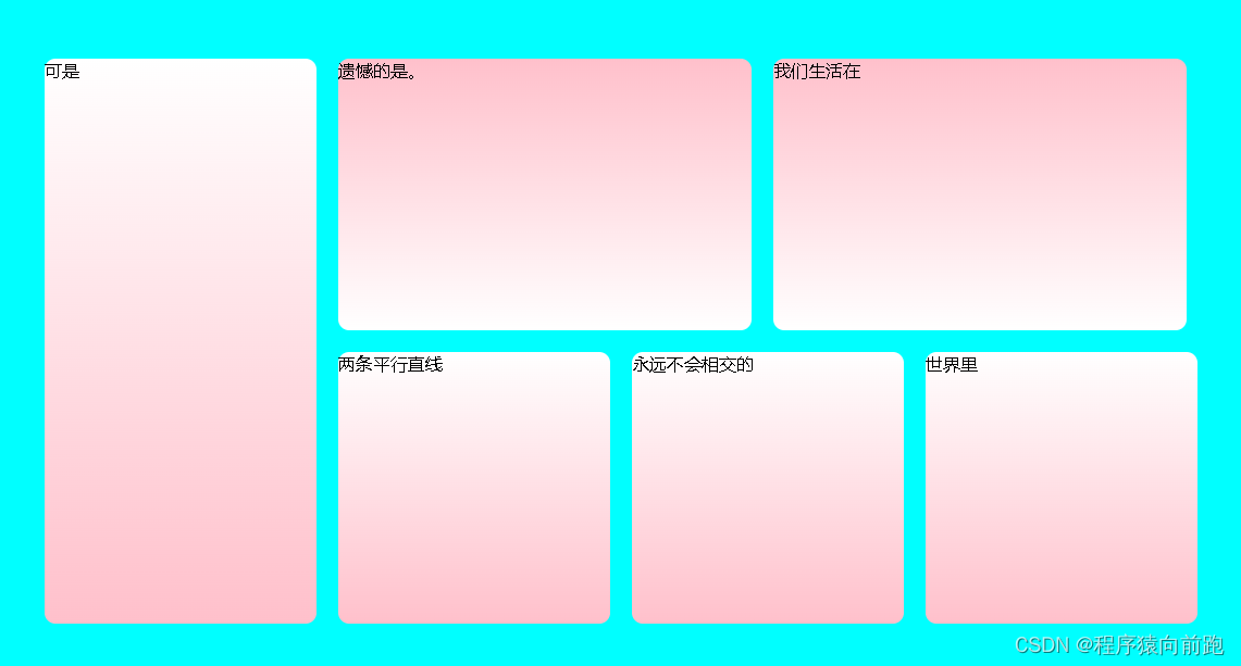
2.全屏加载动画效果
<!DOCTYPE html>
<html><head><meta charset="utf-8"><title>全屏加载动画效果</title><link rel="stylesheet" href="css/animate.min.css"><style type="text/css">body {margin: 0;padding: 0;}.container {width: 100%;/* 浏览器整个高度被分为100份,100vh即为整个页面高度 */height: 100vh;background-color: aqua;position: relative;}.box {width: 1080px;height: 540px;/* background-color: beige; */position: absolute;/* 设置水平居中效果 */left: 50%;margin-left: -540px;top: 50%;margin-top: -270px;}.box .item{float: left;margin: 10px;border-radius: 10px;}.item1{width: 250px;height: 520px;background-image: linear-gradient(to bottom,#fff,pink);}.item2,.item3{width: 380px;height: 250px;background-image: linear-gradient(to bottom,pink,#fff);}.item4,.item5,.item6{width: 250px;height: 250px;background-image: linear-gradient(to bottom,#fff,pink);}</style></head><body><div class="container"><div class="box"><div class="item item1 animate__animated animate__backInDown">可是</div><div class="item item2 animate__animated animate__backInLeft">遗憾的是。</div><div class="item item3 animate__animated animate__backInRight">我们生活在</div><div class="item item4 animate__animated animate__backInUp">两条平行直线</div><div class="item item5 animate__animated animate__bounceIn">永远不会相交的</div><div class="item item6 animate__animated animate__fadeInDown">世界里</div></div></div></body>
</html>
3.吃豆豆
<!DOCTYPE html>
<html><head><meta charset="utf-8"><title>吃豆豆动画效果</title><style type="text/css">body {margin: 0px;padding: 0px;}.eat-peas {width: 600px;height: 200px;/* background-color: antiquewhite; */margin: 150px auto 0;position: relative;}.eat-peas .head {width: 200px;height: 200px;/* border: 2px solid blue; */border-radius: 50%;/* 隐藏多余盒子部分 */overflow: hidden;position: relative;z-index: 2;}/* 利用伪元素构造盒子 */.eat-peas .head::before {content: "";display: block;width: 200px;height: 100px;background-color: tomato;/* 以盒子底部中心为轴向上旋转盒子 */transform-origin: bottom center;transform: rotate(0deg);/* 引入动画 */animation: rotate1 .4s ease infinite alternate;}.eat-peas .head::after {content: "";display: block;width: 200px;height: 100px;background-color: tomato;/* 以盒子顶部中心为轴向下旋转盒子 */transform-origin: top center;transform: rotate(0deg);/* 引入动画 */animation: rotate2 .4s ease infinite alternate;}@keyframes rotate1 {0% {transform: rotate(0deg);}100% {transform: rotate(-30deg);}}@keyframes rotate2 {0% {transform: rotate(0deg);}100% {transform: rotate(30deg);}}/* 眼睛 */.eat-peas .eye{width: 20px;height: 20px;background-color: #000;border: 2px solid #fff;position: absolute;top: 20px;left: 80px;border-radius: 50%;}/* 豆豆 */.eat-peas .peas{width: 40px;height: 40px;background-color: tomato;border-radius: 50%;position: absolute;left: 120px;top: 50%;margin-top: -20px;box-shadow: 70px 0px 0px tomato,140px 0px 0px tomato,210px 0px 0px tomato,280px 0px 0px tomato,350px 0px 0px tomato;animation: move .8s ease infinite;}@keyframes move {0%{transform: translateX(0px);}100%{transform: translateX(-70px);}}</style></head><body><div class="eat-peas"><div class="head"><div class="eye"></div></div><div class="peas"></div></div></body>
</html>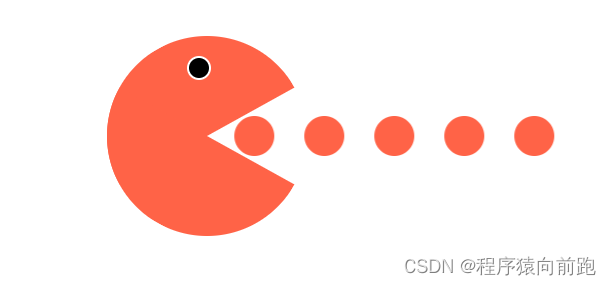
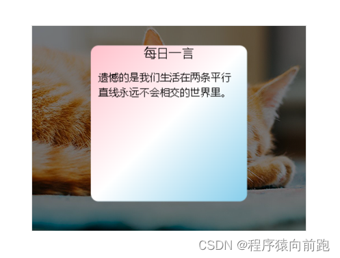
4.鼠标悬停3D翻转效果
<!DOCTYPE html>
<html><head><meta charset="utf-8"><title>鼠标悬停3D翻转效果</title><style type="text/css">body,h3,p{margin: 0;padding: 0;}.scene{width: 400px;height: 400px;/* border: 2px solid red; */margin: 100px auto 0;/* 视距,决定了3D效果*/perspective: 800px;}.scene .box{width: 400px;height: 300px;/* background-color: yellow;*//* 添加过渡动画 */transition: all ease 1s;position: relative;/* 令元素呈现3D效果 */transform-style: preserve-3d;}.scene .box:hover{transform: rotateY(-180deg);}.box .box-front{width: 400px;height: 300px;background-color: pink;position: absolute;left: 0;top: 0;/* 调高层级 */z-index: 2;}.box .box-mid{width: 400px;height: 300px;background-color: rgba(0, 0, 0, 0.5);position: absolute;left: 0;top: 0;transform: translateZ(-1px);}.box .box-back{width: 200px;height: 200px;background-color: skyblue;background-image: linear-gradient(to bottom right,pink,#fff,skyblue);position: absolute;left: 50%;margin-left: -100px;top: 50%;margin-top: -100px;transform: translateZ(-100px) rotateY(-180deg);font-size: 14px;line-height: 20px;box-sizing: border-box;border-radius: 10px;}.box .box-back h3{text-align: center;color: #000;font-weight: 400;font-size: 16px;}.box .box-back p{font-size: 13px;margin: 10px;font-weight: 200;line-height: 20px;}</style></head><body><div class="scene"><div class="box"><div class="box-front"><img src="images/3d01.jpg" alt=""></div><div class="box-mid"></div><div class="box-back"><h3>每日一言</h3><p>遗憾的是我们生活在两条平行直线永远不会相交的世界里。</p></div></div></div></body>
</html>
css3-3D
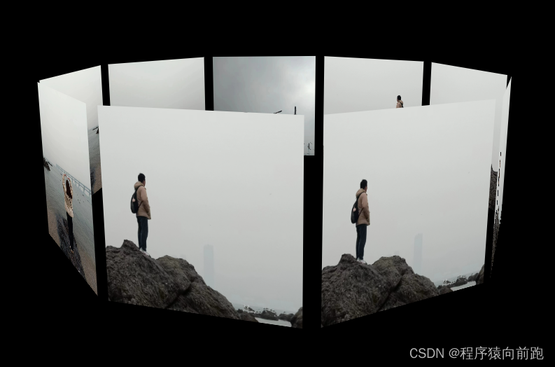
5.3D旋转木马效果
<!DOCTYPE html>
<html><head><meta charset="utf-8"><title>3D旋转木马效果</title><style type="text/css">body{margin: 0;padding: 0;background-color: #000;}.scene{width: 600px;height: 300px;/* border: 2px solid red; */margin: 150px auto 0;/* 设置视距 */perspective: 800px;}.scene .box{width: 600px;height: 300px;/* background-color: yellow; *//* 设置动画 *//* transition: all 1s ease; */position: relative;transform-style: preserve-3d;animation: rotate 5s ease infinite;}/* .scene:hover .box{transform: rotateY(-300deg);} */.scene .box .item{width: 200px;height: 200px;background-color: skyblue;position: absolute;bottom: 0;left: 50%;margin-left: -100px;/* transform: rotateY(calc(var(--i) * 40deg)) translateZ(300px); */}.box .item:nth-child(1){transform:  translateZ(300px);}.box .item:nth-child(2){transform: rotateY(40deg) translateZ(300px);}.box .item:nth-child(3){transform: rotateY(80deg) translateZ(300px);}.box .item:nth-child(4){transform: rotateY(120deg) translateZ(300px);}.box .item:nth-child(5){transform: rotateY(160deg) translateZ(300px);}.box .item:nth-child(6){transform: rotateY(200deg) translateZ(300px);}.box .item:nth-child(7){transform: rotateY(240deg) translateZ(300px);}.box .item:nth-child(8){transform: rotateY(280deg) translateZ(300px);}.box .item:nth-child(9){transform: rotateY(320deg) translateZ(300px);}.box:hover{animation-play-state: paused;}@keyframes rotate {0%{transform: rotateX(-10deg) rotateY(0deg);}100%{transform: rotateX(-10deg) rotateY(-360deg);}}</style></head><body><div class="scene"><div class="box"><div class="item --i:0"><img src="images/gg1.jpg" alt="" width="200" height="200"></div><div class="item --i:1"><img src="images/gg2.jpg" alt="" width="200" height="200"></div><div class="item --i:2"><img src="images/gg3.jpg" alt="" width="200" height="200"></div><div class="item --i:3"><img src="images/gg4.jpg" alt="" width="200" height="200"></div><div class="item --i:4"><img src="images/gg4.jpg" alt="" width="200" height="200"></div><div class="item --i:5"><img src="images/gg1.jpg" alt="" width="200" height="200"></div><div class="item --i:6"><img src="images/gg1.jpg" alt="" width="200" height="200"></div><div class="item --i:7"><img src="images/gg1.jpg" alt="" width="200" height="200"></div><div class="item --i:8"><img src="images/gg1.jpg" alt="" width="200" height="200"></div></div></div></body>
</html>
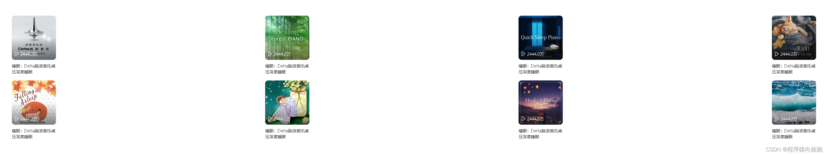
6.flex弹性布局-酷狗音乐播放列表
<!DOCTYPE html>
<html><head><meta charset="utf-8"><title>flex弹性布局-酷狗音乐播放列表</title><style type="text/css">body {margin: 0;padding: 0;}a {text-decoration: none;}.container {width: 100%;/* height: 600px; *//* background-color: antiquewhite; *//* 设置最小宽度,防止缩至过少造成挤压 */min-width: 680px;margin-top: 100px;/* 弹性布局 */display: flex;flex-wrap: wrap;}.container .item {width: 25%;display: flex;/* 调成内容居中显示 */justify-content: center;margin-bottom: 20px;}.container .item .item-con {width: 150px;/* border: 1px solid red; *//* 弹性布局方向设置为纵向 */display: flex;flex-direction: column;}.item-con a.item-con-img {height: 150px;/* background-color: antiquewhite; */position: relative;}.item-con a.item-con-img img {border-radius: 10px;}/* 下方文字 */.item a.item-con-img span {font-size: 14px;color: #fff;/* background-color: red; */display: flex;position: absolute;bottom: 10px;left: 10px;z-index: 2;}.item-con a.item-con-img span img {margin-right: 5px;}/* 图片半下方遮罩层 */.item-con a.item-con-img::after{content: '';width: 100%;height: 50%;/* 使用渐变色 */background-image: linear-gradient(to bottom,rgba(255,255,255,0),rgba(0,0,0,0.5));display: block;position: absolute;left: 0;bottom: 0;border-radius: 0px 0px 10px 10px;}.item-con a.item-con-title{font-size: 14px;color: #333;margin-top: 10px;}.item-con a.item-con-title:hover{color: tomato;}</style></head><body><div class="container"><div class="item"><div class="item-con"><a href="" class="item-con-img"><img src="images/flex-01.jpg" alt=""><span><img src="images/icon_play.png" alt="" width="14">2444.0万</span></a><a href="" class="item-con-title">催眠:Delta脑波音乐减压深度睡眠</a></div></div><div class="item"><div class="item-con"><a href="" class="item-con-img"><img src="images/flex-02.jpg" alt=""><span><img src="images/icon_play.png" alt="" width="14">2444.0万</span></a><a href="" class="item-con-title">催眠:Delta脑波音乐减压深度睡眠</a></div></div><div class="item"><div class="item-con"><a href="" class="item-con-img"><img src="images/flex-03.jpg" alt=""><span><img src="images/icon_play.png" alt="" width="14">2444.0万</span></a><a href="" class="item-con-title">催眠:Delta脑波音乐减压深度睡眠</a></div></div><div class="item"><div class="item-con"><a href="" class="item-con-img"><img src="images/flex-04.jpg" alt=""><span><img src="images/icon_play.png" alt="" width="14">2444.0万</span></a><a href="" class="item-con-title">催眠:Delta脑波音乐减压深度睡眠</a></div></div><div class="item"><div class="item-con"><a href="" class="item-con-img"><img src="images/flex-05.jpg" alt=""><span><img src="images/icon_play.png" alt="" width="14">2444.0万</span></a><a href="" class="item-con-title">催眠:Delta脑波音乐减压深度睡眠</a></div></div><div class="item"><div class="item-con"><a href="" class="item-con-img"><img src="images/flex-06.jpg" alt=""><span><img src="images/icon_play.png" alt="" width="14">2444.0万</span></a><a href="" class="item-con-title">催眠:Delta脑波音乐减压深度睡眠</a></div></div><div class="item"><div class="item-con"><a href="" class="item-con-img"><img src="images/flex-07.jpg" alt=""><span><img src="images/icon_play.png" alt="" width="14">2444.0万</span></a><a href="" class="item-con-title">催眠:Delta脑波音乐减压深度睡眠</a></div></div><div class="item"><div class="item-con"><a href="" class="item-con-img"><img src="images/flex-08.jpg" alt=""><span><img src="images/icon_play.png" alt="" width="14">2444.0万</span></a><a href="" class="item-con-title">催眠:Delta脑波音乐减压深度睡眠</a></div></div></div></body>
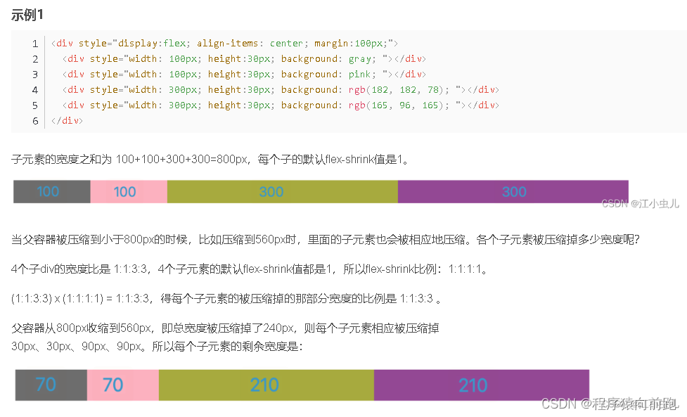
</html>flex-shrink
flex-shrink 属性指定了 flex 元素的收缩规则,默认值是1。在flex 元素的默认宽度之和大于容器的宽度时候,元素会发生收缩,其收缩的大小的依据是 flex-shrink 值。
flex弹性布局-今日头条首页热门视频栏
<!DOCTYPE html>
<html><head><meta charset="utf-8"><title>flex弹性布局-今日头条首页热门视频栏</title><style type="text/css">body {margin: 0;padding: 0;}a{text-decoration: none;}.show-monitor {width: 320px;height: 600px;/* border: 2px solid red; */margin: 50px 0px 0px 50px;}.panel-head {display: flex;/* height: 100px; *//* 解除图标变形 */align-items: center;}.panel-head span.panel-head-title {/* 占满全部空间 */flex-grow: 1;font-size: 20px;margin-left: 10px;}.panel-head .panel-head-sx {font-size: 16px;color: red;margin-left: 5px;}.panel-con {height: 94px;/* background-color: antiquewhite; */margin-top: 20px;display: flex;}.panel-con .panel-con-img {width: 126px;/* 高度自动继承 *//* height: 94px; *//* background-color: aqua; */margin-right: 10px;flex-shrink: 0;}.panel-con .panel-con-img img {width: 100%;height: 100%;/* 裁剪图片 防止变形 */object-fit: cover;}.panel-con .panel-con-txt {/* background-color: aquamarine; *//* 占满剩余空间 */flex-grow: 1;display: flex;flex-direction: column;text-overflow: ellipsis;}.panel-con .panel-con-txt a{font-size: 16px;color: #222;/* 超过44px文字不再显示 */max-height: 44px;overflow: hidden;line-height: 22px;/* 弹性伸缩盒子模型显示 */display: -webkit-box;/* 设置或检索伸缩盒子对象的子元素的排列方式 */-webkit-box-orient: vertical;/* 限制在一个块级元素显示的文本的行数 */-webkit-line-clamp: 2;/* 文本溢出显示省略号 */text-overflow: ellipsis;}.panel-con .panel-con-txt span.like{font-size: 12px;background-color: #fff2f2;color: #f04142;/* 消除占满整行现象 变为内容实际所占宽度*/align-self: flex-start;padding: 3px 6px;border-radius: 5px;margin-top: 5px;}.panel-con .panel-con-txt .desc{font-size: 14px;color: #999;display: flex;justify-content: space-between;margin-top: 5px;}</style></head><body><div class="show-monitor"><div class="panel-head"><img src="images/icon-play.png" alt="" width="22"><span class="panel-head-title">热门视频</span><img src="images/icon-sx2.png" alt="" width="16"><span class="panel-head-sx">换一换</span></div><div class="panel-con"><div class="panel-con-img"><a href=""><img src="images/toutiao-01.jpeg" alt=""></a></div><div class="panel-con-txt"><a href="">司马南:中国与俄罗斯的战线</a><span class="like">1万评论</span><div class="desc"><span>148万次观看</span><span>司马南频道</span></div></div></div><div class="panel-con"><div class="panel-con-img"><a href=""><img src="images/toutiao-02.jpeg" alt=""></a></div><div class="panel-con-txt"><a href="">无论做什么鱼:最忌放盐和料酒研制,大厨教你绝招.</a><span class="like">1万评论</span><div class="desc"><span>148万次观看</span><span>司马南频道</span></div></div></div><div class="panel-con"><div class="panel-con-img"><a href=""><img src="images/toutiao-03.jpeg" alt=""></a></div><div class="panel-con-txt"><a href="">司马南:中国与俄罗斯的战线</a><span class="like">1万评论</span><div class="desc"><span>148万次观看</span><span>司马南频道</span></div></div></div><div class="panel-con"><div class="panel-con-img"><a href=""><img src="images/toutiao-04.jpeg" alt=""></a></div><div class="panel-con-txt"><a href="">司马南:中国与俄罗斯的战线</a><span class="like">1万评论</span><div class="desc"><span>148万次观看</span><span>司马南频道</span></div></div></div></div></body>
</html>

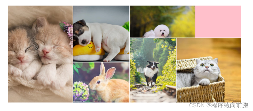
grid网格布局-360图片展示
<!DOCTYPE html>
<html><head><meta charset="utf-8"><title>grid网格布局-360图片展示</title><style type="text/css">body{margin: 0;padding: 0;}.container{width: 100%;/* height: 700px; *//* background-color: aquamarine; */margin-top: 100px;display: grid;/* 行高 */grid-template-rows: 207px 155px 259px;grid-template-columns: 420px 365px 299px 118px 296px;/* 网格居中显示 */justify-content: center;/* 合并单元网格 */grid-template-areas: 'a b d d f''a b e h h''a c e h h';/* 行间隙 列间隙 */gap: 3px 3px;}.item:nth-child(1){grid-area: a;}.item:nth-child(2){grid-area: b;}.item:nth-child(3){grid-area: c;}.item:nth-child(4){grid-area: d;}.item:nth-child(5){grid-area: e;}.item:nth-child(6){grid-area: f;background-color: pink;}.item:nth-child(7){grid-area: h;}</style></head><body><div class="container"><div class="item"><img src="images/grid-01.jpg" alt=""></div><div class="item"><img src="images/grid-02.jpg" alt=""></div><div class="item"><img src="images/grid-03.jpg" alt=""></div><div class="item"><img src="images/grid-04.jpg" alt=""></div><div class="item"><img src="images/grid-05.jpg" alt=""></div><div class="item"></div><div class="item "><img src="images/grid-06.jpg" alt=""></div></div></body>
</html>
小米商城左侧二级菜单
<!DOCTYPE html>
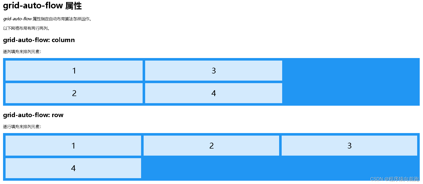
<html><head><meta charset="utf-8"><title>小米商城左侧二级菜单</title><style type="text/css">body {margin: 0;padding: 0;background-image: linear-gradient(to right, skyblue, #fff);}a {text-decoration: none;}.menu {width: 230px;height: 420px;padding: 20px 0;background-color: rgba(0, 0, 0, 0.5);margin: 50px 0 0 50px;position: relative;}.menu .item {height: 42px;/* border: 1px solid red; */color: #fff;font-size: 14px;line-height: 42px;padding-left: 30px;background: url('images/right-jiantou.png') no-repeat 200px 10px;cursor: pointer;}.menu .item:hover {background-color: #ff6700;background-image: url('images/right-jiantou2.png');}/* 右侧二级菜单 */.menu .item .nav {min-width: 250px;height: 460px;background-color: #fff;border: 1px solid #666;position: absolute;top: 0;left: 100%;box-sizing: border-box;/* 六行单元格平分整个区域 */display: grid;grid-template-rows: repeat(6, 1fr);grid-template-columns: 250px;/* 排列方式设置为先列后行 */grid-auto-flow: column;/* 设置隐式网格宽度 */grid-auto-columns: 250px;padding: 20px;/* 初始默认隐藏 */display: none;}.item .nav a {/* border: 1px solid red; */color: #000;display: flex;/* 垂直方向居中对齐,防止随父元素高度而被拉伸 */align-items: center;}.item .nav a img {margin-right: 10px;}.item .nav a:hover {color: #ff6700;}.item:hover .nav {display: grid;}</style></head><body><div class="menu"><div class="item">手机<div class="nav"><a href=""><img src="images/grid-mi-01.webp" alt="" width="40">黑鲨5 Pro</a><a href=""><img src="images/grid-mi-02.webp" alt="" width="40">黑鲨5</a><a href=""><img src="images/grid-mi-03.webp" alt="" width="40">Redmi 10A</a><a href=""><img src="images/grid-mi-04.webp" alt="" width="40">Redmi K50 Pro</a><a href=""><img src="images/grid-mi-05.webp" alt="" width="40">Redmi K40S</a><a href=""><img src="images/grid-mi-06.webp" alt="" width="40">黑鲨5 Pro</a><a href=""><img src="images/grid-mi-07.webp" alt="" width="40">黑鲨5</a><a href=""><img src="images/grid-mi-08.webp" alt="" width="40">Redmi 10A</a><a href=""><img src="images/grid-mi-09.webp" alt="" width="40">Redmi K50 Pro</a><a href=""><img src="images/grid-mi-05.webp" alt="" width="40">Redmi K40S</a></div></div><div class="item">电视<div class="nav"><a href=""><img src="images/grid-mi-01.webp" alt="" width="40">黑鲨5 Pro</a><a href=""><img src="images/grid-mi-02.webp" alt="" width="40">黑鲨5</a><a href=""><img src="images/grid-mi-03.webp" alt="" width="40">Redmi 10A</a><a href=""><img src="images/grid-mi-04.webp" alt="" width="40">Redmi K50 Pro</a><a href=""><img src="images/grid-mi-05.webp" alt="" width="40">Redmi K40S</a><a href=""><img src="images/grid-mi-06.webp" alt="" width="40">黑鲨5 Pro</a><a href=""><img src="images/grid-mi-07.webp" alt="" width="40">黑鲨5</a><a href=""><img src="images/grid-mi-08.webp" alt="" width="40">Redmi 10A</a><a href=""><img src="images/grid-mi-09.webp" alt="" width="40">Redmi K50 Pro</a><a href=""><img src="images/grid-mi-05.webp" alt="" width="40">Redmi K40S</a><a href=""><img src="images/grid-mi-09.webp" alt="" width="40">Redmi K50 Pro</a><a href=""><img src="images/grid-mi-05.webp" alt="" width="40">Redmi K40S</a></div></div><div class="item">笔记本 平板<div class="nav"><a href=""><img src="images/grid-mi-01.webp" alt="" width="40">黑鲨5 Pro</a><a href=""><img src="images/grid-mi-02.webp" alt="" width="40">黑鲨5</a><a href=""><img src="images/grid-mi-03.webp" alt="" width="40">Redmi 10A</a><a href=""><img src="images/grid-mi-04.webp" alt="" width="40">Redmi K50 Pro</a><a href=""><img src="images/grid-mi-05.webp" alt="" width="40">Redmi K40S</a><a href=""><img src="images/grid-mi-07.webp" alt="" width="40">黑鲨5</a><a href=""><img src="images/grid-mi-08.webp" alt="" width="40">Redmi 10A</a><a href=""><img src="images/grid-mi-09.webp" alt="" width="40">Redmi K50 Pro</a><a href=""><img src="images/grid-mi-05.webp" alt="" width="40">Redmi K40S</a><a href=""><img src="images/grid-mi-01.webp" alt="" width="40">黑鲨5 Pro</a><a href=""><img src="images/grid-mi-02.webp" alt="" width="40">黑鲨5</a><a href=""><img src="images/grid-mi-03.webp" alt="" width="40">Redmi 10A</a><a href=""><img src="images/grid-mi-04.webp" alt="" width="40">Redmi K50 Pro</a><a href=""><img src="images/grid-mi-05.webp" alt="" width="40">Redmi K40S</a><a href=""><img src="images/grid-mi-06.webp" alt="" width="40">黑鲨5 Pro</a><a href=""><img src="images/grid-mi-07.webp" alt="" width="40">黑鲨5</a><a href=""><img src="images/grid-mi-08.webp" alt="" width="40">Redmi 10A</a><a href=""><img src="images/grid-mi-09.webp" alt="" width="40">Redmi K50 Pro</a><a href=""><img src="images/grid-mi-05.webp" alt="" width="40">Redmi K40S</a></div></div><div class="item">家电</div><div class="item">出行 穿戴</div><div class="item">智能 路由器</div><div class="item">电源 配件</div><div class="item">健康 儿童</div><div class="item">耳机 音箱</div><div class="item">生活 箱包</div></div></body>
</html>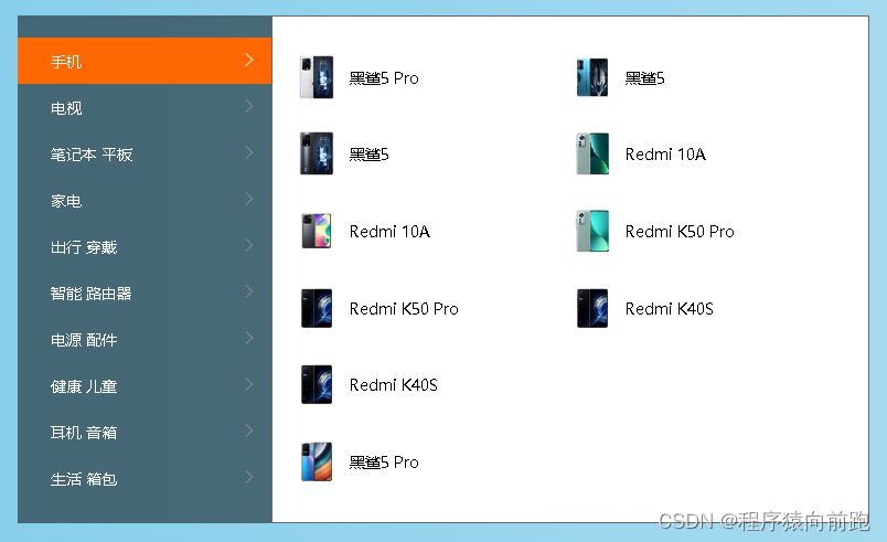
网盘地址