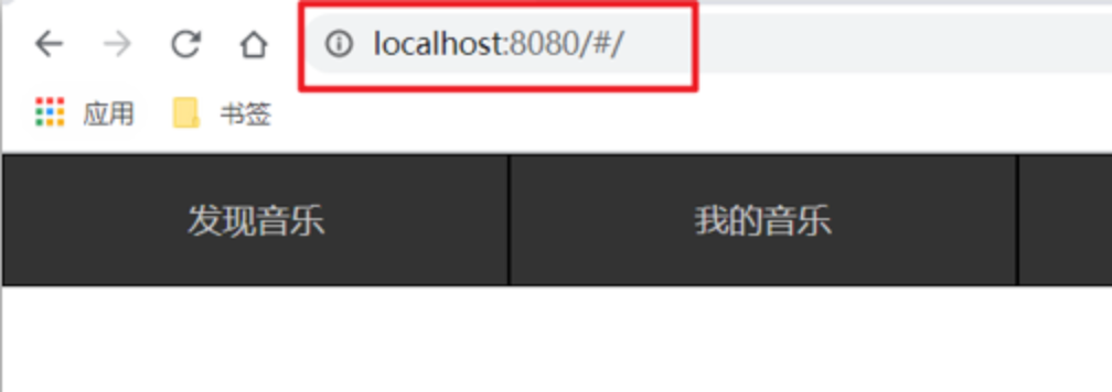
Vue2:组件高级(下)
Date: May 25, 2023
Sum: 自定义指令、插槽、商品列表、动态组件
目标:
自定义指令
基础概念:
概念:
内置指令:vue 官方提供了 v-for、v-model、v-if 等常用的内置指令。
自定义指令:Vue支持让开发者,自己注册一些指令。这些指令被称为自定义指令。
自定义指令可以封装一些 dom 操作,扩展额外功能。
类型:私有自定义指令和全局自定义指令
语法:
指令中的配置项介绍:
inserted:当指令所绑定的元素,被添加到页面当中时,会自动调用
换句话说,就是被绑定元素插入父节点时调用的钩子函数
el:使用指令的那个DOM元素
局部注册:
在每个 vue 组件中,可以在 directives 节点下声明私有自定义指令。
示例代码如下:
//在Vue组件的配置项中
directives: {"指令名": {inserted () {// 可以对 el 标签,扩展额外功能el.focus()}}
}
directives: {// 自定义一个私有指令focus: {// 当被绑定的元素插入到 DOM 中时,自动触发 mounted 函数mounted(el) {el.focus() // 让被绑定的元素自动获得焦点}}},
注意:自定义指令在使用的时候以v-开头,但是在声明的时候不需要加v-前缀
全局注册:
//在main.js中
Vue.directive('指令名', {"inserted" (el) {// 可以对 el 标签,扩展额外功能el.focus()}
})
全局共享的自定义指令需要通过“单页面应用程序的实例对象”进行声明,示例代码如下:
const app = Vue.createApp({})// 注册一个全局自定义指令 `v-focue`
app.directive('focus', {// 当被绑定的元素插入到 DOM 中时,自动触发 mounted 函数mounted(el) {// Focus the elementel.focus()}
})
使用自定义指令
在使用自定义指令时,需要加上 v- 前缀。
示例代码如下:
<!-- 声明自定义指令时,指令的名字是 focus -->
<!-- 使用自定义指令时,需要加上 v- 指令前缀 -->
<input v-focus />
案例:当页面加载时,让元素获取焦点(autofocus在safari浏览器有兼容性)
-
Code: 采用局部注册与全局注册两种方式
App.vue
<template><div><h1>自定义指令</h1><input v-focus ref="inp" type="text"></div>
</template><script>
export default {// mounted() {//   this.$refs.inp.focus()// }// 2. 局部注册指令directives: {// 指令:指令的配置项focus: {inserted(el) {el.focus()}}}
}
</script><style></style>
main.js
import Vue from 'vue'
import App from './App.vue'Vue.config.productionTip = false// 全局注册指令
Vue.directive('focus', {inserted(el) {el.focus()}
})new Vue({render: h => h(App),
}).$mount('#app')
自定义指令-指令的值
**需求:**实现一个 color 指令 - 传入不同的颜色, 给标签设置文字颜色
语法:
1.在绑定指令时,可以通过“等号”的形式为指令 绑定 具体的参数值
<div v-color="color">我是内容</div>
2.通过 binding.value 可以拿到指令值,指令值修改会 触发 update 函数
directives: {color: {inserted (el, binding) {el.style.color = binding.value},update (el, binding) {el.style.color = binding.value}}
}
updated 函数
mounted或inserted 函数只在元素第一次插入 DOM 时被调用,当 DOM 更新时 mounted或inserted 函数不会被触发。 updated函数会在每次 DOM 更新完成后被调用。
示例代码如下:
app.directive('focus', {mounted(el) {  // 第一次插入 DOM 时触发这个函数el.focus()},updated(el) { // 每次 DOM 更新时都会触发 updated 函数el.focus()}
})
注意:在 vue2 的项目中使用自定义指令时,【 mounted -> bind 】【 updated -> update 】
函数简写
如果 mounted 和updated 函数中的逻辑完全相同,则可以简写成如下格式:
app.directive('focus', (el) => {// 在 mounted 和 updated 时都会触发相同的业务处理el.focus()
})
案例:
-
Code:
App.vue
<template><div><h1 v-color="color1">指令的值1测试</h1><h1 v-color="color2">指令的值2测试</h1></div>
</template><script>
export default {data () {return {color1: 'red',color2: 'green',}},directives: {color: {inserted(el, binding) {el.style.color = binding.value},update(el, binding) {console.log('指令的值被修改!');el.style.color = binding.value}}}
}
</script><style></style>
自定义指令-v-loading指令的封装
场景:
开发过程中,发送请求需要时间,在请求的数据未回来时,页面会处于空白状态 => 用户体验不好
**需求:**封装一个 v-loading 指令,实现加载中的效果
分析:
1.本质 loading效果就是一个蒙层,盖在了盒子上
2.数据请求中,开启loading状态,添加蒙层
3.数据请求完毕,关闭loading状态,移除蒙层
实现:
1.准备一个 loading类,通过伪元素定位,设置宽高,实现蒙层
2.开启关闭 loading状态(添加移除蒙层),本质只需要添加移除类即可
3.结合自定义指令的语法进行封装复用
.loading:before {content: "";position: absolute;left: 0;top: 0;width: 100%;height: 100%;background: #fff url("./loading.gif") no-repeat center;
}
案例:
-
Code:
App.vue
<template><div class="main"><div class="box" v-loading="isLoading"><ul><li v-for="item in list" :key="item.id" class="news"><div class="left"><div class="title">{{ item.title }}</div><div class="info"><span>{{ item.source }}</span><span>{{ item.time }}</span></div></div><div class="right"><img :src="item.img" alt=""></div></li></ul></div></div>
</template><script>
// 安装axios =>  yarn add axios
import axios from 'axios'// 接口地址:http://hmajax.itheima.net/api/news
// 请求方式:get
export default {data () {return {list: [],isLoading: true,}},async created () {// 1. 发送请求获取数据const res = await axios.get('http://hmajax.itheima.net/api/news')setTimeout(() => {// 2. 更新到 list 中this.list = res.data.datathis.isLoading = false}, 2000)},directives: {loading: {inserted(el, binding) {binding.value ? el.classList.add('loading') : el.classList.remove('loading')},update(el, binding) {binding.value ? el.classList.add('loading') : el.classList.remove('loading')},}}
}
</script><style>
/* 伪类 - 蒙层效果 */
.loading:before {content: '';position: absolute;left: 0;top: 0;width: 100%;height: 100%;background: #fff url('./loading.gif') no-repeat center;
}/* .box2 {width: 400px;height: 400px;border: 2px solid #000;position: relative;
} */.box {width: 800px;min-height: 500px;border: 3px solid orange;border-radius: 5px;position: relative;
}
.news {display: flex;height: 120px;width: 600px;margin: 0 auto;padding: 20px 0;cursor: pointer;
}
.news .left {flex: 1;display: flex;flex-direction: column;justify-content: space-between;padding-right: 10px;
}
.news .left .title {font-size: 20px;
}
.news .left .info {color: #999999;
}
.news .left .info span {margin-right: 20px;
}
.news .right {width: 160px;height: 120px;
}
.news .right img {width: 100%;height: 100%;object-fit: cover;
}
</style>
总结:
- 通过指令相关语法,封装了指令 v-loading 实现了请求的loading效果
- 核心思路:
-
准备类名 loading,通过伪元素提供遮罩层
-
添加或移除类名,实现loading蒙层的添加移除
-
利用指令语法,封装 v-loading 通用指令
inserted 钩子中,binding.value 判断指令的值,设置默认状态
update 钩子中,binding.value 判断指令的值,更新类名状态
-
插槽
概念:
插槽(Slot)是 vue 为组件的封装者提供的能力。允许开发者在封装组件时,把不确定的、希望由用户指定的部分定义为插槽。
作用:让组件内部的一些 结构 支持 自定义
可以把插槽认为是组件封装期间,为用户预留的内容的占位符。
案例:
将需要多次显示的对话框,封装成一个组件
组件的内容部分,不希望写死,希望能使用的时候自定义。怎么办
体验插槽的基础用法
在封装组件时,可以通过 元素定义插槽,从而为用户预留内容占位符。
注意:给插槽传入内容时,可以传入纯文本、html标签、组件
示例代码如下:
MyCom.vue
<template><p>这是第一个p标签</p><!-- 1. 通过 slot 标签,为用户预留内容占位符(插槽) --><slot></slot><p>这是最后一个p标签</p>
</template>
App.vue
<!-- 使用组件 -->
<my-com><!-- 2. 在使用MyCom1 组件时, 为插槽指定具体的内容---><p>~~~用户自定义的内容~~~</p>
</my-com>
没有预留插槽的内容会被丢弃
如果在封装组件时没有预留任何 插槽,则用户提供的任何自定义内容都会被丢弃。
示例代码如下:
MyCom.vue
<template><p>这是第一个p标签</p><!-- 封装组件时,没有预留任何插槽 --><p>这是最后一个p标签</p>
</template>
App.vue
<my-com-1><!-- 自定义的内容会被丢弃 --><p>~~~用户自定义的内容~~~<p>
</my-com-1>
默认内容
封装组件时,可以为预留的 插槽提供后备内容(默认内容)。如果组件的使用者没有为插槽提供任何内容,则后备内容会生效。
示例代码如下:
<template><p>这是第一个p标签</p><slot>这是后备内容</slot><p>这是最后一个p标签</p>
</template>
案例:对话框复用
- Code:
具名插槽
需求:一个组件内有多处结构,需要外部传入标签,进行定制
上面的弹框中有三处不同,但是默认插槽只能定制一个位置,这时候怎么办呢?
解决方案:如果在封装组件时需要预留多个插槽节点,则需要为每个 插槽指定具体的 name 名称。这种带有具体名称的插槽叫做“具名插槽”。
示例代码如下:
多个slot使用name属性区分名字
MyCom.vue
<template><div><header><!-- 我们希望把页头放这里 --><slot name="header"></slot></header><main><!-- 我们希望把主要内容放这里 --><slot></slot></main><footer><!-- 我们希望把页脚放这里 --><slot name="footer"></slot></footer></div>
</template>
注意:没有指定 name 名称的插槽,会有隐含的名称叫做 “default”。
App.vue
为具名插槽提供内容
通过 元素上使用 v-slot 指令向具名插槽提供内容,并以 v-slot 的参数的形式提供其名称。即,template配合v-slot:名字来分发对应标签。
<template><div><h1>App 根组件</h1><hr/><!-- 使用组件 --><my-com><template v-slot:header><h1>滕王阁序</h1></template><template v-slot:default><p>test1</p><p>test2</p><p>test3</p>        </template><template v-slot:footer><p>落款:王勃</p></template></my-com></div>
</template>
案例:
-
Code:
App.vue
<template><div><MyDialog><template v-slot:content><div>一段内容</div></template><template v-slot:footer><button>取消</button><button>确认</button></template></MyDialog></div>
</template><script>
import MyDialog from './components/MyDialog.vue'
export default {data () {return {}},components: {MyDialog}
}
</script><style>
body {background-color: #b3b3b3;
}
</style>
MyDialog.vue
<template><div class="dialog"><div class="dialog-header"><h3>友情提示</h3><span class="close">✖️</span></div><div class="dialog-content"><!-- 1. 需要定制的位置,使用slot占位 --><slot name="content"></slot></div><div class="dialog-footer"><slot name="footer"></slot></div></div>
</template><script>
export default {data () {return {}}
}
</script><style scoped>
* {margin: 0;padding: 0;
}
.dialog {width: 470px;height: 230px;padding: 0 25px;background-color: #ffffff;margin: 40px auto;border-radius: 5px;
}
.dialog-header {height: 70px;line-height: 70px;font-size: 20px;border-bottom: 1px solid #ccc;position: relative;
}
.dialog-header .close {position: absolute;right: 0px;top: 0px;cursor: pointer;
}
.dialog-content {height: 80px;font-size: 18px;padding: 15px 0;
}
.dialog-footer {display: flex;justify-content: flex-end;
}
.dialog-footer button {width: 65px;height: 35px;background-color: #ffffff;border: 1px solid #e1e3e9;cursor: pointer;outline: none;margin-left: 10px;border-radius: 3px;
}
.dialog-footer button:last-child {background-color: #007acc;color: #fff;
}
</style>
具名插槽的简写形式
跟 v-on 和 v-bind 一样,v-slot 也有缩写,即把参数之前的所有内容 (v-slot:) 替换为字符 #。
例如 v-slot:header可以被重写为 #header
App.vue
<template><div><h1>App 根组件</h1><hr/><!-- 使用组件 --><my-com><template #header><h1>滕王阁序</h1></template><template #default><p>test1</p><p>test2</p><p>test3</p>        </template><template #footer><p>落款:王勃</p></template></my-com></div>
</template>
作用域插槽
概念:在封装组件的过程中,可以为预留的 插槽绑定 props 数据,这种带有 props 数据的 叫做“作用域插槽”。
分类:
- 默认插槽
- 具名插槽 插槽只有两种,作用域插槽不属于插槽的一种分类
作用:定义slot 插槽的同时, 是可以传值的。给 插槽 上可以 绑定数据,将来 使用组件时可以用
案例:
案例1:封装表格组件

使用步骤:
1- 给 slot 标签, 以添加属性的方式传值
<slot :id="item.id" msg="测试文本"></slot>
2- 所有添加的属性, 都会被收集到一个对象中
{ id: 3, msg: '测试文本' }
3- 在template中, 通过 #插槽名= "obj" 接收,默认插槽名为 default
<MyTable :list="list"><template #default="obj"><button @click="del(obj.id)">删除</button></template>
</MyTable>
-
Code:
MyTable.vue
<template><table class="my-table"><thead><tr><th>序号</th><th>姓名</th><th>年纪</th><th>操作</th></tr></thead><tbody><tr v-for="(item, index) in data" :key="item.id"><td>{{ index + 1 }}</td><td>{{ item.name }}</td><td>{{ item.age }}</td><td><!-- 1. 给slot标签,添加属性的方式传值 --><slot :row="item" msg="测试文本"></slot><!-- 2. 所有的属性会添加到一个对象中 --><!-- {id: 2,msg: ‘测试文本’}--></td></tr></tbody></table>
</template><script>
export default {props: {data: Array,},
}
</script><style scoped>
.my-table {width: 450px;text-align: center;border: 1px solid #ccc;font-size: 24px;margin: 30px auto;
}
.my-table thead {background-color: #1f74ff;color: #fff;
}
.my-table thead th {font-weight: normal;
}
.my-table thead tr {line-height: 40px;
}
.my-table th,
.my-table td {border-bottom: 1px solid #ccc;border-right: 1px solid #ccc;
}
.my-table td:last-child {border-right: none;
}
.my-table tr:last-child td {border-bottom: none;
}
.my-table button {width: 65px;height: 35px;font-size: 18px;border: 1px solid #ccc;outline: none;border-radius: 3px;cursor: pointer;background-color: #ffffff;margin-left: 5px;
}
</style>
App.vue
 <template><div><MyTable :data="list"><template #default="obj"><button @click="handleDel(obj.row.id)">删除</button></template></MyTable><MyTable :data="list2"><!-- 采用解构的方式,解构obj出row --><template #default="{ row }"><button  @click="handleAlert(row)">展示</button></template></MyTable></div>
</template><script>
import MyTable from './components/MyTable.vue'
export default {data () {return {list: [{ id: 1, name: '张小花', age: 18 },{ id: 2, name: '孙大明', age: 19 },{ id: 3, name: '刘德忠', age: 17 },],list2: [{ id: 1, name: '赵小云', age: 18 },{ id: 2, name: '刘蓓蓓', age: 19 },{ id: 3, name: '姜肖泰', age: 17 },]}},components: {MyTable},methods: {handleDel(id) {this.list = this.list.filter(item => item.id !== id)},handleAlert(row) {console.log(row);}}
}
</script>
对于Code的用法的理解:
解构作用域插槽的 Prop
作用域插槽对外提供的数据对象,可以使用解构赋值简化数据的接收过程。
示例代码如下:
<MyTable :data="list2"><!-- 采用解构的方式,解构obj出row --><template #default="{ row }"><button  @click="handleAlert(row)">展示</button></template>
</MyTable>
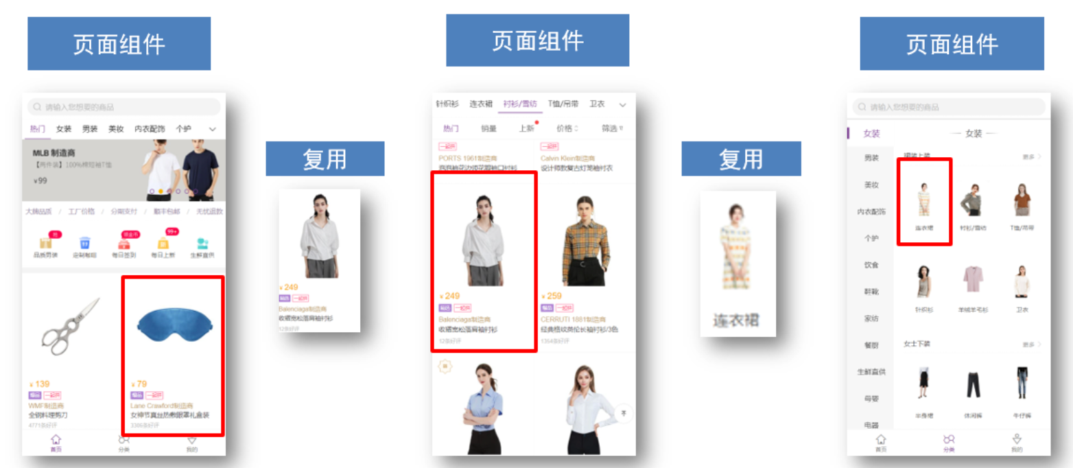
综合案例:商品列表
需求说明:
效果:
需求说明:
- my-tag 标签组件封装
(1) 双击显示输入框,输入框获取焦点
(2) 失去焦点,隐藏输入框
(3) 回显标签信息
(4) 内容修改,回车 → 修改标签信息
- my-table 表格组件封装
(1) 动态传递表格数据渲染
(2) 表头支持用户自定义
(3) 主体支持用户自定义
MyTag组件封装
封装内容:MyTag
完成步骤:
(1) 双击显示输入框,输入框获取焦点
关键点:
1-显示输入框:v-if v-else @dbclick
2-自动聚焦: n e x t T i c k → nextTick→ nextTick→refs 获取dom 或者 自定义指令v-focus
(2) 失去焦点,隐藏输入框
关键点:
1-@blur=”isEdit = false”
-
Code:
App.vue
<template><div class="table-case"><table class="my-table"><thead><tr><th>编号</th><th>名称</th><th>图片</th><th width="100px">标签</th></tr></thead><tbody><tr><td>1</td><td>梨皮朱泥三绝清代小品壶经典款紫砂壶</td><td><img src="https://yanxuan-item.nosdn.127.net/f8c37ffa41ab1eb84bff499e1f6acfc7.jpg" /></td><td><!-- 标签组件 --><MyTag></MyTag></td></tr></tbody></table></div>
</template><script>
import MyTag from './components/MyTag.vue'
export default {name: 'TableCase',components: {MyTag},data() {return {goods: [{id: 101,picture:'https://yanxuan-item.nosdn.127.net/f8c37ffa41ab1eb84bff499e1f6acfc7.jpg',name: '梨皮朱泥三绝清代小品壶经典款紫砂壶',tag: '茶具',},{id: 102,picture:'https://yanxuan-item.nosdn.127.net/221317c85274a188174352474b859d7b.jpg',name: '全防水HABU旋钮牛皮户外徒步鞋山宁泰抗菌',tag: '男鞋',},{id: 103,picture:'https://yanxuan-item.nosdn.127.net/cd4b840751ef4f7505c85004f0bebcb5.png',name: '毛茸茸小熊出没,儿童羊羔绒背心73-90cm',tag: '儿童服饰',},{id: 104,picture:'https://yanxuan-item.nosdn.127.net/56eb25a38d7a630e76a608a9360eec6b.jpg',name: '基础百搭,儿童套头针织毛衣1-9岁',tag: '儿童服饰',},],}},
}
</script><style lang="less" scoped>
.table-case {width: 1000px;margin: 50px auto;img {width: 100px;height: 100px;object-fit: contain;vertical-align: middle;}.my-table {width: 100%;border-spacing: 0;img {width: 100px;height: 100px;object-fit: contain;vertical-align: middle;}th {background: #f5f5f5;border-bottom: 2px solid #069;}td {border-bottom: 1px dashed #ccc;}td,th {text-align: center;padding: 10px;transition: all 0.5s;&.red {color: red;}}.none {height: 100px;line-height: 100px;color: #999;}}}
</style>
MyTag.vue
<template><div class="my-tag"><input v-if="isEdit"v-focusref="inp"class="input"type="text"placeholder="输入标签"@blur="isEdit = false"/><div @dblclick="handleClick"v-elseclass="text">茶具</div></div>
</template><script>
export default {data() {return {isEdit: false}},methods: {handleClick() {// 双击后,切换到显示状态this.isEdit = true// 立刻获取焦点 (由于Vue是异步Dom更新,所以这里需要采用$nextTick())// Plan1: $nextTick// this.$nextTick(() => {//   this.$refs.inp.focus()// })// Plan2: v-focus},}
}
</script><style lang="less" scoped>
.my-tag {cursor: pointer;.input {appearance: none;outline: none;border: 1px solid #ccc;width: 100px;height: 40px;box-sizing: border-box;padding: 10px;color: #666;&::placeholder {color: #666;}}
}
</style>
main.js
import Vue from 'vue'
import App from './App.vue'Vue.config.productionTip = false// 全局注册指令
Vue.directive('focus', {inserted(el) {el.focus()}
})new Vue({render: h => h(App),
}).$mount('#app')
(3) 回显标签信息
关键点:
1-回显的标签
回显的标签信息是父组件传递过来的
v-model实现功能(简化代码) v-model ⇒ :value 和 @input
(4) 内容修改,回车 → 修改标签信息
关键点:
1-enter子传父
子传父,将回车时,输入框的内容提交给父组件更新
由于父组件是v-model,触发事件,需要触发 input 事件
2-拿到文本框中实时的值:
e.target 指触发事件的事件源
-
Code:
App.vue
<template><div class="table-case"><table class="my-table"><thead><tr><th>编号</th><th>名称</th><th>图片</th><th width="100px">标签</th></tr></thead><tbody><tr><td>1</td><td>梨皮朱泥三绝清代小品壶经典款紫砂壶</td><td><img src="https://yanxuan-item.nosdn.127.net/f8c37ffa41ab1eb84bff499e1f6acfc7.jpg" /></td><td><!-- 标签组件 --><MyTag v-model="tempText"></MyTag></td></tr></tbody></table></div>
</template><script>
import MyTag from './components/MyTag.vue'
export default {name: 'TableCase',components: {MyTag},data() {return {tempText: '紫砂壶',goods: [{id: 101,picture:'https://yanxuan-item.nosdn.127.net/f8c37ffa41ab1eb84bff499e1f6acfc7.jpg',name: '梨皮朱泥三绝清代小品壶经典款紫砂壶',tag: '茶具',},{id: 102,picture:'https://yanxuan-item.nosdn.127.net/221317c85274a188174352474b859d7b.jpg',name: '全防水HABU旋钮牛皮户外徒步鞋山宁泰抗菌',tag: '男鞋',},{id: 103,picture:'https://yanxuan-item.nosdn.127.net/cd4b840751ef4f7505c85004f0bebcb5.png',name: '毛茸茸小熊出没,儿童羊羔绒背心73-90cm',tag: '儿童服饰',},{id: 104,picture:'https://yanxuan-item.nosdn.127.net/56eb25a38d7a630e76a608a9360eec6b.jpg',name: '基础百搭,儿童套头针织毛衣1-9岁',tag: '儿童服饰',},],}},
}
</script><style lang="less" scoped>
.table-case {width: 1000px;margin: 50px auto;img {width: 100px;height: 100px;object-fit: contain;vertical-align: middle;}.my-table {width: 100%;border-spacing: 0;img {width: 100px;height: 100px;object-fit: contain;vertical-align: middle;}th {background: #f5f5f5;border-bottom: 2px solid #069;}td {border-bottom: 1px dashed #ccc;}td,th {text-align: center;padding: 10px;transition: all 0.5s;&.red {color: red;}}.none {height: 100px;line-height: 100px;color: #999;}}}
</style>
MyTag.vue
<template><div class="my-tag"><input v-if="isEdit"v-focusref="inp"class="input"type="text":value="value"placeholder="输入标签"@blur="isEdit = false"@keyup.enter="handleEnter"/><div @dblclick="handleClick"v-elseclass="text">{{ value }}</div></div>
</template><script>
export default {props: {value: String,},data() {return {isEdit: false}},methods: {handleClick() {// 双击后,切换到显示状态this.isEdit = true// 立刻获取焦点 (由于Vue是异步Dom更新,所以这里需要采用$nextTick())// Plan1: $nextTick// this.$nextTick(() => {//   this.$refs.inp.focus()// })// Plan2: v-focus},handleEnter(e) {// 1-enter子传父// 子传父,将回车时,输入框的内容提交给父组件更新// 由于父组件是v-model,触发事件,需要触发 input 事件// 2-拿到文本框中实时的值:// e.target 指触发事件的事件源if(e.target.value.trim() === ''){alert('请输入内容!')return}this.$emit('input', e.target.value)this.isEdit = false},}
}
</script><style lang="less" scoped>
.my-tag {cursor: pointer;.input {appearance: none;outline: none;border: 1px solid #ccc;width: 100px;height: 40px;box-sizing: border-box;padding: 10px;color: #666;&::placeholder {color: #666;}}
}
</style>
MyTable组件封装
(1) 动态传递表格数据渲染
(2) 表头支持用户自定义
(3) 主体支持用户自定义
关键:插槽(具名插槽、作用域插槽)
-
Code:
App.vue
<template><div class="table-case"><MyTable :data="goods"><template #head><th>编号</th><th>名称</th><th>图片</th><th width="100px">标签</th></template><template #body="{ index, item }"><td>{{ index }}</td><td>{{ item.name }}</td><td><img :src=item.picture /></td><td><!-- 标签组件 --><MyTag v-model="item.tag"></MyTag></td></template></MyTable></div>
</template><script>
// my-table 表格组件的封装
// 1.数据不能写死,动态传递表格渲染的数据 props
// 2.结构不能写死 -多处结构自定义 【具名插槽】
// (1)表头支持自定义
// (2)主体支持自定义import MyTag from './components/MyTag.vue'
import MyTable from './components/MyTable.vue'
export default {name: 'TableCase',components: {MyTag,MyTable},data() {return {goods: [{id: 101,picture:'https://yanxuan-item.nosdn.127.net/f8c37ffa41ab1eb84bff499e1f6acfc7.jpg',name: '梨皮朱泥三绝清代小品壶经典款紫砂壶',tag: '茶具',},{id: 102,picture:'https://yanxuan-item.nosdn.127.net/221317c85274a188174352474b859d7b.jpg',name: '全防水HABU旋钮牛皮户外徒步鞋山宁泰抗菌',tag: '男鞋',},{id: 103,picture:'https://yanxuan-item.nosdn.127.net/cd4b840751ef4f7505c85004f0bebcb5.png',name: '毛茸茸小熊出没,儿童羊羔绒背心73-90cm',tag: '儿童服饰',},{id: 104,picture:'https://yanxuan-item.nosdn.127.net/56eb25a38d7a630e76a608a9360eec6b.jpg',name: '基础百搭,儿童套头针织毛衣1-9岁',tag: '儿童服饰',},],}},
}
</script><style lang="less" scoped>
.table-case {width: 1000px;margin: 50px auto;img {width: 100px;height: 100px;object-fit: contain;vertical-align: middle;}
}
</style>
MyTable.vue
<template><table class="my-table"><thead><tr><slot name="head"></slot></tr></thead><tbody><tr v-for="(item, index) in data" :key="item.id"><!-- 使用作用域插槽 --><slot name="body" :item="item" :index="index"></slot></tr></tbody></table>
</template><script>
export default {props: {data: {type: Array,required: true,}},
}
</script><style lang="less" scoped>
.my-table {width: 100%;border-spacing: 0;img {width: 100px;height: 100px;object-fit: contain;vertical-align: middle;}th {background: #f5f5f5;border-bottom: 2px solid #069;}td {border-bottom: 1px dashed #ccc;}td,th {text-align: center;padding: 10px;transition: all 0.5s;&.red {color: red;}}.none {height: 100px;line-height: 100px;color: #999;}
}
</style>
MyTag.vue同上
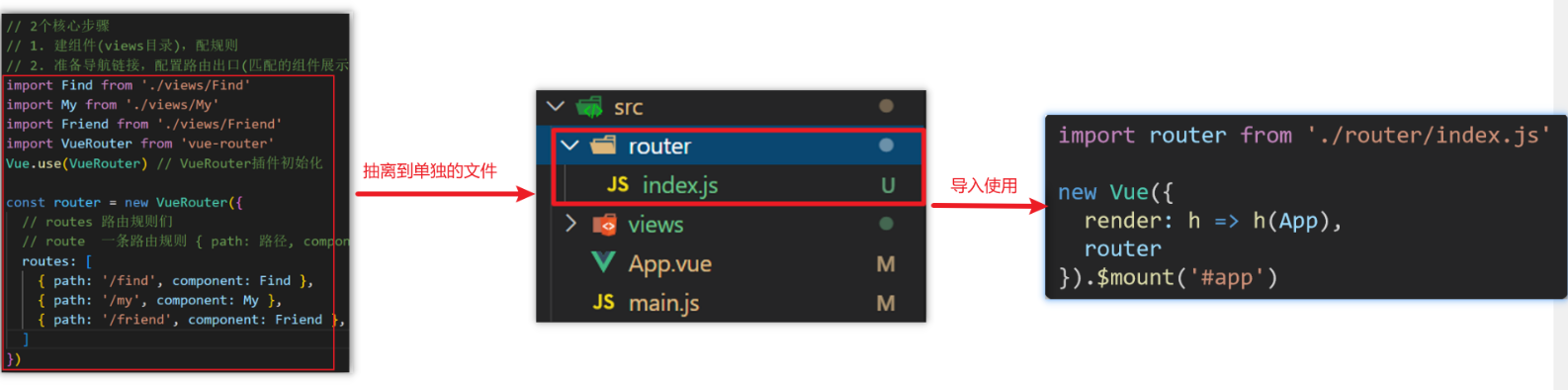
动态组件
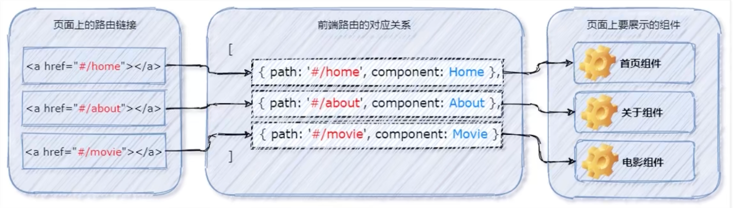
- 什么是动态组件
动态组件指的是动态切换组件的显示与隐藏。vue 提供了一个内置的 组件,专门用来实现组件的动态渲染。
① 是组件的占位符
② 通过 is 属性动态指定要渲染的组件名称
③
- 如何实现动态组件渲染
示例代码如下:
data() {return {comName: 'MyHome' // 1.当前要渲染的组件的名称}
},<template><div><h1 class="mb-4">App 根组件</h1><!-- 点击按钮,动态切换组件的名称 --><button @click="comName = 'MyHome'">首页</button><button @click="comName = 'MyMovie'">电影</button><hr /><!-- 2.用is来指定需要渲染的组件的名字 --><component :is="comName"></component></div>
</template>
注意:当我们切换组件时,之前组件会被销毁(所以之前的数据也会被清空)
- 使用 keep-alive 保持状态
默认情况下,切换动态组件时无法保持组件的状态。此时可以使用 vue 内置的 组件保持动态组件的状态。
示例代码如下:
<keep-alive><component :is="comName"></component>
</keep-alive>