WPF不仅支持传统的Windows Forms编程的用户界面和用户体验设计,同时还推出了以模板为核心的新一代设计理念。在WPF中,通过引入模板,将数据和算法的“内容”和“形式”进行解耦。模板主要分为两大类:数据模板【Data Template】和控件模板【Control Template】。

基本上,ControlTemplate描述如何显示控件,而DataTemplate描述如何显示数据。
控件模板 Control Template
控件模板让我们可以定义控件的外观,改变控件的展现形式,通过Control Template实现。
1. 编辑默认模板
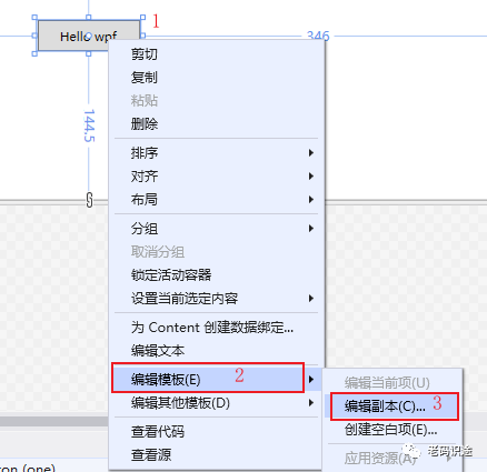
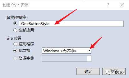
选中控件--右键--编辑模板--编辑副本,打开创建Style资源对话框,如下所示:
创建Style资源,输入资源名称,定义位置,默认为此文档【Window】,然后点击【确定】,创建资源。如下所示:
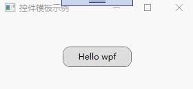
创建控件元素的默认资源,如下所示:
<Window x:Class="WpfApp2.TwoWindow"xmlns="http://schemas.microsoft.com/winfx/2006/xaml/presentation"xmlns:x="http://schemas.microsoft.com/winfx/2006/xaml"xmlns:d="http://schemas.microsoft.com/expression/blend/2008"xmlns:mc="http://schemas.openxmlformats.org/markup-compatibility/2006"xmlns:local="clr-namespace:WpfApp2"mc:Ignorable="d"Title="TwoWindow" Height="350" Width="800"><Window.Resources><Style x:Key="FocusVisual"><Setter Property="Control.Template"><Setter.Value><ControlTemplate><Rectangle Margin="2" SnapsToDevicePixels="true" Stroke="{DynamicResource {x:Static SystemColors.ControlTextBrushKey}}" StrokeThickness="1" StrokeDashArray="1 2"/></ControlTemplate></Setter.Value></Setter></Style><SolidColorBrush x:Key="Button.Static.Background" Color="#FFDDDDDD"/><SolidColorBrush x:Key="Button.Static.Border" Color="#FF707070"/><SolidColorBrush x:Key="Button.MouseOver.Background" Color="#FFBEE6FD"/><SolidColorBrush x:Key="Button.MouseOver.Border" Color="#FF3C7FB1"/><SolidColorBrush x:Key="Button.Pressed.Background" Color="#FFC4E5F6"/><SolidColorBrush x:Key="Button.Pressed.Border" Color="#FF2C628B"/><SolidColorBrush x:Key="Button.Disabled.Background" Color="#FFF4F4F4"/><SolidColorBrush x:Key="Button.Disabled.Border" Color="#FFADB2B5"/><SolidColorBrush x:Key="Button.Disabled.Foreground" Color="#FF838383"/><Style x:Key="OneButtonStyle" TargetType="{x:Type Button}"><Setter Property="FocusVisualStyle" Value="{StaticResource FocusVisual}"/><Setter Property="Background" Value="{StaticResource Button.Static.Background}"/><Setter Property="BorderBrush" Value="{StaticResource Button.Static.Border}"/><Setter Property="Foreground" Value="{DynamicResource {x:Static SystemColors.ControlTextBrushKey}}"/><Setter Property="BorderThickness" Value="1"/><Setter Property="HorizontalContentAlignment" Value="Center"/><Setter Property="VerticalContentAlignment" Value="Center"/><Setter Property="Padding" Value="1"/><Setter Property="Template"><Setter.Value><ControlTemplate TargetType="{x:Type Button}"><Border x:Name="border" BorderBrush="{TemplateBinding BorderBrush}" BorderThickness="{TemplateBinding BorderThickness}" Background="{TemplateBinding Background}" SnapsToDevicePixels="true"><ContentPresenter x:Name="contentPresenter" Focusable="False" HorizontalAlignment="{TemplateBinding HorizontalContentAlignment}" Margin="{TemplateBinding Padding}" RecognizesAccessKey="True" SnapsToDevicePixels="{TemplateBinding SnapsToDevicePixels}" VerticalAlignment="{TemplateBinding VerticalContentAlignment}"/></Border><ControlTemplate.Triggers><Trigger Property="IsDefaulted" Value="true"><Setter Property="BorderBrush" TargetName="border" Value="{DynamicResource {x:Static SystemColors.HighlightBrushKey}}"/></Trigger><Trigger Property="IsMouseOver" Value="true"><Setter Property="Background" TargetName="border" Value="{StaticResource Button.MouseOver.Background}"/><Setter Property="BorderBrush" TargetName="border" Value="{StaticResource Button.MouseOver.Border}"/></Trigger><Trigger Property="IsPressed" Value="true"><Setter Property="Background" TargetName="border" Value="{StaticResource Button.Pressed.Background}"/><Setter Property="BorderBrush" TargetName="border" Value="{StaticResource Button.Pressed.Border}"/></Trigger><Trigger Property="IsEnabled" Value="false"><Setter Property="Background" TargetName="border" Value="{StaticResource Button.Disabled.Background}"/><Setter Property="BorderBrush" TargetName="border" Value="{StaticResource Button.Disabled.Border}"/><Setter Property="TextElement.Foreground" TargetName="contentPresenter" Value="{StaticResource Button.Disabled.Foreground}"/></Trigger></ControlTemplate.Triggers></ControlTemplate></Setter.Value></Setter></Style></Window.Resources><Grid><Button x:Name="one" Content="Hello wpf" Margin="5" Width="100" Height="30" Style="{DynamicResource OneButtonStyle}"></Button></Grid>
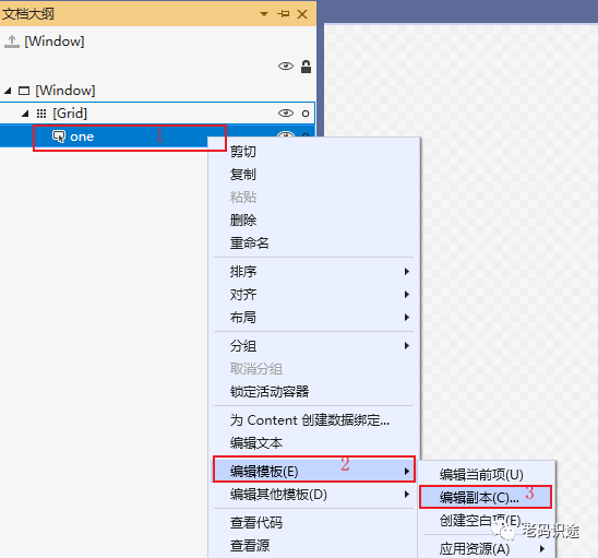
</Window>编辑默认模板,也可以通过【文档大纲】右键--编辑模板--编辑副本,然后打开创建资源对话框,进行操作,如下所示:
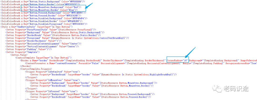
2. 修改默认样式
通过默认创建的控件模板Style,可以修改和重定义控件的显示内容,如:设置按钮显示圆角,和鼠标放上去为红色。
要实现以上功能,只需要修改两个地方即可,如下所示:
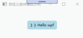
3. 自定义控件模板
通过自定义模板,同样能达到修改控件样式的效果。
控件模板也是资源的一种,每一个控件模板都有一个唯一的key,在控件上通过Template进行绑定,如下所示:
<Window x:Class="WpfApp2.ThreeWindow"xmlns="http://schemas.microsoft.com/winfx/2006/xaml/presentation"xmlns:x="http://schemas.microsoft.com/winfx/2006/xaml"xmlns:d="http://schemas.microsoft.com/expression/blend/2008"xmlns:mc="http://schemas.openxmlformats.org/markup-compatibility/2006"xmlns:local="clr-namespace:WpfApp2"mc:Ignorable="d"Title="自定义控件模板示例" Height="150" Width="300"><Window.Resources><ControlTemplate x:Key="oneStyle" TargetType="Button"><Border Background="LightBlue" CornerRadius="5" x:Name="border"><StackPanel Orientation="Horizontal" HorizontalAlignment="{TemplateBinding HorizontalAlignment}"><TextBlock VerticalAlignment="{TemplateBinding VerticalAlignment}">》》</TextBlock><ContentPresenter HorizontalAlignment="{TemplateBinding HorizontalAlignment}" VerticalAlignment="{TemplateBinding VerticalAlignment}"></ContentPresenter></StackPanel></Border><ControlTemplate.Triggers><Trigger Property="IsMouseOver" Value="true"><Setter Property="Background" TargetName="border" Value="Red"/><Setter Property="BorderBrush" TargetName="border" Value="Blue"/></Trigger></ControlTemplate.Triggers></ControlTemplate></Window.Resources><Grid><Button x:Name="one" Content="Hello wpf" Margin="5" Width="100" Height="30" VerticalAlignment="Center"  HorizontalAlignment="Center" Template="{StaticResource oneStyle}"></Button></Grid>
</Window>
自定义控件模板,示例如下:
数据模板 DataTemplate
控件模板决定了数据的展示形式和用户体检,在软件UI设计中非常重要。同样数据的展示形式越来越多样化,正所谓:横看成岭侧成峰,远近高低各不同。同样的数据内容,在DataGrid中的展示是文本的列表形式,在ComboBox中是下拉框的形式。给数据披上外衣,将数据和形式解耦,是一种新的发展趋势。
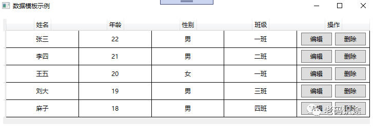
1. DataGrid
1. 数据模板
DataGrid是可以自定义网格数据显示的控件,通过自定义显示的列模板,可以实现各式各样的展现方式。列定义如下:
-
DataGrid的列定义,通过Binding="{Binding Name}"的方式绑定属性,通过ElementStyle="{StaticResource one_center}"的方式绑定样式。
-
DataGrid预制了几种列展示数据的方式,如:DataGridTextColumn【文本】,DataGridCheckBoxColumn【复选框】,DataGridComboBoxColumn【下拉框】,DataGridHyperlinkColumn【链接】等,如果使用数据模板,则采用DataGridTemplateColumn进行定义。
UI示例如下所示:
<Window x:Class="WpfApp2.A1Window"xmlns="http://schemas.microsoft.com/winfx/2006/xaml/presentation"xmlns:x="http://schemas.microsoft.com/winfx/2006/xaml"xmlns:d="http://schemas.microsoft.com/expression/blend/2008"xmlns:mc="http://schemas.openxmlformats.org/markup-compatibility/2006"xmlns:local="clr-namespace:WpfApp2"mc:Ignorable="d"Title="数据模板示例" Height="450" Width="650"><Window.Resources><Style x:Key="one_center" TargetType="TextBlock"><Setter Property="VerticalAlignment" Value="Center"></Setter><Setter Property="HorizontalAlignment" Value="Center"></Setter></Style><Style x:Key="one_header" TargetType="DataGridColumnHeader"><Setter Property="VerticalAlignment" Value="Center"></Setter><Setter Property="HorizontalAlignment" Value="Center"></Setter><Setter Property="HorizontalContentAlignment" Value="Center"></Setter><Setter Property="BorderThickness" Value="0"></Setter></Style></Window.Resources><Grid><DataGrid x:Name="one"  Margin="10" AutoGenerateColumns="False"  CanUserAddRows="False"  CanUserSortColumns="False" BorderThickness="0" ><DataGrid.Columns><DataGridTextColumn Header="姓名" Binding="{Binding Name}" Width="*" ElementStyle="{StaticResource one_center}" HeaderStyle="{StaticResource one_header}"  /><DataGridTextColumn Header="年龄" Binding="{Binding Age}" Width="*" ElementStyle="{StaticResource one_center}" HeaderStyle="{StaticResource one_header}"/><DataGridTextColumn Header="性别" Binding="{Binding Sex}" Width="*" ElementStyle="{StaticResource one_center}" HeaderStyle="{StaticResource one_header}"/><DataGridTextColumn Header="班级" Binding="{Binding Classes}" Width="*" ElementStyle="{StaticResource one_center}" HeaderStyle="{StaticResource one_header}"/><DataGridTemplateColumn Header="操作" Width="*" HeaderStyle="{StaticResource one_header}"><DataGridTemplateColumn.CellTemplate><DataTemplate><StackPanel Orientation="Horizontal" VerticalAlignment="Center" HorizontalAlignment="Center"><Button x:Name="edit" Content="编辑" Width="60" Margin="3" Height="25"></Button><Button x:Name="delete" Content="删除" Width="60" Margin="3" Height="25"></Button></StackPanel></DataTemplate></DataGridTemplateColumn.CellTemplate></DataGridTemplateColumn></DataGrid.Columns></DataGrid></Grid>
</Window>
2.后台数据绑定
后台数据绑定通过ItemsSource进行赋值,绑定的数据的属性名,要和DataGrid的列绑定数据的名称保持一致,如下所示:
namespace WpfApp2
{/// <summary>/// A1Window.xaml 的交互逻辑/// </summary>public partial class A1Window : Window{public A1Window(){InitializeComponent();List<Student> lst = new List<Student>();lst.Add(new Student() { Name = "张三", Age = 22, Sex = "男", Classes = "一班" });lst.Add(new Student() { Name = "李四", Age = 21, Sex = "男", Classes = "二班" });lst.Add(new Student() { Name = "王五", Age = 20, Sex = "女", Classes = "一班" });lst.Add(new Student() { Name = "刘大", Age = 19, Sex = "男", Classes = "三班" });lst.Add(new Student() { Name = "麻子", Age = 18, Sex = "男", Classes = "四班" });one.ItemsSource = lst;}}public class Student{public string Name { get; set; }public int Age { get; set; }public string Sex { get; set; }public string Classes { get; set; }}
}
DataGrid示例,如下所示:
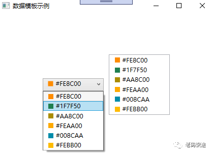
2. ListBox和ComboBox
1. 数据模板
ListBox,ComboBox,均是包含可选择的项的列表,只是ListBox不需要下拉显示,ComboBox需要下拉显示。通过定义数据模板,可以丰富数据的展示形式。
通过ItemTemplate="{StaticResource item_template}"的形式,进行数据模板的绑定。如下所示:
<Window x:Class="WpfApp2.A2Window"xmlns="http://schemas.microsoft.com/winfx/2006/xaml/presentation"xmlns:x="http://schemas.microsoft.com/winfx/2006/xaml"xmlns:d="http://schemas.microsoft.com/expression/blend/2008"xmlns:mc="http://schemas.openxmlformats.org/markup-compatibility/2006"xmlns:local="clr-namespace:WpfApp2"mc:Ignorable="d"Title="数据模板示例" Height="450" Width="800"><Window.Resources><DataTemplate x:Key="item_template"><StackPanel Orientation="Horizontal" Margin="5 ,0"><Border Width="10" Height="10" Background="{Binding Code}"></Border><TextBlock Text="{Binding Code}" Margin="5,0" ></TextBlock></StackPanel></DataTemplate></Window.Resources><Grid><StackPanel Margin="3" Orientation="Horizontal" HorizontalAlignment="Center" VerticalAlignment="Center"><ComboBox x:Name="one" Height="25" Width="120" Margin="5" ItemTemplate="{StaticResource item_template}"></ComboBox><ListBox x:Name="two"  Width="120" Margin="5" ItemTemplate="{StaticResource item_template}"></ListBox></StackPanel></Grid>
</Window>
2.后台数据绑定
与DataGrid一样,后台通过ItemsSource进行数据的绑定。如下所示:
namespace WpfApp2
{/// <summary>/// A2Window.xaml 的交互逻辑/// </summary>public partial class A2Window : Window{public A2Window(){InitializeComponent();List<Color> lst = new List<Color>();lst.Add(new Color() { Code = "#FE8C00" });lst.Add(new Color() { Code = "#1F7F50" });lst.Add(new Color() { Code = "#AA8C00" });lst.Add(new Color() { Code = "#FEAA00" });lst.Add(new Color() { Code = "#008CAA" });lst.Add(new Color() { Code = "#FEBB00" });one.ItemsSource = lst;two.ItemsSource = lst;}}public class Color{public string Code { get; set; }}
}
示例截图,如下所示:
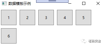
3. ItemsControl
1. 数据模板
ItemsControl,主要用于展示集合数据的项,也是列表控件的一种。ItemsControl 需要设置两个内容:
-
ItemsControl.ItemsPanel,做为数据展示的容器。
-
ItemsControl.ItemTemplate,用于单个数据的展示形式。
具体如下所示:
<Window x:Class="WpfApp2.A3Window"xmlns="http://schemas.microsoft.com/winfx/2006/xaml/presentation"xmlns:x="http://schemas.microsoft.com/winfx/2006/xaml"xmlns:d="http://schemas.microsoft.com/expression/blend/2008"xmlns:mc="http://schemas.openxmlformats.org/markup-compatibility/2006"xmlns:local="clr-namespace:WpfApp2"mc:Ignorable="d"Title="A3Window" Height="450" Width="800"><Grid><ItemsControl x:Name="one"><ItemsControl.ItemsPanel><ItemsPanelTemplate><WrapPanel></WrapPanel></ItemsPanelTemplate></ItemsControl.ItemsPanel><ItemsControl.ItemTemplate><DataTemplate><Button Width="50" Height="50" Margin="5" Content="{Binding Code}"></Button></DataTemplate></ItemsControl.ItemTemplate></ItemsControl></Grid>
</Window>
2.后台数据绑定
与DataGrid一样,后台通过ItemsSource进行数据的绑定。如下所示:
namespace WpfApp2
{/// <summary>/// A3Window.xaml 的交互逻辑/// </summary>public partial class A3Window : Window{public A3Window(){InitializeComponent();List<Test> lst = new List<Test>();lst.Add(new Test() { Code = "1" });lst.Add(new Test() { Code = "2" });lst.Add(new Test() { Code = "3" });lst.Add(new Test() { Code = "4" });lst.Add(new Test() { Code = "5" });lst.Add(new Test() { Code = "6" });one.ItemsSource = lst;}}public class Test{public string Code { get; set; }}
}
示例截图
控件模板和数据模板的应用场景还有很多,本文旨在抛砖引玉,一起学习,共同进步。