文章目录
- 1.预期效果
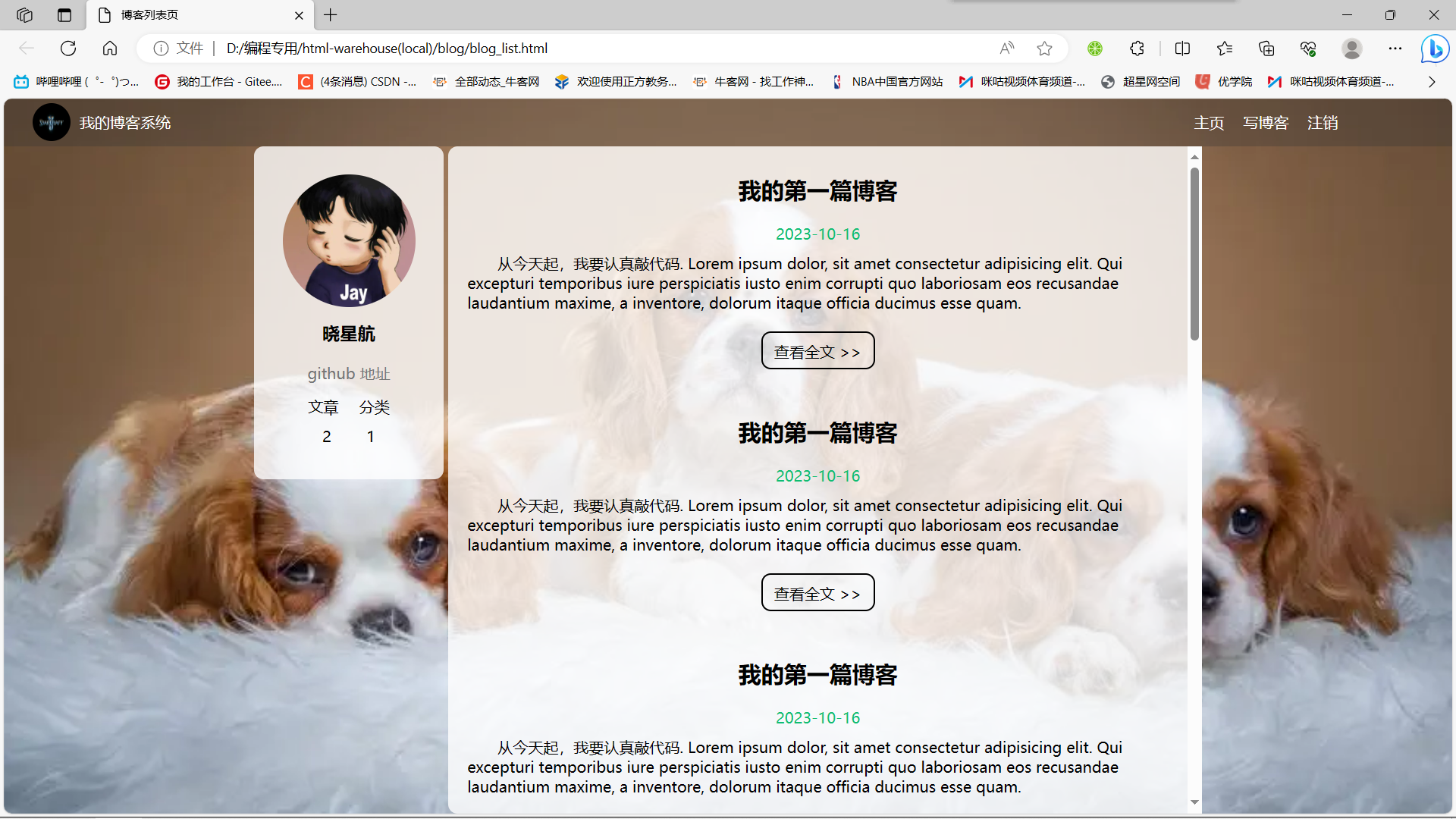
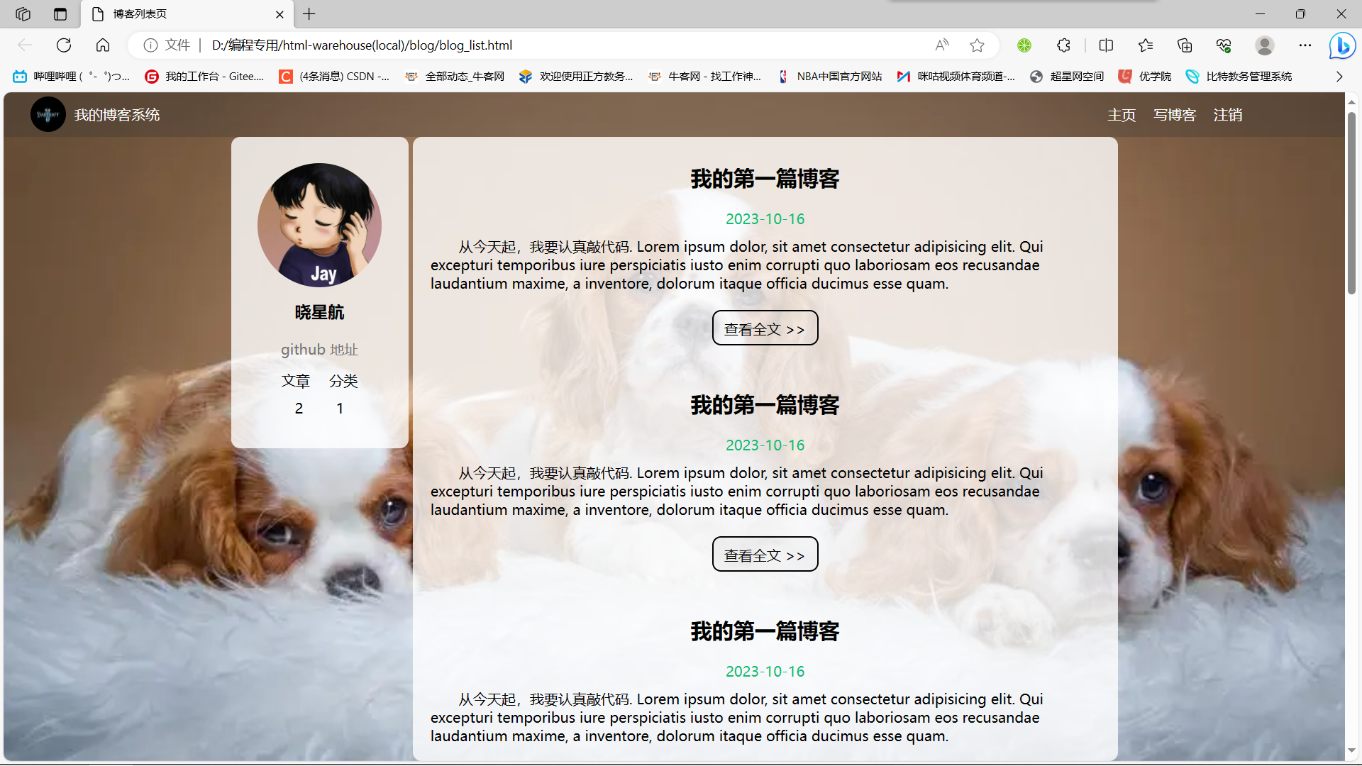
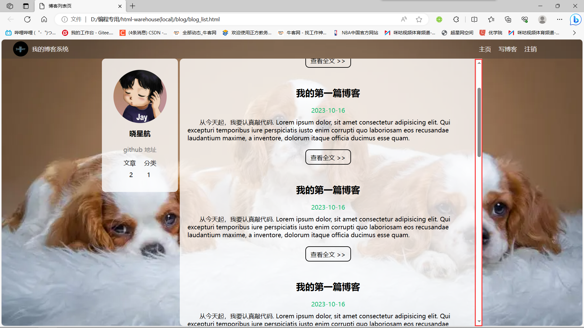
- 1.1博客列表页效果
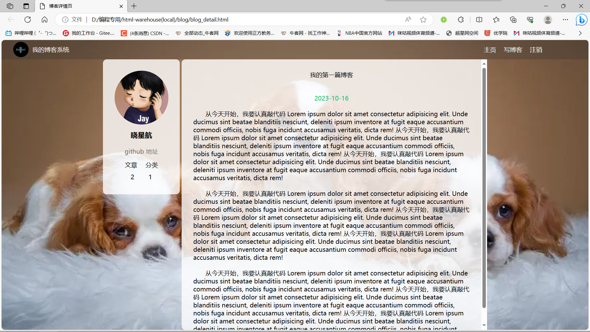
- 1.2博客详情页效果
- 1.3博客登陆页效果
- 1.4博客编辑页效果
- 2.实现博客列表页
- 2.1实现导航栏
- 2.2实现版心
- 2.3实现个人信息
- 2.4实现博客列表
- 2.5博客列表页完整代码
- 3.实现博客正文页
- 3.1引入导航栏
- 3.2引入版心
- 3.3引入个人信息
- 3.4实现博客正文
- 3.5博客正文页完整代码
- 4.实现博客登陆页
- 4.1引入导航栏
- 4.2实现版心
- 4.3实现登陆框
- 4.4博客登录页完整代码
- 5.实现博客编辑页
- 5.1引入导航栏
- 5.2实现编辑区
- 5.3引入jquery
- 5.4引入 editor.md
- 5.5博客编辑页完整代码
大家好,我是晓星航。今天为大家带来的是 博客系统(页面设计) 相关的讲解!😀
1.预期效果
1.1博客列表页效果
1.2博客详情页效果
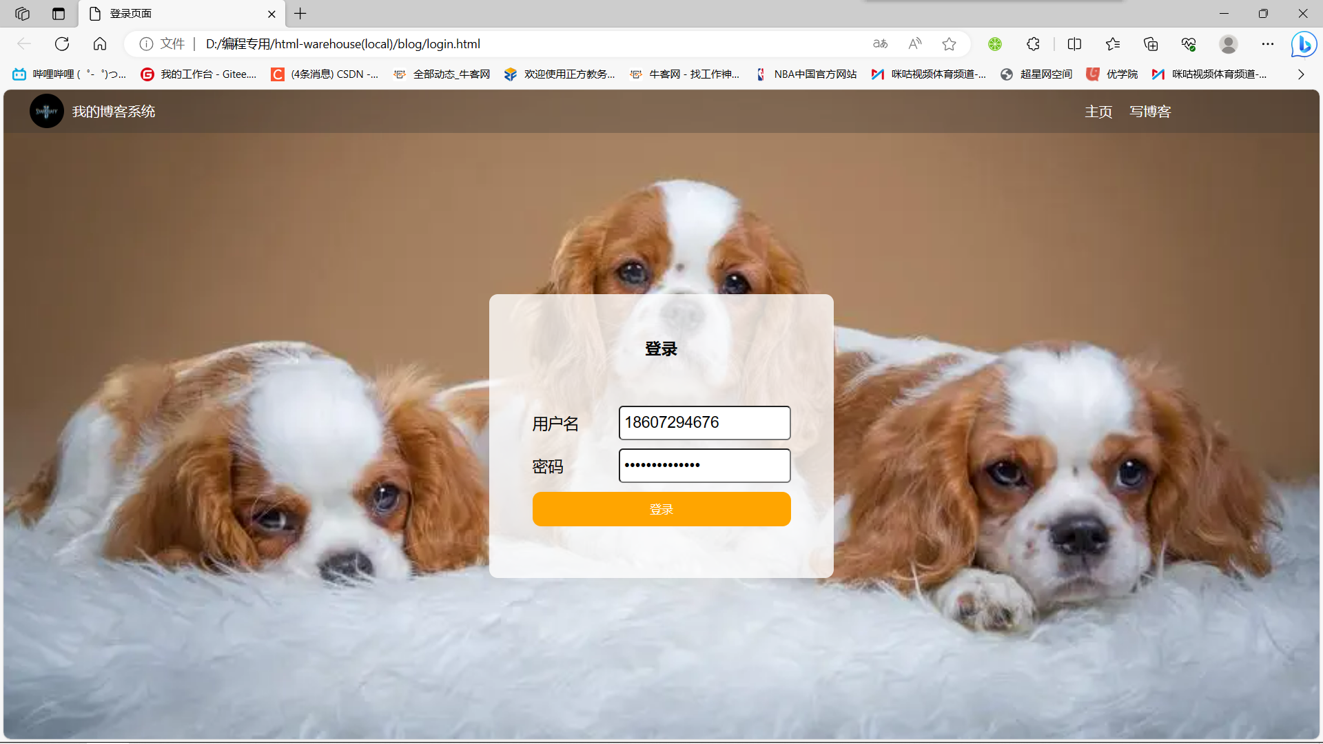
1.3博客登陆页效果
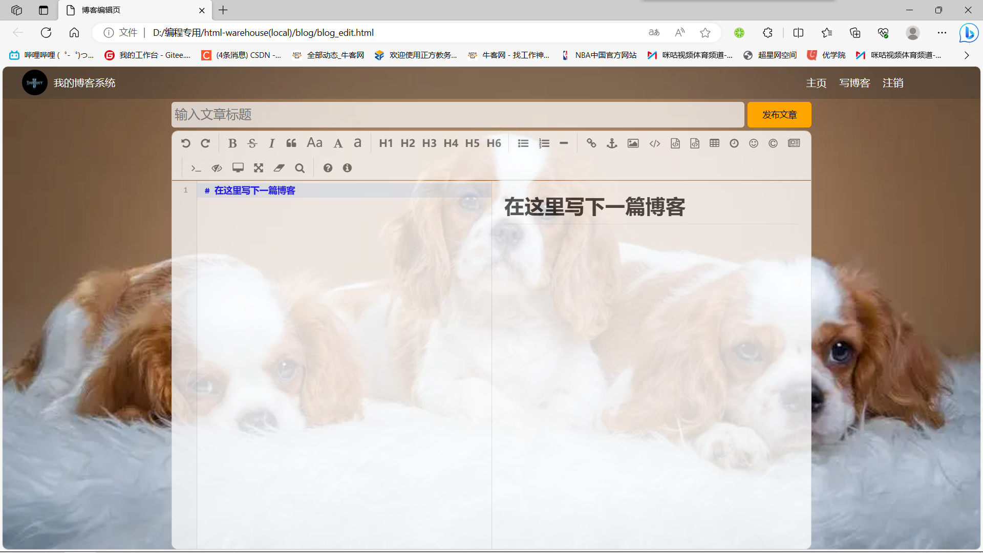
1.4博客编辑页效果
2.实现博客列表页
创建 blog_list.html, 编写博客列表页.
2.1实现导航栏
编辑 blog_list.html, 创建导航栏的 html 代码.
- 导航栏里面包含 logo, 标题, 以及一些按钮(跳转链接).
- 为了实现左右排列, 在 logo 和 按钮 之间加一个 spacer 作为占位器.
<!-- 这是一个导航栏 --><div class="nav"><img src="image/logo2.jpg" alt=""><span class="title">我的博客系统</span><a href="#">主页</a><a href="#">写博客</a><a href="#">注销</a></div>
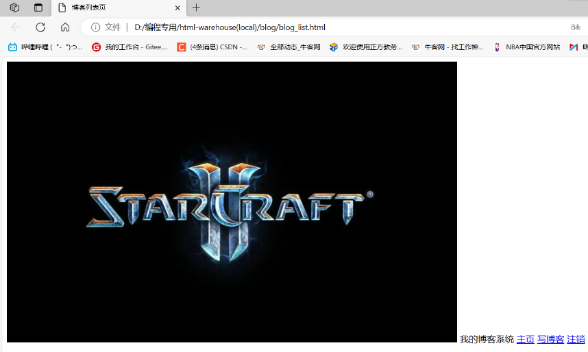
准备一个 logo2.jpg(星际争霸), 放到 img 目录中.

创建 common.css .
对于导航栏来说, 每个页面都需要, 因此把样式提取出来.
- 先清除浏览器默认样式
- 准备一个 cat.jpg 作为背景图.
- 需要把 html 和 body 高度都设为 100%, 使背景的高度和浏览器窗口高度一样.
- 导航栏 nav 内部使用 flex 布局, 用来排列 logo 和一些按钮.
* {margin: 0;padding: 0;box-sizing: border-box;
}
/* 设置整体页面高度 */
html, body {height: 100%;background-image: url(../img/cat.jpg);background-position: center center;background-size: cover;background-repeat: no-repeat;
}
/* 上方导航栏 */
.nav {width: 100%;height: 50px;background-color: rgba(51, 51, 51, 0.4);color: #fff;display: flex;justify-content: left;align-items: center;
}
/* 导航栏中的图标 */
.nav img {width: 40px;height: 40px;margin-left: 30px;margin-right: 10px;border-radius: 50%;
}
/* 导航栏中的占位器 */
.nav .spacer {width: 70%;
}
/* 导航栏中的按钮 */
.nav a {color: #fff;text-decoration: none;padding: 0 10px;
}
代码解析:
这里的 100% 相当于是网页的高度,它可以随着网页大小的动态变化而变化。
注意:
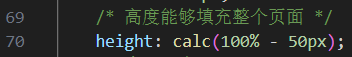
-两侧必须要有一个空格,因为在 CSS中-可能是标识符的一部分,CSS如果要表达减法运算,就得加上空格。那么我们之前了解到 CSS 不能进行算数运算,那么这里我们为什么可以有算术间的运算呢?
答:因为那是针对 CSS2 这个版本,在进化到 CSS3 之后,此时我们引入了少量的运算!(但是在运算符的两侧一定要加上空格,不然可能会被编译器误解成标识符)
引入 common.css
<link rel="stylesheet" href="css/conmmon.css">
使用css前:

使用css后:
2.2实现版心
编辑 blog_list.html
- container 作为版心, 实现居中对齐的效果.
- 左侧放用户信息
- 右侧放博客列表
<!-- 版心 -->
<div class="container"><!-- 左侧个人信息 --><div class="container-left"></div><!-- 右侧内容详情 --><div class="container-right"></div>
</div>
编辑 common.css
/* 页面内容容器, 版心 */
.container {/* 使用 calc 计算高度 */height: calc(100% - 50px);/* 设置版心宽度 */width: 1000px;/* 水平居中 */margin: 0 auto;/* 使用弹性布局 */display: flex;justify-content: space-between;align-items: center;
}
/* 左侧部分, 用来放置用户信息 */
.container-left {height: 100%;width: 200px;
}
/* 右侧部分, 用来放置正文 */
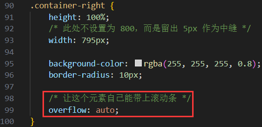
.container-right {height: 100%;/* 和左侧部分中间留出 5px 间隙 */width: 795px;/* 如果内容溢出就自动加上滚动条 */overflow: auto;background-color: rgba(255, 255, 255, 0.8);border-radius: 10px;
}
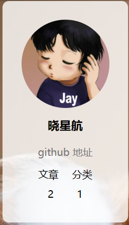
2.3实现个人信息
编辑 blog_list.html
- 把个人信息放到一个 .card div 中.
- 个人信息中包含 头像 (img), 用户名 (h3), 用户的 github (a), 用户的文章数量和分类数量.
<!-- 左侧个人信息 -->
<div class="container-left"><div class="card"><img src="img/doge.jpg" class="avtar" alt=""><h3>比特汤老湿</h3><a href="http:www.github.com">github 地址</a><div class="counter"><span>文章</span><span>分类</span></div><div class="counter"><span>2</span><span>1</span></div></div>
</div>
编辑 common.css
/* 展示用户信息的卡片 */
.card {background-color: rgba(255, 255, 255, 0.8);border-radius: 10px;padding: 30px;
}
/* 用户头像 */
.card img {width: 140px;height: 140px;border-radius: 50%;
}
/* 用户名 */
.card h3 {text-align: center;padding: 10px;
}
/* 用户 github 链接 */
.card a {display: block;text-align: center;color: #999;text-decoration: none;padding: 10px;
}
/* 展示文章数目的面板 */
.card .counter {padding: 5px;display: flex;justify-content: space-around;
}
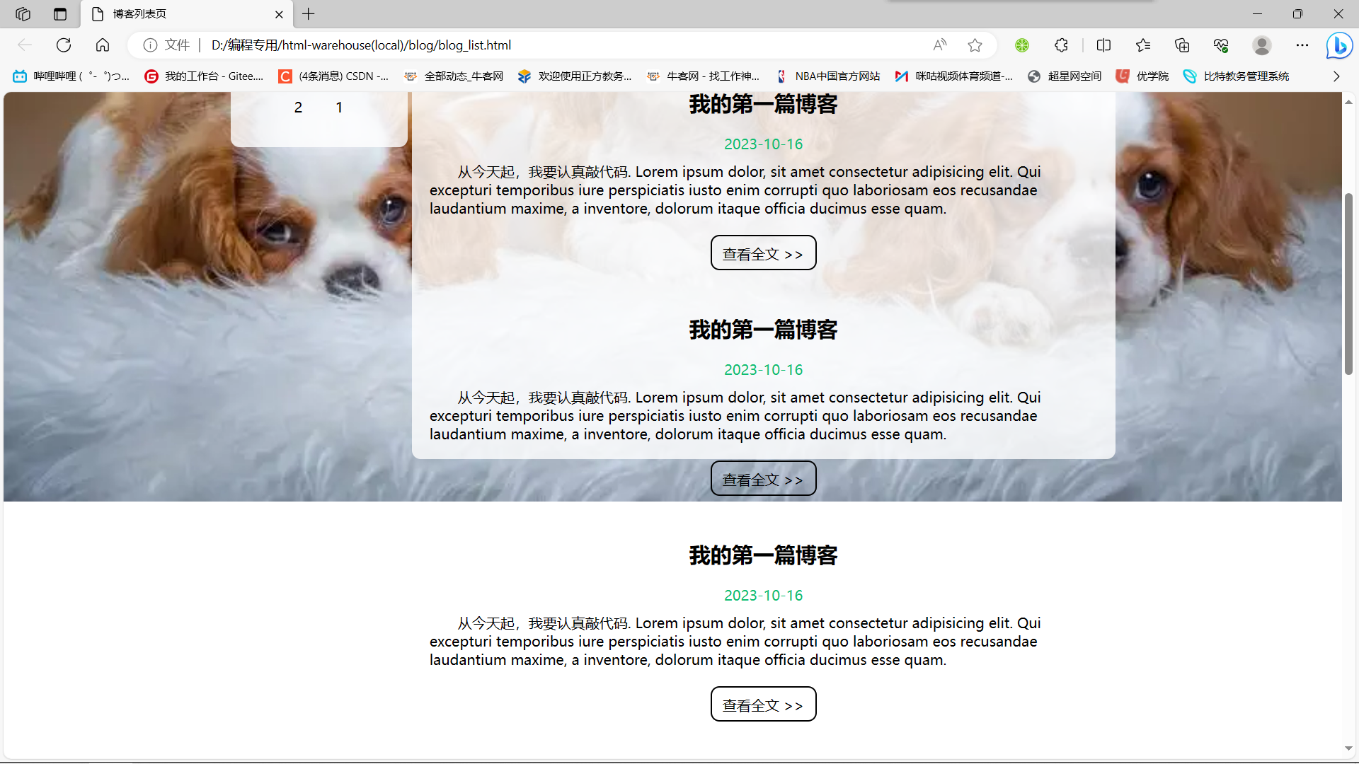
2.4实现博客列表
编辑 blog_list.html
- 每个博客使用 div.blog 来表示.
- 每个博客中包含标题, 发布时间, 描述, 查看全文按钮.
<!-- 右侧内容详情 -->
<div class="container-right"><!-- 每一篇博客包含标题, 摘要, 时间 --><div class="blog"><div class="title">我的第一篇博客</div><div class="date">2021-06-02</div><div class="desc">
从今天起, 我要认真敲代码. Lorem ipsum, dolor sit amet consectetur
adipisicing elit. Cum distinctio ullam eum utveroab laborum numquam tenetur est in dolorum a sint, assumenda
adipisci similique quaerat vel.Facere,et.</div><a href="blog_content.html?blogId=1" class="detail">查看全文 >></a></div><div class="blog"><div class="title">我的第二篇博客</div><div class="date">2021-06-02</div><div class="desc">从今天起, 我要认真敲代码. Lorem ipsum, dolor sit amet consectetur
adipisicing elit. Cum distinctio ullam eum utveroab laborum numquam tenetur est in dolorum a sint, assumenda
adipisci similique quaerat vel.Facere,et.</div><a href="blog_content.html?blogId=2" class="detail">查看全文 >></a></div>
</div>
创建 blog_list.css
这部分内容不再是公共部分了, 放到单独的 css 中.
- 使用伪类选择器
.blog .detail:hover, 实现光标悬停时修改样式的功能. - 给
.blog .detail中加上过度效果transition: all 0.3s;使悬停的样式改变更逼真 .
/* 表示一篇博客 */
.blog {width: 100%;padding: 10px 20px;
}
/* 博客的标题 */
.blog .title {color: black;font-size: 20px;font-weight: 700;text-align: center;padding: 10px 0;
}
/* 博客的摘要 */
.blog .desc {color: #000;text-indent: 2em;margin-top: 10px;
}
/* 博客的日期 */
.blog .date {color: #008000;margin-top: 10px;
text-align: center;
}
/* 查看详情 按钮 */
.blog .detail {display: block;width: 120px;height: 40px;line-height: 40px;color: black;text-align: center;text-decoration: none;margin: 10px auto 0 auto;border: 2px solid black;/* 给颜色加上过渡效果 */transition: all 0.3s;
}
/* 查看详情按钮的鼠标 hover 效果 */
.blog .detail:hover {background-color: #000;color: #fff;
}
引入 blog_list.css
<link rel="stylesheet" href="css/blog_content.css">
2.5博客列表页完整代码
博客列表页面的HTML和CSS的全部代码如下:
blog_list.html完整代码:
<!DOCTYPE html>
<html lang="en">
<head><meta charset="UTF-8"><meta name="viewport" content="width=device-width, initial-scale=1.0"><title>博客列表页</title><link rel="stylesheet" href="css/common.css"><link rel="stylesheet" href="css/blog_list.css">
</head>
<body><!-- 这是一个导航栏 --><div class="nav"><img src="image/logo.jpg" alt=""><span class="title">我的博客系统</span><!-- 这个标签仅仅用于占位,把这几个 a 标签挤到右边去 --><div class="spacer"></div><a href="#">主页</a><a href="#">写博客</a><a href="#">注销</a></div><!-- 页面主体部分 --><div class="container"><!-- 左侧信息 --><div class="container-left"><!-- 使用这个 .card 表示用户信息 --><div class="card"><!-- 用户头像 --><img src="image/Jay.jpg" alt=""><!-- 用户名 --><h3>晓星航</h3><a href="#">github 地址</a><div class="counter"><span>文章</span><span>分类</span></div><div class="counter"><span>2</span><span>1</span></div></div></div><!-- 右侧信息 --><div class="container-right"><!-- 表示一篇博客 --><div class="blog"><!-- 博客标题 --><div class="title">我的第一篇博客</div><!-- 发布时间 --><div class="date">2023-10-16</div><!-- 博客摘要 --><div class="desc">从今天起,我要认真敲代码. Lorem ipsum dolor, sit amet consectetur adipisicing elit. Qui excepturi temporibus iure perspiciatis iusto enim corrupti quo laboriosam eos recusandae laudantium maxime, a inventore, dolorum itaque officia ducimus esse quam.</div><!-- 查看全文按钮 --><a href="#">查看全文 >> </a></div><!-- 表示一篇博客 --><div class="blog"><!-- 博客标题 --><div class="title">我的第一篇博客</div><!-- 发布时间 --><div class="date">2023-10-16</div><!-- 博客摘要 --><div class="desc">从今天起,我要认真敲代码. Lorem ipsum dolor, sit amet consectetur adipisicing elit. Qui excepturi temporibus iure perspiciatis iusto enim corrupti quo laboriosam eos recusandae laudantium maxime, a inventore, dolorum itaque officia ducimus esse quam.</div><!-- 查看全文按钮 --><a href="#">查看全文 >> </a></div><!-- 表示一篇博客 --><div class="blog"><!-- 博客标题 --><div class="title">我的第一篇博客</div><!-- 发布时间 --><div class="date">2023-10-16</div><!-- 博客摘要 --><div class="desc">从今天起,我要认真敲代码. Lorem ipsum dolor, sit amet consectetur adipisicing elit. Qui excepturi temporibus iure perspiciatis iusto enim corrupti quo laboriosam eos recusandae laudantium maxime, a inventore, dolorum itaque officia ducimus esse quam.</div><!-- 查看全文按钮 --><a href="#">查看全文 >> </a></div><!-- 表示一篇博客 --><div class="blog"><!-- 博客标题 --><div class="title">我的第一篇博客</div><!-- 发布时间 --><div class="date">2023-10-16</div><!-- 博客摘要 --><div class="desc">从今天起,我要认真敲代码. Lorem ipsum dolor, sit amet consectetur adipisicing elit. Qui excepturi temporibus iure perspiciatis iusto enim corrupti quo laboriosam eos recusandae laudantium maxime, a inventore, dolorum itaque officia ducimus esse quam.</div><!-- 查看全文按钮 --><a href="#">查看全文 >> </a></div><!-- 表示一篇博客 --><div class="blog"><!-- 博客标题 --><div class="title">我的第一篇博客</div><!-- 发布时间 --><div class="date">2023-10-16</div><!-- 博客摘要 --><div class="desc">从今天起,我要认真敲代码. Lorem ipsum dolor, sit amet consectetur adipisicing elit. Qui excepturi temporibus iure perspiciatis iusto enim corrupti quo laboriosam eos recusandae laudantium maxime, a inventore, dolorum itaque officia ducimus esse quam.</div><!-- 查看全文按钮 --><a href="#">查看全文 >> </a></div><!-- 表示一篇博客 --><div class="blog"><!-- 博客标题 --><div class="title">我的第一篇博客</div><!-- 发布时间 --><div class="date">2023-10-16</div><!-- 博客摘要 --><div class="desc">从今天起,我要认真敲代码. Lorem ipsum dolor, sit amet consectetur adipisicing elit. Qui excepturi temporibus iure perspiciatis iusto enim corrupti quo laboriosam eos recusandae laudantium maxime, a inventore, dolorum itaque officia ducimus esse quam.</div><!-- 查看全文按钮 --><a href="#">查看全文 >> </a></div><!-- 表示一篇博客 --><div class="blog"><!-- 博客标题 --><div class="title">我的第一篇博客</div><!-- 发布时间 --><div class="date">2023-10-16</div><!-- 博客摘要 --><div class="desc">从今天起,我要认真敲代码. Lorem ipsum dolor, sit amet consectetur adipisicing elit. Qui excepturi temporibus iure perspiciatis iusto enim corrupti quo laboriosam eos recusandae laudantium maxime, a inventore, dolorum itaque officia ducimus esse quam.</div><!-- 查看全文按钮 --><a href="#">查看全文 >> </a></div><!-- 表示一篇博客 --><div class="blog"><!-- 博客标题 --><div class="title">我的第一篇博客</div><!-- 发布时间 --><div class="date">2023-10-16</div><!-- 博客摘要 --><div class="desc">从今天起,我要认真敲代码. Lorem ipsum dolor, sit amet consectetur adipisicing elit. Qui excepturi temporibus iure perspiciatis iusto enim corrupti quo laboriosam eos recusandae laudantium maxime, a inventore, dolorum itaque officia ducimus esse quam.</div><!-- 查看全文按钮 --><a href="#">查看全文 >> </a></div><!-- 表示一篇博客 --><div class="blog"><!-- 博客标题 --><div class="title">我的第一篇博客</div><!-- 发布时间 --><div class="date">2023-10-16</div><!-- 博客摘要 --><div class="desc">从今天起,我要认真敲代码. Lorem ipsum dolor, sit amet consectetur adipisicing elit. Qui excepturi temporibus iure perspiciatis iusto enim corrupti quo laboriosam eos recusandae laudantium maxime, a inventore, dolorum itaque officia ducimus esse quam.</div><!-- 查看全文按钮 --><a href="#">查看全文 >> </a></div><!-- 表示一篇博客 --><div class="blog"><!-- 博客标题 --><div class="title">我的第一篇博客</div><!-- 发布时间 --><div class="date">2023-10-16</div><!-- 博客摘要 --><div class="desc">从今天起,我要认真敲代码. Lorem ipsum dolor, sit amet consectetur adipisicing elit. Qui excepturi temporibus iure perspiciatis iusto enim corrupti quo laboriosam eos recusandae laudantium maxime, a inventore, dolorum itaque officia ducimus esse quam.</div><!-- 查看全文按钮 --><a href="#">查看全文 >> </a></div></div></div>
</body>
</html>
common.css完整代码:
/* 写样式的起手式,先去除浏览器的公共样式,并且设置 border-box,避免元素盒子被内边距和边框撑大 */
* {margin: 0;padding: 0;box-sizing: border-box;
}html, body {/* html 是页面的最顶层元素, 高度 100% 是相对父元素来说是 100% (和父元素一样高)对于 html 标签来说,父元素就是浏览器窗口,浏览器窗口多高,html就多高。body 的父亲是 html,设为 100% 意思是 body 和 html 一样高。如果不设置高度,此时元素的默认高度取决于内部的内容。*/height: 100%;
}body {/* 相对路径的基准路径就是当前文件所在路径!!! *//* background-image: url(../image/physics.jpg); */background-image: url(../image/dog.jpg);background-repeat: no-repeat;background-size: cover;background-position: center center;
}
/* 实现导航栏的样式 */
.nav {/* 设置宽度 和 父元素一样宽 *//* 块级元素来说, 默认就是 width: 100% */width: 100%;/* 设置高度是 50px */height: 50px;background-color: rgba(50, 50, 50, 0.3);color:white;/* 导航栏里面的元素都是水平排列,弹性布局来设置 */display: flex;/* 垂直方向子元素居中 */align-items: center;
}.nav img{width: 40px;height: 40px;margin-left: 30px;margin-right: 10px;/* 让元素变园,把内切圆半径设置为宽度的一半,就正好是一个圆形 */border-radius: 50%;
}.nav .spacer {width: 70%;
}.nav a {color:white;/* 去掉下划线 */text-decoration: none;/* 为了让这几个 a 标签不要贴的这么紧凑,加上个内边距此处使用外边距也行,内边距更好。内边距也是元素的内容,可以增大用户点击的面积 */padding: 0 10px;
}/* 编写页面主题样式 */
.container {/* 设置主题部分宽度 1000px */width: 1000px;/* 高度能够填充整个页面 */height: calc(100% - 50px);/* 水平居中 */margin: 0 auto;/* 为了方便看效果,临时加上个背景色,后面再去掉 *//* background-color: blue; *//* 弹性布局 */display: flex;align-items: center;justify-content: space-between;
}.container-left {/* 尺寸写 百分数,是相对于父元素为基准 */height: 100%;width: 200px;/* background-color: red; */
}.container-right {height: 100%;/* 此处不设置为 800,而是留出 5px 作为中缝 */width: 795px;background-color: rgba(255, 255, 255, 0.8);border-radius: 10px;/* 让这个元素自己能带上滚动条 *//* 这个属性表示,内容没有溢出,无滚动条;如果内容溢出了,则自动加上滚动条   */overflow: auto;
}/* 左侧用户信息 */
.card {background-color: rgba(255, 255, 255, 0.8);border-radius: 10px;/* 设置内边距,让内容和边框之间有点距离 */padding: 30px;
}/* 用户头像 */
.card img {width: 140px;height: 140px;border-radius: 50%;
}/* 用户名字 */
.card h3 {/* 让文字水平居中 */text-align: center;/* 让文字和上下都有边距 *//* 使用内边距或者外边距均可~~ 更倾向于使用内边距 *//* 因为外边距有的时候有坑!!! */padding: 10px;
}/* 用户的 github 链接 */
.card a {/* a 标签是行内元素,行内元素的很多东西比较膈应  */text-align: center;/* 为了配合上述样式,设置成块级元素即可 */display: block;color: #777;text-decoration: none;padding: 10px;
}.card .counter {/* 为了让里面的元素水平排列,使用弹性布局 */display: flex;justify-content: space-evenly;/* 让元素之间有点距离感 */padding: 5px;
}
blog_list.css完整代码:
/* 认为这个文件是给博客列表页实现样式的 *//* 设置整个博客的容器元素的样式 */
.blog {width: 100%;padding: 20px;
}.blog .title {text-align: center;font-size: 24px;font-weight: 700;padding: 10px;
}.blog .date {text-align: center;color: rgb(15, 189, 114);padding: 10px;
}.blog .desc {text-indent: 2em;
}.blog a {/* a 标签,不方便设置样式,转成块级元素 */display: block;width: 120px;height: 40px;/* 设置水平居中 */margin-top: 20px;margin-left: auto;margin-right: auto;/* 设置边框 */border: 2px solid black;/* 让文字水平居中 */text-align: center;/* 让文字垂直居中 */line-height: 40px;/* 去掉下划线 */text-decoration: none;/* 文字改成黑色 */color: black;/* 圆角矩形 */border-radius: 10px;/* 给鼠标加一个悬停过渡效果 */transition: all 0.8s;
}/* 设置一下,让鼠标滑倒按钮上有一个变化 */
.blog a:hover {color: white;background: #666;
}
3.实现博客正文页
创建 blog_content.html
3.1引入导航栏
编辑 blog_content.html
这部分代码和 blog_list.html 中相同, 直接复制即可.
<!-- 导航栏 -->
<div class="nav"><img src="img/logo2.jpg" alt=""><span class="title">我的博客系统</span><!-- 用来占据中间位置 --><span class="spacer"></span><a href="blog_list.html">主页</a><a href="blog_edit.html">写博客</a><a href="logout">注销</a>
</div>
引入样式 common.css
<link rel="stylesheet" href="css/conmmon.css">
3.2引入版心
编辑 blog_content.html
这部分代码和 blog_list.html 相同, 直接复制
<!-- 版心 -->
<div class="container"><!-- 左侧个人信息 --><div class="container-left"></div><div class="container-right"></div>
</div>
3.3引入个人信息
编辑 blog_content.html
这部分代码和 blog_list.html 相同, 直接复制
<!-- 左侧个人信息 -->
<div class="container-left"><div class="card"><img src="img/doge.jpg" class="avtar" alt=""><h3>比特汤老湿</h3><a href="http:www.github.com">github 地址</a><div class="counter"><span>文章</span><span>分类</span></div><div class="counter"><span>2</span><span>1</span></div></div>
</div>
3.4实现博客正文
编辑 blog_content.html
- 博客内容整体放倒 div.blog-content 中.
- 博客内容中包含博客标题 (h3), 博客时间(div.date), 博客正文§
<div class="blog-content">
<!-- 博客标题 --><h3>我的第一篇博客</h3><!-- 博客时间 --><div class="date">2021-06-02</div><!-- 博客正文 --><p>从今天起我要好好敲代码.Lorem ipsum dolor sit amet, consectetur adipisicing elit. Aut recusandae
omnis natus ut! Autem aliasullam sit facilis ipsa dolore, molestiae neque aperiam in a facere dolor
mollitia dolorum animi.Lorem ipsum dolor sit amet, consectetur adipisicing elit. Aut recusandae
omnis natus ut! Autem aliasullam sit facilis ipsa dolore, molestiae neque aperiam in a facere dolor
mollitia dolorum animi.Lorem ipsum dolor sit amet, consectetur adipisicing elit. Aut recusandae
omnis natus ut! Autem aliasullam sit facilis ipsa dolore, molestiae neque aperiam in a facere dolor
mollitia dolorum animi.</p><p>Lorem ipsum dolor sit amet consectetur adipisicing elit. Laudantium sint
accusantium, enim istecorrupti itaque, omnis alias maiores nemo quae rerum deleniti facere
officiis iure velit. Blanditiispariatur delectus perferendis.Lorem ipsum dolor sit amet consectetur adipisicing elit. Laudantium sint
accusantium, enim istecorrupti itaque, omnis alias maiores nemo quae rerum deleniti facere
officiis iure velit. Blanditiispariatur delectus perferendis.</p>
</div>
创建 blog_content.css
/* 博客正文容器 */
.blog-content {padding: 30px;
}
/* 博客标题 */
.blog-content h3 {text-align: center;padding: 20px 0;
}
/* 博客日期 */
.blog-content .date {color: #008000;padding: 10px 0;text-align: center;
}
/* 博客内容段落 */
.blog-content p {text-indent: 2em;
padding: 10px 0;
}
引入 blog_content.css
<link rel="stylesheet" href="css/blog_content.css">
这时我们发现如果我们滚动旁边的滚动条时,背景也跟着滚动了,就好像一个化了妆的小姑娘突然卸妆了一样
那么针对这个问题,我们解决方法就是将滚动条从旁边移动到我们的博客页面中,从而达到一个内容动而背景不变的效果。
这个
auto属性表示内容没有溢出,无滚动条;如果内容溢出了,则自动加上滚动条。
此时我们可以看到我们现在的滚动条从页面外变化到了页面中,背景也不会变化了。
3.5博客正文页完整代码
博客正文页全部代码:
blog_detail.html:
<!DOCTYPE html>
<html lang="en">
<head><meta charset="UTF-8"><meta name="viewport" content="width=device-width, initial-scale=1.0"><title>博客详情页</title><link rel="stylesheet" href="css/common.css"><link rel="stylesheet" href="css/blog_detail.css">
</head>
<body><!-- 这是一个导航栏 --><div class="nav"><img src="image/logo.jpg" alt=""><span class="title">我的博客系统</span><!-- 这个标签仅仅用于占位,把这几个 a 标签挤到右边去 --><div class="spacer"></div><a href="#">主页</a><a href="#">写博客</a><a href="#">注销</a></div><!-- 页面主体部分 --><div class="container"><!-- 左侧信息 --><div class="container-left"><!-- 使用这个 .card 表示用户信息 --><div class="card"><!-- 用户头像 --><img src="image/Jay.jpg" alt=""><!-- 用户名 --><h3>晓星航</h3><a href="#">github 地址</a><div class="counter"><span>文章</span><span>分类</span></div><div class="counter"><span>2</span><span>1</span></div></div></div><!-- 右侧信息 --><div class="container-right"><!-- 博客标题 --><div class="title">我的第一篇博客</div><!-- 博客发布时间 --><div class="date">2023-10-16</div><!-- 博客正文 --><div class="content"><p>从今天开始,我要认真敲代码 Lorem ipsum dolor sit amet consectetur adipisicing elit. Unde ducimus sint beatae blanditiis nesciunt, deleniti ipsum inventore at fugit eaque accusantium commodi officiis, nobis fuga incidunt accusamus veritatis, dicta rem!从今天开始,我要认真敲代码 Lorem ipsum dolor sit amet consectetur adipisicing elit. Unde ducimus sint beatae blanditiis nesciunt, deleniti ipsum inventore at fugit eaque accusantium commodi officiis, nobis fuga incidunt accusamus veritatis, dicta rem!从今天开始,我要认真敲代码 Lorem ipsum dolor sit amet consectetur adipisicing elit. Unde ducimus sint beatae blanditiis nesciunt, deleniti ipsum inventore at fugit eaque accusantium commodi officiis, nobis fuga incidunt accusamus veritatis, dicta rem!</p><p>从今天开始,我要认真敲代码 Lorem ipsum dolor sit amet consectetur adipisicing elit. Unde ducimus sint beatae blanditiis nesciunt, deleniti ipsum inventore at fugit eaque accusantium commodi officiis, nobis fuga incidunt accusamus veritatis, dicta rem!从今天开始,我要认真敲代码 Lorem ipsum dolor sit amet consectetur adipisicing elit. Unde ducimus sint beatae blanditiis nesciunt, deleniti ipsum inventore at fugit eaque accusantium commodi officiis, nobis fuga incidunt accusamus veritatis, dicta rem!从今天开始,我要认真敲代码 Lorem ipsum dolor sit amet consectetur adipisicing elit. Unde ducimus sint beatae blanditiis nesciunt, deleniti ipsum inventore at fugit eaque accusantium commodi officiis, nobis fuga incidunt accusamus veritatis, dicta rem!</p><p>从今天开始,我要认真敲代码 Lorem ipsum dolor sit amet consectetur adipisicing elit. Unde ducimus sint beatae blanditiis nesciunt, deleniti ipsum inventore at fugit eaque accusantium commodi officiis, nobis fuga incidunt accusamus veritatis, dicta rem!从今天开始,我要认真敲代码 Lorem ipsum dolor sit amet consectetur adipisicing elit. Unde ducimus sint beatae blanditiis nesciunt, deleniti ipsum inventore at fugit eaque accusantium commodi officiis, nobis fuga incidunt accusamus veritatis, dicta rem!从今天开始,我要认真敲代码 Lorem ipsum dolor sit amet consectetur adipisicing elit. Unde ducimus sint beatae blanditiis nesciunt, deleniti ipsum inventore at fugit eaque accusantium commodi officiis, nobis fuga incidunt accusamus veritatis, dicta rem!</p></div></div></div>
</body>
</html>
4.实现博客登陆页
4.1引入导航栏
编辑 login.html
这部分代码和 blog_list.html 中相同, 直接复制即可.
<!-- 导航栏 -->
<div class="nav"><img src="img/logo2.jpg" alt=""><span class="title">我的博客系统</span><!-- 用来占据中间位置 --><span class="spacer"></span><a href="blog_list.html">主页</a><a href="blog_edit.html">写博客</a>
</div>
引入样式 common.css
<link rel="stylesheet" href="css/conmmon.css">
注意,在博客登录页是没有注销按钮的(都没有登录何谈注销呢)
4.2实现版心
编辑 login.html
使用 flex 使登陆对话框能够在页面中水平垂直居中.
<!-- 版心 -->
<div class="login-container"></div>
创建 login.css
.login-container {width: 100%;height: calc(100% - 50px);display: flex;justify-content: center;align-items: center;
}
引入 login.css
<link rel="stylesheet" href="css/login.css">
4.3实现登陆框
编辑 login.html
- 登陆框整体放倒 div.login-dialog 中.
- 内部包含三个行, 使用 div.row 表示.
- 每个行里分别包含, 用户名输入框, 密码输入框, 提交按钮.
<!-- 中间的登陆框 -->
<div class="login-dialog"><h3>登陆</h3><div class="row"><span>用户名</span><input type="text" id="username"></div><div class="row"><span>密码</span><input type="password" id="password"></div><div class="row"><button id="submit">提交</button></div>
</div>
编辑 login.css
- 使用
#submit:active伪类选择器, 实现点击按钮时样式切换的效果.
.login-dialog {width: 400px;height: 400px;background-color: rgba(255, 255, 255, 0.8);border-radius: 10px;
}
.login-dialog h3 {padding: 50px 0;text-align: center;
}
.login-dialog .row {height: 50px;display: flex;justify-content: center;align-items: center;
}
.login-dialog .row span {display: block;width: 100px;
font-weight: 700;
}
#username,
#password {width: 200px;height: 40px;line-height: 40px;font-size: 24px;border-radius: 10px;border: none;outline: none;text-indent: 10px;
}
#submit {width: 300px;height: 50px;color: white;background-color: green;border: none;border-radius: 10px;
}
#submit:active {background-color: #666;
}
4.4博客登录页完整代码
博客登录页面完整代码:
login.html:
<!DOCTYPE html>
<html lang="en">
<head><meta charset="UTF-8"><meta name="viewport" content="width=device-width, initial-scale=1.0"><title>登录页面</title><link rel="stylesheet" href="css/common.css"><link rel="stylesheet" href="css/login.css">
</head>
<body><!-- 这是一个导航栏 --><div class="nav"><img src="image/logo.jpg" alt=""><span class="title">我的博客系统</span><!-- 这个标签仅仅用于占位,把这几个 a 标签挤到右边去 --><div class="spacer"></div><a href="#">主页</a><a href="#">写博客</a></div><!-- 正文部分 --><!-- 贯穿整个页面的容器 --><div class="login-container"><!-- 垂直水平居中的登录对话框 --><div class="login-dialog"><h3>登录</h3><div class="row"><span>用户名</span><input type="text" id="username" placeholder="手机号/邮箱"></div><div class="row"><span>密码</span><input type="password" id="password"></div><div class="row"><button id="submit">登录</button></div></div></div>
</body>
</html>
login.css:
/* 这个文件专门放登录页面的样式 */.login-container {width: 100%;height: calc(100% - 50px);/* background-color: rgb(128, 0, 0); *//* 为了让对话框能够垂直水平居中,使用弹性布局!!! */display: flex;justify-content: center;align-items: center;
}.login-dialog {width: 400px;height: 330px;background-color: rgba(255,255,255,0.8);border-radius: 10px;
}.login-dialog h3 {text-align: center;padding: 50px 0;
}.login-dialog .row {height: 50px;display: flex;justify-content: center;align-items: center;
}.login-dialog .row span {width: 100px;font-size: 18px;
}#username, #password {width: 200px;height: 40px;border-radius: 5px;/* 去掉边框 */bottom: none;/* 放大字体 */font-size: 18px;padding-left: 5px;
}#submit {width: 300px;height: 40px;color: white;background-color: orange;border: none;border-radius: 10px;
}#submit:active {background-color: #666;
}
5.实现博客编辑页
创建 blog_edit.html
5.1引入导航栏
编辑 blog_edit.html
这部分代码和 blog_list.html 中相同, 直接复制即可.
<!-- 导航栏 -->
<div class="nav"><img src="img/logo2.jpg" alt=""><span class="title">我的博客系统</span><!-- 用来占据中间位置 --><span class="spacer"></span><a href="blog_list.html">主页</a><a href="blog_edit.html">写博客</a><a href="logout">注销</a>
</div>
引入样式 common.css
<link rel="stylesheet" href="css/conmmon.css">
5.2实现编辑区
编辑 blog_edit.html
- 整个编辑区放到 div.blog-edit-container 中.
- 里面包含一个标题编辑区, 和内容编辑区.
- 标题编辑区, 包含一个 input, 用来填写标题, 以及一个 button 按钮用于提交.
- 内容编辑区先创建一个 div#editor, 后面将使用 editor.md 进行初始化.
<!-- 编辑框容器 -->
<div class="blog-edit-container"><!-- 标题编辑区 --><div class="title"><input type="text" placeholder="在这里写下文章标题" id="title"><button id="submit">发布文章</button></div><!-- 创建编辑器标签 --><div id="editor"></div>
</div>
创建 blog_edit.css
#editor 需要使用
opacity: 80%;设置透明度. 如果直接使用background-color后面会被 editor.md 给覆盖掉.
.blog-edit-container {width: 1000px;height: calc(100% - 50px);margin: 0 auto;
}
.blog-edit-container .title {width: 100%;height: 50px;display: flex;justify-content: space-between;align-items: center;
}
#title {height: 40px;width: 890px;text-indent: 10px;border-radius: 10px;outline: none;border: none;background-color:rgba(255, 255, 255, 0.8);
}
#submit {height: 40px;width: 100px;color: white;background-color: orange;
border: none;outline: none;border-radius: 10px;
}
#editor {border-radius: 10px;/* 针对 #editor 用 bgc 属性无法设置半透明了. 里面包含的内容带了背景色 *//* background-color:rgba(255, 255, 255, 0.8); *//* 可以使用 opacity 属性实现 */opacity: 80%;
}
5.3引入jquery
首先我们引入jquery
网上找到 jquery 源码
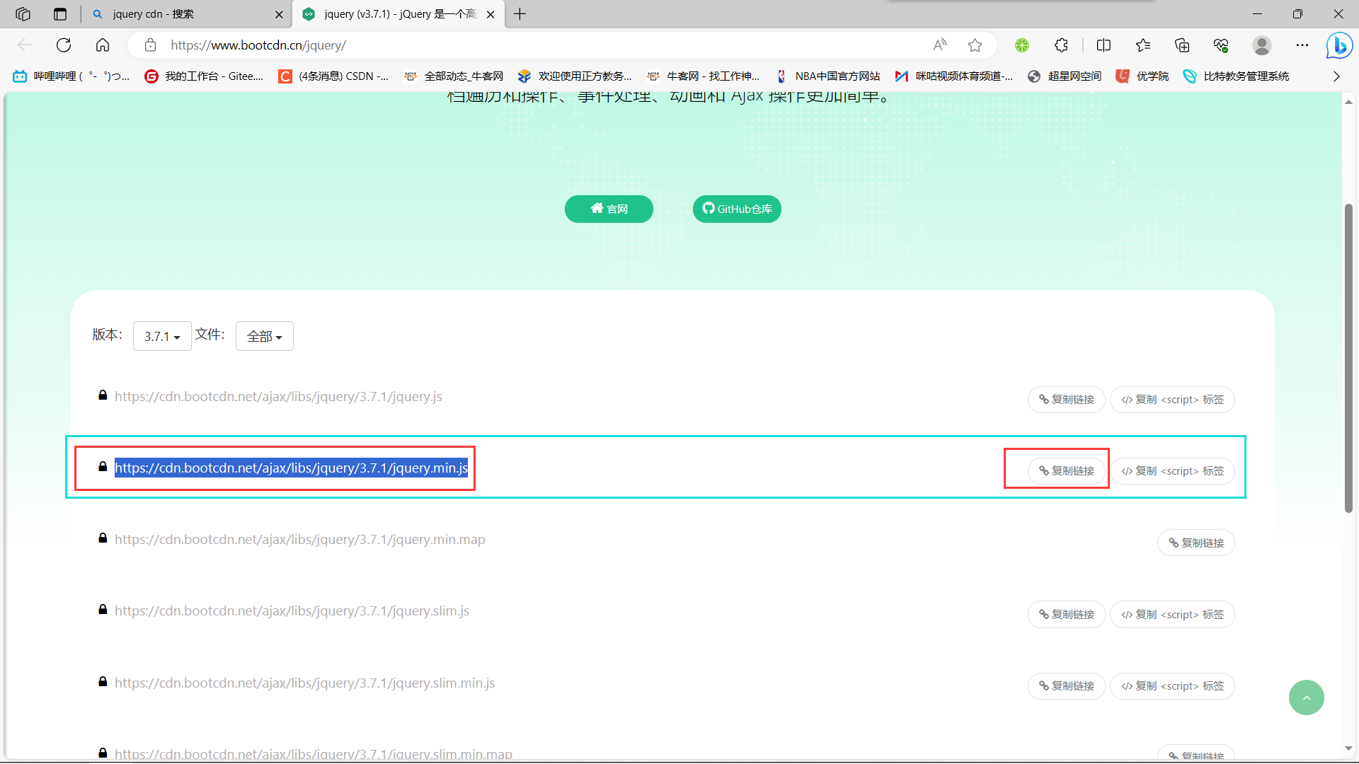
在找到官网后,继续找到后缀为 min.js 的这个链接,点击右侧的复制链接
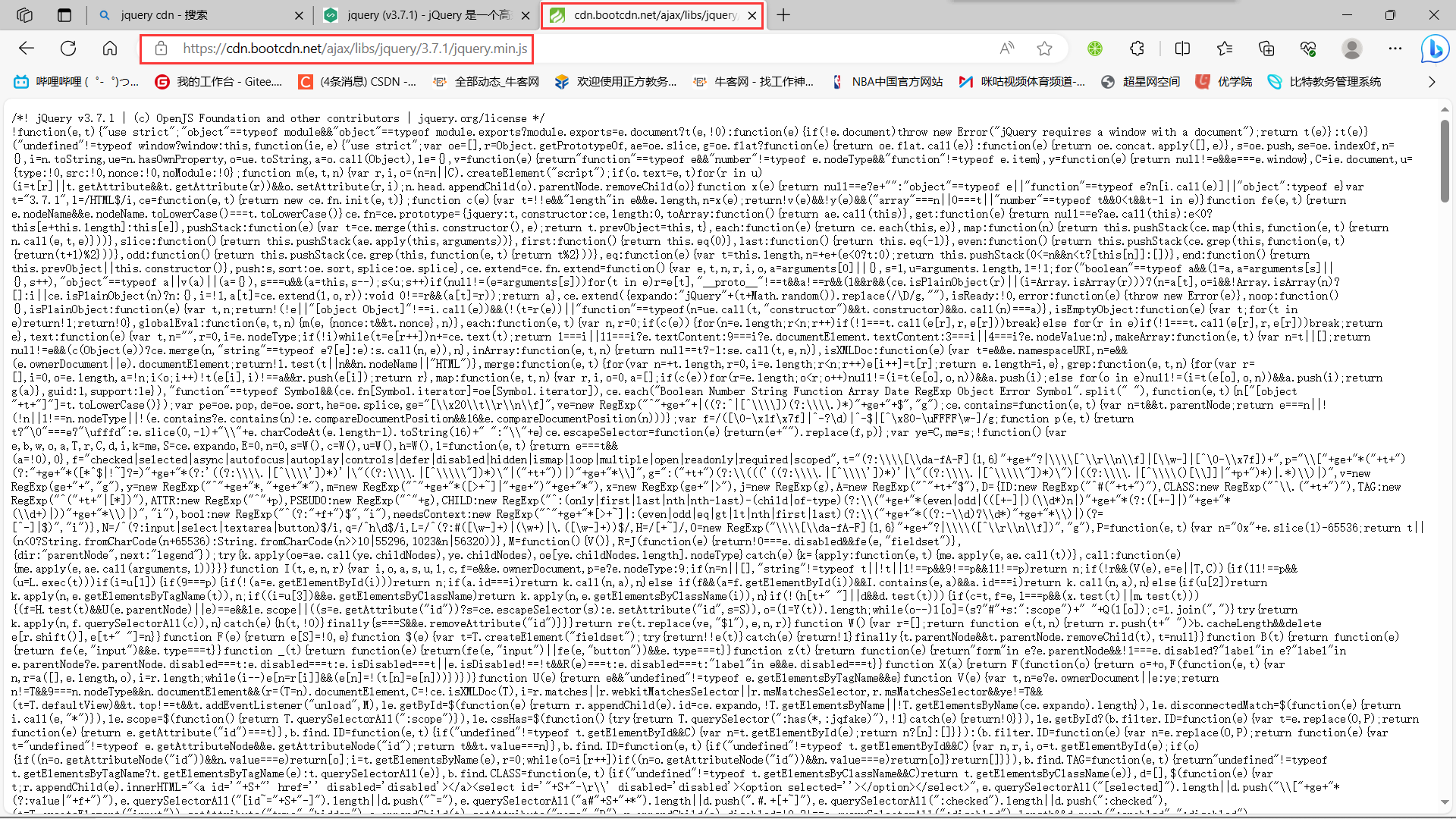
复制完连接后,我们找到一个新的标签页,并把我们之前复制的链接粘贴上去访问
此时我们有两个选择:
方法一:
全选我们的代码,复制之后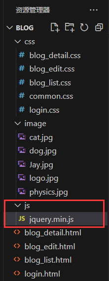 新建一个js目录,和一个
 jquery.min.js 文件。
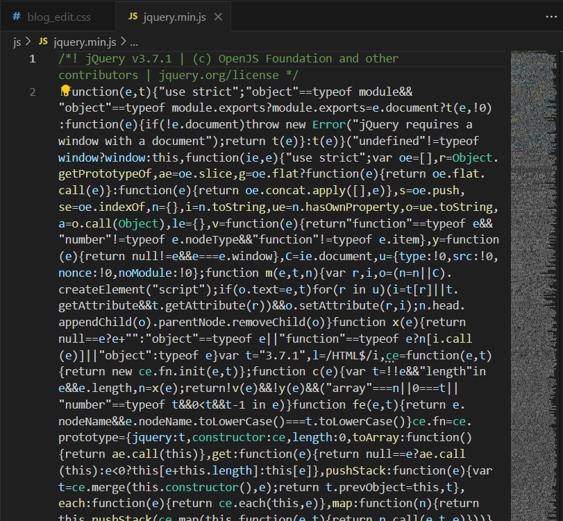
直接把刚才复制的全部代码粘贴到我们新建的 jquery.min.js 文件中即可。(这种方法粗暴野蛮,但是确实是一个简单的办法)

引入js代码。
法二:
直接引入js链接:
5.4引入 editor.md
js引入好之后,我们就可以开始引入editor.md了
editor.md 是一个开源的页面 markdown 编辑器组件.
这里的代码是需要进入github上进行下载的
如果github进不去可以下一个steam++
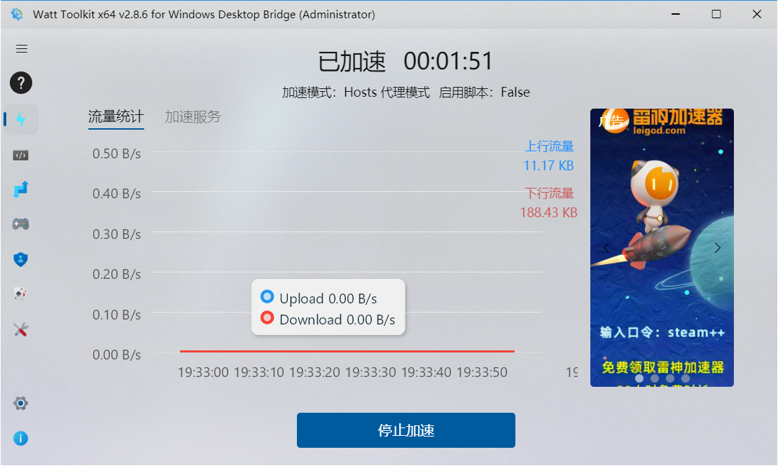
使用它加速之后,我们github就可以轻松进入了(steam++是一个免费加速的软件,他加速的原理是实时查找GitHub的VPN并进行切换,因此我们进入GitHub可以不会掉线)
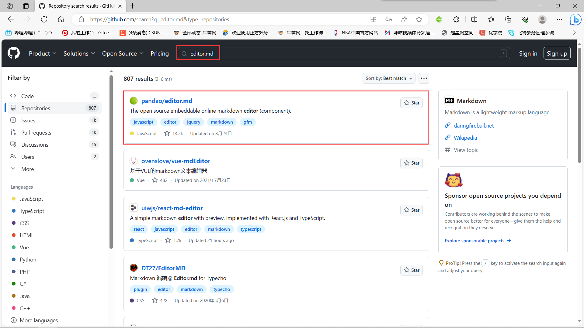
进入GitHub之后,我们搜索 editor.md ,并找到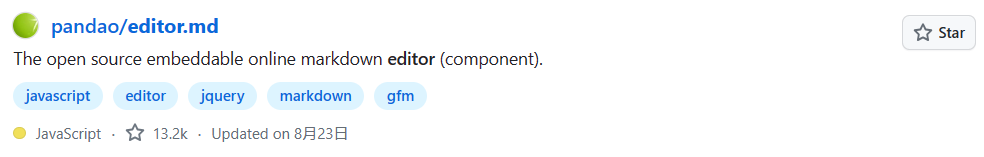
这个进行下载
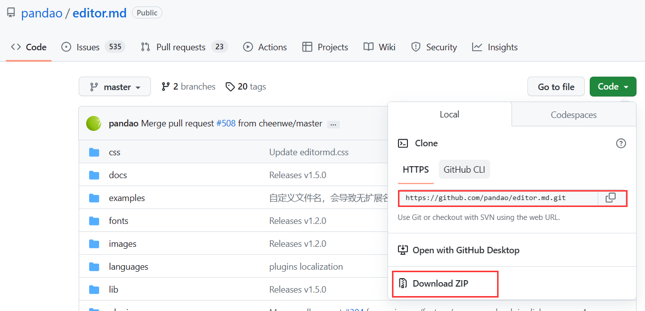
上述两种方式都可以进行代码的下载。
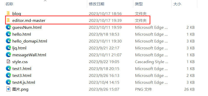
下载好后,我们选择一个我们可以找得到的位置解压存放
[官网参见](Editor.md - 开源在线 Markdown 编辑器 (pandao.github.io))
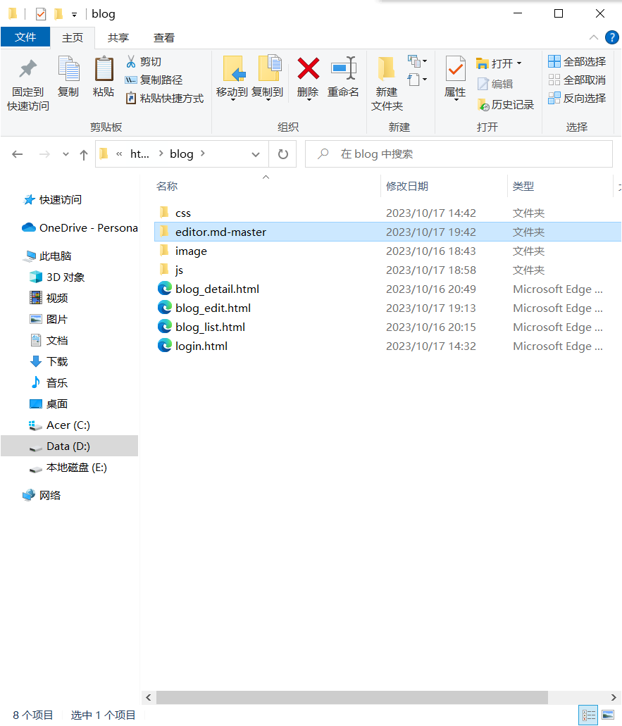
把整个目录都拷贝到我们当前的前端页面文件夹中:
用法可以参考代码中的 examples 目录中的示例. 非常丰富.
- 下载 editor.md
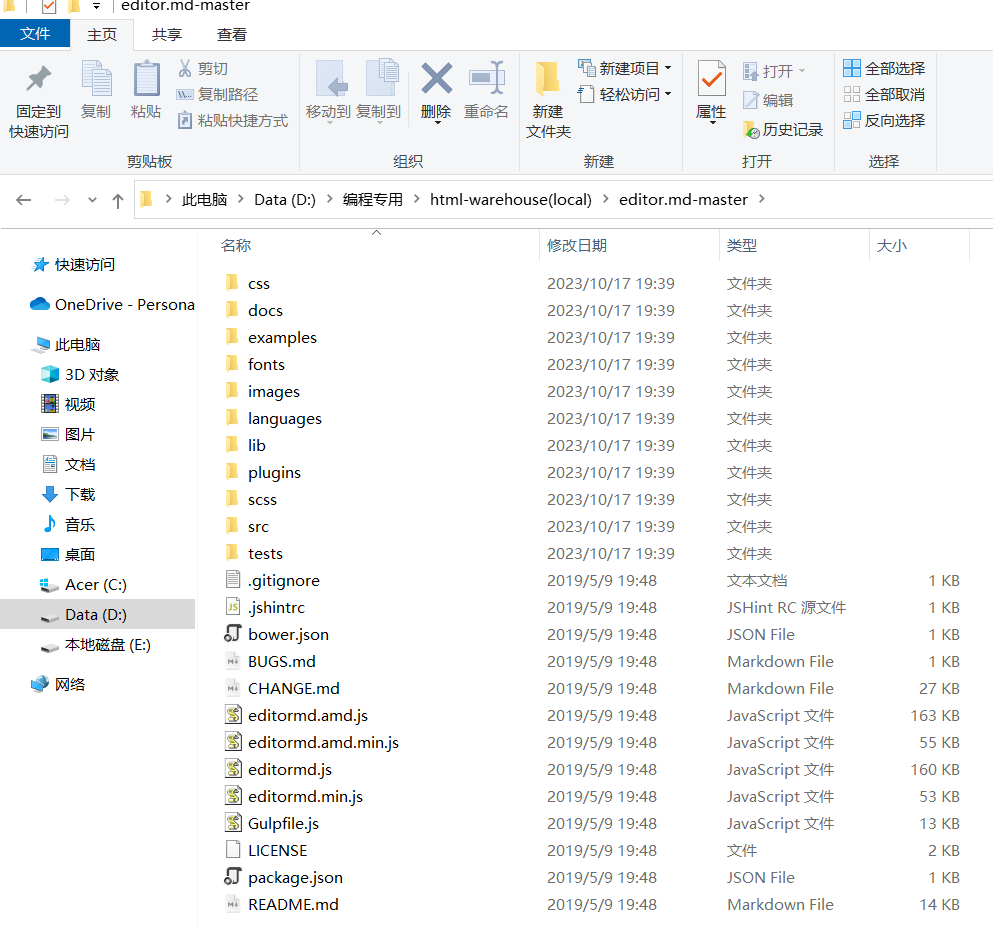
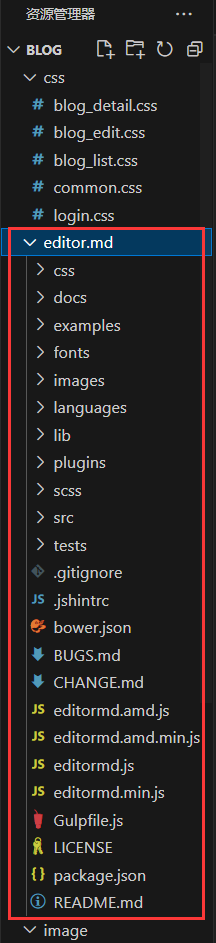
从官网上下载到压缩包. 放到目录中. 目录结构如下:
- 引入 editor.md
第一步:先保证页面里有一个 id 为 editor 的 div!!!
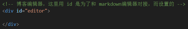
<!-- 博客编辑器,这里用 id 是为了和 markdown编辑器对接,而设置的 --><div id="editor"></div>
第二步:引入 editor.md 对应的 css 和 js,这些引入代码必须放到 jquery 引入代码的下方
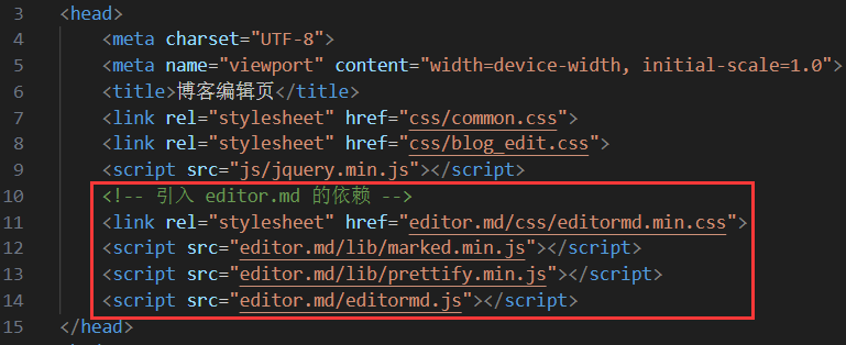
<!-- 引入 editor.md 的依赖 --><link rel="stylesheet" href="editor.md/css/editormd.min.css"><script src="editor.md/lib/marked.min.js"></script><script src="editor.md/lib/prettify.min.js"></script><script src="editor.md/editormd.js"></script>
- 初始化 editor.md
编辑 blog_edit.html (官方文档上有的,直接复制粘贴即可)
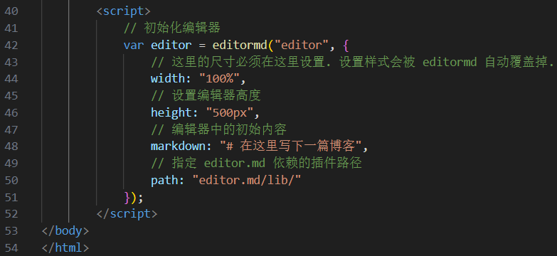
<script>
// 初始化编辑器
var editor = editormd("editor", {// 这里的尺寸必须在这里设置. 设置样式会被 editormd 自动覆盖掉. width: "100%",// 高度 100% 意思是和父元素一样高. 要在父元素的基础上去掉标题编辑区的高度height: "calc(100% - 50px)",// 编辑器中的初始内容markdown: "# 在这里写下一篇博客",// 指定 editor.md 依赖的插件路径path: "editor.md/lib/"
});
</script>
初始化代码是要创建一个 editor 对象,就对应着页面的 markdown 编辑器,通过  这个函数来构造。这个函数就是在 editormd.js 这个文件中定义的。 这个 id 就对应上面的 div#editor,此处必须写作 id 不能写为其他选择器。
5.5博客编辑页完整代码
blog_edit.html:
<!DOCTYPE html>
<html lang="en">
<head><meta charset="UTF-8"><meta name="viewport" content="width=device-width, initial-scale=1.0"><title>博客编辑页</title><link rel="stylesheet" href="css/common.css"><link rel="stylesheet" href="css/blog_edit.css"><script src="js/jquery.min.js"></script><!-- 引入 editor.md 的依赖 --><link rel="stylesheet" href="editor.md/css/editormd.min.css"><script src="editor.md/lib/marked.min.js"></script><script src="editor.md/lib/prettify.min.js"></script><script src="editor.md/editormd.js"></script>
</head>
<body><!-- 这是一个导航栏 --><div class="nav"><img src="image/logo.jpg" alt=""><span class="title">我的博客系统</span><!-- 这个标签仅仅用于占位,把这几个 a 标签挤到右边去 --><div class="spacer"></div><a href="#">主页</a><a href="#">写博客</a><a href="#">注销</a></div><!-- 编辑区的容器 --><div class="blog-edit-container"><!-- 博客标题编辑区 --><div class="title"><input type="text" id="title" placeholder="输入文章标题"><button id="submit">发布文章</button></div><!-- 博客编辑器,这里用 id 是为了和 markdown编辑器对接,而设置的 --><div id="editor"></div></div><script>// 初始化编辑器var editor = editormd("editor", {// 这里的尺寸必须在这里设置. 设置样式会被 editormd 自动覆盖掉. width: "100%",// 设置编辑器高度height: "calc(100% - 50px)",// 编辑器中的初始内容markdown: "# 在这里写下一篇博客",// 指定 editor.md 依赖的插件路径path: "editor.md/lib/"});</script>
</body>
</html>
blog_edit.css:
/* 这个文件用来写博客编辑页的样式 */.blog-edit-container {width: 1000px;height: calc(100% - 50px);margin: 0 auto;
}.blog-edit-container .title {height: 50px;display: flex;align-items: center;justify-content: space-between;
}#title {height: 40px;width: 895px;border: none;padding-left: 5px;font-size: 20px;border-radius: 5px;/* 去掉轮廓线,鼠标选中后黑圈 */outline: none;/* 设置背景半透明 */background-color: rgba(255, 255, 255, 0.7);
}#title:focus {background-color: rgb(255, 255, 255);
}#submit {height: 40px;width: 100px;border-radius: 5px;background-color: orange;border: none;
}#submit:active{background-color: #666;
}#editor {border-radius: 10px;/* 给editor设置半透明,虽然editor自身半透明了但是这里面的元素,不是透明的,导致仍然看不到背景 *//* background-color: rgba(255, 255, 255, 0.8); */opacity: 80%;
}
jquery.min.js:
此处代码字数过多就不展示了,详细请参考5.3的链接,可以在里面全选复制
js代码。
<div id="editor"></div></div><script>// 初始化编辑器var editor = editormd("editor", {// 这里的尺寸必须在这里设置. 设置样式会被 editormd 自动覆盖掉. width: "100%",// 设置编辑器高度height: "calc(100% - 50px)",// 编辑器中的初始内容markdown: "# 在这里写下一篇博客",// 指定 editor.md 依赖的插件路径path: "editor.md/lib/"});</script>
blog_edit.css:
/* 这个文件用来写博客编辑页的样式 */.blog-edit-container {width: 1000px;height: calc(100% - 50px);margin: 0 auto;
}.blog-edit-container .title {height: 50px;display: flex;align-items: center;justify-content: space-between;
}#title {height: 40px;width: 895px;border: none;padding-left: 5px;font-size: 20px;border-radius: 5px;/* 去掉轮廓线,鼠标选中后黑圈 */outline: none;/* 设置背景半透明 */background-color: rgba(255, 255, 255, 0.7);
}#title:focus {background-color: rgb(255, 255, 255);
}#submit {height: 40px;width: 100px;border-radius: 5px;background-color: orange;border: none;
}#submit:active{background-color: #666;
}#editor {border-radius: 10px;/* 给editor设置半透明,虽然editor自身半透明了但是这里面的元素,不是透明的,导致仍然看不到背景 *//* background-color: rgba(255, 255, 255, 0.8); */opacity: 80%;
}
jquery.min.js:
此处代码字数过多就不展示了,详细请参考5.3的链接,可以在里面全选复制
js代码。
感谢各位读者的阅读,本文章有任何错误都可以在评论区发表你们的意见,我会对文章进行改正的。如果本文章对你有帮助请动一动你们敏捷的小手点一点赞,你的每一次鼓励都是作者创作的动力哦!😘