那天做需求的时候,遇到一个小功能,建立在前人栽树,后人乘凉的情况下,仅用片刻就写完了;说来惭愧,我以前并未写过文本渐变的需求,脑中也仅有一个shape渐变带来的大概思路,回头来看想着学习一下这款自定义控件的内部实现,故记录于此
很多时候通过阅读原作者源码,总能为我们带来一些思考,一些成长
Tip:为表尊重,源码中的注释声明并未做任何修改,仅记录自身学习中的思考、想法
- 效果
- 需求效果
- 实现效果
- 基础思考
- 开发实践
- 项目结构
- 使用方式
- 集成学习
- ShapeTextView 自定义控件
- shape_attr 自定义属性
- Styleable 动态属性
- IShapeDrawableStyleable 背景属性抽象类
- ITextColorStyleable 文本属性抽象类
- ShapeTextViewStyleable 具体实现类
- Builder
- ShapeDrawableBuilder
- TextColorBuilder
- LinearGradientFontSpan 文本渐变核心类
效果
可以先看看效果是不是你所需要的,以免浪费开发时间… 如有需要可直接 下载Demo
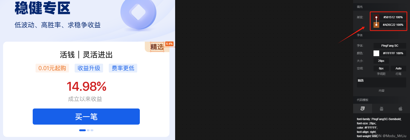
需求效果

渐变背景

渐变文本
实现效果
本文只针对item样式中的 右上角的双重渐变(渐变背景、渐变文本)实现

基础思考
如果让你实现右上角的标签,你考虑了哪些实现方式?
Tip:右上角标签仅可能有一个,只是样式、描述不同
- 单标签固定样式:产品要求不严格的话,直接让设计切图!(简单便捷)
- 多标签固定样式:产品要求不严格的话,当样式标签固定在 2-5个之间,可以让设计切图,显示逻辑处理!(简单便捷)
多标签不固定样式:例如内部可能字体可能是精选、常态、盈利等等,当这种场景被不确定占据时,只能通过代码来进行适配
关于渐变背景,因仅为一种固定渐变背景,且并非本文关键,故在此直接写出,如果你想更详细的学习和了解shape,可前往 shape保姆级手册
关于渐变位置主要有startColor、centerColor、endColor ,如根据设计图的话,可仅设置startColor、endColor
shape_staid_select_top_right(背景shape)- Demo中可能未打包
<?xml version="1.0" encoding="utf-8"?>
<shape xmlns:android="http://schemas.android.com/apk/res/android"><cornersandroid:bottomLeftRadius="5dp"android:topRightRadius="5dp" /><paddingandroid:bottom="1dp"android:left="@dimen/mp_12"android:right="@dimen/mp_12"android:top="1dp" /><gradientandroid:angle="45"android:centerColor="#F8E2C7"android:endColor="#F8E2C8"android:startColor="#F8E2C7" />
</shape>
开发实践
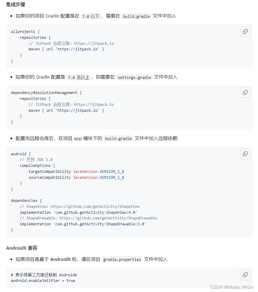
因为我们的文本渐变效果是直接从 ShapeView 剥离的产物,所以如果不介意引入三方库的话,最简单的方式肯定是直接依赖了,只不过会导致项目体积更大一些,毕竟有些东西我们用不到
关于 ShapeView 的集成,可自行前往作者项目主页查看,此处仅做部分摘要
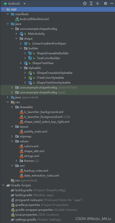
项目结构
此处项目结构为我Demo的结构目录,主要通过减少三方库的引入,从而减少项目体积、包体积
使用方式
ShapeTextView 就是我们这次学习的控件,现在开始一步步倒推看一下
<?xml version="1.0" encoding="utf-8"?>
<RelativeLayout xmlns:android="http://schemas.android.com/apk/res/android"xmlns:app="http://schemas.android.com/apk/res-auto"xmlns:tools="http://schemas.android.com/tools"android:layout_width="match_parent"android:layout_height="match_parent"android:gravity="center_horizontal"tools:context=".MainActivity"><com.example.shapefontbg.shape.ShapeTextViewandroid:id="@+id/tv_shape"android:layout_width="wrap_content"android:layout_height="wrap_content"android:layout_marginTop="30dp"android:background="@drawable/shape_staid_select_top_right"android:text="我爱洗澡,皮肤好好~"android:textSize="14sp"app:shape_textEndColor="#501512"app:shape_textStartColor="#AD5C22"app:typefaceScale="medium" /></RelativeLayout>
集成学习
ShapeTextView 自定义控件
我感觉自定义控件内主要有以下几点,需要总结、注意
- 初始化背景属性、文本属性(内部)
- 通过读取
typefaceScale属性,设置对应字体加粗效果(内部) - 增添动态设置
Text、setTextColor、TypefaceScale方法(支持外部调用)
package com.example.shapefontbg.shapeimport android.content.Context
import android.graphics.Canvas
import android.graphics.Paint
import android.util.AttributeSet
import androidx.appcompat.widget.AppCompatTextView
import com.example.shapefontbg.R
import com.example.shapefontbg.shape.builder.ShapeDrawableBuilder
import com.example.shapefontbg.shape.builder.TextColorBuilder
import com.example.shapefontbg.shape.styleable.ShapeTextViewStyleable/*** author : Android 轮子哥* github : https://github.com/getActivity/ShapeView* time   : 2021/07/17* desc   : 支持直接定义 Shape 背景的 TextView*/
class ShapeTextView @JvmOverloads constructor(context: Context, attrs: AttributeSet? = null, defStyleAttr: Int = 0) :AppCompatTextView(context, attrs, defStyleAttr) {private val shapeDrawableBuilder: ShapeDrawableBuilderprivate val textColorBuilder: TextColorBuilder?private var typefaceScale: Floatcompanion object {private val STYLEABLE = ShapeTextViewStyleable()}enum class TypefaceScale {MEDIUM, MEDIUM_SMALL, DEFAULT,}init {val typedArray = context.obtainStyledAttributes(attrs, R.styleable.ShapeTextView)//初始化背景属性shapeDrawableBuilder = ShapeDrawableBuilder(this, typedArray, STYLEABLE)//初始化文本属性textColorBuilder = TextColorBuilder(this, typedArray, STYLEABLE)// 读取字体加粗程度val scale = typedArray.getInt(R.styleable.ShapeTextView_typefaceScale, 0)typefaceScale = typedArrayTypefaceScale(scale)// 资源回收typedArray.recycle()// 设置相关背景属性shapeDrawableBuilder.intoBackground()// 设置相关文本属性
//        原始部分
//        if (textColorBuilder.isTextGradientColors) {
//            text = textColorBuilder.buildLinearGradientSpannable(text)
//        } else {
//            textColorBuilder.intoTextColor()
//        }textColorBuilder.intoTextColor()}/*** 字体粗度* */private fun typedArrayTypefaceScale(scale: Int): Float = when (scale) {1 -> 0.6f2 -> 1.1felse -> 0.0f}override fun setTextColor(color: Int) {super.setTextColor(color)textColorBuilder?.textColor = colortextColorBuilder?.clearTextGradientColors()}/*** 渐变入口* */override fun setText(text: CharSequence, type: BufferType) {if (textColorBuilder?.isTextGradientColors == true) {super.setText(textColorBuilder.buildLinearGradientSpannable(text), type)} else {super.setText(text, type)}}override fun onDraw(canvas: Canvas?) {if (typefaceScale == 0f) {return super.onDraw(canvas)}val strokeWidth = paint.strokeWidthval style = paint.stylepaint.strokeWidth = typefaceScalepaint.style = Paint.Style.FILL_AND_STROKEsuper.onDraw(canvas)paint.strokeWidth = strokeWidthpaint.style = style}fun setTypefaceScale(scale: TypefaceScale = TypefaceScale.DEFAULT) {typefaceScale = when (scale) {TypefaceScale.DEFAULT -> 0.0fTypefaceScale.MEDIUM_SMALL -> 0.6fTypefaceScale.MEDIUM -> 1.1f}invalidate()}}
修改部分
原始
if (textColorBuilder.isTextGradientColors) {text = textColorBuilder.buildLinearGradientSpannable(text)} else {textColorBuilder.intoTextColor()}
改为(可能多走了一层内层判断,性能应该没有太大影响)
textColorBuilder.intoTextColor()
原因:内部、外部判断逻辑重复,去除外部判断即可
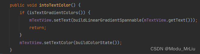
内部实现为文本渐变核心类,后续会单独说明

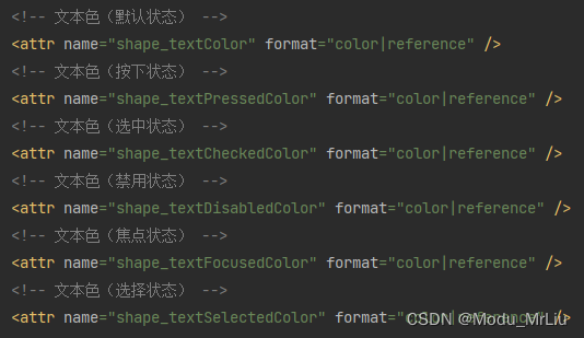
shape_attr 自定义属性
<?xml version="1.0" encoding="utf-8"?>
<resources><!-- Shape 形状(默认是矩形) --><attr name="shape"><!-- 矩形 --><enum name="rectangle" value="0" /><!-- 椭圆形 --><enum name="oval" value="1" /><!-- 线条 --><enum name="line" value="2" /><!-- 圆环 --><enum name="ring" value="3" /></attr><!-- Shape 宽度 --><attr name="shape_width" format="dimension" /><!-- Shape 高度 --><attr name="shape_height" format="dimension" /><!-- 填充色(默认状态) --><attr name="shape_solidColor" format="color|reference" /><!-- 填充色(按下状态) --><attr name="shape_solidPressedColor" format="color|reference" /><!-- 填充色(选中状态) --><attr name="shape_solidCheckedColor" format="color|reference" /><!-- 填充色(禁用状态) --><attr name="shape_solidDisabledColor" format="color|reference" /><!-- 填充色(焦点状态) --><attr name="shape_solidFocusedColor" format="color|reference" /><!-- 填充色(选择状态) --><attr name="shape_solidSelectedColor" format="color|reference" /><!-- 圆角大小 --><attr name="shape_radius" format="dimension" /><!-- 左上角的圆角大小 --><attr name="shape_topLeftRadius" format="dimension" /><!-- 右上角的圆角大小 --><attr name="shape_topRightRadius" format="dimension" /><!-- 左下角的圆角大小 --><attr name="shape_bottomLeftRadius" format="dimension" /><!-- 右下角的圆角大小 --><attr name="shape_bottomRightRadius" format="dimension" /><!-- 渐变色起始颜色 --><attr name="shape_startColor" format="color" /><!-- 渐变色中间颜色(可不设置) --><attr name="shape_centerColor" format="color" /><!-- 渐变色结束颜色 --><attr name="shape_endColor" format="color" /><!-- 是否将用于缩放渐变 --><attr name="shape_useLevel" format="boolean" /><!-- 渐变角度(仅用于线性渐变。必须是 0-315 范围内的值,并且是 45 的倍数) --><attr name="shape_angle" format="float" /><!-- 渐变类型(默认类型是线性渐变) --><attr name="shape_gradientType"><!-- 线性渐变 --><enum name="linear" value="0" /><!-- 径向渐变 --><enum name="radial" value="1" /><!-- 扫描渐变 --><enum name="sweep" value="2" /></attr><!-- 渐变中心 X 点坐标的相对位置(默认值为 0.5)--><attr name="shape_centerX" format="float|fraction" /><!-- 渐变中心 Y 点坐标的相对位置(默认值为 0.5)--><attr name="shape_centerY" format="float|fraction" /><!-- 渐变色半径(仅用于径向渐变) --><attr name="shape_gradientRadius" format="float|fraction|dimension" /><!-- 边框色(默认状态) --><attr name="shape_strokeColor" format="color|reference" /><!-- 边框色(按下状态) --><attr name="shape_strokePressedColor" format="color|reference" /><!-- 边框色(选中状态) --><attr name="shape_strokeCheckedColor" format="color|reference" /><!-- 边框色(禁用状态) --><attr name="shape_strokeDisabledColor" format="color|reference" /><!-- 边框色(焦点状态) --><attr name="shape_strokeFocusedColor" format="color|reference" /><!-- 边框色(选择状态) --><attr name="shape_strokeSelectedColor" format="color|reference" /><!-- 边框宽度 --><attr name="shape_strokeWidth" format="dimension" /><!-- 边框虚线宽度(为 0 就是实线,大于 0 就是虚线) --><attr name="shape_dashWidth" format="dimension" /><!-- 边框虚线间隔(虚线与虚线之间的间隔) --><attr name="shape_dashGap" format="dimension" /><!-- 文本色(默认状态) --><attr name="shape_textColor" format="color|reference" /><!-- 文本色(按下状态) --><attr name="shape_textPressedColor" format="color|reference" /><!-- 文本色(选中状态) --><attr name="shape_textCheckedColor" format="color|reference" /><!-- 文本色(禁用状态) --><attr name="shape_textDisabledColor" format="color|reference" /><!-- 文本色(焦点状态) --><attr name="shape_textFocusedColor" format="color|reference" /><!-- 文本色(选择状态) --><attr name="shape_textSelectedColor" format="color|reference" /><!-- 文本渐变色起始颜色 --><attr name="shape_textStartColor" format="color" /><!-- 文本渐变色中间颜色(可不设置) --><attr name="shape_textCenterColor" format="color" /><!-- 文本渐变色结束颜色 --><attr name="shape_textEndColor" format="color" /><!-- 文本渐变方向(默认类型是水平渐变) --><attr name="shape_textGradientOrientation"><!-- 水平渐变 --><enum name="horizontal" value="0" /><!-- 垂直渐变 --><enum name="vertical" value="1" /></attr><!-- CheckBox 或者 RadioButton 图标(默认状态) --><attr name="shape_buttonDrawable" format="reference" /><!-- CheckBox 或者 RadioButton 图标(按下状态) --><attr name="shape_buttonPressedDrawable" format="reference" /><!-- CheckBox 或者 RadioButton 图标(选中状态) --><attr name="shape_buttonCheckedDrawable" format="reference" /><!-- CheckBox 或者 RadioButton 图标(禁用状态) --><attr name="shape_buttonDisabledDrawable" format="reference" /><!-- CheckBox 或者 RadioButton 图标(焦点状态) --><attr name="shape_buttonFocusedDrawable" format="reference" /><!-- CheckBox 或者 RadioButton 图标(选择状态) --><attr name="shape_buttonSelectedDrawable" format="reference" /><attr name="typefaceScale"><enum name="normal" value="0" /><enum name="medium_small" value="1" /><enum name="medium" value="2" /></attr><declare-styleable name="ShapeTextView"><attr name="shape" /><attr name="shape_width" /><attr name="shape_height" /><attr name="shape_solidColor" /><attr name="shape_solidPressedColor" /><attr name="shape_solidDisabledColor" /><attr name="shape_solidFocusedColor" /><attr name="shape_solidSelectedColor" /><attr name="shape_radius" /><attr name="shape_topLeftRadius" /><attr name="shape_topRightRadius" /><attr name="shape_bottomLeftRadius" /><attr name="shape_bottomRightRadius" /><attr name="shape_startColor" /><attr name="shape_centerColor" /><attr name="shape_endColor" /><attr name="shape_useLevel" /><attr name="shape_angle" /><attr name="shape_gradientType" /><attr name="shape_centerX" /><attr name="shape_centerY" /><attr name="shape_gradientRadius" /><attr name="shape_strokeColor" /><attr name="shape_strokePressedColor" /><attr name="shape_strokeDisabledColor" /><attr name="shape_strokeFocusedColor" /><attr name="shape_strokeSelectedColor" /><attr name="shape_strokeWidth" /><attr name="shape_dashWidth" /><attr name="shape_dashGap" /><attr name="shape_textColor" /><attr name="shape_textPressedColor" /><attr name="shape_textDisabledColor" /><attr name="shape_textFocusedColor" /><attr name="shape_textSelectedColor" /><attr name="shape_textStartColor" /><attr name="shape_textCenterColor" /><attr name="shape_textEndColor" /><attr name="shape_textGradientOrientation" /><attr name="typefaceScale" /></declare-styleable>
</resources>
Styleable 动态属性
分别针对
ShapeView背景和TextView自身通用型自定义属性
我觉得因为原始项目中具体实现Styleable类有很多个,如果后续有扩展的话,也可以再用工厂模式或策略模式二次封装;

IShapeDrawableStyleable 背景属性抽象类
package com.example.shapefontbg.shape.styleable/*** author : Android 轮子哥* github : https://github.com/getActivity/ShapeView* time   : 2021/08/28* desc   : ShapeDrawable View 属性收集接口*/
interface IShapeDrawableStyleable {val shapeTypeStyleable: Intval shapeWidthStyleable: Intval shapeHeightStyleable: Intval solidColorStyleable: Intval solidPressedColorStyleable: Intval solidCheckedColorStyleable: Intget() = 0val solidDisabledColorStyleable: Intval solidFocusedColorStyleable: Intval solidSelectedColorStyleable: Intval radiusStyleable: Intval topLeftRadiusStyleable: Intval topRightRadiusStyleable: Intval bottomLeftRadiusStyleable: Intval bottomRightRadiusStyleable: Intval startColorStyleable: Intval centerColorStyleable: Intval endColorStyleable: Intval useLevelStyleable: Intval angleStyleable: Intval gradientTypeStyleable: Intval centerXStyleable: Intval centerYStyleable: Intval gradientRadiusStyleable: Intval strokeColorStyleable: Intval strokePressedColorStyleable: Intval strokeCheckedColorStyleable: Intget() = 0val strokeDisabledColorStyleable: Intval strokeFocusedColorStyleable: Intval strokeSelectedColorStyleable: Intval strokeWidthStyleable: Intval dashWidthStyleable: Intval dashGapStyleable: Int
}
ITextColorStyleable 文本属性抽象类
package com.example.shapefontbg.shape.styleable/*** author : Android 轮子哥* github : https://github.com/getActivity/ShapeView* time   : 2021/08/28* desc   : 文本颜色 View 属性收集接口*/
interface ITextColorStyleable {val textColorStyleable: Intval textPressedColorStyleable: Intval textCheckedColorStyleable: Intget() = 0val textDisabledColorStyleable: Intval textFocusedColorStyleable: Intval textSelectedColorStyleable: Intval textStartColorStyleable: Intval textCenterColorStyleable: Intval textEndColorStyleable: Intval textGradientOrientationStyleable: Int
}
ShapeTextViewStyleable 具体实现类
我感觉主要有俩点作用:
- 声明对应抽象类的自定义属性,可用于固定属性、动态设置属性
- 将动态属性和静态自定义属性做了一个基础映射
package com.example.shapefontbg.shape.styleableimport com.example.shapefontbg.R/*** author : Android 轮子哥* github : https://github.com/getActivity/ShapeView* time   : 2021/08/28* desc   : TextView 的 Shape 属性值*/
class ShapeTextViewStyleable : IShapeDrawableStyleable, ITextColorStyleable {/*** [IShapeDrawableStyleable]*/override val shapeTypeStyleable = R.styleable.ShapeTextView_shapeoverride val shapeWidthStyleable = R.styleable.ShapeTextView_shape_widthoverride val shapeHeightStyleable = R.styleable.ShapeTextView_shape_heightoverride val solidColorStyleable = R.styleable.ShapeTextView_shape_solidColoroverride val solidPressedColorStyleable = R.styleable.ShapeTextView_shape_solidPressedColoroverride val solidDisabledColorStyleable = R.styleable.ShapeTextView_shape_solidDisabledColoroverride val solidFocusedColorStyleable = R.styleable.ShapeTextView_shape_solidFocusedColoroverride val solidSelectedColorStyleable = R.styleable.ShapeTextView_shape_solidSelectedColoroverride val radiusStyleable = R.styleable.ShapeTextView_shape_radiusoverride val topLeftRadiusStyleable = R.styleable.ShapeTextView_shape_topLeftRadiusoverride val topRightRadiusStyleable = R.styleable.ShapeTextView_shape_topRightRadiusoverride val bottomLeftRadiusStyleable = R.styleable.ShapeTextView_shape_bottomLeftRadiusoverride val bottomRightRadiusStyleable = R.styleable.ShapeTextView_shape_bottomRightRadiusoverride val startColorStyleable = R.styleable.ShapeTextView_shape_startColoroverride val centerColorStyleable = R.styleable.ShapeTextView_shape_centerColoroverride val endColorStyleable = R.styleable.ShapeTextView_shape_endColoroverride val useLevelStyleable = R.styleable.ShapeTextView_shape_useLeveloverride val angleStyleable = R.styleable.ShapeTextView_shape_angleoverride val gradientTypeStyleable = R.styleable.ShapeTextView_shape_gradientTypeoverride val centerXStyleable = R.styleable.ShapeTextView_shape_centerXoverride val centerYStyleable = R.styleable.ShapeTextView_shape_centerYoverride val gradientRadiusStyleable = R.styleable.ShapeTextView_shape_gradientRadiusoverride val strokeColorStyleable = R.styleable.ShapeTextView_shape_strokeColoroverride val strokePressedColorStyleable = R.styleable.ShapeTextView_shape_strokePressedColoroverride val strokeDisabledColorStyleable = R.styleable.ShapeTextView_shape_strokeDisabledColoroverride val strokeFocusedColorStyleable = R.styleable.ShapeTextView_shape_strokeFocusedColoroverride val strokeSelectedColorStyleable = R.styleable.ShapeTextView_shape_strokeSelectedColoroverride val strokeWidthStyleable = R.styleable.ShapeTextView_shape_strokeWidthoverride val dashWidthStyleable = R.styleable.ShapeTextView_shape_dashWidthoverride val dashGapStyleable = R.styleable.ShapeTextView_shape_dashGap/*** [ITextColorStyleable]*/override val textColorStyleable = R.styleable.ShapeTextView_shape_textColoroverride val textPressedColorStyleable = R.styleable.ShapeTextView_shape_textPressedColoroverride val textDisabledColorStyleable = R.styleable.ShapeTextView_shape_textDisabledColoroverride val textFocusedColorStyleable = R.styleable.ShapeTextView_shape_textFocusedColoroverride val textSelectedColorStyleable = R.styleable.ShapeTextView_shape_textSelectedColoroverride val textStartColorStyleable = R.styleable.ShapeTextView_shape_textStartColoroverride val textCenterColorStyleable = R.styleable.ShapeTextView_shape_textCenterColoroverride val textEndColorStyleable = R.styleable.ShapeTextView_shape_textEndColoroverride val textGradientOrientationStyleable = R.styleable.ShapeTextView_shape_textGradientOrientation
}
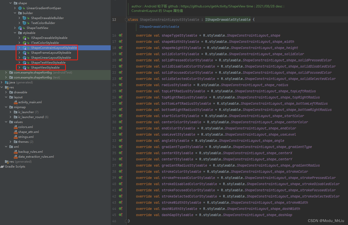
扩展:因为原作者的Shape使用场景、范围较广,所以有挺多Layout-Styleable,内部实现也均有所不同,因为该篇主要记录渐变文本,所以我们仅需关注ShapeTextViewStyleable即可
Builder
关于 ShapeDrawableBuilder 和 TextColorBuilder 的封装剥离,个人认为这样的封装方式主要有以下考虑
- 单一职责,解耦(分别作用于背景和TextView自身)
- 支持自定义属性设置方式(含静态设置、动态设置)
- 建造者模式,便于链式动态设置自定义属性
- 封装一些通用型方法
ShapeDrawableBuilder
主要作用于Shape背景相关属性设置
package com.example.shapefontbg.shape.builder;import android.content.res.TypedArray;
import android.graphics.Color;
import android.graphics.drawable.Drawable;
import android.graphics.drawable.GradientDrawable;
import android.graphics.drawable.StateListDrawable;
import android.view.View;import androidx.annotation.Nullable;import com.example.shapefontbg.shape.styleable.IShapeDrawableStyleable;/*** author : Android 轮子哥* github : https://github.com/getActivity/ShapeView* time   : 2021/08/28* desc   : ShapeDrawable 构建类*/
@SuppressWarnings("unused")
public final class ShapeDrawableBuilder {private static final int NO_COLOR = Color.TRANSPARENT;private final View mView;private int mShape;private int mShapeWidth;private int mShapeHeight;private int mSolidColor;private Integer mSolidPressedColor;private Integer mSolidCheckedColor;private Integer mSolidDisabledColor;private Integer mSolidFocusedColor;private Integer mSolidSelectedColor;private float mTopLeftRadius;private float mTopRightRadius;private float mBottomLeftRadius;private float mBottomRightRadius;private int[] mGradientColors;private boolean mUseLevel;private int mAngle;private int mGradientType;private float mCenterX;private float mCenterY;private int mGradientRadius;private int mStrokeColor;private Integer mStrokePressedColor;private Integer mStrokeCheckedColor;private Integer mStrokeDisabledColor;private Integer mStrokeFocusedColor;private Integer mStrokeSelectedColor;private int mStrokeWidth;private int mDashWidth;private int mDashGap;public ShapeDrawableBuilder(View view, TypedArray typedArray, IShapeDrawableStyleable styleable) {mView = view;mShape = typedArray.getInt(styleable.getShapeTypeStyleable(), 0);mShapeWidth = typedArray.getDimensionPixelSize(styleable.getShapeWidthStyleable(), -1);mShapeHeight = typedArray.getDimensionPixelSize(styleable.getShapeHeightStyleable(), -1);mSolidColor = typedArray.getColor(styleable.getSolidColorStyleable(), NO_COLOR);if (typedArray.hasValue(styleable.getSolidPressedColorStyleable())) {mSolidPressedColor = typedArray.getColor(styleable.getSolidPressedColorStyleable(), NO_COLOR);}if (styleable.getSolidCheckedColorStyleable() > 0 && typedArray.hasValue(styleable.getSolidCheckedColorStyleable())) {mSolidCheckedColor = typedArray.getColor(styleable.getSolidCheckedColorStyleable(), NO_COLOR);}if (typedArray.hasValue(styleable.getSolidDisabledColorStyleable())) {mSolidDisabledColor = typedArray.getColor(styleable.getSolidDisabledColorStyleable(), NO_COLOR);}if (typedArray.hasValue(styleable.getSolidFocusedColorStyleable())) {mSolidFocusedColor = typedArray.getColor(styleable.getSolidFocusedColorStyleable(), NO_COLOR);}if (typedArray.hasValue(styleable.getSolidSelectedColorStyleable())) {mSolidSelectedColor = typedArray.getColor(styleable.getSolidSelectedColorStyleable(), NO_COLOR);}int radius = typedArray.getDimensionPixelSize(styleable.getRadiusStyleable(), 0);mTopLeftRadius = typedArray.getDimensionPixelSize(styleable.getTopLeftRadiusStyleable(), radius);mTopRightRadius = typedArray.getDimensionPixelSize(styleable.getTopRightRadiusStyleable(), radius);mBottomLeftRadius = typedArray.getDimensionPixelSize(styleable.getBottomLeftRadiusStyleable(), radius);mBottomRightRadius = typedArray.getDimensionPixelSize(styleable.getBottomRightRadiusStyleable(), radius);if (typedArray.hasValue(styleable.getStartColorStyleable()) && typedArray.hasValue(styleable.getEndColorStyleable())) {if (typedArray.hasValue(styleable.getCenterColorStyleable())) {mGradientColors = new int[]{typedArray.getColor(styleable.getStartColorStyleable(), NO_COLOR),typedArray.getColor(styleable.getCenterColorStyleable(), NO_COLOR),typedArray.getColor(styleable.getEndColorStyleable(), NO_COLOR)};} else {mGradientColors = new int[]{typedArray.getColor(styleable.getStartColorStyleable(), NO_COLOR),typedArray.getColor(styleable.getEndColorStyleable(), NO_COLOR)};}}mUseLevel = typedArray.getBoolean(styleable.getUseLevelStyleable(), false);mAngle = (int) typedArray.getFloat(styleable.getAngleStyleable(), 0);mGradientType = typedArray.getInt(styleable.getGradientTypeStyleable(), GradientDrawable.LINEAR_GRADIENT);mCenterX = typedArray.getFloat(styleable.getCenterXStyleable(), 0.5f);mCenterY = typedArray.getFloat(styleable.getCenterYStyleable(), 0.5f);mGradientRadius = typedArray.getDimensionPixelSize(styleable.getGradientRadiusStyleable(), radius);mStrokeColor = typedArray.getColor(styleable.getStrokeColorStyleable(), NO_COLOR);if (typedArray.hasValue(styleable.getStrokePressedColorStyleable())) {mStrokePressedColor = typedArray.getColor(styleable.getStrokePressedColorStyleable(), NO_COLOR);}if (styleable.getStrokeCheckedColorStyleable() > 0 && typedArray.hasValue(styleable.getStrokeCheckedColorStyleable())) {mStrokeCheckedColor = typedArray.getColor(styleable.getStrokeCheckedColorStyleable(), NO_COLOR);}if (typedArray.hasValue(styleable.getStrokeDisabledColorStyleable())) {mStrokeDisabledColor = typedArray.getColor(styleable.getStrokeDisabledColorStyleable(), NO_COLOR);}if (typedArray.hasValue(styleable.getStrokeFocusedColorStyleable())) {mStrokeFocusedColor = typedArray.getColor(styleable.getStrokeFocusedColorStyleable(), NO_COLOR);}if (typedArray.hasValue(styleable.getStrokeSelectedColorStyleable())) {mStrokeSelectedColor = typedArray.getColor(styleable.getStrokeSelectedColorStyleable(), NO_COLOR);}mStrokeWidth = typedArray.getDimensionPixelSize(styleable.getStrokeWidthStyleable(), 0);mDashWidth = typedArray.getDimensionPixelSize(styleable.getDashWidthStyleable(), 0);mDashGap = typedArray.getDimensionPixelSize(styleable.getDashGapStyleable(), 0);}public ShapeDrawableBuilder setShape(int shape) {mShape = shape;return this;}public int getShape() {return mShape;}public ShapeDrawableBuilder setShapeWidth(int width) {mShapeWidth = width;return this;}public int getShapeWidth() {return mShapeWidth;}public ShapeDrawableBuilder setShapeHeight(int height) {mShapeHeight = height;return this;}public int getShapeHeight() {return mShapeHeight;}public ShapeDrawableBuilder setSolidColor(int color) {mSolidColor = color;clearGradientColors();return this;}public int getSolidColor() {return mSolidColor;}public ShapeDrawableBuilder setSolidPressedColor(Integer color) {mSolidPressedColor = color;return this;}@Nullablepublic Integer getSolidPressedColor() {return mSolidPressedColor;}public ShapeDrawableBuilder setSolidCheckedColor(Integer color) {mSolidCheckedColor = color;return this;}@Nullablepublic Integer getSolidCheckedColor() {return mSolidCheckedColor;}public ShapeDrawableBuilder setSolidDisabledColor(Integer color) {mSolidDisabledColor = color;return this;}@Nullablepublic Integer getSolidDisabledColor() {return mSolidDisabledColor;}public ShapeDrawableBuilder setSolidFocusedColor(Integer color) {mSolidFocusedColor = color;return this;}@Nullablepublic Integer getSolidFocusedColor() {return mSolidFocusedColor;}public ShapeDrawableBuilder setSolidSelectedColor(Integer color) {mSolidSelectedColor = color;return this;}@Nullablepublic Integer getSolidSelectedColor() {return mSolidSelectedColor;}public ShapeDrawableBuilder setRadius(float radius) {return setRadius(radius, radius, radius, radius);}public ShapeDrawableBuilder setRadius(float topLeftRadius, float topRightRadius, float bottomLeftRadius, float bottomRightRadius) {mTopLeftRadius = topLeftRadius;mTopRightRadius = topRightRadius;mBottomLeftRadius = bottomLeftRadius;mBottomRightRadius = bottomRightRadius;return this;}public float getTopLeftRadius() {return mTopLeftRadius;}public float getTopRightRadius() {return mTopRightRadius;}public float getBottomLeftRadius() {return mBottomLeftRadius;}public float getBottomRightRadius() {return mBottomRightRadius;}public ShapeDrawableBuilder setGradientColors(int startColor, int endColor) {return setGradientColors(new int[]{startColor, endColor});}public ShapeDrawableBuilder setGradientColors(int startColor, int centerColor, int endColor) {return setGradientColors(new int[]{startColor, centerColor, endColor});}public ShapeDrawableBuilder setGradientColors(int[] colors) {mGradientColors = colors;return this;}@Nullablepublic int[] getGradientColors() {return mGradientColors;}public boolean isGradientColors() {return mGradientColors != null &&mGradientColors.length > 0;}public void clearGradientColors() {mGradientColors = null;}public ShapeDrawableBuilder setUseLevel(boolean useLevel) {mUseLevel = useLevel;return this;}public boolean isUseLevel() {return mUseLevel;}public ShapeDrawableBuilder setAngle(int angle) {mAngle = angle;return this;}public int getAngle() {return mAngle;}public ShapeDrawableBuilder setGradientType(int type) {mGradientType = type;return this;}public int getGradientType() {return mGradientType;}public ShapeDrawableBuilder setCenterX(float x) {mCenterX = x;return this;}public float getCenterX() {return mCenterX;}public ShapeDrawableBuilder setCenterY(float y) {mCenterY = y;return this;}public float getCenterY() {return mCenterY;}public ShapeDrawableBuilder setGradientRadius(int radius) {mGradientRadius = radius;return this;}public int getGradientRadius() {return mGradientRadius;}public ShapeDrawableBuilder setStrokeColor(int color) {mStrokeColor = color;return this;}public int getStrokeColor() {return mStrokeColor;}public ShapeDrawableBuilder setStrokePressedColor(Integer color) {mStrokePressedColor = color;return this;}@Nullablepublic Integer getStrokePressedColor() {return mStrokePressedColor;}public ShapeDrawableBuilder setStrokeCheckedColor(Integer color) {mStrokeCheckedColor = color;return this;}@Nullablepublic Integer getStrokeCheckedColor() {return mStrokeCheckedColor;}public ShapeDrawableBuilder setStrokeDisabledColor(Integer color) {mStrokeDisabledColor = color;return this;}@Nullablepublic Integer getStrokeDisabledColor() {return mStrokeDisabledColor;}public ShapeDrawableBuilder setStrokeFocusedColor(Integer color) {mStrokeFocusedColor = color;return this;}@Nullablepublic Integer getStrokeFocusedColor() {return mStrokeFocusedColor;}public ShapeDrawableBuilder setStrokeSelectedColor(Integer color) {mStrokeSelectedColor = color;return this;}@Nullablepublic Integer getStrokeSelectedColor() {return mStrokeSelectedColor;}public ShapeDrawableBuilder setStrokeWidth(int width) {mStrokeWidth = width;return this;}public int getStrokeWidth() {return mStrokeWidth;}public ShapeDrawableBuilder setDashWidth(int width) {mDashWidth = width;return this;}public int getDashWidth() {return mDashWidth;}public ShapeDrawableBuilder setDashGap(int gap) {mDashGap = gap;return this;}public int getDashGap() {return mDashGap;}public boolean isDashLineEnable() {return mDashGap > 0;}public Drawable buildBackgroundDrawable() {if (!isGradientColors() && mSolidColor == NO_COLOR && mStrokeColor == NO_COLOR) {return null;}GradientDrawable defaultDrawable = createGradientDrawable(mSolidColor, mStrokeColor);// 判断是否设置了渐变色if (isGradientColors()) {defaultDrawable.setColors(mGradientColors);}if (mSolidPressedColor != null && mStrokePressedColor != null &&mSolidCheckedColor != null && mStrokeCheckedColor != null &&mSolidDisabledColor != null && mStrokeDisabledColor != null &&mSolidFocusedColor != null && mStrokeFocusedColor != null &&mSolidSelectedColor != null && mStrokeSelectedColor != null) {return defaultDrawable;}StateListDrawable drawable = new StateListDrawable();if (mSolidPressedColor != null || mStrokePressedColor != null) {drawable.addState(new int[]{android.R.attr.state_pressed}, createGradientDrawable(mSolidPressedColor != null ? mSolidPressedColor : mSolidColor,mStrokePressedColor != null ? mStrokePressedColor : mStrokeColor));}if (mSolidCheckedColor != null || mStrokeCheckedColor != null) {drawable.addState(new int[]{android.R.attr.state_checked}, createGradientDrawable(mSolidCheckedColor != null ? mSolidCheckedColor : mSolidColor,mStrokeCheckedColor != null ? mStrokeCheckedColor : mStrokeColor));}if (mSolidDisabledColor != null || mStrokeDisabledColor != null) {drawable.addState(new int[]{-android.R.attr.state_enabled}, createGradientDrawable(mSolidDisabledColor != null ? mSolidDisabledColor : mSolidColor,mStrokeDisabledColor != null ? mStrokeDisabledColor : mStrokeColor));}if (mSolidFocusedColor != null || mStrokeFocusedColor != null) {drawable.addState(new int[]{android.R.attr.state_focused}, createGradientDrawable(mSolidFocusedColor != null ? mSolidFocusedColor : mSolidColor,mStrokeFocusedColor != null ? mStrokeFocusedColor : mStrokeColor));}if (mSolidSelectedColor != null || mStrokeSelectedColor != null) {drawable.addState(new int[]{android.R.attr.state_selected}, createGradientDrawable(mSolidSelectedColor != null ? mSolidSelectedColor : mSolidColor,mStrokeSelectedColor != null ? mStrokeSelectedColor : mStrokeColor));}drawable.addState(new int[]{}, defaultDrawable);return drawable;}public void intoBackground() {Drawable drawable = buildBackgroundDrawable();if (drawable == null) {return;}
//        if (isDashLineEnable() || isShadowEnable()) {
//            // 需要关闭硬件加速,否则虚线或者阴影在某些手机上面无法生效
//            mView.setLayerType(View.LAYER_TYPE_SOFTWARE, null);
//        }mView.setBackground(drawable);}private GradientDrawable createGradientDrawable(int solidColor, int strokeColor) {//top-left, top-right, bottom-right, bottom-left.float[] radius = {mTopLeftRadius, mTopLeftRadius, mTopRightRadius, mTopRightRadius, mBottomRightRadius, mBottomRightRadius, mBottomLeftRadius, mBottomLeftRadius};GradientDrawable gradientDrawable = new GradientDrawable();gradientDrawable.setShape(mShape);                                              // 形状gradientDrawable.setSize(mShapeWidth, mShapeHeight);                            // 尺寸gradientDrawable.setCornerRadii(radius);                                        // 圆角gradientDrawable.setColor(solidColor);                                          // 颜色gradientDrawable.setUseLevel(mUseLevel);gradientDrawable.setStroke(strokeColor, mStrokeWidth, mDashWidth, mDashGap);    // 边框gradientDrawable.setOrientation(toOrientation(mAngle));gradientDrawable.setGradientType(mGradientType);gradientDrawable.setGradientRadius(mGradientRadius);gradientDrawable.setGradientCenter(mCenterX, mCenterY);return gradientDrawable;}public GradientDrawable.Orientation toOrientation(int angle) {angle %= 360;// angle 必须为 45 的整数倍if (angle % 45 == 0) {switch (angle) {case 0:return GradientDrawable.Orientation.LEFT_RIGHT;case 45:return GradientDrawable.Orientation.BL_TR;case 90:return GradientDrawable.Orientation.BOTTOM_TOP;case 135:return GradientDrawable.Orientation.BR_TL;case 180:return GradientDrawable.Orientation.RIGHT_LEFT;case 225:return GradientDrawable.Orientation.TR_BL;case 270:return GradientDrawable.Orientation.TOP_BOTTOM;case 315:return GradientDrawable.Orientation.TL_BR;default:break;}}return GradientDrawable.Orientation.LEFT_RIGHT;}
}
设置shape背景场景,可以 一 一对应属性
场景判断
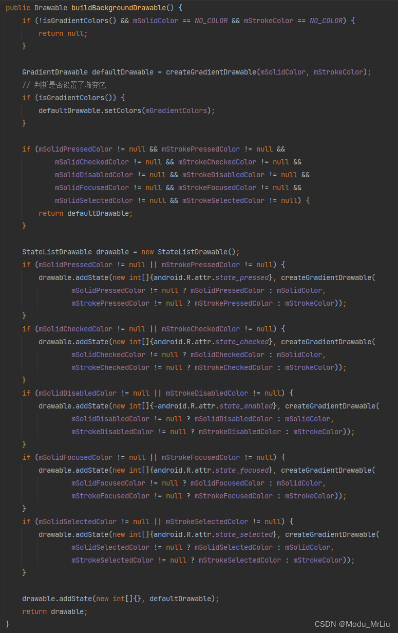
背景属性具体设置方式,包含角度处理

TextColorBuilder
主要作用于 TextView本身属性设置
package com.example.shapefontbg.shape.builder;import android.content.res.ColorStateList;
import android.content.res.TypedArray;
import android.text.SpannableStringBuilder;
import android.widget.TextView;import androidx.annotation.Nullable;import com.example.shapefontbg.shape.LinearGradientFontSpan;
import com.example.shapefontbg.shape.styleable.ITextColorStyleable;/*** author : Android 轮子哥* github : https://github.com/getActivity/ShapeView* time   : 2021/08/28* desc   : TextColor 构建类*/
@SuppressWarnings("unused")
public final class TextColorBuilder {private final TextView mTextView;private int mTextColor;private Integer mTextPressedColor;private Integer mTextCheckedColor;private Integer mTextDisabledColor;private Integer mTextFocusedColor;private Integer mTextSelectedColor;private int[] mTextGradientColors;private int mTextGradientOrientation;public TextColorBuilder(TextView textView, TypedArray typedArray, ITextColorStyleable styleable) {mTextView = textView;mTextColor = typedArray.getColor(styleable.getTextColorStyleable(), textView.getTextColors().getDefaultColor());if (typedArray.hasValue(styleable.getTextPressedColorStyleable())) {mTextPressedColor = typedArray.getColor(styleable.getTextPressedColorStyleable(), mTextColor);}if (styleable.getTextCheckedColorStyleable() > 0 && typedArray.hasValue(styleable.getTextCheckedColorStyleable())) {mTextCheckedColor = typedArray.getColor(styleable.getTextCheckedColorStyleable(), mTextColor);}if (typedArray.hasValue(styleable.getTextDisabledColorStyleable())) {mTextDisabledColor = typedArray.getColor(styleable.getTextDisabledColorStyleable(), mTextColor);}if (typedArray.hasValue(styleable.getTextFocusedColorStyleable())) {mTextFocusedColor = typedArray.getColor(styleable.getTextFocusedColorStyleable(), mTextColor);}if (typedArray.hasValue(styleable.getTextSelectedColorStyleable())) {mTextSelectedColor = typedArray.getColor(styleable.getTextSelectedColorStyleable(), mTextColor);}if (typedArray.hasValue(styleable.getTextStartColorStyleable()) && typedArray.hasValue(styleable.getTextEndColorStyleable())) {if (typedArray.hasValue(styleable.getTextCenterColorStyleable())) {mTextGradientColors = new int[]{typedArray.getColor(styleable.getTextStartColorStyleable(), mTextColor),typedArray.getColor(styleable.getTextCenterColorStyleable(), mTextColor),typedArray.getColor(styleable.getTextEndColorStyleable(), mTextColor)};} else {mTextGradientColors = new int[]{typedArray.getColor(styleable.getTextStartColorStyleable(), mTextColor),typedArray.getColor(styleable.getTextEndColorStyleable(), mTextColor)};}}mTextGradientOrientation = typedArray.getColor(styleable.getTextGradientOrientationStyleable(),LinearGradientFontSpan.GRADIENT_ORIENTATION_HORIZONTAL);}public TextColorBuilder setTextColor(int color) {mTextColor = color;clearTextGradientColors();return this;}public int getTextColor() {return mTextColor;}public TextColorBuilder setTextPressedColor(Integer color) {mTextPressedColor = color;return this;}@Nullablepublic Integer getTextPressedColor() {return mTextPressedColor;}public TextColorBuilder setTextCheckedColor(Integer color) {mTextCheckedColor = color;return this;}@Nullablepublic Integer getTextCheckedColor() {return mTextCheckedColor;}public TextColorBuilder setTextDisabledColor(Integer color) {mTextDisabledColor = color;return this;}@Nullablepublic Integer getTextDisabledColor() {return mTextDisabledColor;}public TextColorBuilder setTextFocusedColor(Integer color) {mTextFocusedColor = color;return this;}@Nullablepublic Integer getTextFocusedColor() {return mTextFocusedColor;}public TextColorBuilder setTextSelectedColor(Integer color) {mTextSelectedColor = color;return this;}@Nullablepublic Integer getTextSelectedColor() {return mTextSelectedColor;}public TextColorBuilder setTextGradientColors(int startColor, int endColor) {return setTextGradientColors(new int[]{startColor, endColor});}public TextColorBuilder setTextGradientColors(int startColor, int centerColor, int endColor) {return setTextGradientColors(new int[]{startColor, centerColor, endColor});}public TextColorBuilder setTextGradientColors(int[] colors) {mTextGradientColors = colors;return this;}@Nullablepublic int[] getTextGradientColors() {return mTextGradientColors;}public boolean isTextGradientColors() {return mTextGradientColors != null && mTextGradientColors.length > 0;}public void clearTextGradientColors() {mTextGradientColors = null;}public TextColorBuilder setTextGradientOrientation(int orientation) {mTextGradientOrientation = orientation;return this;}public int getTextGradientOrientation() {return mTextGradientOrientation;}public SpannableStringBuilder buildLinearGradientSpannable(CharSequence text) {return LinearGradientFontSpan.buildLinearGradientSpannable(text, mTextGradientColors, null, mTextGradientOrientation);}public ColorStateList buildColorState() {if (mTextPressedColor == null &&mTextCheckedColor == null &&mTextDisabledColor == null &&mTextFocusedColor == null &&mTextSelectedColor == null) {return ColorStateList.valueOf(mTextColor);}int maxSize = 6;int arraySize = 0;int[][] statesTemp = new int[maxSize][];int[] colorsTemp = new int[maxSize];if (mTextPressedColor != null) {statesTemp[arraySize] = new int[]{android.R.attr.state_pressed};colorsTemp[arraySize] = mTextPressedColor;arraySize++;}if (mTextCheckedColor != null) {statesTemp[arraySize] = new int[]{android.R.attr.state_checked};colorsTemp[arraySize] = mTextCheckedColor;arraySize++;}if (mTextDisabledColor != null) {statesTemp[arraySize] = new int[]{-android.R.attr.state_enabled};colorsTemp[arraySize] = mTextDisabledColor;arraySize++;}if (mTextFocusedColor != null) {statesTemp[arraySize] = new int[]{android.R.attr.state_focused};colorsTemp[arraySize] = mTextFocusedColor;arraySize++;}if (mTextSelectedColor != null) {statesTemp[arraySize] = new int[]{android.R.attr.state_selected};colorsTemp[arraySize] = mTextSelectedColor;arraySize++;}statesTemp[arraySize] = new int[]{};colorsTemp[arraySize] = mTextColor;arraySize++;int[][] states;int[] colors;if (arraySize == maxSize) {states = statesTemp;colors = colorsTemp;} else {states = new int[arraySize][];colors = new int[arraySize];// 对数组进行拷贝System.arraycopy(statesTemp, 0, states, 0, arraySize);System.arraycopy(colorsTemp, 0, colors, 0, arraySize);}return new ColorStateList(states, colors);}public void intoTextColor() {if (isTextGradientColors()) {mTextView.setText(buildLinearGradientSpannable(mTextView.getText()));return;}mTextView.setTextColor(buildColorState());}
}
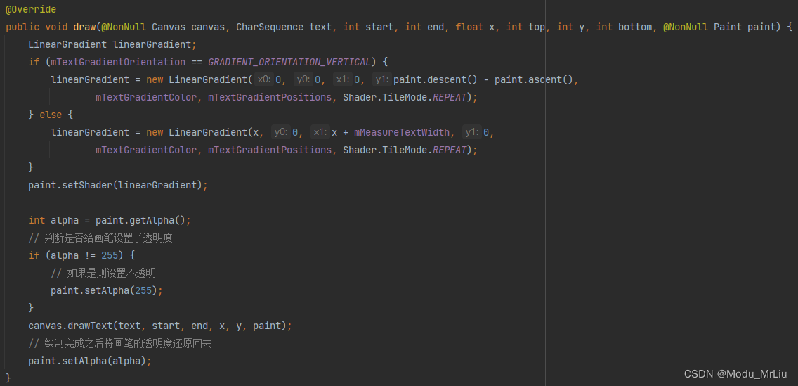
LinearGradientFontSpan 文本渐变核心类
通过 LinearGradient 设置渐变效果
package com.example.shapefontbg.shape;import android.graphics.Canvas;
import android.graphics.LinearGradient;
import android.graphics.Paint;
import android.graphics.Shader;
import android.text.SpannableStringBuilder;
import android.text.Spanned;
import android.text.style.ReplacementSpan;
import android.widget.LinearLayout;import androidx.annotation.NonNull;/*** author : Android 轮子哥* github : https://github.com/getActivity/ShapeView* time   : 2021/08/17* desc   : 支持直接定义文本渐变色的 Span*/
public class LinearGradientFontSpan extends ReplacementSpan {/*** 水平渐变方向*/public static final int GRADIENT_ORIENTATION_HORIZONTAL = LinearLayout.HORIZONTAL;/*** 垂直渐变方向*/public static final int GRADIENT_ORIENTATION_VERTICAL = LinearLayout.VERTICAL;/*** 构建一个文字渐变色的 Spannable 对象*/public static SpannableStringBuilder buildLinearGradientSpannable(CharSequence text, int[] colors, float[] positions, int orientation) {SpannableStringBuilder builder = new SpannableStringBuilder(text);//下面声明了建造方法,所以支持链式设置LinearGradientFontSpan span = new LinearGradientFontSpan().setTextGradientColor(colors).setTextGradientOrientation(orientation).setTextGradientPositions(positions);builder.setSpan(span, 0, builder.length(), Spanned.SPAN_EXCLUSIVE_EXCLUSIVE);return builder;}/*** 测量的文本宽度*/private float mMeasureTextWidth;/*** 文字渐变方向*/private int mTextGradientOrientation;/*** 文字渐变颜色组*/private int[] mTextGradientColor;/*** 文字渐变位置组*/private float[] mTextGradientPositions;@Overridepublic int getSize(Paint paint, CharSequence text, int start, int end, Paint.FontMetricsInt fontMetricsInt) {mMeasureTextWidth = paint.measureText(text, start, end);// 这段不可以去掉,字体高度没设置,会出现 draw 方法没有被调用的问题// 详情请见:https://stackoverflow.com/questions/20069537/replacementspans-draw-method-isnt-calledPaint.FontMetricsInt metrics = paint.getFontMetricsInt();if (fontMetricsInt != null) {fontMetricsInt.top = metrics.top;fontMetricsInt.ascent = metrics.ascent;fontMetricsInt.descent = metrics.descent;fontMetricsInt.bottom = metrics.bottom;}return (int) mMeasureTextWidth;}@Overridepublic void draw(@NonNull Canvas canvas, CharSequence text, int start, int end, float x, int top, int y, int bottom, @NonNull Paint paint) {LinearGradient linearGradient;if (mTextGradientOrientation == GRADIENT_ORIENTATION_VERTICAL) {linearGradient = new LinearGradient(0, 0, 0, paint.descent() - paint.ascent(),mTextGradientColor, mTextGradientPositions, Shader.TileMode.REPEAT);} else {linearGradient = new LinearGradient(x, 0, x + mMeasureTextWidth, 0,mTextGradientColor, mTextGradientPositions, Shader.TileMode.REPEAT);}paint.setShader(linearGradient);int alpha = paint.getAlpha();// 判断是否给画笔设置了透明度if (alpha != 255) {// 如果是则设置不透明paint.setAlpha(255);}canvas.drawText(text, start, end, x, y, paint);// 绘制完成之后将画笔的透明度还原回去paint.setAlpha(alpha);}public LinearGradientFontSpan setTextGradientOrientation(int orientation) {mTextGradientOrientation = orientation;return this;}public LinearGradientFontSpan setTextGradientColor(int[] colors) {mTextGradientColor = colors;return this;}public LinearGradientFontSpan setTextGradientPositions(float[] positions) {mTextGradientPositions = positions;return this;}
}
测量渐变文本的宽度

渐变方向、渐变颜色、画笔透明度处理等~