简而言之,在main.js中导出以下库,仅此,搞多了出错难排查
import ElementPlus from 'element-plus' //导入
ElementPlus模块import 'element-plus/dist/index.css' //引入样式
app.use(ElementPlus) //注册库就能使用了
Element Plus 是一个基于 Vue 3 的组件库,提供了一系列 UI 组件(如按钮、表格、对话框等),可以帮助快速构建用户界面。那么提供了该组件跟我平常直接在<template></template>标签中直接写<button></button>标签来创建按钮有什么区别?
Element Plus组件实际上是对原生 HTML 和 CSS 的封装,它提供了一系列预定义的样式和功能,使得开发者可以更轻松地构建一致且美观的用户界面
封装:
Element Plus组件将原生 HTML 元素(如按钮、表格等)进行了封装,增加了丰富的样式和功能选项。样式与一致性:组件自带的样式确保了在不同设备和浏览器上的一致性,减少了样式调整的复杂性。
事件处理:尽管组件库提供了许多内置功能,事件处理仍然需要使用 JavaScript 进行定义和处理。这与原生 HTML 是一样的。
使用方便:通过使用组件,开发者可以更快地实现复杂的功能,而不必从头开始设计和实现所有的样式和行为。
一.安装
使用包管理器:
# NPM
npm install element-plus --save
# Yarn
yarn add element-plus
# pnpm
pnpm install element-plus
如果网络环境不好,建议使用中国npm镜像:设置清华大学镜像并安装element-plus:
npm config set registry https://mirrors.tuna.tsinghua.edu.cn/npm/
npm install element-plus
中国科学技术大学(USTC)镜像:
npm config set registry https://mirrors.ustc.edu.cn/npm/
npm install element-plus
淘宝镜像:
npm config set registry https://registry.npm.taobao.org
npm install element-plus
使用cnpm 作为npm 的替代工具,自动使用淘宝镜像
npm install -g cnpm --registry=https://registry.npm.taobao.org
cnpm install element-plus
如果想要切换回npm官方源
npm config set registry https://registry.npmjs.org
浏览器直接引入:
unpkg:
<head>
<!-- Import style -->
<link rel="stylesheet" href="//unpkg.com/element-plus/dist/index.css" />
<!-- Import Vue 3 -->
<script src="//unpkg.com/vue@3"></script>
<!-- Import component library -->
<script src="//unpkg.com/element-plus"></script>
</head>
jsDelivr:
<head>
<!-- Import style -->
<link
rel="stylesheet"
href="//cdn.jsdelivr.net/npm/element-plus/dist/index.css"
/>
<!-- Import Vue 3 -->
<script src="//cdn.jsdelivr.net/npm/vue@3"></script>
<!-- Import component library -->
<script src="//cdn.jsdelivr.net/npm/element-plus"></script>
</head>
二.在项目中使用Element Plus
引入:
(volar适用于ts,而对于js,使用vetur)
完整引入(对打包后的文件大小不在乎,使用完整导入更方便)
// main.js
import { createApp } from 'vue'
import ElementPlus from 'element-plus' //从element-plus库中导入ElementPlus对象,该对象主要是库的主要功能或组件集合,可在vue应用中使用
import 'element-plus/dist/index.css' //引入样式
import App from './App.vue'const app = createApp(App)app.use(ElementPlus) //注册库,所有Element Plus组件都可以在应用中使用,在所有组件中都能使用
app.mount('#app')
按需导入:
安装额外插件来导入要使用的组件
安装 unplugin-vue-components 和 unplugin-auto-import
npm install -D unplugin-vue-components unplugin-auto-import
将下面代码插入vite配置文件vite.config.js中
// vite.config.jsimport { defineConfig } from 'vite'
import AutoImport from 'unplugin-auto-import/vite'
import Components from 'unplugin-vue-components/vite'
import { ElementPlusResolver } from 'unplugin-vue-components/resolvers'export default defineConfig({plugins: [vue(), //添加vue插件,千万不要把它忘记了,报一堆错,浏览器一片红AutoImport({resolvers: [ElementPlusResolver()],}),Components({resolvers: [ElementPlusResolver()],}),],
})
作用:
自动导入:使用
unplugin-auto-import,可以在代码中直接使用 Element Plus 的 API,而无需手动导入,这样可以简化代码并提高开发效率。自动注册组件:通过
unplugin-vue-components和ElementPlusResolver,可以自动注册所有使用的 Element Plus 组件,避免在每个文件中重复注册,简化组件管理。提升开发体验:减少样板代码,提高代码整洁性和可维护性,使开发者能更专注于业务逻辑。
Element Plus 的 API 包括组件、属性、事件和方法等。以下是一些常见的 Element Plus API:
常见组件
1.基础组件:
- Button:按钮组件,支持多种样式和尺寸。
- Input:输入框组件,支持文本输入和验证。
- Select:下拉选择框组件,支持多选和搜索。
2.布局组件:
- Container:用于布局的容器组件,可以设置顶部、底部、侧边栏等。
- Row/Col:栅格布局组件,用于快速创建响应式布局。
3.表单组件:
- Form:表单组件,支持表单验证。
- Checkbox、Radio、Switch:用于选择的各种组件。
4.反馈组件:
- Message:全局消息提示组件。
- Notification:通知提示组件。
5.数据展示组件:
- Table:表格组件,支持排序、筛选和分页。
- Pagination:分页组件,用于数据分页展示。
组件的属性和方法:
属性:每个组件都有一系列可配置的属性,例如:
type、size:用于设置按钮的类型和尺寸。placeholder:用于设置输入框的占位符文本。事件:组件通常会提供事件监听,例如:
click:按钮的点击事件。change:输入框内容变化时触发的事件。方法:某些组件提供的方法,可以在实例中调用,例如:
show():显示模态框。hide():隐藏模态框。
全局配置
在引入ElementPlus时,可以传入一个包含size和zIndex属性的全局配置对象。size用于设置表单组建的默认尺寸,zIndex用于设置弹出组件的层级,zIndex的默认值为2000
完整引入(上边注册库仅仅是app.use(ElementPlus))
import { createApp } from 'vue'
import ElementPlus from 'element-plus'
import App from './App.vue'const app = createApp(App)
app.use(ElementPlus, { size: 'small', zIndex: 3000 })
按需引入:
<template><el-config-provider :size="size" :z-index="zIndex"><app /></el-config-provider>
</template><script>
import { defineComponent } from 'vue'
import { ElConfigProvider } from 'element-plus'export default defineComponent({components: {ElConfigProvider,},setup() {return {zIndex: 3000,size: 'small',}},
})
</script>
三.组件
基础组件:
button按钮:
button属性:
1.type用来指定按钮内的背景颜色,但是按钮内的文字颜色是白色
<div class="mb-4"><el-button>Default</el-button><el-button type="primary">Primary</el-button><el-button type="success">Success</el-button><el-button type="info">Info</el-button><el-button type="warning">Warning</el-button><el-button type="danger">Danger</el-button></div>
2.plain属性确定是否为朴素按钮,设置了朴素按钮之后,仅显示边框颜色和透明背景色
<div class="mb-4"><el-button plain>Plain</el-button><el-button type="primary" plain>Primary</el-button> <!--有颜色的边框和文本,背景没有颜色--><el-button type="success" plain>Success</el-button><el-button type="info" plain>Info</el-button><el-button type="warning" plain>Warning</el-button><el-button type="danger" plain>Danger</el-button></div>
3.round 按钮是否为圆角样式<div class="mb-4"><el-button round>Round</el-button><el-button type="primary" round>Primary</el-button><el-button type="success" round>Success</el-button><el-button type="info" round>Info</el-button><el-button type="warning" round>Warning</el-button><el-button type="danger" round>Danger</el-button></div>
4.circle 是否是圆形按钮 icon 图标,前面有冒号是动态绑定,没有是静态<div><el-button :icon="Search" circle /><el-button type="primary" :icon="Edit" circle /><el-button type="success" :icon="Check" circle /><el-button type="info" :icon="Message" circle /><el-button type="warning" :icon="Star" circle /><el-button type="danger" :icon="Delete" circle /></div>
5.disabled 定义按钮是否禁用<template><div class="mb-4"><el-button disabled>Default</el-button><el-button type="primary" disabled>Primary</el-button><el-button type="success" disabled>Success</el-button><el-button type="info" disabled>Info</el-button><el-button type="warning" disabled>Warning</el-button><el-button type="danger" disabled>Danger</el-button></div><div><el-button plain disabled>Plain</el-button><el-button type="primary" plain disabled>Primary</el-button><el-button type="success" plain disabled>Success</el-button><el-button type="info" plain disabled>Info</el-button><el-button type="warning" plain disabled>Warning</el-button><el-button type="danger" plain disabled>Danger</el-button></div> </template>
6.链接按钮 link<template><p>Basic link button</p><div class="mb-4"><el-buttonv-for="button in buttons":key="button.text":type="button.type"link>{{ button.text }}</el-button></div><p>Disabled link button</p><div><el-buttonv-for="button in buttons":key="button.text":type="button.type"link <!--链接按钮-->disabled>{{ button.text }}</el-button></div> </template><script setup lang="ts"> const buttons = [{ type: '', text: 'plain' },{ type: 'primary', text: 'primary' },{ type: 'success', text: 'success' },{ type: 'info', text: 'info' },{ type: 'warning', text: 'warning' },{ type: 'danger', text: 'danger' }, ] as const </script>
7.文字按钮 没有边框和背景色的按钮<template><p>Basic text button</p><div class="mb-4"><el-buttonv-for="button in buttons":key="button.text":type="button.type"text >{{ button.text }}</el-button></div><p>Background color always on</p><div class="mb-4"><el-buttonv-for="button in buttons":key="button.text":type="button.type"text bg>{{ button.text }}</el-button></div><p>Disabled text button</p><div><el-buttonv-for="button in buttons":key="button.text":type="button.type"textdisabled>{{ button.text }}</el-button></div> </template><script setup lang="ts"> const buttons = [{ type: '', text: 'plain' },{ type: 'primary', text: 'primary' },{ type: 'success', text: 'success' },{ type: 'info', text: 'info' },{ type: 'warning', text: 'warning' },{ type: 'danger', text: 'danger' }, ] as const </script>
8.图标按钮(要是图标里不需要加文字,那么直接是单标签)<template><div><el-button type="primary" :icon="Edit" /><el-button type="primary" :icon="Share" /><el-button type="primary" :icon="Delete" /><el-button type="primary" :icon="Search">Search</el-button><el-button type="primary">Upload<el-icon class="el-icon--right"><Upload /></el-icon></el-button></div> </template> <script setup lang="ts"> import { Delete, Edit, Search, Share, Upload } from '@element-plus/icons-vue' </script>
9.按钮组(el-button-group)<template><el-button-group><el-button type="primary" :icon="ArrowLeft">Previous Page</el-button><el-button type="primary">Next Page<el-icon class="el-icon--right"><ArrowRight /></el-icon></el-button></el-button-group><el-button-group class="ml-4"><el-button type="primary" :icon="Edit" /><el-button type="primary" :icon="Share" /><el-button type="primary" :icon="Delete" /></el-button-group> </template><script setup lang="ts"> import {ArrowLeft,ArrowRight,Delete,Edit,Share, } from '@element-plus/icons-vue' </script>
10.加载状态按钮<template><el-button type="primary" loading>Loading</el-button><el-button type="primary" :loading-icon="Eleme" loading>Loading</el-button><el-button type="primary" loading><template #loading><div class="custom-loading"><svg class="circular" viewBox="-10, -10, 50, 50"><pathclass="path"d="M 30 15L 28 17M 25.61 25.61A 15 15, 0, 0, 1, 15 30A 15 15, 0, 1, 1, 27.99 7.5L 15 15"style="stroke-width: 4px; fill: rgba(0, 0, 0, 0)"/></svg></div></template>Loading</el-button> </template><script lang="ts" setup> import { Eleme } from '@element-plus/icons-vue' </script><style scoped> .el-button .custom-loading .circular {margin-right: 6px;width: 18px;height: 18px;animation: loading-rotate 2s linear infinite; } .el-button .custom-loading .circular .path {animation: loading-dash 1.5s ease-in-out infinite;stroke-dasharray: 90, 150;stroke-dashoffset: 0;stroke-width: 2;stroke: var(--el-button-text-color);stroke-linecap: round; } </style>
11.调整尺寸 size ="small" size="large"<template><div class="flex flex-wrap items-center mb-4"><el-button size="large">Large</el-button><el-button>Default</el-button><el-button size="small">Small</el-button><el-button size="large" :icon="Search">Search</el-button><el-button :icon="Search">Search</el-button><el-button size="small" :icon="Search">Search</el-button></div><div class="flex flex-wrap items-center mb-4"><el-button size="large" round>Large</el-button><el-button round>Default</el-button><el-button size="small" round>Small</el-button><el-button size="large" :icon="Search" round>Search</el-button><el-button :icon="Search" round>Search</el-button><el-button size="small" :icon="Search" round>Search</el-button></div><div class="flex flex-wrap items-center"><el-button :icon="Search" size="large" circle /><el-button :icon="Search" circle /><el-button :icon="Search" size="small" circle /></div> </template><script setup lang="ts"> import { Search } from '@element-plus/icons-vue' </script>
12.自定义元素标签 tag="div"d
<template><el-button>button</el-button><el-button tag="div" role="button" tabindex="0">div</el-button><el-buttontype="primary"tag="a"href="https://github.com/element-plus/element-plus"target="_blank"rel="noopener noreferrer">a</el-button>
</template>
13.自定义颜色(isDark: 这是一个响应式变量,通常用于指示当前主题是“深色模式(Dark Mode)”还是“浅色模式(Light Mode))<script lang="ts" setup> import { isDark } from '~/composables/dark' </script><template><div><el-button color="#626aef" :dark="isDark">Default</el-button><el-button color="#626aef" :dark="isDark" plain>Plain</el-button><el-button color="#626aef" :dark="isDark" disabled>Disabled</el-button><el-button color="#626aef" :dark="isDark" disabled plain>Disabled Plain</el-button></div> </template>
button插槽:
button方法:
<el-button>:单个按钮,用于执行一个特定的操作。<el-button-group>:包含多个按钮,通常用于一组相关的操作,比如多种选择或工具栏。- 使用
button-group时,按钮之间的间距和样式会自动调整,视觉上更整齐
示例:
<template><el-button-group><el-button type="primary">按钮1</el-button><el-button>按钮2</el-button><el-button type="success">按钮3</el-button></el-button-group>
</template>
三个按钮被包裹在
button-group中,形成了一个统一的操作区域。


Border边框:
边框样式:(实线和虚线)
border-top:1px solid var(--el-border-color)
<script setup>
</script><template><table class="demo-border"><tbody><tr><td class="text">Name</td><td class="text">Thickness</td><td class="line">Demo</td></tr><tr><td class="text">Solid</td><td class="text">1px</td><td class="line"><!-- <div /> --><div></div></td></tr><tr><td class="text">Dashed</td><td class="text">2px</td><td class="line"><div class="dashed" ></div></td></tr></tbody></table>
</template>
<style scoped>
.demo-border .text {width: 15%;
}
.demo-border .line {width: 70%;
}
.demo-border .line div {width: 100%;height: 0;border-top: 1px solid var(--el-border-color);  /*上边框,--el-border-color是element-plus中定义的一个css变量,是个默认颜色值*/
}
.demo-border .line .dashed {border-top: 2px dashed var(--el-border-color);
}
</style>
圆角样式:(el-border-radius)<script setup> </script><template><!-- el-row创建行,gutter属性设置外边距,即列与列之间的间距 。: 前缀表示这是一个动态绑定,意味着 gutter 的值来自 Vue 的数据或计算属性--><el-row :gutter="12" class="demo-radius"> <el-colv-for="(radius, i) in radiusGroup":key="i":span="6":xs="{ span: 12 }"><div class="title">{{ radius.name }}</div><div class="value"><code>border-radius:{{radius.type? useCssVar(`--el-border-radius-${radius.type}`): '"0px"'}}</code></div><divclass="radius":style="{borderRadius: radius.type? `var(--el-border-radius-${radius.type})` <!----el-border-radius-->: '',}"/></el-col></el-row></template><script lang="ts" setup> import { ref } from 'vue' import { useCssVar } from '@vueuse/core'const radiusGroup = ref([{name: 'No Radius',type: '',},{name: 'Small Radius',type: 'small',},{name: 'Large Radius',type: 'base',},{name: 'Round Radius',type: 'round',}, ]) </script> <style scoped> .demo-radius .title {color: var(--el-text-color-regular);font-size: 18px;margin: 10px 0; } .demo-radius .value {color: var(--el-text-color-primary);font-size: 16px;margin: 10px 0; } .demo-radius .radius {height: 40px;width: 70%;border: 1px solid var(--el-border-color);border-radius: 0;margin-top: 20px; } </style>
阴影:(el-box-shadow)<template><div class="flex justify-between items-center flex-wrap"><divv-for="(shadow, i) in shadowGroup":key="i"class="flex flex-col justify-center items-center"m="auto"w="46"><divclass="inline-flex"h="30"w="30"m="2":style="{boxShadow: `var(${getCssVarName(shadow.type)})`,}"/><span p="y-4" class="demo-shadow-text" text="sm">{{ shadow.name }}</span><code text="xs">{{ getCssVarName(shadow.type) }}</code></div></div> </template><script lang="ts" setup> import { ref } from 'vue'const shadowGroup = ref([{name: 'Basic Shadow',type: '',},{name: 'Light Shadow',type: 'light',},{name: 'Lighter Shadow',type: 'lighter',},{name: 'Dark Shadow',type: 'dark',}, ])const getCssVarName = (type: string) => { return `--el-box-shadow${type ? '-' : ''}${type}` //el-box-shadow } </script>


color色彩:Element Plus为了避免视觉传达差异,使用一套特定的调色板来规定颜色,为搭建的产品提供一致的外观视觉感受
主色
中性色
中性色用于文本、背景和边框颜色。 通过运用不同的中性色,来表现层次结构


Container布局容器
用于布局的容器组件,方便快速搭建页面的基本结构:
<el-container>:外层容器。 当子元素中包含<el-header>或<el-footer>时,全部子元素会垂直上下排列, 否则会水平左右排列。
<el-header>:顶栏容器。
<el-aside>:侧边栏容器。
<el-main>:主要区域容器。
<el-footer>:底栏容器。
常见的页面布局
1.container包裹header和main<template><div class="common-layout"><el-container><el-header style="background-color:#D4D7DE;color:red">Header</el-header><el-main style="background:#409EFF;color:blask">Main</el-main></el-container></div> </template>
2.container包裹header和main和footer<template><div class="common-layout"><el-container><el-header>Header</el-header><el-main>Main</el-main><el-footer>Footer</el-footer></el-container></div> </template>
3.container包裹aside和main,不过要指定侧边栏width属性,明确指定侧边栏的宽度,从而确保整体布局的一致性和可预测性
用style设置容器背景色height在<el-container>标签无效
<template><div class="common-layout"><el-container><el-aside width="200px" style="background-color:pink">Aside</el-aside><el-main style="background-color:red">Main</el-main></el-container></div>
</template>
4.三个部分,大container包裹header和小container,小container包裹aside和main<template><div class="common-layout"><el-container><el-header>Header</el-header><el-container><el-aside width="200px">Aside</el-aside><el-main>Main</el-main></el-container></el-container></div> </template>
5.大container包裹所有,中container包裹aside,main,footer,小container包裹main和footer<template><div class="common-layout"><el-container><el-header>Header</el-header><el-container><el-aside width="200px">Aside</el-aside><el-container><el-main>Main</el-main><el-footer>Footer</el-footer></el-container></el-container></el-container></div> </template>
|


lcon图标
Element Plus提供了一套常用的图标集合(如果想要直接使用,需要全局注册组件)
安装
使用包管理器# NPM
npm install @element-plus/icons-vue
# Yarn
yarn add @element-plus/icons-vue
# pnpm
pnpm install @element-plus/icons-vue
法1:注册所有图标需要从@element-plus/icons-vue 中导入所有图标并进行全局注册
Object.entries(ElementPlusIconsVue): 获取ElementPlusIconsVue对象中所有的键值对(图标组件)。
for (const [key, component] of ...): 遍历每个图标的键(名称)和对应的组件。
app.component(key, component): 将每个图标组件以其名称注册到 Vue 应用中,使得在模板中可以直接使用这些图标。这样,开发者就可以方便地在应用中使用
ElementPlus提供的图标组件// main.js// 如果您正在使用CDN引入,请删除下面一行。 import * as ElementPlusIconsVue from '@element-plus/icons-vue'const app = createApp(App) for (const [key, component] of Object.entries(ElementPlusIconsVue)) {app.component(key, component) }法2:直接通过浏览器的HTML标签导入Element Plus,然后就能使用全局变量ElementPlusIconsVue
根据不同的 CDN 提供商有不同的引入方式, 根据不同的 CDN 提供商有不同的引入方式, 我们在这里以 unpkg 和 jsDelivr 举例
使用unpkg:
<script src="//unpkg.com/@element-plus/icons-vue"></script>
使用jsDelivr:<script src="//cdn.jsdelivr.net/npm/@element-plus/icons-vue"></script>
基础用法
<!-- 使用 el-icon 为 SVG 图标提供属性 -->
<template><div><el-icon :size="size" :color="color"><Edit /></el-icon><!-- 或者独立使用它,不从父级获取属性 --><Edit /></div>
</template><!--<Edit /> 是一个 SVG 图标组件,通常来自 Element Plus 图标库。它用于在界面中显示一个编辑图标。代码中的 <el-icon> 组件用来包裹这个图标,并通过 :size 和 :color 属性动态设置图标的大小和颜色。如果不使用 <el-icon> 包裹,<Edit /> 图标仍然可以独立显示,但会使用默认样式。-->
结合el-icon使用
<template><p>with extra class <b>is-loading</b>, your icon is able to rotate 360 deg in 2seconds, you can also override this</p><el-icon :size="20"><Edit /></el-icon><el-icon color="#409efc" class="no-inherit"><Share /></el-icon><el-icon><Delete /></el-icon><el-icon class="is-loading"><Loading /></el-icon><el-button type="primary"><el-icon style="vertical-align: middle"><Search /></el-icon><span style="vertical-align: middle"> Search </span></el-button>
</template>
直接使用svg图标
<template><div style="font-size: 20px"><!-- 由于SVG图标默认不携带任何属性 --><!-- 你需要直接提供它们 --><Edit style="width: 1em; height: 1em; margin-right: 8px" /><Share style="width: 1em; height: 1em; margin-right: 8px" /><Delete style="width: 1em; height: 1em; margin-right: 8px" /><Search style="width: 1em; height: 1em; margin-right: 8px" /></div>
</template>


Layout布局
通过基础的24分栏,迅速简便创建布局
组件默认使用 Flex 布局,不需要手动设置
type="flex"。请注意父容器避免使用
inline相关样式,会导致组件宽度不能撑满。
1.el-row 行el-col 列
<el-col>组件的:span属性用于定义列的宽度<template><el-row><el-col :span="24"><div class="grid-content ep-bg-purple-dark"></div></el-col></el-row><el-row><el-col :span="12"><div class="grid-content ep-bg-purple"></div></el-col><el-col :span="12"><div class="grid-content ep-bg-purple-light"></div></el-col></el-row><el-row><el-col :span="8"><div class="grid-content ep-bg-purple"></div></el-col><el-col :span="8"><div class="grid-content ep-bg-purple-light"></div></el-col><el-col :span="8"><div class="grid-content ep-bg-purple"></div></el-col></el-row><el-row><el-col :span="6"><div class="grid-content ep-bg-purple"></div></el-col><el-col :span="6"><div class="grid-content ep-bg-purple-light"></div></el-col><el-col :span="6"><div class="grid-content ep-bg-purple"></div></el-col><el-col :span="6"><div class="grid-content ep-bg-purple-light"></div></el-col></el-row><el-row><el-col :span="4"><div class="grid-content ep-bg-purple"></div></el-col><el-col :span="4"><div class="grid-content ep-bg-purple-light"></div></el-col><el-col :span="4"><div class="grid-content ep-bg-purple"></div></el-col><el-col :span="4"><div class="grid-content ep-bg-purple-light"></div></el-col><el-col :span="4"><div class="grid-content ep-bg-purple"></div></el-col><el-col :span="4"><div class="grid-content ep-bg-purple-light"></div></el-col></el-row> </template> <style lang="scss"> .grid-content {height: 100px; /* 或其他高度 */ }.ep-bg-purple-dark {background-color: #6a0dad; /* 深紫色 */ }.ep-bg-purple {background-color: #8a2be2; /* 紫色 */ }.ep-bg-purple-light {background-color: #d8bfd8; /* 浅紫色 */ }</style>
2.分栏间隔 gutter指定列之间的间距<template><el-row :gutter="20"><el-col :span="6"><div class="grid-content ep-bg-purple" /></el-col><el-col :span="6"><div class="grid-content ep-bg-purple" /></el-col><el-col :span="6"><div class="grid-content ep-bg-purple" /></el-col><el-col :span="6"><div class="grid-content ep-bg-purple" /></el-col></el-row> </template><style> .el-row {margin-bottom: 20px; } .el-row:last-child {margin-bottom: 0; } .el-col {border-radius: 4px; }.grid-content {border-radius: 4px;min-height: 36px; } </style>
3.混合布局<template><el-row :gutter="20"><el-col :span="16"><div class="grid-content ep-bg-purple" /></el-col><el-col :span="8"><div class="grid-content ep-bg-purple" /></el-col></el-row><el-row :gutter="20"><el-col :span="8"><div class="grid-content ep-bg-purple" /></el-col><el-col :span="8"><div class="grid-content ep-bg-purple" /></el-col><el-col :span="4"><div class="grid-content ep-bg-purple" /></el-col><el-col :span="4"><div class="grid-content ep-bg-purple" /></el-col></el-row><el-row :gutter="20"><el-col :span="4"><div class="grid-content ep-bg-purple" /></el-col><el-col :span="16"><div class="grid-content ep-bg-purple" /></el-col><el-col :span="4"><div class="grid-content ep-bg-purple" /></el-col></el-row> </template><style> .el-row {margin-bottom: 20px; } .el-row:last-child {margin-bottom: 0; } .el-col {border-radius: 4px; }.grid-content {border-radius: 4px;min-height: 36px; } </style>
4.列偏移<template><el-row :gutter="20"><el-col :span="6"><div class="grid-content ep-bg-purple" /></el-col><el-col :span="6" :offset="6"><div class="grid-content ep-bg-purple" /></el-col></el-row><el-row :gutter="20"><el-col :span="6" :offset="6"><div class="grid-content ep-bg-purple" /></el-col><el-col :span="6" :offset="6"><div class="grid-content ep-bg-purple" /></el-col></el-row><el-row :gutter="20"><el-col :span="12" :offset="6"><div class="grid-content ep-bg-purple" /></el-col></el-row> </template><style> .el-row {margin-bottom: 20px; } .el-row:last-child {margin-bottom: 0; } .el-col {border-radius: 4px; }.grid-content {border-radius: 4px;min-height: 36px; } </style>
5.对齐方式<template><el-row class="row-bg"><el-col :span="6"><div class="grid-content ep-bg-purple" /></el-col><el-col :span="6"><div class="grid-content ep-bg-purple-light" /></el-col><el-col :span="6"><div class="grid-content ep-bg-purple" /></el-col></el-row><el-row class="row-bg" justify="center"><el-col :span="6"><div class="grid-content ep-bg-purple" /></el-col><el-col :span="6"><div class="grid-content ep-bg-purple-light" /></el-col><el-col :span="6"><div class="grid-content ep-bg-purple" /></el-col></el-row><el-row class="row-bg" justify="end"><el-col :span="6"><div class="grid-content ep-bg-purple" /></el-col><el-col :span="6"><div class="grid-content ep-bg-purple-light" /></el-col><el-col :span="6"><div class="grid-content ep-bg-purple" /></el-col></el-row><el-row class="row-bg" justify="space-between"><el-col :span="6"><div class="grid-content ep-bg-purple" /></el-col><el-col :span="6"><div class="grid-content ep-bg-purple-light" /></el-col><el-col :span="6"><div class="grid-content ep-bg-purple" /></el-col></el-row><el-row class="row-bg" justify="space-around"><el-col :span="6"><div class="grid-content ep-bg-purple" /></el-col><el-col :span="6"><div class="grid-content ep-bg-purple-light" /></el-col><el-col :span="6"><div class="grid-content ep-bg-purple" /></el-col></el-row><el-row class="row-bg" justify="space-evenly"><el-col :span="6"><div class="grid-content ep-bg-purple" /></el-col><el-col :span="6"><div class="grid-content ep-bg-purple-light" /></el-col><el-col :span="6"><div class="grid-content ep-bg-purple" /></el-col></el-row> </template><style> .el-row {margin-bottom: 20px; } .el-row:last-child {margin-bottom: 0; } .el-col {border-radius: 4px; }.grid-content {border-radius: 4px;min-height: 36px; } </style>
6.响应式布局<template><el-row :gutter="10"><el-col :xs="8" :sm="6" :md="4" :lg="3" :xl="1"><div class="grid-content ep-bg-purple" /></el-col><el-col :xs="4" :sm="6" :md="8" :lg="9" :xl="11"><div class="grid-content ep-bg-purple-light" /></el-col><el-col :xs="4" :sm="6" :md="8" :lg="9" :xl="11"><div class="grid-content ep-bg-purple" /></el-col><el-col :xs="8" :sm="6" :md="4" :lg="3" :xl="1"><div class="grid-content ep-bg-purple-light" /></el-col></el-row> </template><style> .el-col {border-radius: 4px; }.grid-content {border-radius: 4px;min-height: 36px; } </style>


Link链接
链接标签和按钮都有type属性,disabled
1.基础文字链接 el-link<template><div><el-link href="https://element-plus.org" target="_blank">default</el-link><el-link type="primary">primary</el-link><el-link type="success">success</el-link><el-link type="warning">warning</el-link><el-link type="danger">danger</el-link><el-link type="info">info</el-link></div> </template> <style scoped> .el-link {margin-right: 8px; } .el-link .el-icon--right.el-icon {vertical-align: text-bottom; } </style>2禁用状态:
<template><div><el-link disabled>default</el-link><el-link type="primary" disabled>primary</el-link><el-link type="success" disabled>success</el-link><el-link type="warning" disabled>warning</el-link><el-link type="danger" disabled>danger</el-link><el-link type="info" disabled>info</el-link></div>
</template>
<style scoped>
.el-link {margin-right: 8px;
}
.el-link .el-icon--right.el-icon {vertical-align: text-bottom;
}
</style>
3.下划线 :underline="false"<template><div><el-link :underline="false">Without Underline</el-link><el-link>With Underline</el-link></div> </template> <style scoped> .el-link {margin-right: 8px; } .el-link .el-icon--right.el-icon {vertical-align: text-bottom; } </style>
4.图标
链接标签中引用 :icon="edit"连接标签包裹图标标签
<template><div><el-link :icon="Edit">Edit</el-link><el-link>Check<el-icon class="el-icon--right"><icon-view /></el-icon></el-link></div>
</template><script setup lang="ts">
import { Edit, View as IconView } from '@element-plus/icons-vue'
</script><style scoped>
.el-link {margin-right: 8px;
}
</style>


scrollbar滚动条
1.el-scrollbar
<template><el-scrollbar height="400px"><p v-for="item in 20" :key="item" class="scrollbar-demo-item">{{ item }}</p></el-scrollbar>
</template><style scoped>
.scrollbar-demo-item {display: flex;align-items: center;justify-content: center;height: 50px;margin: 10px;text-align: center;border-radius: 4px;background: var(--el-color-primary-light-9);color: var(--el-color-primary);
}
</style>
2.横向滚动<template><el-scrollbar><div class="scrollbar-flex-content"><p v-for="item in 50" :key="item" class="scrollbar-demo-item">{{ item }}</p></div></el-scrollbar> </template><style scoped> .scrollbar-flex-content {display: flex; } .scrollbar-demo-item {flex-shrink: 0;display: flex;align-items: center;justify-content: center;width: 100px;height: 50px;margin: 10px;text-align: center;border-radius: 4px;background: var(--el-color-danger-light-9);color: var(--el-color-danger); } </style>
3.最大高度:
<template><el-button @click="add">Add Item</el-button><el-button @click="onDelete">Delete Item</el-button><el-scrollbar max-height="400px"><p v-for="item in count" :key="item" class="scrollbar-demo-item">{{ item }}</p></el-scrollbar>
</template><script lang="ts" setup>
import { ref } from 'vue'
const count = ref(3)const add = () => {count.value++
}
const onDelete = () => {if (count.value > 0) {count.value--}
}
</script><style scoped>
.scrollbar-demo-item {display: flex;align-items: center;justify-content: center;height: 50px;margin: 10px;text-align: center;border-radius: 4px;background: var(--el-color-primary-light-9);color: var(--el-color-primary);
}
</style>
4.手动滚动<template><el-scrollbar ref="scrollbarRef" height="400px" always @scroll="scroll"><div ref="innerRef"><p v-for="item in 20" :key="item" class="scrollbar-demo-item">{{ item }}</p></div></el-scrollbar><el-sliderv-model="value":max="max":format-tooltip="formatTooltip"@input="inputSlider"/> </template><script lang="ts" setup> import { onMounted, ref } from 'vue' import { ElScrollbar } from 'element-plus'const max = ref(0) const value = ref(0) const innerRef = ref<HTMLDivElement>() const scrollbarRef = ref<InstanceType<typeof ElScrollbar>>()onMounted(() => {max.value = innerRef.value!.clientHeight - 380 })const inputSlider = (value: number) => {scrollbarRef.value!.setScrollTop(value) } const scroll = ({ scrollTop }) => {value.value = scrollTop } const formatTooltip = (value: number) => {return `${value} px` } </script><style scoped> .scrollbar-demo-item {display: flex;align-items: center;justify-content: center;height: 50px;margin: 10px;text-align: center;border-radius: 4px;background: var(--el-color-primary-light-9);color: var(--el-color-primary); } .el-slider {margin-top: 20px; } </style>


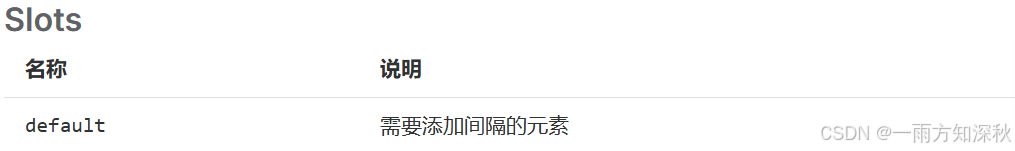
space间距
虽然我们拥有 Divider 组件,但很多时候我们需要不是一个被 Divider 组件 分割开的页面结构,因此我们会重复的使用很多的 Divider 组件,这在我们的开发效率上造成了一定的困扰。 间距组件就是为了解决这种困扰应运而生的


![[C++]使用C++部署yolov11目标检测的tensorrt模型支持图片视频推理windows测试通过](https://i-blog.csdnimg.cn/direct/039d294b13854248a4a636bfcffeba0e.png)