Bootstrap的弹性盒子布局学习笔记
目录
- 01-综述
- 02-利用类d-flex与类d-inline-flex将容器定义为弹性盒子
- 03-对弹性容器的的元素在水平方向上进行排列顺序设置
- 03-对弹性容器的的元素在垂直方向上进行排列顺序设置
- 04-弹性盒子内所有元素在主轴方向上的对齐方式
- 05-1-弹性盒子内各行在交叉轴方向上的对齐方式
- 05-2-弹性盒子内多行内容在交叉轴方向上的对齐方式
- 06-单独设置弹性容器内某个元素在交叉轴上的对齐方式
- 07-均分容器剩下的空间布局(填满容器布局)
- 08-设置某个元素尽可能多的占用剩余空间
- 09-水平方向上的浮动布局(左对齐,右对齐)
- 10-垂直方向上的浮动布局(顶部对齐和底部对齐)
- 11-自动换行
- 12-设置弹性盒子内各元素的顺序
01-综述
Bootstrap的弹性盒子(Flexbox)是一种用于创建灵活的、响应式布局的布局模型。它在Bootstrap中的实现使得构建复杂的网页布局变得更加容易和可控。以下是Bootstrap弹性盒子的主要特性:
-
灵活的布局: 弹性盒子模型使得容器内的子元素可以自由伸缩和排列,以适应不同的屏幕尺寸和设备。
-
水平和垂直居中: Bootstrap的Flexbox支持轻松实现元素在水平和垂直方向上的居中对齐,无需使用复杂的CSS。
-
顺序控制: 您可以通过调整子元素的顺序,轻松地改变它们在容器中的排列顺序,而无需改变HTML结构。
-
自适应列宽: 弹性盒子允许容器内的列自适应其宽度,以填充可用的空间,而不需要指定固定的列宽。
-
自动换行: 当子元素在容器中无法一行容纳时,它们会自动换行到下一行,而不会溢出或重叠。
-
空间分配: 您可以通过调整弹性盒子子元素之间的权重来分配可用空间,从而实现不同元素之间的不同宽度比例。
-
对齐和间距控制: 弹性盒子允许您精确控制子元素在容器内的对齐方式和间距。
-
嵌套支持: 您可以嵌套多个弹性盒子容器,以创建更复杂的布局。
总之,Bootstrap的弹性盒子模型提供了一种强大的工具,可以简化网页布局的开发,使其更加灵活和响应式。它是构建现代Web界面的重要工具之一,特别适用于需要适应不同屏幕大小和设备的项目。在Bootstrap 4和Bootstrap 5中,Flexbox已经成为默认的布局模型,因此您可以轻松地利用其功能来创建各种各样的布局。
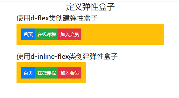
02-利用类d-flex与类d-inline-flex将容器定义为弹性盒子
在Bootstrap的弹性盒子特性中,主要是使用类d-flex与类d-inline-flex装饰容器定义为弹性盒子。
问:Bootstrap的类d-flex与类d-inline-flex有什么区别?
答:
-
d-flex类: 这个类用于将元素设置为"flex"显示方式,使元素成为一个弹性容器,内部的子元素可以利用Flexbox布局来排列。这意味着元素将占据整个可用宽度,通常会在容器中占据一行,充满剩余的水平空间。子元素默认会堆叠在一行上,根据弹性容器的规则进行排列。 -
d-inline-flex类: 这个类也将元素设置为"flex"显示方式,但与d-flex不同的是,它会使元素成为内联弹性容器,即元素不会占据整个可用宽度,而是在行内显示。这意味着多个d-inline-flex元素可以在同一行内并排显示,并且根据内联弹性容器的规则进行子元素的排列。
区别总结:
d-flex会使元素占据整个可用宽度,通常在容器中占据一行,充满剩余的水平空间。d-inline-flex使元素成为内联弹性容器,元素在同一行内并排显示,不会占据整个可用宽度,根据内联弹性容器的规则进行排列。
您可以根据需要选择这两个类之一,以控制元素的显示方式,并根据布局要求将元素设置为块级或内联元素。
示例代码如下:
<!DOCTYPE html>
<html>
<head><meta charset="UTF-8"><title>创建弹性盒子</title><meta name="viewport" content="width=device-width,initial-scale=1, shrink-to-fit=no"><link rel="stylesheet" href="bootstrap-4.5.3-dist/css/bootstrap.css"><script src="jquery-3.5.1.slim.js"></script><script src="bootstrap-4.5.3-dist/js/bootstrap.min.js"></script>
</head>
<body class="container">
<h3 align="center">定义弹性盒子</h3>
<h4>使用d-flex类创建弹性盒子</h4>
<!--使用d-flex类创建弹性盒子-->
<div class="d-flex p-3 bg-warning text-white"><div class="p-2 bg-primary">首页</div><div class="p-2 bg-success">在线课程</div><div class="p-2 bg-danger">加入会员</div>
</div><br/>
<h4>使用d-inline-flex类创建弹性盒子</h4>
<!--使用d-inline-flex类创建弹性盒子-->
<div class="d-inline-flex p-3 bg-warning text-white"><div class="p-2 bg-primary">首页</div><div class="p-2 bg-success">在线课程</div><div class="p-2 bg-danger">加入会员</div>
</div>
</body>
</html>
代码中的“p-3”的意思请访问博文:https://blog.csdn.net/wenhao_ir/article/details/132666590 查看。
运行效果如下图所示:
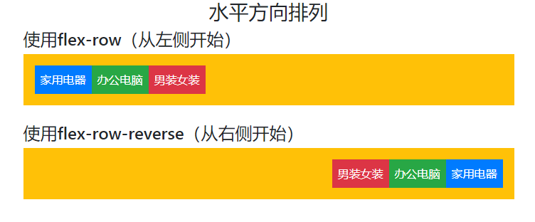
03-对弹性容器的的元素在水平方向上进行排列顺序设置
可以使用类flex-row设置弹性容器的元素从左到右进行排列,当然,默认也是从左到右排列。
可以使用类flex-row-reverse设置弹性容器的元素从右到左进行排列。
示例代码如下:
<!DOCTYPE html>
<html>
<head><meta charset="UTF-8"><title>水平方向排列</title><meta name="viewport" content="width=device-width,initial-scale=1, shrink-to-fit=no"><link rel="stylesheet" href="bootstrap-4.5.3-dist/css/bootstrap.css"><script src="jquery-3.5.1.slim.js"></script><script src="bootstrap-4.5.3-dist/js/bootstrap.min.js"></script>
</head>
<body class="container">
<h3 align="center">水平方向排列</h3>
<h4>使用flex-row(从左侧开始)</h4>
<div class="d-flex flex-row p-3 bg-warning text-white"><div class="p-2 bg-primary">家用电器</div><div class="p-2 bg-success">办公电脑</div><div class="p-2 bg-danger">男装女装</div>
</div><br/>
<h4>使用flex-row-reverse(从右侧开始)</h4>
<div class="d-flex flex-row-reverse bg-warning p-3 text-white"><div class="p-2 bg-primary">家用电器</div><div class="p-2 bg-success">办公电脑</div><div class="p-2 bg-danger">男装女装</div>
</div>
</body>
</html>
运行效果如下:
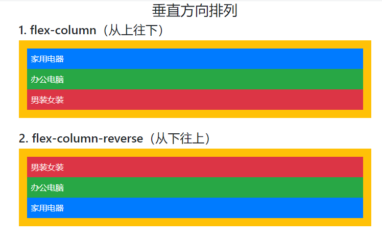
03-对弹性容器的的元素在垂直方向上进行排列顺序设置
可以使用类flex-column设置弹性容器的元素从上到下进行排列,当然,默认也是从上到下排列。
可以使用类flex-row-reverse设置弹性容器的元素从下到上进行排列。
示例代码如下:
<!DOCTYPE html>
<html>
<head><meta charset="UTF-8"><title>垂直方向排列</title><meta name="viewport" content="width=device-width,initial-scale=1, shrink-to-fit=no"><link rel="stylesheet" href="bootstrap-4.5.3-dist/css/bootstrap.css"><script src="jquery-3.5.1.slim.js"></script><script src="bootstrap-4.5.3-dist/js/bootstrap.min.js"></script>
</head>
<body class="container">
<h3  align="center">垂直方向排列</h3>
<h4>1. flex-column(从上往下)</h4>
<div class="d-flex flex-column p-3 bg-warning text-white"><div class="p-2 bg-primary">家用电器</div><div class="p-2 bg-success">办公电脑</div><div class="p-2 bg-danger">男装女装</div>
</div><br/>
<h4>2. flex-column-reverse(从下往上)</h4>
<div class="d-flex flex-column-reverse bg-warning p-3 text-white"><div class="p-2 bg-primary">家用电器</div><div class="p-2 bg-success">办公电脑</div><div class="p-2 bg-danger">男装女装</div>
</div>
</body>
</html>
运行效果如下:
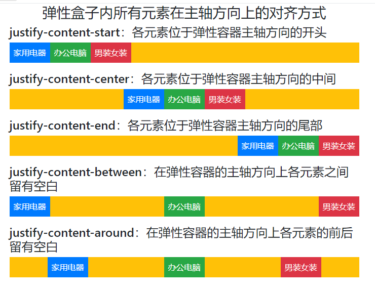
04-弹性盒子内所有元素在主轴方向上的对齐方式
可以利用下面的五个类实现“弹性盒子内所有元素在主轴方向上的对齐方式”:
justify-content-start
justify-content-center
justify-content-end
justify-content-between
justify-content-around
示例代码如下:
<!DOCTYPE html>
<html>
<head><meta charset="UTF-8"><title>弹性盒子内所有元素在主轴方向上的对齐方式</title><meta name="viewport" content="width=device-width,initial-scale=1, shrink-to-fit=no"><link rel="stylesheet" href="bootstrap-4.5.3-dist/css/bootstrap.css"><script src="jquery-3.5.1.slim.js"></script><script src="bootstrap-4.5.3-dist/js/bootstrap.min.js"></script>
</head>
<body class="container">
<h3 align="center">弹性盒子内所有元素在主轴方向上的对齐方式</h3><h4>justify-content-start:各元素位于弹性容器主轴方向的开头</h4>
<div class="d-flex justify-content-start mb-3 bg-warning text-white"><div class="p-2 bg-primary">家用电器</div><div class="p-2 bg-success">办公电脑</div><div class="p-2 bg-danger">男装女装</div>
</div><h4>justify-content-center:各元素位于弹性容器主轴方向的中间</h4>
<div class="d-flex justify-content-center mb-3 bg-warning text-white"><div class="p-2 bg-primary">家用电器</div><div class="p-2 bg-success">办公电脑</div><div class="p-2 bg-danger">男装女装</div>
</div><h4>justify-content-end:各元素位于弹性容器主轴方向的尾部</h4>
<div class="d-flex justify-content-end mb-3 bg-warning text-white"><div class="p-2 bg-primary">家用电器</div><div class="p-2 bg-success">办公电脑</div><div class="p-2 bg-danger">男装女装</div>
</div><h4>justify-content-between:在弹性容器的主轴方向上各元素之间留有空白</h4>
<div class="d-flex justify-content-between mb-3 bg-warning text-white"><div class="p-2 bg-primary">家用电器</div><div class="p-2 bg-success">办公电脑</div><div class="p-2 bg-danger">男装女装</div>
</div><h4>justify-content-around:在弹性容器的主轴方向上各元素的前后留有空白</h4>
<div class="d-flex justify-content-around bg-warning text-white"><div class="p-2 bg-primary">家用电器</div><div class="p-2 bg-success">办公电脑</div><div class="p-2 bg-danger">男装女装</div>
</div>
</body>
</html>
这个示例代码中的类 mb-3 的详细介绍请参见博文:https://blog.csdn.net/wenhao_ir/article/details/132666590
关于什么叫主轴?
请大家参见博文:https://blog.csdn.net/wenhao_ir/article/details/133357422
运行效果如下图所示:
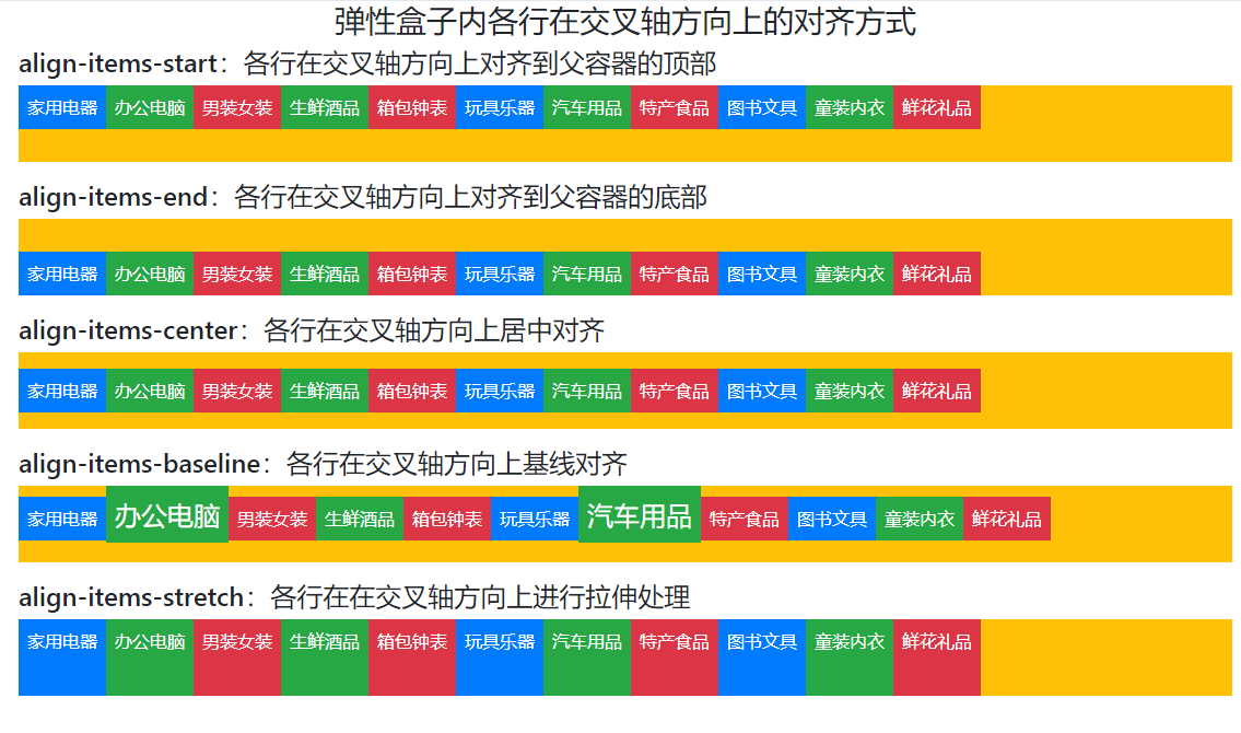
05-1-弹性盒子内各行在交叉轴方向上的对齐方式
示例代码如下 :
<!DOCTYPE html>
<html>
<head><meta charset="UTF-8"><title>弹性盒子内各行在交叉轴方向上的对齐方式</title><meta name="viewport" content="width=device-width,initial-scale=1, shrink-to-fit=no"><link rel="stylesheet" href="bootstrap-4.5.3-dist/css/bootstrap.css"><script src="jquery-3.5.1.slim.js"></script><script src="bootstrap-4.5.3-dist/js/bootstrap.min.js"></script>
</head>
<style>.box{width: 100%;   /*设置宽度*/height: 70px;   /*设置高度*/}
</style>
<body class="container">
<h3 align="center">弹性盒子内各行在交叉轴方向上的对齐方式 </h3><h4>align-items-start:各行在交叉轴方向上对齐到父容器的顶部</h4>
<div class="d-flex align-items-start bg-warning text-white mb-3 box"><div class="p-2 bg-primary">家用电器</div><div class="p-2 bg-success">办公电脑</div><div class="p-2 bg-danger">男装女装</div><div class="p-2 bg-success">生鲜酒品</div><div class="p-2 bg-danger">箱包钟表</div><div class="p-2 bg-primary">玩具乐器</div><div class="p-2 bg-success">汽车用品</div><div class="p-2 bg-danger">特产食品</div><div class="p-2 bg-primary">图书文具</div><div class="p-2 bg-success">童装内衣</div><div class="p-2 bg-danger">鲜花礼品</div>
</div><h4>align-items-end:各行在交叉轴方向上对齐到父容器的底部</h4>
<div class="d-flex align-items-end bg-warning text-white mb-3 box"><div class="p-2 bg-primary">家用电器</div><div class="p-2 bg-success">办公电脑</div><div class="p-2 bg-danger">男装女装</div><div class="p-2 bg-success">生鲜酒品</div><div class="p-2 bg-danger">箱包钟表</div><div class="p-2 bg-primary">玩具乐器</div><div class="p-2 bg-success">汽车用品</div><div class="p-2 bg-danger">特产食品</div><div class="p-2 bg-primary">图书文具</div><div class="p-2 bg-success">童装内衣</div><div class="p-2 bg-danger">鲜花礼品</div>
</div><h4>align-items-center:各行在交叉轴方向上居中对齐</h4>
<div class="d-flex align-items-center bg-warning text-white mb-3 box"><div class="p-2 bg-primary">家用电器</div><div class="p-2 bg-success">办公电脑</div><div class="p-2 bg-danger">男装女装</div><div class="p-2 bg-success">生鲜酒品</div><div class="p-2 bg-danger">箱包钟表</div><div class="p-2 bg-primary">玩具乐器</div><div class="p-2 bg-success">汽车用品</div><div class="p-2 bg-danger">特产食品</div><div class="p-2 bg-primary">图书文具</div><div class="p-2 bg-success">童装内衣</div><div class="p-2 bg-danger">鲜花礼品</div>
</div><h4>align-items-baseline:各行在交叉轴方向上基线对齐</h4>
<div class="d-flex align-items-baseline bg-warning text-white mb-3 box"><div class="p-2 bg-primary">家用电器</div><div class="p-2 bg-success" style="font-size: x-large;">办公电脑</div><div class="p-2 bg-danger">男装女装</div><div class="p-2 bg-success">生鲜酒品</div><div class="p-2 bg-danger">箱包钟表</div><div class="p-2 bg-primary">玩具乐器</div><div class="p-2 bg-success" style="font-size: x-large;">汽车用品</div><div class="p-2 bg-danger">特产食品</div><div class="p-2 bg-primary">图书文具</div><div class="p-2 bg-success">童装内衣</div><div class="p-2 bg-danger">鲜花礼品</div>
</div><h4>align-items-stretch:各行在在交叉轴方向上进行拉伸处理</h4>
<div class="d-flex align-items-stretch bg-warning text-white mb-3 box"><div class="p-2 bg-primary">家用电器</div><div class="p-2 bg-success">办公电脑</div><div class="p-2 bg-danger">男装女装</div><div class="p-2 bg-success">生鲜酒品</div><div class="p-2 bg-danger">箱包钟表</div><div class="p-2 bg-primary">玩具乐器</div><div class="p-2 bg-success">汽车用品</div><div class="p-2 bg-danger">特产食品</div><div class="p-2 bg-primary">图书文具</div><div class="p-2 bg-success">童装内衣</div><div class="p-2 bg-danger">鲜花礼品</div>
</div></body>
</html>
关于什么叫交叉轴?
请大家参见博文:https://blog.csdn.net/wenhao_ir/article/details/133357422
关于基线的概念及子元素在其父容器内基线对齐,请大家参考博文:
https://blog.csdn.net/wenhao_ir/article/details/133343442
运行效果如下:
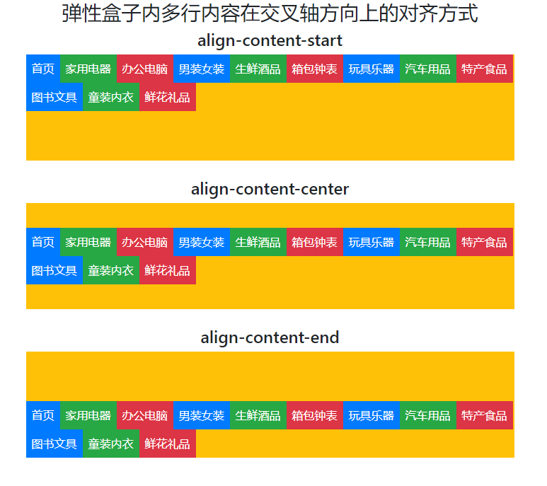
05-2-弹性盒子内多行内容在交叉轴方向上的对齐方式
05-1中各个类处理的对象是各行,而05-2中的类处理的对象是连续的多行。
示例代码如下:
<!DOCTYPE html>
<html>
<head><meta charset="UTF-8"><title>弹性盒子内多行内容在交叉轴方向上的对齐方式</title><meta name="viewport" content="width=device-width,initial-scale=1, shrink-to-fit=no"><link rel="stylesheet" href="bootstrap-4.5.3-dist/css/bootstrap.css"><script src="jquery-3.5.1.slim.js"></script><script src="bootstrap-4.5.3-dist/js/bootstrap.min.js"></script>
</head>
<body class="container"><h3 align="center">弹性盒子内多行内容在交叉轴方向上的对齐方式</h3>
<h4  align="center">align-content-start</h4>
<div class="d-flex align-content-start bg-warning text-white flex-wrap mb-4" style="height: 150px;"><div class="p-2 bg-primary">首页</div><div class="p-2 bg-success">家用电器</div><div class="p-2 bg-danger">办公电脑</div><div class="p-2 bg-primary">男装女装</div><div class="p-2 bg-success">生鲜酒品</div><div class="p-2 bg-danger">箱包钟表</div><div class="p-2 bg-primary">玩具乐器</div><div class="p-2 bg-success">汽车用品</div><div class="p-2 bg-danger">特产食品</div><div class="p-2 bg-primary">图书文具</div><div class="p-2 bg-success">童装内衣</div><div class="p-2 bg-danger">鲜花礼品</div>
</div>
<h4  align="center">align-content-center</h4>
<div class="d-flex align-content-center bg-warning text-white flex-wrap mb-4" style="height: 150px;"><div class="p-2 bg-primary">首页</div><div class="p-2 bg-success">家用电器</div><div class="p-2 bg-danger">办公电脑</div><div class="p-2 bg-primary">男装女装</div><div class="p-2 bg-success">生鲜酒品</div><div class="p-2 bg-danger">箱包钟表</div><div class="p-2 bg-primary">玩具乐器</div><div class="p-2 bg-success">汽车用品</div><div class="p-2 bg-danger">特产食品</div><div class="p-2 bg-primary">图书文具</div><div class="p-2 bg-success">童装内衣</div><div class="p-2 bg-danger">鲜花礼品</div>
</div>
<h4  align="center">align-content-end</h4>
<div class="d-flex align-content-end bg-warning text-white flex-wrap" style="height: 150px;"><div class="p-2 bg-primary">首页</div><div class="p-2 bg-success">家用电器</div><div class="p-2 bg-danger">办公电脑</div><div class="p-2 bg-primary">男装女装</div><div class="p-2 bg-success">生鲜酒品</div><div class="p-2 bg-danger">箱包钟表</div><div class="p-2 bg-primary">玩具乐器</div><div class="p-2 bg-success">汽车用品</div><div class="p-2 bg-danger">特产食品</div><div class="p-2 bg-primary">图书文具</div><div class="p-2 bg-success">童装内衣</div><div class="p-2 bg-danger">鲜花礼品</div>
</div>
</body
</html>
运行效果如下图所示:
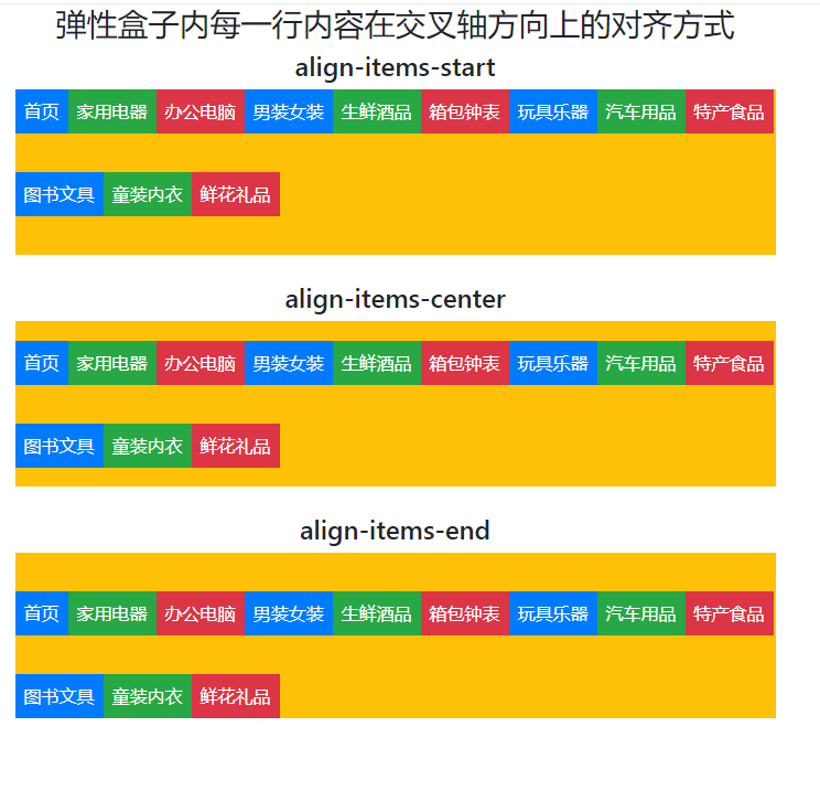
我们把这个示例中的类换成5-1中的各个类,即以每行为处理单位的类,代码如下:
我们把这个示例中的类换成5-1中的各个类,即以每行为处理单位的类,代码如下:
我们把这个示例中的类换成5-1中的各个类,即以每行为处理单位的类,代码如下:
<!DOCTYPE html>
<html>
<head><meta charset="UTF-8"><title>弹性盒子内每一行内容在交叉轴方向上的对齐方式</title><meta name="viewport" content="width=device-width,initial-scale=1, shrink-to-fit=no"><link rel="stylesheet" href="bootstrap-4.5.3-dist/css/bootstrap.css"><script src="jquery-3.5.1.slim.js"></script><script src="bootstrap-4.5.3-dist/js/bootstrap.min.js"></script>
</head><body class="container"><h3 align="center">弹性盒子内每一行内容在交叉轴方向上的对齐方式</h3>
<h4  align="center">align-items-start</h4>
<div class="d-flex align-items-start bg-warning text-white flex-wrap mb-4" style="height: 150px;"><div class="p-2 bg-primary">首页</div><div class="p-2 bg-success">家用电器</div><div class="p-2 bg-danger">办公电脑</div><div class="p-2 bg-primary">男装女装</div><div class="p-2 bg-success">生鲜酒品</div><div class="p-2 bg-danger">箱包钟表</div><div class="p-2 bg-primary">玩具乐器</div><div class="p-2 bg-success">汽车用品</div><div class="p-2 bg-danger">特产食品</div><div class="p-2 bg-primary">图书文具</div><div class="p-2 bg-success">童装内衣</div><div class="p-2 bg-danger">鲜花礼品</div>
</div>
<h4  align="center">align-items-center</h4>
<div class="d-flex align-items-center bg-warning text-white flex-wrap mb-4" style="height: 150px;"><div class="p-2 bg-primary">首页</div><div class="p-2 bg-success">家用电器</div><div class="p-2 bg-danger">办公电脑</div><div class="p-2 bg-primary">男装女装</div><div class="p-2 bg-success">生鲜酒品</div><div class="p-2 bg-danger">箱包钟表</div><div class="p-2 bg-primary">玩具乐器</div><div class="p-2 bg-success">汽车用品</div><div class="p-2 bg-danger">特产食品</div><div class="p-2 bg-primary">图书文具</div><div class="p-2 bg-success">童装内衣</div><div class="p-2 bg-danger">鲜花礼品</div>
</div>
<h4  align="center">align-items-end</h4>
<div class="d-flex align-items-end bg-warning text-white flex-wrap" style="height: 150px;"><div class="p-2 bg-primary">首页</div><div class="p-2 bg-success">家用电器</div><div class="p-2 bg-danger">办公电脑</div><div class="p-2 bg-primary">男装女装</div><div class="p-2 bg-success">生鲜酒品</div><div class="p-2 bg-danger">箱包钟表</div><div class="p-2 bg-primary">玩具乐器</div><div class="p-2 bg-success">汽车用品</div><div class="p-2 bg-danger">特产食品</div><div class="p-2 bg-primary">图书文具</div><div class="p-2 bg-success">童装内衣</div><div class="p-2 bg-danger">鲜花礼品</div>
</div>
</body
</html>
运行效果如下:
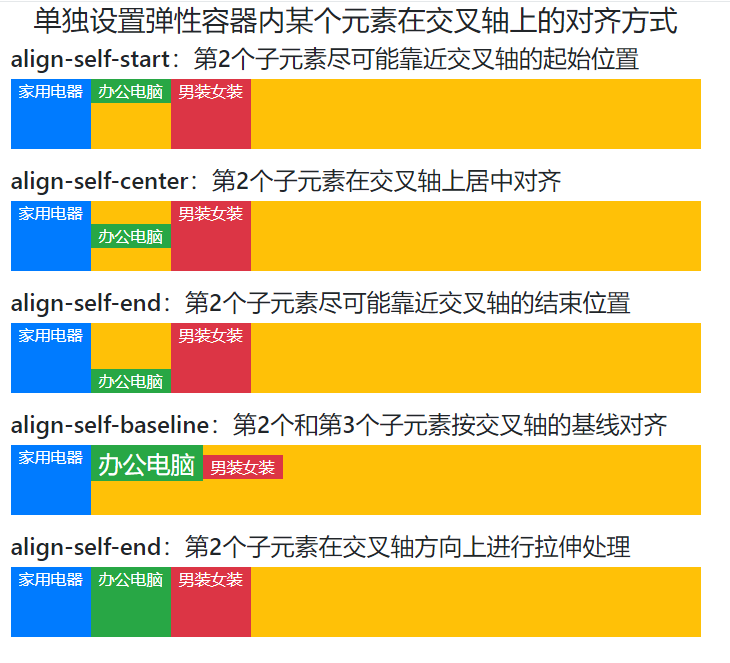
06-单独设置弹性容器内某个元素在交叉轴上的对齐方式
在第05点中,设置的是整个容器内所有元素在交叉上的对齐方式。
可以利用下面的类实现设置弹性容器内某个元素在交叉上的对齐方式。
align-self-start
align-self-center
align-self-end
align-self-baseline
align-self-stretch
要想使用好上面这几个自动对齐的类,必须要理解什么是交叉轴。交叉轴的概念请参考我的另一篇博文:https://blog.csdn.net/wenhao_ir/article/details/133357422
示例代码如下:
<!DOCTYPE html>
<html>
<head><meta charset="UTF-8"><title>单独设置弹性容器内某个元素在交叉轴上的对齐方式</title><meta name="viewport" content="width=device-width,initial-scale=1, shrink-to-fit=no"><link rel="stylesheet" href="bootstrap-4.5.3-dist/css/bootstrap.css"><script src="jquery-3.5.1.slim.js"></script><script src="bootstrap-4.5.3-dist/js/bootstrap.min.js"></script>
</head>
<style>.box{width: 100%;   /*设置宽度*/height: 70px;   /*设置高度*/}
</style>
<body class="container">
<h3 align="center">单独设置弹性容器内某个元素在交叉轴上的对齐方式</h3><h4>align-self-start:第2个子元素尽可能靠近交叉轴的起始位置</h4>
<div class="d-flex bg-warning text-white mb-3 box"><div class="px-2 bg-primary">家用电器</div><div class="px-2 bg-success align-self-start">办公电脑</div><div class="px-2 bg-danger">男装女装</div>
</div><h4>align-self-center:第2个子元素在交叉轴上居中对齐</h4>
<div class="d-flex bg-warning text-white mb-3 box"><div class="px-2 bg-primary">家用电器</div><div class="px-2 bg-success align-self-center">办公电脑</div><div class="px-2 bg-danger">男装女装</div>
</div><h4>align-self-end:第2个子元素尽可能靠近交叉轴的结束位置</h4>
<div class="d-flex bg-warning text-white mb-3 box"><div class="px-2 bg-primary">家用电器</div><div class="px-2 bg-success align-self-end">办公电脑</div><div class="px-2 bg-danger">男装女装</div>
</div><h4>align-self-baseline:第2个和第3个子元素按交叉轴的基线对齐</h4>
<div class="d-flex bg-warning text-white mb-3 box"><div class="px-2 bg-primary">家用电器</div><div class="px-2 bg-success align-self-baseline" style="font-size: x-large;">办公电脑</div><div class="px-2 bg-danger align-self-baseline">男装女装</div>
</div><h4>align-self-end:第2个子元素在交叉轴方向上进行拉伸处理</h4>
<div class="d-flex bg-warning text-white mb-3 box"><div class="px-2 bg-primary">家用电器</div><div class="px-2 bg-success align-self-stretch">办公电脑</div><div class="px-2 bg-danger">男装女装</div>
</div>
</body>
</html>
运行效果如下图所示:
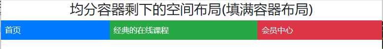
07-均分容器剩下的空间布局(填满容器布局)
可以使用类flex-fill实现均分容器剩下的空间布局(填满容器布局)
示例代码如下:
<!DOCTYPE html>
<html>
<head><meta charset="UTF-8"><title>均分容器剩下的空间布局(填满容器布局)</title><meta name="viewport" content="width=device-width,initial-scale=1, shrink-to-fit=no"><link rel="stylesheet" href="bootstrap-4.5.3-dist/css/bootstrap.css"><script src="jquery-3.5.1.slim.js"></script><script src="bootstrap-4.5.3-dist/js/bootstrap.min.js"></script>
</head>
<body>
<h3 align="center">均分容器剩下的空间布局(填满容器布局)</h3>
<div class="d-flex bg-warning text-white"><div class="flex-fill p-2 bg-primary ">首页</div><div class="flex-fill p-2 bg-success">经典的在线课程</div><div class="flex-fill p-2 bg-danger">会员中心</div>
</div>
</body>
</html>
运行效果如下图所示:
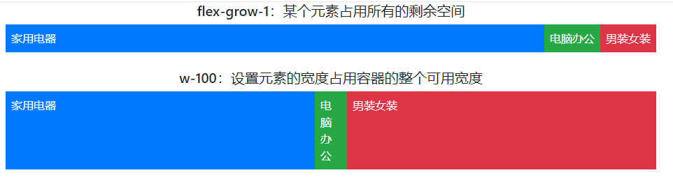
08-设置某个元素尽可能多的占用剩余空间
可以利用类flex-grow-1与类w-100实现设置某个元素尽可能多的占用剩余空间。
示例代码如下:
<!DOCTYPE html>
<html>
<head><meta charset="UTF-8"><title>某个元素尽可能多的占用剩余空间</title><meta name="viewport" content="width=device-width,initial-scale=1, shrink-to-fit=no"><link rel="stylesheet" href="bootstrap-4.5.3-dist/css/bootstrap.css"><script src="jquery-3.5.1.slim.js"></script><script src="bootstrap-4.5.3-dist/js/bootstrap.min.js"></script>
</head>
<body class="container">
<h5 align="center">flex-grow-1:某个元素占用所有的剩余空间</h5>
<div class="d-flex bg-warning text-white mb-4"><div class="p-2 flex-grow-1 bg-primary">家用电器</div><div class="p-2 bg-success">电脑办公</div><div class="p-2 bg-danger">男装女装</div>
</div>
<h5 align="center">w-100:设置元素的宽度占用容器的整个可用宽度</h5>
<div class="d-flex bg-warning text-white"><div class="p-2 w-100 bg-primary">家用电器</div><div class="p-2 bg-success">电脑办公</div><div class="p-2 w-100 bg-danger">男装女装</div>
</div>
</body>
</html>
运行效果如下图所示:
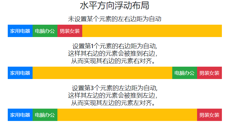
09-水平方向上的浮动布局(左对齐,右对齐)
可以利用类mr-auto和类ml-auto分别实现容器内元素的左对齐和右对齐。
类mr-auto介绍如下:
在Bootstrap中,mr-auto是一个类(class),用于调整水平对齐方式。具体地说,mr-auto类被应用于一个元素(通常是一个元素的CSS类),以将该元素的右边距(margin-right)设置为自动(auto),从而使它右边的元素在其容器内水平右对齐。
这通常用于在Bootstrap的网格系统中,将某个元素右边的元素推送到其容器的右侧,以实现水平对齐效果。
类ml-auto的介绍:略。
示例代码如下:
<!DOCTYPE html>
<html>
<head><meta charset="UTF-8"><title>水平方向浮动布局</title><meta name="viewport" content="width=device-width,initial-scale=1, shrink-to-fit=no"><link rel="stylesheet" href="bootstrap-4.5.3-dist/css/bootstrap.css"><script src="jquery-3.5.1.slim.js"></script><script src="bootstrap-4.5.3-dist/js/bootstrap.min.js"></script>
</head>
<body class="container">
<h3 class="mb-3" align="center">水平方向浮动布局</h3><h5 align="center">未设置某个元素的左右边距为自动</h5>
<div class="d-flex bg-warning text-white mb-3"><div class="p-2 bg-primary">家用电器</div><div class="p-2 bg-success">电脑办公</div><div class="p-2 bg-danger">男装女装</div>
</div><h5 align="center">设置第1个元素的右边距为自动,<br/>这样其右边的元素会被推到右边,<br/>从而实现其右边的元素右对齐。</h5>
<div class="d-flex bg-warning text-white mb-3"><div class="mr-auto p-2 bg-primary">家用电器</div><div class="p-2 bg-success">电脑办公</div><div class="p-2 bg-danger">男装女装</div>
</div><h5 align="center">设置第3个元素的左边距为自动,<br/>这样其左边的元素会被推到左边,<br/>从而实现其左边的元素左对齐。</h5>
<div class="d-flex bg-warning text-white mb-3"><div class="p-2 bg-primary">家用电器</div><div class="p-2 bg-success">电脑办公</div><div class="ml-auto p-2 bg-danger">男装女装</div>
</div>
</body>
</html>
运行效果如下:
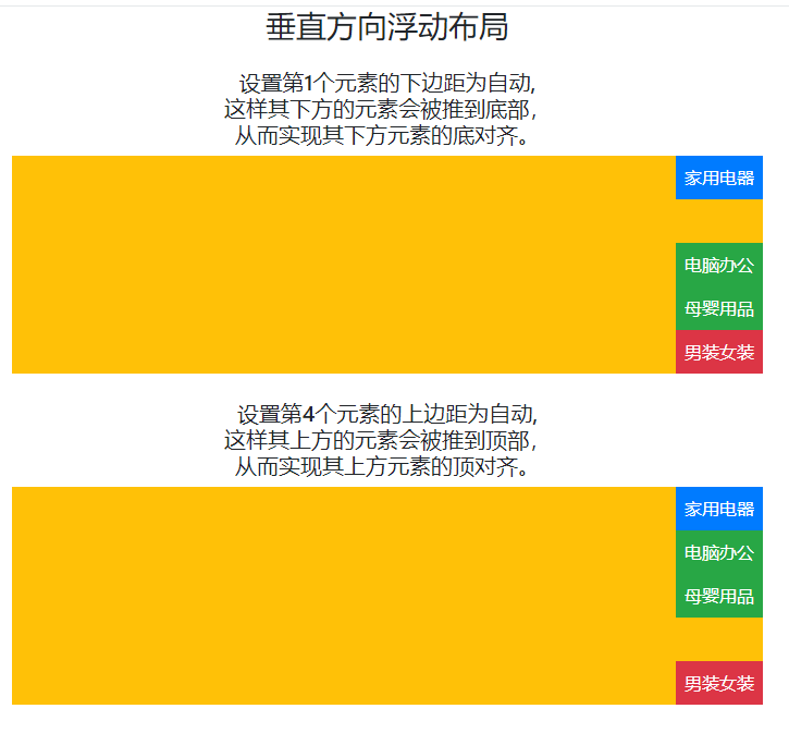
10-垂直方向上的浮动布局(顶部对齐和底部对齐)
可以利用类mb-auto和mt-auto实现别的元素的底部对齐和顶部对齐,mb为margin-bottom的缩写,mt为margin-top的缩定。
理解了第9个中的mr-atuo,其实也就理解这两个了,这里就不再赘述。
代码如下:
<!DOCTYPE html>
<html>
<head><meta charset="UTF-8"><title>垂直方向浮动布局</title><meta name="viewport" content="width=device-width,initial-scale=1, shrink-to-fit=no"><link rel="stylesheet" href="bootstrap-4.5.3-dist/css/bootstrap.css"><script src="jquery-3.5.1.slim.js"></script><script src="bootstrap-4.5.3-dist/js/bootstrap.min.js"></script>
</head>
<body class="container">
<h3  class="mb-4" align="center">垂直方向浮动布局</h3><h5 align="center">设置第1个元素的下边距为自动,<br/>这样其下方的元素会被推到底部,<br/>从而实现其下方元素的底对齐。</h5>
<div class="d-flex align-items-end flex-column bg-warning text-white mb-4" style="height: 200px;"><div class="mb-auto p-2 bg-primary">家用电器</div><div class="p-2 bg-success">电脑办公</div><div class="p-2 bg-success">母婴用品</div><div class="p-2 bg-danger">男装女装</div>
</div><h5 align="center">设置第4个元素的上边距为自动,<br/>这样其上方的元素会被推到顶部,<br/>从而实现其上方元素的顶对齐。</h5>
<div class="d-flex align-items-end flex-column bg-warning text-white" style="height: 200px;"><div class="p-2 bg-primary">家用电器</div><div class="p-2 bg-success">电脑办公</div><div class="p-2 bg-success">母婴用品</div><div class="mt-auto p-2 bg-danger">男装女装</div>
</div>
</body>
</html>
运行效果如下图所示:
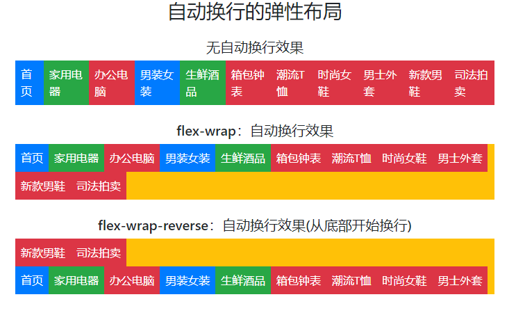
11-自动换行
可以利用类flex-wrap和类flex-wrap-reverse实现自动换行。
对这两个类介绍如下:
Bootstrap的类 flex-wrap 是用于控制 Flexbox 布局中项目如何在容器中换行的类。Flexbox是一种弹性布局模型,允许容器中的项目在不同方向上自动调整它们的位置以适应可用空间。flex-wrap 类有三个可能的值:
-
flex-nowrap(默认值):项目不会换行,它们会尽可能地挤在一行内,即使超出了容器的边界。 -
flex-wrap:项目会根据需要换行,如果容器的宽度不足以容纳所有项目,那么一部分项目会自动换行到下一行。 -
flex-wrap-reverse:与flex-wrap类似,但是项目会从容器的底部开始向上换行。
这些类通常与 Bootstrap 的网格系统一起使用,以控制列在不同屏幕尺寸下的布局方式。例如,你可以使用 flex-nowrap 类来确保在较小的屏幕上列不会换行,而在较大的屏幕上可以使用 flex-wrap 类来允许列自动换行以适应更大的屏幕宽度。
示例代码如下:
<!DOCTYPE html>
<html>
<head><meta charset="UTF-8"><title>自动换行的弹性布局</title><meta name="viewport" content="width=device-width,initial-scale=1, shrink-to-fit=no"><link rel="stylesheet" href="bootstrap-4.5.3-dist/css/bootstrap.css"><script src="jquery-3.5.1.slim.js"></script><script src="bootstrap-4.5.3-dist/js/bootstrap.min.js"></script>
</head>
<body class="container">
<h3 class="mb-4" align="center">自动换行的弹性布局</h3><h5 align="center">无自动换行效果</h5>
<div class="d-flex bg-warning text-white mb-4" ><div class="p-2 bg-primary">首页</div><div class="p-2 bg-success">家用电器</div><div class="p-2 bg-danger">办公电脑</div><div class="p-2 bg-primary">男装女装</div><div class="p-2 bg-success">生鲜酒品</div><div class="p-2 bg-danger">箱包钟表</div><div class="p-2 bg-danger">潮流T恤</div><div class="p-2 bg-danger">时尚女鞋</div><div class="p-2 bg-danger">男士外套</div><div class="p-2 bg-danger">新款男鞋</div><div class="p-2 bg-danger">司法拍卖</div>
</div><h5 align="center">flex-wrap:自动换行效果</h5>
<div class="d-flex bg-warning text-white mb-4 flex-wrap " ><div class="p-2 bg-primary">首页</div><div class="p-2 bg-success">家用电器</div><div class="p-2 bg-danger">办公电脑</div><div class="p-2 bg-primary">男装女装</div><div class="p-2 bg-success">生鲜酒品</div><div class="p-2 bg-danger">箱包钟表</div><div class="p-2 bg-danger">潮流T恤</div><div class="p-2 bg-danger">时尚女鞋</div><div class="p-2 bg-danger">男士外套</div><div class="p-2 bg-danger">新款男鞋</div><div class="p-2 bg-danger">司法拍卖</div>
</div><h5 align="center">flex-wrap-reverse:自动换行效果(从底部开始换行)</h5>
<div class="d-flex bg-warning text-white mb-4 flex-wrap-reverse"><div class="p-2 bg-primary">首页</div><div class="p-2 bg-success">家用电器</div><div class="p-2 bg-danger">办公电脑</div><div class="p-2 bg-primary">男装女装</div><div class="p-2 bg-success">生鲜酒品</div><div class="p-2 bg-danger">箱包钟表</div><div class="p-2 bg-danger">潮流T恤</div><div class="p-2 bg-danger">时尚女鞋</div><div class="p-2 bg-danger">男士外套</div><div class="p-2 bg-danger">新款男鞋</div><div class="p-2 bg-danger">司法拍卖</div>
</div>
</body>
</html>
运行效果如下图所示:
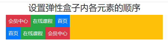
12-设置弹性盒子内各元素的顺序
可以利用类 order-x实现弹性盒子内各元素的顺序设置。
示例代码如下:
<!DOCTYPE html>
<html>
<head><meta charset="UTF-8"><title>设置弹性盒子内各元素的顺序</title><meta name="viewport" content="width=device-width,initial-scale=1, shrink-to-fit=no"><link rel="stylesheet" href="bootstrap-4.5.3-dist/css/bootstrap.css"><script src="jquery-3.5.1.slim.js"></script><script src="bootstrap-4.5.3-dist/js/bootstrap.min.js"></script>
</head>
<body class="container">
<h3 align="center">设置弹性盒子内各元素的顺序</h3>
<div class="d-flex bg-warning text-white"><div class="order-3 p-2 bg-primary">首页</div><div class="order-2 p-2 bg-success">在线课程</div><div class="order-1 p-2 bg-danger">会员中心</div>
</div>
<div class="d-flex bg-warning text-white"><div class="order-1 p-2 bg-primary">首页</div><div class="order-2 p-2 bg-success">在线课程</div><div class="order-3 p-2 bg-danger">会员中心</div>
</div>
</body>
</html>
运行效果如下图所示:

