QCustomPlot绘图基础概述
- 一、概述
- 二、改变外观
- 1. Graph 类型
- 2. Axis 坐标轴
- 3. 网格
- 三、案例
- 1. 简单布局两个图
- 2. 绘图与多个轴和更先进的样式
- 3. 绘制日期和时间数据
- 四、其他Graph:曲线,条形图,统计框图,…
一、概述
本教程使用 customPlot 作为指向 QCustomPlot 实例的指针。如果我们在QtCreator中提升了一个控件,那么我们可能会通过ui->customPlot(或我们给控件的任何名称)来访问相应的控件。
我们可以通过customPlot->addGraph()在绘图中创建一个新Graph。然后你给Graph分配一些数据点,例如通过customPlot->graph(0)->setData(…),例如以两个QVector的形式表示x和y(键和值)。
QCustomPlot使用术语键和值而不是x和y的原因是为了更灵活地分配哪个轴具有什么角色。因此,如果你将左轴定义为“关键轴”,将下轴定义为“价值轴”,你就可以在图表的左侧绘制出一个直立的图表。
默认情况下,QCustomPlot控件有四个轴:类型为QCPAxis的customPlot->xAxis、yAxis、xAxis2和yAxis2,分别对应于下、左、上和右轴。它们的范围定义了绘图的哪一部分是当前可见的:customPlot->xAxis->setRange(- 1,1)。
要对屏幕上显示的绘图进行任何类型的更改,请调用customPlot->replot(),相当于手动刷新,和QPainter里面的 refresh() 一样。请注意,当控件调整大小和触发内置用户交互时,将自动进行重新绘制。例如,这样的用户交互是用鼠标拖动轴范围和用鼠标滚轮缩放。
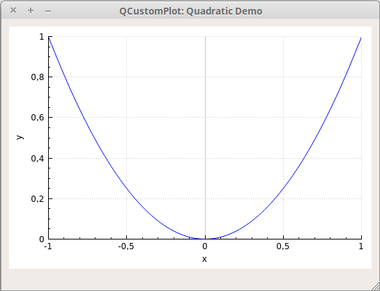
// 生成数据:
QVector<double> x(101), y(101); // initialize with entries 0..100
for (int i=0; i<101; ++i)
{x[i] = i/50.0 - 1; // x goes from -1 to 1y[i] = x[i]*x[i]; // let's plot a quadratic function
}// create graph and assign data to it:
customPlot->addGraph();
customPlot->graph(0)->setData(x, y);// give the axes some labels:
customPlot->xAxis->setLabel("x");
customPlot->yAxis->setLabel("y");// set axes ranges, so we see all data:
customPlot->xAxis->setRange(-1, 1);
customPlot->yAxis->setRange(0, 1);
customPlot->replot();
输出应该如下所示。
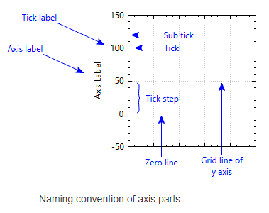
标记刻度和标记是由轴当前使用的轴自动选择的。这个轴这是QCPAxisTicker类型的实例,可以通过xAxis->ticker()等方式访问。
我们可以通过 xAxis->ticker()->setTickCount(6) 来调整自动尝试创建的大致刻度数。默认的轴刻度非常适合简单的数字显示,但是也有专门的类,例如时间刻度、日历日期刻度、类别刻度、圆周率(或其他符号单位)和对数轴。有关详细信息,请参阅QCPAxisTicker文档。
轴的刻度标签(数字)永远不会超出控件边框,即使它们变宽了,因为这个控件会自动去计算轴刻度,而且这是在默认情况下打开。如果刻度标签和轴标签需要更多的空间,它会使轴矩形收缩。如果我们不希望自动确定边距,请通过调用customPlot->axisRect()->setAutoMargins(QCP::msNone)来禁用该行为。我们也可以通过customPlot->axisRect()-> setmargin(…)手动调整边距。
二、改变外观
1. Graph 类型
Graph的外观由许多因素决定,所有这些因素都可以修改。以下是最重要的几点:
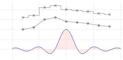
- 线条样式:调用graph->setLineStyle(…)。对于所有可能的线条样式,请参阅QCPGraph::LineStyle文档或介绍页面上的线条样式演示截图。
| 枚举器类型 | 含义 |
|---|---|
| lsNone | 数据点不与任何直线相连(例如,数据仅根据散点样式用符号表示) |
| lsLine | 数据点由一条直线连接 |
| lsStepLeft | 线绘制为步长,其中步长高度是左侧数据点的值 |
| lsStepRight | 线被绘制为步,其中步高是正确数据点的值 |
| lsStepCenter | 当步长位于两个数据点之间时,线被绘制为步长 |
| lsImpulse | 每个数据点用一条平行于值轴的线表示,这条线从数据点延伸到零值线 |
- 线条 Pen:QPainter框架提供的所有笔都是可用的,例如实线、虚线、虚线、不同宽度、颜色、透明度等。通过graph->setPen(…)设置配置的笔刷的。
- 散点符号:调用graph->setScatterStyle(…)来改变散点符号的外观。对于所有可能的分散样式,请参阅QCPScatterStyle文档或介绍页面上显示的分散样式演示截图。如果我们不希望在数据点上显示任何散点符号,请将图的散点样式设置为QCPScatterStyle::ssNone。
| 枚举类型 | 外观 | 含义 |
|---|---|---|
| ssNone | 没有绘制散点符号(例如在QCPGraph中,数据仅用线条表示) | |
| ssDot | 单个像素(如果你想要一个具有一定半径的圆形,可以使用ssDisc或scircle) | |
| ssCross |  | 一个十字架 |
| ssPlus |  | 一个+ |
| ssCircle |  | 一个圆 |
| ssDisc |  | 一个用钢笔的颜色填充的圆圈(不像scircle那样用画笔填充) |
| ssSquare |  | 一个正方形 |
| ssDiamond |  | 一颗钻石 |
| ssStar |  | 有八臂的星形,即十字和正号的组合 |
| ssTriangle |  | 立在基线上的等边三角形 |
| ssTriangleInverted |  | 一个等边三角形,立在角上 |
| ssCrossSquare |  | 有一个十字的正方形 |
| ssPlusSquare |  | 里面有加号的正方形 |
| ssCrossCircle |  | 一个里面有十字架的圆 |
| ssPlusCircle |  | 里面有加号的圆圈 |
| ssPeace |  | 一个圆,有一条垂直线和两条向下的对角线 |
| ssPixmap | 由setPixmap指定的自定义像素图,以数据点坐标为中心 | |
| ssCustom | 每个散射执行自定义绘制操作(如QPainterPath,参见setCustomPath) |
- Graph下或两个Graph之间的填充:QPainter框架提供的所有笔刷都可以用于Graph填充:实体,各种图案,纹理,渐变,颜色,透明度等。通过graph->setBrush(…)设置已配置的画笔。
2. Axis 坐标轴
我们可以可以通过更改绘制轴的笔和标签使用的字体来修改轴的外观。看一下QCPAxis的文档应该是不言自明的。这里有一个最重要的属性的快速总结:
- setBasePen,
- setTickPen,
- setTickLength,
- setSubTickLength,
- setSubTickPen,
- setTickLabelFont,
- setLabelFont,
- setTickLabelPadding,
- setLabelPadding。
你可以用setRangeReversed反转一个轴(例如,让值从左到右减少而不是增加)。
如果你想在轴端装饰(如箭头),使用setLowerEnding或setUpperEnding。
3. 网格
我们可以通过访问轴的相应QCPGrid实例来修改网格。
例如,通过访问customPlot->yAxis->grid()来更改绑定到左轴的水平网格线的外观。网格线的外观基本上是绘制它们的QPen,可以通过yAxis->grid()->setPen()设置。点0处的网格线可以用不同的笔绘制,它可以配置setZeroLinePen。如果我们不希望用特殊的笔绘制零线,只需将其设置为Qt::NoPen,那么标记0处的网格线将使用普通网格笔绘制。
子网格线默认设置为不可见。它们可以通过grid()->setSubGridVisible(true)激活。
三、案例
1. 简单布局两个图
这里有一个例子,它创建了衰减余弦函数及其指数包络的图像:
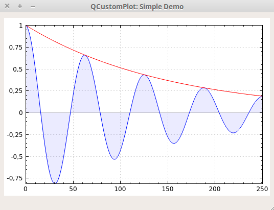
// 添加两个图并设置外观:
customPlot->addGraph();
customPlot->graph(0)->setPen(QPen(Qt::blue)); // 第一张图的线条颜色为蓝色
customPlot->graph(0)->setBrush(QBrush(QColor(0, 0, 255, 20))); //第一个Graph将被半透明的蓝色填充
customPlot->addGraph();
customPlot->graph(1)->setPen(QPen(Qt::red)); // 第二张图的线条颜色为红色// 生成一些数据点(第一张图为y0,第二张图为y1):
QVector<double> x(251), y0(251), y1(251);
for (int i=0; i<251; ++i)
{x[i] = i;y0[i] = qExp(-i/150.0)*qCos(i/10.0); // 指数衰减余弦y1[i] = qExp(-i/150.0);              // 指数函数
}// configure right and top axis to show ticks but no labels:
// (see QCPAxisRect::setupFullAxesBox for a quicker method to do this)
customPlot->xAxis2->setVisible(true);
customPlot->xAxis2->setTickLabels(false);
customPlot->yAxis2->setVisible(true);
customPlot->yAxis2->setTickLabels(false);// make left and bottom axes always transfer their ranges to right and top axes:
connect(customPlot->xAxis, SIGNAL(rangeChanged(QCPRange)), customPlot->xAxis2, SLOT(setRange(QCPRange)));
connect(customPlot->yAxis, SIGNAL(rangeChanged(QCPRange)), customPlot->yAxis2, SLOT(setRange(QCPRange)));// pass data points to graphs:
customPlot->graph(0)->setData(x, y0);
customPlot->graph(1)->setData(x, y1);// let the ranges scale themselves so graph 0 fits perfectly in the visible area:
customPlot->graph(0)->rescaleAxes();// same thing for graph 1, but only enlarge ranges (in case graph 1 is smaller than graph 0):
customPlot->graph(1)->rescaleAxes(true);// Note: we could have also just called customPlot->rescaleAxes(); instead
// Allow user to drag axis ranges with mouse, zoom with mouse wheel and select graphs by clicking:
customPlot->setInteractions(QCP::iRangeDrag | QCP::iRangeZoom | QCP::iSelectPlottables);
正如你所看到的,对 Graph 应用填充就像设置一个不是 Qt::NoBrush的笔刷一样简单。填充将从Graph(这里是Graph0)到平行于键(这里是x)轴的零值线。如果我们想在这个图和另一个图之间填充通道,我们将额外调用graph->setChannelFillGraph(otherGraph)。要删除通道填充,只需将0作为otherGraph 传递即可,填充将像以前一样一直到达零值线。要完全移除填充,调用graph->setBrush(Qt::NoBrush)。
2. 绘图与多个轴和更先进的样式
现在,让我们来看一个更复杂的示例,创建演示截图,其中包含四个轴上的五个Graph,纹理填充,垂直误差条,图例,作为小数分隔符的点等。
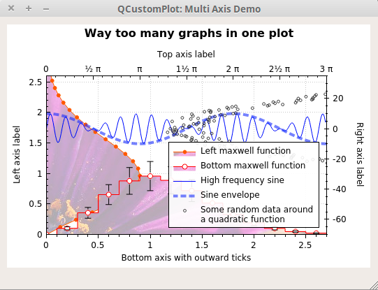
customPlot->setLocale(QLocale(QLocale::English, QLocale::UnitedKingdom)); // period as decimal separator and comma as thousand separator
customPlot->legend->setVisible(true);
QFont legendFont = font();  // start out with MainWindow's font..
legendFont.setPointSize(9); // and make a bit smaller for legend
customPlot->legend->setFont(legendFont);
customPlot->legend->setBrush(QBrush(QColor(255,255,255,230)));
// by default, the legend is in the inset layout of the main axis rect. So this is how we access it to change legend placement:
customPlot->axisRect()->insetLayout()->setInsetAlignment(0, Qt::AlignBottom|Qt::AlignRight);// setup for graph 0: key axis left, value axis bottom
// will contain left maxwell-like function
customPlot->addGraph(customPlot->yAxis, customPlot->xAxis);
customPlot->graph(0)->setPen(QPen(QColor(255, 100, 0)));
customPlot->graph(0)->setBrush(QBrush(QPixmap("./balboa.jpg"))); // fill with texture of specified image
customPlot->graph(0)->setLineStyle(QCPGraph::lsLine);
customPlot->graph(0)->setScatterStyle(QCPScatterStyle(QCPScatterStyle::ssDisc, 5));
customPlot->graph(0)->setName("Left maxwell function");// setup for graph 1: key axis bottom, value axis left (those are the default axes)
// will contain bottom maxwell-like function with error bars
customPlot->addGraph();
customPlot->graph(1)->setPen(QPen(Qt::red));
customPlot->graph(1)->setBrush(QBrush(QPixmap("./balboa.jpg"))); // same fill as we used for graph 0
customPlot->graph(1)->setLineStyle(QCPGraph::lsStepCenter);
customPlot->graph(1)->setScatterStyle(QCPScatterStyle(QCPScatterStyle::ssCircle, Qt::red, Qt::white, 7));
customPlot->graph(1)->setName("Bottom maxwell function");
QCPErrorBars *errorBars = new QCPErrorBars(customPlot->xAxis, customPlot->yAxis);
errorBars->removeFromLegend();
errorBars->setDataPlottable(customPlot->graph(1));// setup for graph 2: key axis top, value axis right
// will contain high frequency sine with low frequency beating:
customPlot->addGraph(customPlot->xAxis2, customPlot->yAxis2);
customPlot->graph(2)->setPen(QPen(Qt::blue));
customPlot->graph(2)->setName("High frequency sine");// setup for graph 3: same axes as graph 2
// will contain low frequency beating envelope of graph 2
customPlot->addGraph(customPlot->xAxis2, customPlot->yAxis2);
QPen blueDotPen;
blueDotPen.setColor(QColor(30, 40, 255, 150));
blueDotPen.setStyle(Qt::DotLine);
blueDotPen.setWidthF(4);
customPlot->graph(3)->setPen(blueDotPen);
customPlot->graph(3)->setName("Sine envelope");// setup for graph 4: key axis right, value axis top
// will contain parabolically distributed data points with some random perturbance
customPlot->addGraph(customPlot->yAxis2, customPlot->xAxis2);
customPlot->graph(4)->setPen(QColor(50, 50, 50, 255));
customPlot->graph(4)->setLineStyle(QCPGraph::lsNone);
customPlot->graph(4)->setScatterStyle(QCPScatterStyle(QCPScatterStyle::ssCircle, 4));
customPlot->graph(4)->setName("Some random data around\na quadratic function");// generate data, just playing with numbers, not much to learn here:
QVector<double> x0(25), y0(25);
QVector<double> x1(15), y1(15), y1err(15);
QVector<double> x2(250), y2(250);
QVector<double> x3(250), y3(250);
QVector<double> x4(250), y4(250);
for (int i=0; i<25; ++i) // data for graph 0
{x0[i] = 3*i/25.0;y0[i] = qExp(-x0[i]*x0[i]*0.8)*(x0[i]*x0[i]+x0[i]);
}
for (int i=0; i<15; ++i) // data for graph 1
{x1[i] = 3*i/15.0;;y1[i] = qExp(-x1[i]*x1[i])*(x1[i]*x1[i])*2.6;y1err[i] = y1[i]*0.25;
}
for (int i=0; i<250; ++i) // data for graphs 2, 3 and 4
{x2[i] = i/250.0*3*M_PI;x3[i] = x2[i];x4[i] = i/250.0*100-50;y2[i] = qSin(x2[i]*12)*qCos(x2[i])*10;y3[i] = qCos(x3[i])*10;y4[i] = 0.01*x4[i]*x4[i] + 1.5*(rand()/(double)RAND_MAX-0.5) + 1.5*M_PI;
}// pass data points to graphs:
customPlot->graph(0)->setData(x0, y0);
customPlot->graph(1)->setData(x1, y1);
errorBars->setData(y1err);
customPlot->graph(2)->setData(x2, y2);
customPlot->graph(3)->setData(x3, y3);
customPlot->graph(4)->setData(x4, y4);
// activate top and right axes, which are invisible by default:
customPlot->xAxis2->setVisible(true);
customPlot->yAxis2->setVisible(true);
// set ranges appropriate to show data:
customPlot->xAxis->setRange(0, 2.7);
customPlot->yAxis->setRange(0, 2.6);
customPlot->xAxis2->setRange(0, 3.0*M_PI);
customPlot->yAxis2->setRange(-70, 35);
// set pi ticks on top axis:
customPlot->xAxis2->setTicker(QSharedPointer<QCPAxisTickerPi>(new QCPAxisTickerPi));
// add title layout element:
customPlot->plotLayout()->insertRow(0);
customPlot->plotLayout()->addElement(0, 0, new QCPTextElement(customPlot, "Way too many graphs in one plot", QFont("sans", 12, QFont::Bold)));
// set labels:
customPlot->xAxis->setLabel("Bottom axis with outward ticks");
customPlot->yAxis->setLabel("Left axis label");
customPlot->xAxis2->setLabel("Top axis label");
customPlot->yAxis2->setLabel("Right axis label");
// make ticks on bottom axis go outward:
customPlot->xAxis->setTickLength(0, 5);
customPlot->xAxis->setSubTickLength(0, 3);
// make ticks on right axis go inward and outward:
customPlot->yAxis2->setTickLength(3, 3);
customPlot->yAxis2->setSubTickLength(1, 1);
正如我们所看到的,我们可以自由定义哪个轴应该在Graph中扮演哪个角色。例如,索引为0的Graph使用左轴(yAxis)作为其键,底部轴(xAxis)作为其值。因此,Graph相对于左轴是向上的:
为了显示Graph1的错误条,我们创建了一个QCPErrorBars实例,它可以附加到其他绘图表(如QCPGraph)并为它们提供错误条。有关所使用方法的进一步说明,请查看相应的文档。
3. 绘制日期和时间数据
接下来,我们将了解如何绘制日期和/或时间相关数据。它基本上归结为在各自的轴上安装QCPAxisTickerDateTime类型的不同轴刻度。
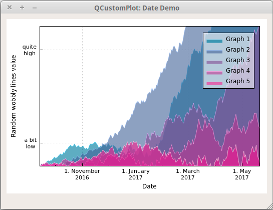
// set locale to english, so we get english month names:
customPlot->setLocale(QLocale(QLocale::English, QLocale::UnitedKingdom));// seconds of current time, we'll use it as starting point in time for data:
double now = QDateTime::currentDateTime().toTime_t();
srand(8); // set the random seed, so we always get the same random data// create multiple graphs:
for (int gi=0; gi<5; ++gi)
{customPlot->addGraph();QColor color(20+200/4.0*gi,70*(1.6-gi/4.0), 150, 150);customPlot->graph()->setLineStyle(QCPGraph::lsLine);customPlot->graph()->setPen(QPen(color.lighter(200)));customPlot->graph()->setBrush(QBrush(color));// generate random walk data:QVector<QCPGraphData> timeData(250);for (int i=0; i<250; ++i){timeData[i].key = now + 24*3600*i;if (i == 0)timeData[i].value = (i/50.0+1)*(rand()/(double)RAND_MAX-0.5);elsetimeData[i].value = qFabs(timeData[i-1].value)*(1+0.02/4.0*(4-gi)) + (i/50.0+1)*(rand()/(double)RAND_MAX-0.5);}customPlot->graph()->data()->set(timeData);
}// configure bottom axis to show date instead of number:
QSharedPointer<QCPAxisTickerDateTime> dateTicker(new QCPAxisTickerDateTime);
dateTicker->setDateTimeFormat("d. MMMM\nyyyy");
customPlot->xAxis->setTicker(dateTicker);// configure left axis text labels:
QSharedPointer<QCPAxisTickerText> textTicker(new QCPAxisTickerText);
textTicker->addTick(10, "a bit\nlow");
textTicker->addTick(50, "quite\nhigh");
customPlot->yAxis->setTicker(textTicker);// set a more compact font size for bottom and left axis tick labels:
customPlot->xAxis->setTickLabelFont(QFont(QFont().family(), 8));
customPlot->yAxis->setTickLabelFont(QFont(QFont().family(), 8));// set axis labels:
customPlot->xAxis->setLabel("Date");
customPlot->yAxis->setLabel("Random wobbly lines value");// make top and right axes visible but without ticks and labels:
customPlot->xAxis2->setVisible(true);
customPlot->yAxis2->setVisible(true);
customPlot->xAxis2->setTicks(false);
customPlot->yAxis2->setTicks(false);
customPlot->xAxis2->setTickLabels(false);
customPlot->yAxis2->setTickLabels(false);// set axis ranges to show all data:
customPlot->xAxis->setRange(now, now+24*3600*249);
customPlot->yAxis->setRange(0, 60);// show legend with slightly transparent background brush:
customPlot->legend->setVisible(true);
customPlot->legend->setBrush(QColor(255, 255, 255, 150));
传递给 dateTicker->setDateTimeFormat() 的字符串与传递给 QDateTime::toString 的字符串具有相同的日期格式化选项,请参阅Qt文档。QCustomPlot中的所有日期/时间坐标都被处理为自午夜1以来的秒数。1970年1月,UTC(被称为Unix/Epoch Time)。这也是我们在Qt日期/时间类上调用QDateTime::toTime_t或setTime_t时使用的单元。
对于亚秒级精度,轴计时器与浮点数一起工作。因此,小于1.0的值表示相应的几分之一秒。我们可以使用QCPAxisTickerDateTime::dateTimeToKey和keyToDateTime来转换浮点Unix时间和QDateTime,独立于Qt版本(Qt的QDateTime::toMSecsSinceEpoch仅在Qt 4.7中引入)。
四、其他Graph:曲线,条形图,统计框图,…
到目前为止,我们只看了图表。由于它们是如此主要的用例,QCustomPlot为它们提供了一个专门的接口。我们一直在使用它:QCustomPlot::addGraph, QCustomPlot::graph等。但这并不是故事的全部。QCustomPlot有一个更通用的接口,用于在图中绘制数据的类,称为Plottables。
这个接口是围绕抽象基类QCPAbstractPlottable构建的。所有Plottables都来自这个类,还有我们熟悉的QCPGraph类。QCustomPlot提供了许多其他绘图类:
-
QCPGraph:这是我们一直在使用的可绘图类。将一系列数据点显示为具有不同线条样式、填充和散点的Graph。
-
QCPCurve:类似于QCPGraph,不同之处在于它用于显示参数曲线。与函数图不同,它们可能有循环。
-
QCPBars:一个条形图。取一系列数据点并用条形表示它们。如果绘图中有多个qcpbar绘图,则可以将它们堆叠在一起,如介绍页面上的截图所示。
-
QCPStatisticalBox:统计箱图。取一个五位数汇总(最小值、下四分位数、中位数、上四分位数、最大值),并将其表示为统计框。也可以显示异常值。
-
QCPColorMap:一个2D地图,通过使用颜色渐变来可视化第三个数据维度。类QCPColorScale伴随着这个图表来可视化图表中的数据比例。
-
QCPFinancial:一个图表,可以使用烛台或OHLC条来可视化例如股票价格开盘,高点,低点,收盘信息。
-
QCPErrorBars:这是一个特殊的图表,因为它附加到第二个图表上,以允许在其他图表的数据点上显示错误栏。
与QCPGraph不同的是,其他绘图需要在QCustomPlot之外使用new创建。这意味着没有addCurve或addBars函数,而有addGraph函数。
可绘图表所属的QCustomPlot实例是从可绘图表的构造函数中传递的轴中推断出来的。然后QCustomPlot获得可绘图表的所有权。可以使用QCustomPlot::plottable(int index)访问现有的plottables,并且可以使用QCustomPlot::plottableCount检索图(包括Graph)中的plottables总数。当然我们可以自己设置一个Map去维护这个索引关系的。
下面是一个创建三个柱状图的快速示例:
QCPBars *myBars = new QCPBars(customPlot->xAxis, customPlot->yAxis);
// now we can modify properties of myBars:
myBars->setName("Bars Series 1");
QVector<double> keyData;
QVector<double> valueData;
keyData << 1 << 2 << 3;
valueData << 2 << 4 << 8;
myBars->setData(keyData, valueData);
customPlot->rescaleAxes();
customPlot->replot();
可以在示例项目和其他教程中找到有关其他绘图的更多详细信息。此外,每种可绘图类型在各自类的文档页面上都有详细的描述。
当然,完全有可能编写我们自己的图表,使任何数据看起来完全符合我们的需要。我们应该查看QCPAbstractPlottable文档,了解如何开始创建它的子类。我们还可以查看现有的标绘图,了解它们是如何工作的。
为此,建议首先查看QCPBars或QCPCurve。QCPGraph功能非常丰富,因此可能不太适合作为入门起点。


![[React源码解析] React的设计理念和源码架构 (一)](https://img-blog.csdnimg.cn/75242141fe5646f2a123486823875d6a.png)