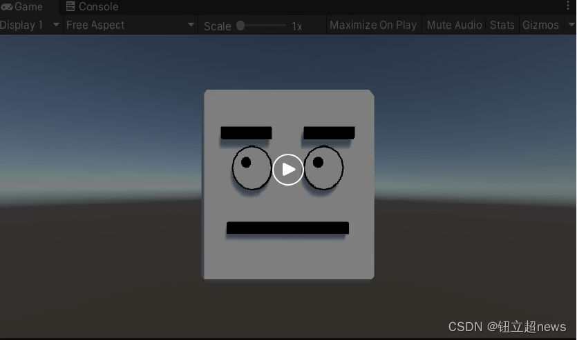
用CSS3实现广告的展示动画特效,不需要用JS哦,大家可以学习下,很多地方都可以用到,还在等什么呢,代码奉上啦!
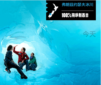
展示图:
DEMO代码:html>
用CSS3实现广告的展示动画特效 - Web前端之家html,body{
margin:0px;
}
.gwd-pagedeck{
position:relative;
}
.gwd-pagedeck >.gwd-page{
position:absolute;
left:0;
top:0;
width: 336px;
height: 280px;
background:#000;
overflow:hidden;
cursor:pointer;
}
.gwd-page-content{
position:absolute;
background-color:transparent;
width: 336px;
height: 280px;
}
.gwd-img01{
position:absolute;
left:0;
top:0;
width: 336px;
height: 280px;
transform:scale3d(1.3,1.3,1.3);
-moz-transform:scale3d(1.3,1.3,1.3);
-webkit-transform:scale3d(1.3,1.3,1.3);
transform-style:preserve-3d;
-moz-transform-style:preserve-3d;
-webkit-transform-style:preserve-3d;
}
.gwd-animation01{
animation:gwd-animation01 8.844s linear 0s 1 normal forwards;
-moz-animation:gwd-animation01 8.844s linear 0s 1 normal forwards;
-webkit-animation:gwd-animation01 8.844s linear 0s 1 normal forwards;
}
.gwd-img02{
position:absolute;
left:0;
top:0;
width: 336px;
height: 280px;
opacity:0;
transform:scale3d(1.3,1.3,1.3);
-moz-transform:scale3d(1.3,1.3,1.3);
-webkit-transform:scale3d(1.3,1.3,1.3);
transform-style:preserve-3d;
-webkit-transform-style:preserve-3d;
-moz-transform-style:preserve-3d;
}
.gwd-animation02{
animation:gwd-animation02 14.6s linear 0s 1 normal forwards;
-moz-animation:gwd-animation02 14.6s linear 0s 1 normal forwards;
-webkit-animation:gwd-animation02 14.6s linear 0s 1 normal forwards;
}
.gwd-img03{
position:absolute;
top:-78px;
left:155px;
opacity:1;
width:165px;
height:66px;
transform-style:preserve-3d;
-webkit-transform-style:preserve-3d;
-moz-transform-style:preserve-3d;
}
.gwd-animation03{
animation:gwd-animation03 .6s linear 0s 1 normal forwards;
-moz-animation:gwd-animation03 .6s linear 0s 1 normal forwards;
-webkit-animation:gwd-animation03 .6s linear 0s 1 normal forwards;
}
.gwd-img04{
position: absolute;
top: -74px;
width: 33px;
height: 49px;
left: 162px;
}
.gwd-animation04{
animation:gwd-animation04 2.2s linear 0s 1 normal forwards;
-moz-animation:gwd-animation04 2.2s linear 0s 1 normal forwards;
-webkit-animation:gwd-animation04 2.2s linear 0s 1 normal forwards;
}
.gwd-img05{
position:absolute;
left:160px;
top:-36px;
width:88px;
height:15px;
transform-style:preserve-3d;
-moz-transform-style:preserve-3d;
-webkit-transform-style:preserve-3d;
transform:translate3d(47px,0px,0px);
-moz-transform:translate3d(47px,0px,0px);
-webkit-transform:translate3d(47px,0px,0px);
}
.gwd-animation05{
animation:gwd-animation05 1.8s linear 0s 1 normal forwards;
-moz-animation:gwd-animation05 1.8s linear 0s 1 normal forwards;
-webkit-animation:gwd-animation05 1.8s linear 0s 1 normal forwards;
}
.gwd-img06{
position: absolute;
height: 1px;
left: 159px;
top: -45px;
transform-style:preserve-3d;
-moz-transform-style:preserve-3d;
-webkit-transform-style:preserve-3d;
transform:translate3d(47px,0px,0px);
-moz-transform:translate3d(47px,0px,0px);
-webkit-transform:translate3d(47px,0px,0px);
}
.gwd-animation06{
animation:gwd-animation06 2.6s linear 0s 1 normal forwards;
-moz-animation:gwd-animation06 2.6s linear 0s 1 normal forwards;
-webkit-animation:gwd-animation06 2.6s linear 0s 1 normal forwards;
}
.gwd-img07{
position:absolute;
top: -62px;
opacity: 1;
left: 207px;
width: 104px;
height: 14px;
}
.gwd-animation07{
animation:gwd-animation07 9.56s linear 0s 1 normal forwards;
-moz-animation:gwd-animation07 9.56s linear 0s 1 normal forwards;
-webkit-animation:gwd-animation07 9.56s linear 0s 1 normal forwards;
}
.gwd-img08{
position: absolute;
left: 119px;
top: 39px;
opacity:0;
width:6px;
height:6px;
transform-style:preserve-3d;
-moz-transform-style:preserve-3d;
-webkit-transform-style:preserve-3d;
transform:translate3d(46px,3px,0px);
-moz-transform:translate3d(46px,3px,0px);
-webkit-transform:translate3d(46px,3px,0px);
}
.gwd-animation08{
animation:gwd-animation08 9.973s linear 0s 1 normal forwards;
-moz-animation:gwd-animation08 9.973s linear 0s 1 normal forwards;
-webkit-animation:gwd-animation08 9.973s linear 0s 1 normal forwards;
}
.gwd-img09{
position: absolute;
left: 138px;
top: 97px;
opacity: 0;
width: 44px;
height: 21px;
transform-style:preserve-3d;
-moz-transform-style:preserve-3d;
-webkit-transform-style:preserve-3d;
transform:translate3d(138px,0,0);
-moz-transform:translate3d(138px,0,0);
-webkit-transform:translate3d(138px,0,0);
}
.gwd-animation09{
animation:gwd-animation09 8.846s linear 0s 1 normal forwards;
-moz-animation:gwd-animation09 8.846s linear 0s 1 normal forwards;
-webkit-animation:gwd-animation09 8.846s linear 0s 1 normal forwards;
}
.gwd-img10{
position:absolute;
width: 218px;
height: 21px;
left: 138px;
top: 124px;
opacity: 0;
ransform-style:preserve-3d;
-moz-transform-style:preserve-3d;
-webkit-transform-style:preserve-3d;
transform:translate3d(-37px,0,0);
-moz-transform:translate3d(-37px,0,0);
-webkit-transform:translate3d(-37px,0,0);
}
.gwd-animation10{
animation:gwd-animation10 8.6s linear 0s 1 normal forwards;
-moz-animation:gwd-animation10 8.6s linear 0s 1 normal forwards;
-webkit-animation:gwd-animation10 8.6s linear 0s 1 normal forwards;
}
.gwd-img11{
position: absolute;
top: 10px;
opacity: 0;
height: 13px;
left: 206px;
width: 26px;
}
.gwd-animation11{
animation: