很久很久没有写博客了,说来也有点惭愧。正好最近整理自己的项目工程目录,看到一些值得分享的控件,准备在之后的几篇博客中准备把它们陆续搬运上来。
这篇博客准备整理一下Android Material Design自带的点击水波纹扩散的效果。话不多说,开始正题。
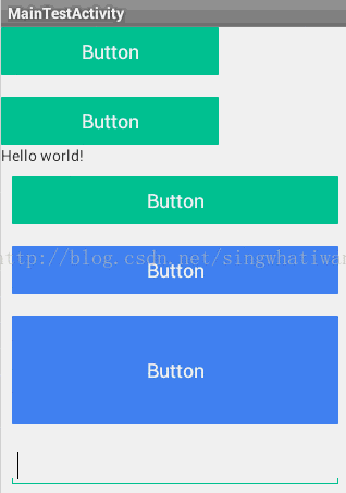
水波纹效果分为两种:有界水波纹和无界水波纹。都通过系统自带的动画文件实现。
有界水波纹:
有界水波纹通过系统自带的动画文件 selectableItemBackground 实现只要将其设置为控件的背景即可。简单写几句代码:
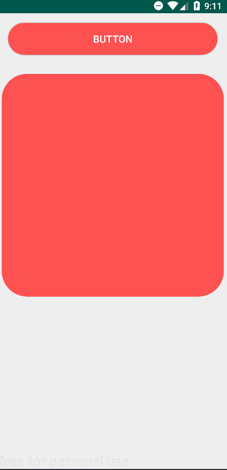
<Buttonandroid:id="@+id/button"android:layout_width="match_parent"android:layout_height="50dp"android:layout_margin="15dp"android:background="?android:attr/selectableItemBackground"android:text="Button" />效果如下:

无界水波纹:
无界水波纹通过动画文件 selectableItemBackgroundBorderless 实现,用法和有界水波纹一样,修改一下上面的代码:
<Buttonandroid:id="@+id/button"android:layout_width="match_parent"android:layout_height="50dp"android:layout_margin="15dp"android:background="?android:attr/selectableItemBackgroundBorderless"android:text="Button" />效果:

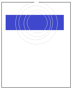
可以看到,所谓的有界和无界的区别就在于,有界水波纹扩散不会超出控件自身的边界,而无界水波纹扩散范围是一个正方形区域,正方形的边长取控件高宽的较大值。
当然这样的效果还是太单调,有时我们需要自定义水波纹的颜色,方法也很简单。
有界水波纹:
要自定义有界水波纹的颜色,只需要创建drawable文件,添加ripple节点,将节点的color属性设置为你想要的颜色,再在其下添加item节点,指定该item的id属性为mask即可。
比如说我们定义“button_red_mask”文件:
<?xml version="1.0" encoding="utf-8"?>
<ripple xmlns:android="http://schemas.android.com/apk/res/android"android:color="#FF5151"><itemandroid:id="@android:id/mask"android:drawable="@color/colorPrimary" />
</ripple>
item节点中的drawable属性另有用处,之后再讲,但这里并不影响水波纹的颜色,我这里就随便设了一个。之后再将这个文件设置为控件的背景即可:
<Buttonandroid:id="@+id/button"android:layout_width="match_parent"android:layout_height="50dp"android:layout_margin="15dp"android:background="@drawable/button_red_mask"android:text="Button" />看看效果:

无界水波纹:
无界水波纹要自定义波纹颜色就更简单了,连上述的item节点都不需要,只需要ripple节点指定其color属性即可。
定义“button_red_mask “文件:
<?xml version="1.0" encoding="utf-8"?>
<ripple xmlns:android="http://schemas.android.com/apk/res/android"android:color="#FF5151"></ripple>
再将其设置为控件的背景:
<Buttonandroid:id="@+id/button"android:layout_width="match_parent"android:layout_height="50dp"android:layout_margin="15dp"android:background="@drawable/button_red_unmask"android:text="Button" />效果:

除了自定义波纹颜色,你甚至可以自定义波纹的扩散边界。做法也不复杂,就是我们之前提到的item节点中的drawable属性,只需要将drawable属性设置为指定的图片,就可以将该图片作为扩散边界。来试一试。
定义“button_red_mask_icon“文件:
<?xml version="1.0" encoding="utf-8"?>
<ripple xmlns:android="http://schemas.android.com/apk/res/android"android:color="#FF5151"><itemandroid:id="@android:id/mask"android:drawable="@drawable/heart" />
</ripple>
将其设置为控件的背景:
<Buttonandroid:id="@+id/button"android:layout_width="350dp"android:layout_height="350dp"android:layout_gravity="center_horizontal"android:background="@drawable/button_red_mask_icon"android:text="Button" />看看效果:

当然自定义边界所指定的图片,除了真实的图片,自定义的drawble资源也是可以的。
比如说我们先定义一个圆角矩形资源“button_red_up”
<?xml version="1.0" encoding="utf-8"?>
<shape xmlns:android="http://schemas.android.com/apk/res/android"><solid android:color="#ff5151" /><corners android:radius="40dp" /></shape>
再定义一个“button_red_mask_shape”文件,将item节点的drawable属性设置为上面的“button_red_up”:
<?xml version="1.0" encoding="utf-8"?>
<ripple xmlns:android="http://schemas.android.com/apk/res/android"android:color="#FF5151"><itemandroid:id="@android:id/mask"android:drawable="@drawable/button_red_up" />
</ripple>
最后把它设置成控件的背景:
<Buttonandroid:id="@+id/button"android:layout_width="match_parent"android:layout_height="50dp"android:layout_margin="15dp"android:background="@drawable/button_red_mask_shape"android:text="Button" />效果如下:

当然,上面的所有做法,控件的不点击的时候是不显示形状的。有时候我们需要控件的不点击的时候就显示一个指定的形状,那又该怎么做呢?其实也不难,只需要在上述的item节点下,再添加一个shape节点来指定形状即可。
我们再定义一个“button_red_mask_shape_pro”文件:
<?xml version="1.0" encoding="utf-8"?>
<ripple xmlns:android="http://schemas.android.com/apk/res/android"android:color="#20000000"><item><shape><corners android:radius="40dp" /><solid android:color="#FF5151" /></shape></item>
</ripple>
这个文件指定了控件形状为圆角矩形,水波纹颜色为半透明的黑色。再把这个文件设置为控件的背景:
<Buttonandroid:id="@+id/button"android:layout_width="match_parent"android:layout_height="50dp"android:layout_margin="15dp"android:background="@drawable/button_red_mask_shape_pro"android:text="Button" />效果:

再进一步,如果还想给按钮再加一个selector效果,即按钮未按下时显示一张图,按下时显示另一张图,也是可以做到的。
先定义一个按钮未按下时的资源“button_red_up”:
<?xml version="1.0" encoding="utf-8"?>
<shape xmlns:android="http://schemas.android.com/apk/res/android"><solid android:color="#ff5151" /><corners android:radius="40dp" /></shape>
再定义一个按钮按下时的资源“button_red_down”:
<?xml version="1.0" encoding="utf-8"?>
<shape xmlns:android="http://schemas.android.com/apk/res/android"><solid android:color="#BA3F3F" /><corners android:radius="40dp" /></shape>
然后定义selector资源文件“button_red_mask_shape_selector”:
<?xml version="1.0" encoding="utf-8"?>
<ripple xmlns:android="http://schemas.android.com/apk/res/android"android:color="#20000000"><item><selector><itemandroid:state_pressed="true"android:drawable="@drawable/button_red_down"/><itemandroid:state_pressed="false"android:drawable="@drawable/button_red_up"/></selector></item>
</ripple>
其实就是在item节点下再添加一个selector节点,引用之前定义的两个资源即可。最后把控件的背景设置为该资源:
<Buttonandroid:id="@+id/button"android:layout_width="match_parent"android:layout_height="50dp"android:layout_margin="15dp"android:background="@drawable/button_red_mask_shape_selector"android:text="Button" />来看看效果:

好了,以上就是Andorid的Material Design中自带的水波纹扩散效果的所有内容了。
===========================================================
其实之前自己顺手写了一个点击水波纹扩散效果的控件,虽然从来没有用过,这里也顺便拿出来分享一下,没准以后就用上了呢。
话不多说,先看效果:
实现的效果是点击时生成一个随手指移动的小圆圈,松开时小圆圈呈现水波纹扩散效果,之前在前端上经常看到这样的设计。
所有代码都被封装在一个视图类里面,复制即可用。上源码:
按钮类 DiffusionButton.java
public class DiffusionButton extends AppCompatButton {private Context context;private Paint paint;private Path path;private RectF roundRect;private int width;private int height;private int touchX;private int touchY;private int maxRadius;private int currentRadius;private int invalidateInterval = 10;private boolean isPushButton;private boolean isClickFinish;private boolean isInit;/*** 可设置参数*/// 扩散速度private int speed;// 扩散颜色private int diffusionColor;// 控件圆角半径private int radius;// 控件左上角横向半径private int leftTopRadiusX;// 控件左上角纵向半径private int leftTopRadiusY;// 控件右上角横向半径private int rightTopRadiusX;// 控件右上角纵向半径private int rightTopRadiusY;// 控件左下角横向半径private int leftBottomRadiusX;// 控件左下角纵向半径private int leftBottomRadiusY;// 控件右下角横向半径private int rightBottomRadiusX;// 控件右下角纵向半径private int rightBottomRadiusY;// 按下时的圆圈半径private int touchRadius;public DiffusionButton(Context context) {super(context, null);}public DiffusionButton(Context context, AttributeSet attrs) {this(context, attrs, R.attr.buttonStyle);}public DiffusionButton(Context context, AttributeSet attrs, int defStyle) {super(context, attrs, defStyle);TypedArray array = context.obtainStyledAttributes(attrs, R.styleable.DiffusionButton);speed = array.getInt(R.styleable.DiffusionButton_speed, 25);diffusionColor = array.getColor(R.styleable.DiffusionButton_diffusionColor, Color.parseColor("#30000000"));radius = array.getDimensionPixelSize(R.styleable.DiffusionButton_radius, 0);leftTopRadiusX = array.getDimensionPixelSize(R.styleable.DiffusionButton_leftTopRadiusX, radius);leftTopRadiusY = array.getDimensionPixelSize(R.styleable.DiffusionButton_leftTopRadiusY, radius);leftBottomRadiusX = array.getDimensionPixelSize(R.styleable.DiffusionButton_leftBottomRadiusX, radius);leftBottomRadiusY = array.getDimensionPixelSize(R.styleable.DiffusionButton_leftBottomRadiusY, radius);rightTopRadiusX = array.getDimensionPixelSize(R.styleable.DiffusionButton_rightTopRadiusX, radius);rightTopRadiusY = array.getDimensionPixelSize(R.styleable.DiffusionButton_rightTopRadiusY, radius);rightBottomRadiusX = array.getDimensionPixelSize(R.styleable.DiffusionButton_rightBottomRadiusX, radius);rightBottomRadiusY = array.getDimensionPixelSize(R.styleable.DiffusionButton_rightBottomRadiusY, radius);touchRadius = array.getDimensionPixelSize(R.styleable.DiffusionButton_touchRadius, dp2px(20));array.recycle();init(context);}/*** 初始化方法** @param context*/private void init(Context context) {this.context = context;paint = new Paint();paint.setColor(diffusionColor);path = new Path();}/*** 构造剪裁路径方法*/private void buildPath() {if (path == null) {return;}path.reset();path.addRoundRect(roundRect, new float[]{leftTopRadiusX, leftTopRadiusY,rightTopRadiusX, rightTopRadiusY,rightBottomRadiusX, rightBottomRadiusY,leftBottomRadiusX, leftBottomRadiusY,}, Path.Direction.CCW);}/*** 扩散动画完成后重置方法*/private void resetData() {isPushButton = false;isClickFinish = false;currentRadius = touchRadius;invalidate();}@Overrideprotected void onLayout(boolean changed, int l, int t, int r, int b) {super.onLayout(changed, l, t, r, b);width = getMeasuredWidth();height = getMeasuredHeight();roundRect = new RectF(0, 0, width, height);buildPath();isInit = true;}@Overrideprotected void onDraw(Canvas canvas) {super.onDraw(canvas);if (!isPushButton && !isClickFinish) {return;}// 剪裁显示区域canvas.clipPath(path);if (isClickFinish) {// 绘制扩散圆canvas.drawCircle(touchX, touchY, currentRadius, paint);if (currentRadius < maxRadius) {currentRadius += speed;postInvalidateDelayed(invalidateInterval);} else {resetData();}}if (isPushButton) {// 绘制点击圆canvas.drawCircle(touchX, touchY, touchRadius, paint);}}@Overridepublic boolean onTouchEvent(MotionEvent event) {switch (event.getAction()) {case MotionEvent.ACTION_DOWN:touchX = (int) event.getX();touchY = (int) event.getY();isPushButton = true;invalidate();break;case MotionEvent.ACTION_MOVE:touchX = (int) event.getX();touchY = (int) event.getY();invalidate();break;case MotionEvent.ACTION_UP:if (touchX > 0 && touchY > 0 && touchX < width && touchY < height) {isPushButton = false;isClickFinish = true;// 计算最大扩散半径maxRadius = (int) Math.max(Math.max(getDistance(touchX, touchY, 0, 0), getDistance(touchX, touchY, 0, height)),Math.max(getDistance(touchX, touchY, width, 0), getDistance(touchX, touchY, width, height)));currentRadius = touchRadius;postInvalidateDelayed(invalidateInterval);} else {resetData();}break;}return super.onTouchEvent(event);}private double getDistance(int x1, int y1, int x2, int y2) {return Math.sqrt(Math.pow(x1 - x2, 2) + Math.pow(y1 - y2, 2));}/*** 设置扩散速度** @param speed*/public void setSpeed(int speed) {this.speed = speed;}/*** 设置扩散颜色** @param diffusionColor*/public void setDiffusionColor(int diffusionColor) {this.diffusionColor = diffusionColor;if (paint != null) {paint.setColor(diffusionColor);}}/*** 设置控件圆角半径** @param radius 半径,单位dp*/public void setRadius(int radius) {if (radius >= 0) {this.radius = dp2px(radius);leftTopRadiusX = radius;leftTopRadiusY = radius;rightTopRadiusX = radius;rightTopRadiusY = radius;leftBottomRadiusX = radius;leftBottomRadiusY = radius;rightBottomRadiusX = radius;rightBottomRadiusY = radius;if (isInit) {buildPath();}}}/*** 设置控件圆角半径* <p>* 参数为四个数组,分别对应控件左上角横纵向半径、右上角横纵向半径、左下角横纵向半径、右下角横纵向半径** @param leftTopRadius     半径,单位dp,下同* @param rightTopRadius* @param leftBottomRadius* @param rightBottomRadius*/public void setRadius(int[] leftTopRadius, int[] rightTopRadius, int[] leftBottomRadius, int[] rightBottomRadius) {leftTopRadiusX = dp2px(leftTopRadius[0]);leftTopRadiusY = dp2px(leftTopRadius[1]);rightTopRadiusX = dp2px(rightTopRadius[0]);rightTopRadiusY = dp2px(rightTopRadius[1]);leftBottomRadiusX = dp2px(leftBottomRadius[0]);leftBottomRadiusY = dp2px(leftBottomRadius[1]);rightBottomRadiusX = dp2px(rightBottomRadius[0]);rightBottomRadiusY = dp2px(rightBottomRadius[1]);if (isInit) {buildPath();}}/*** 设置按下时的圆圈半径** @param touchRadius 半径,单位dp*/public void setTouchRadius(int touchRadius) {this.touchRadius = dp2px(touchRadius);}private int dp2px(int dpVal) {return (int) TypedValue.applyDimension(TypedValue.COMPLEX_UNIT_DIP, dpVal, getResources().getDisplayMetrics());}
}
布局类 DiffusionLayout.java
public class DiffusionLayout extends LinearLayout {private Context context;private Paint paint;private Path path;private RectF roundRect;private int width;private int height;private int touchX;private int touchY;private int maxRadius;private int currentRadius;private int invalidateInterval = 10;private boolean isPushButton;private boolean isClickFinish;private boolean isInit;/*** 可设置参数*/// 扩散速度private int speed;// 扩散颜色private int diffusionColor;// 控件圆角半径private int radius;// 控件左上角横向半径private int leftTopRadiusX;// 控件左上角纵向半径private int leftTopRadiusY;// 控件右上角横向半径private int rightTopRadiusX;// 控件右上角纵向半径private int rightTopRadiusY;// 控件左下角横向半径private int leftBottomRadiusX;// 控件左下角纵向半径private int leftBottomRadiusY;// 控件右下角横向半径private int rightBottomRadiusX;// 控件右下角纵向半径private int rightBottomRadiusY;// 按下时的圆圈半径private int touchRadius;public DiffusionLayout(Context context) {this(context, null);}public DiffusionLayout(Context context, AttributeSet attrs) {this(context, attrs, -1);}public DiffusionLayout(Context context, AttributeSet attrs, int defStyle) {super(context, attrs, defStyle);TypedArray array = context.obtainStyledAttributes(attrs, R.styleable.DiffusionLayout);speed = array.getInt(R.styleable.DiffusionButton_speed, 25);diffusionColor = array.getColor(R.styleable.DiffusionButton_diffusionColor, Color.parseColor("#30000000"));radius = array.getDimensionPixelSize(R.styleable.DiffusionButton_radius, 0);leftTopRadiusX = array.getDimensionPixelSize(R.styleable.DiffusionButton_leftTopRadiusX, radius);leftTopRadiusY = array.getDimensionPixelSize(R.styleable.DiffusionButton_leftTopRadiusY, radius);leftBottomRadiusX = array.getDimensionPixelSize(R.styleable.DiffusionButton_leftBottomRadiusX, radius);leftBottomRadiusY = array.getDimensionPixelSize(R.styleable.DiffusionButton_leftBottomRadiusY, radius);rightTopRadiusX = array.getDimensionPixelSize(R.styleable.DiffusionButton_rightTopRadiusX, radius);rightTopRadiusY = array.getDimensionPixelSize(R.styleable.DiffusionButton_rightTopRadiusY, radius);rightBottomRadiusX = array.getDimensionPixelSize(R.styleable.DiffusionButton_rightBottomRadiusX, radius);rightBottomRadiusY = array.getDimensionPixelSize(R.styleable.DiffusionButton_rightBottomRadiusY, radius);touchRadius = array.getDimensionPixelSize(R.styleable.DiffusionButton_touchRadius, dp2px(20));array.recycle();init(context);}/*** 初始化方法** @param context*/private void init(Context context) {this.context = context;paint = new Paint();paint.setColor(diffusionColor);path = new Path();setWillNotDraw(false);setClickable(true);}/*** 构造剪裁路径方法*/private void buildPath() {if (path == null) {return;}path.reset();path.addRoundRect(roundRect, new float[]{leftTopRadiusX, leftTopRadiusY,rightTopRadiusX, rightTopRadiusY,rightBottomRadiusX, rightBottomRadiusY,leftBottomRadiusX, leftBottomRadiusY,}, Path.Direction.CCW);}/*** 扩散动画完成后重置方法*/private void resetData() {isPushButton = false;isClickFinish = false;currentRadius = touchRadius;invalidate();}@Overrideprotected void onLayout(boolean changed, int l, int t, int r, int b) {super.onLayout(changed, l, t, r, b);width = getMeasuredWidth();height = getMeasuredHeight();roundRect = new RectF(0, 0, width, height);buildPath();isInit = true;}@Overrideprotected void onDraw(Canvas canvas) {super.onDraw(canvas);if (!isPushButton && !isClickFinish) {return;}// 剪裁显示区域canvas.clipPath(path);if (isClickFinish) {// 绘制扩散圆canvas.drawCircle(touchX, touchY, currentRadius, paint);if (currentRadius < maxRadius) {currentRadius += speed;postInvalidateDelayed(invalidateInterval);} else {resetData();}}if (isPushButton) {// 绘制点击圆canvas.drawCircle(touchX, touchY, touchRadius, paint);}}@Overridepublic boolean onTouchEvent(MotionEvent event) {switch (event.getAction()) {case MotionEvent.ACTION_DOWN:touchX = (int) event.getX();touchY = (int) event.getY();isPushButton = true;invalidate();break;case MotionEvent.ACTION_MOVE:touchX = (int) event.getX();touchY = (int) event.getY();invalidate();break;case MotionEvent.ACTION_UP:if (touchX > 0 && touchY > 0 && touchX < width && touchY < height) {isPushButton = false;isClickFinish = true;// 计算最大扩散半径maxRadius = (int) Math.max(Math.max(getDistance(touchX, touchY, 0, 0), getDistance(touchX, touchY, 0, height)),Math.max(getDistance(touchX, touchY, width, 0), getDistance(touchX, touchY, width, height)));currentRadius = touchRadius;postInvalidateDelayed(invalidateInterval);} else {resetData();}break;}return super.onTouchEvent(event);}private double getDistance(int x1, int y1, int x2, int y2) {return Math.sqrt(Math.pow(x1 - x2, 2) + Math.pow(y1 - y2, 2));}/*** 设置扩散速度** @param speed*/public void setSpeed(int speed) {this.speed = speed;}/*** 设置扩散颜色** @param diffusionColor*/public void setDiffusionColor(int diffusionColor) {this.diffusionColor = diffusionColor;if (paint != null) {paint.setColor(diffusionColor);}}/*** 设置控件圆角半径** @param radius 半径,单位dp*/public void setRadius(int radius) {if (radius >= 0) {this.radius = dp2px(radius);leftTopRadiusX = radius;leftTopRadiusY = radius;rightTopRadiusX = radius;rightTopRadiusY = radius;leftBottomRadiusX = radius;leftBottomRadiusY = radius;rightBottomRadiusX = radius;rightBottomRadiusY = radius;if (isInit) {buildPath();}}}/*** 设置控件圆角半径* <p>* 参数为四个数组,分别对应控件左上角横纵向半径、右上角横纵向半径、左下角横纵向半径、右下角横纵向半径** @param leftTopRadius     半径,单位dp,下同* @param rightTopRadius* @param leftBottomRadius* @param rightBottomRadius*/public void setRadius(int[] leftTopRadius, int[] rightTopRadius, int[] leftBottomRadius, int[] rightBottomRadius) {leftTopRadiusX = dp2px(leftTopRadius[0]);leftTopRadiusY = dp2px(leftTopRadius[1]);rightTopRadiusX = dp2px(rightTopRadius[0]);rightTopRadiusY = dp2px(rightTopRadius[1]);leftBottomRadiusX = dp2px(leftBottomRadius[0]);leftBottomRadiusY = dp2px(leftBottomRadius[1]);rightBottomRadiusX = dp2px(rightBottomRadius[0]);rightBottomRadiusY = dp2px(rightBottomRadius[1]);if (isInit) {buildPath();}}/*** 设置按下时的圆圈半径** @param touchRadius 半径,单位dp*/public void setTouchRadius(int touchRadius) {this.touchRadius = dp2px(touchRadius);}private int dp2px(int dpVal) {return (int) TypedValue.applyDimension(TypedValue.COMPLEX_UNIT_DIP, dpVal, getResources().getDisplayMetrics());}
}
控件有两个,DiffusionButton和DiffusionLayout,分别应对点击按钮和点击布局的使用场景。DiffusionButton继承自Button,DiffusionLayout继承自LinearLayout,像使用普通的Button和Layout来使用它们就可以了。
像下面这样:
<com.min.diffusionbutton.view.DiffusionButtonandroid:id="@+id/button"android:layout_width="match_parent"android:layout_height="50dp"android:layout_margin="15dp"android:background="@drawable/button_red_up"android:text="Button"android:textColor="#ffffff"android:textSize="16dp"app:radius="25dp" /><com.min.diffusionbutton.view.DiffusionLayoutandroid:id="@+id/layout"android:layout_width="350dp"android:layout_height="350dp"android:layout_margin="15dp"android:background="@drawable/button_red_up"app:radius="40dp"app:touchRadius="40dp" />运行一下就能看到开头的效果了。
当然控件还支持一些自定义属性设置,各个属性的意义在源码注释里已经写的很清楚了,这里不再赘述。
最后附上源码地址:https://download.csdn.net/download/Sure_Min/12565978
这次的内容就到这里,我们下次再见。